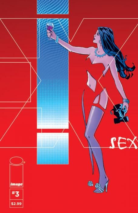
With its third issue, "Sex" becomes less a comic about a series of random scenes and sexual situations and more a book finding its feet, its tone and its plot. Joe Casey and Piotr Kowalski have created a stylish look at an often overlooked part of the superhero genre, and are now starting to capitalize on their unique point of view.
The first two issues of "Sex" looked great. Kowalski's bandes dessinees-influenced storytelling style helped the book stand out from others in the American market. His ability to draw normal-looking humans in complex scenes with detailed backgrounds (including wonderful cityscapes) helped to create a series with a break-out look.
However, Casey's script wandered. We were introduced to a half-dozen characters, but aside from the lead, Simon Cooke, we haven't been able to figure out how all the pieces click together. Things have been isolated, and new characters keep popping up to confuse things further. But with this third issue, and all the characters seemingly established, Casey can be seen moving those pieces into place, setting up new dramatic and threatening situations that will drive the action forward. "Sex" is a lower-level street crime drama playing out amidst a personal tale of loss from the viewpoint of a superhero who's hung up his tights and lost a major piece of himself.
At the same time, the series' title has not been forgotten. We learn in this issue that street punk Keenan has a certain sado-masochistic side, and that presumed villainess Annabelle LaGravenese truly enjoyed her cat-and-mouse game with Simon Cooke's abandoned superhero persona. It brought her a level of gratification she can't find in his absence. Meanwhile, Simon is lost, a man who doesn't know who he is, in a bit of a twist on the old "Is he Bruce Wayne playing Batman, or Batman playing Bruce Wayne?" question.
While Kowalski is the ring leader of the visual look of this book, the work of letterer Rus Wooton and colorist Brad Simpson can't be overlooked. Wooton uses a font that looks straight out of Franco-Belgian comics' hand-drawn lettering libraries, while Simpson's colors are a rainbow of solid blocks. He's not relying on gradients and fancy effects. A lot of the issue is done in bold colors that don't necessarily represent true life. It's an effective approach.
Sonia Harris also deserves credit -- as she does on "The Bounce" -- for her graphic design of the book. Not only are the wraparound covers for the series well executed, but the opening spreads and credit sequences are like nothing else in comics today. I like that Casey has put the extra thought to bring someone in to introduce extra elements into his comics that make sense and feel fancy.
"Sex" #3 feels like the turning point for the series. Casey has put all his soldiers on the field, and they seem to be marching together. The introductions are over, and the plot is more than just a series of question marks. You can feel the momentum building, which is very exciting.

