It's summertime, a.k.a rerun season. While not exactly a re-run, this also isn't exactly new material. The following is a list and discussion of my 12 favourite comic book covers of all-time. It's compiled for a series of threads on the Classic Comics forums done last year around the 12 days of Christmas.
You may have seen me post of these here and there, and I may have discussed some of these artists in prior columns - but this is the top 12, as my heart told me as of the end of 2008. This list would have been very different 10 years ago, and it will be very different 10 years from now. I was a bit surprised by a few omissions - no Neal Adams, no Alex Schomburg, no Joe Kubert etc... etc... What can I say? When you sit down and do a top 12, you really have to stick with what you truly love. Many of these are based purely on design and execution, but I'll admit that nostalgia played a role in at least one selection.
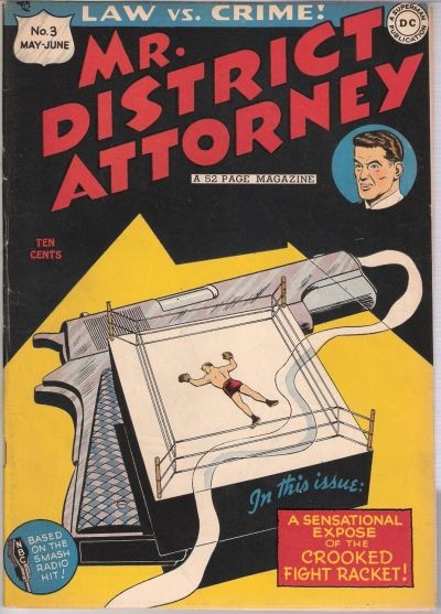
12. Mr. District Attorney #3 - May/June, 1948
Cover by Win Mortimer
As I've mentioned here at the Corner before, Win Mortimer is a criminally underappreciated comic book artist. From what I can tell, he blazed a trail for Adams, Kubert and Cardy as the DC cover artist in the late 40 and early 50s, working on numerous titles during that period. I am shocked by how many of my favourite DC covers are by Mortimer (House Mystery #1, Batman #62 and Superboy #30 to name but a few)
I just love this cover - and when I first saw a copy of it for sale, I simply had to have it. It is very simple, and yet wonderfully designed. I love how some artists can establish an atmosphere with minimal detail.
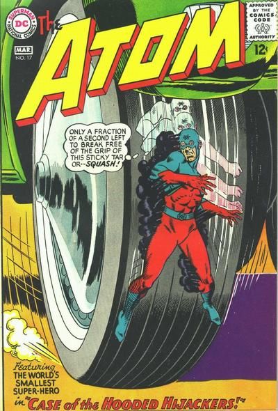
11. The Atom #17 - Feb/March, 1965
Cover by Gil Kane & Murphy Anderson
The thing I love most about the Atom (and all 'shrinkers') is the juxtaposition of the smaller figure against ordinary objects that pose a threat by virtue of their relative size. Of course, car tires pose a threat to anyone - but it's a broken foot for you or me and a complete squashing for Mr. Palmer. I love the way Kane has portrayed the speed of the spinning car wheel. How could anyone 10 year old have passed up this book back in 1965? I completed a run of the Silver Age Atom a few years back, and flipping through those covers is a real treat for the eyes. Looking at my top 12, I'm stunned to see that this is the only Kane cover I've chosen - but I can say with complete certainty that this is my favourite.
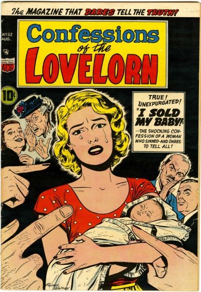
10. Confessions of the Lovelorn #52 - August, 1954
Cover by Ogden Whitney
Much like Win Mortimer, I consider Ogden Whitney to be a sadly underappreciated cover artist. This wonderful cover is evidence of his great skill. It has all of the exploitative elements of a good pre-Code romance cover. Whitney loved using giant hands, and here he uses the pointing fingers to great effect. The gossiping old hens and businessmen in the background only lend to the feeling of shame heaped upon our heroine. All of this conflict is balanced nicely against the image of the innocent baby, sound asleep. Sure it's goofy and over the top - that's the whole point. I love this one on so many levels.
There's no way this one could have come out the next year. They would have edited the crap out of it. The accusatory fingers would be gone. The caption about sinning would be gone, along with the gossips. They'd probably replace the baby with a dying fern and the lead story would be called 'Love Killed My Plant'. Actually that sounds better than most things I see on the shelves today.
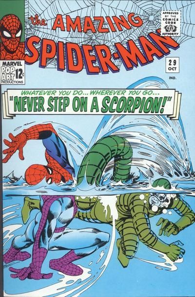
9. Amazing Spider-Man #29 October, 1965
Cover by: some guy named Ditko
The first (of two) Ditko cover to make my list. This one may not be perceived to be quite as iconic as some other Spidey covers, but it's my favourite cover from the title. The Scorpion was introduced in issue #20 and that one featured a good cover, but it was a fairly static image when compared to this one. There is such a great fluidity of motion here, as the bodies bend in a very Ditkoesque manner. It's this sense of motion that distinguishes Ditko from his peers. This is a very simple snapshot, but it informs the reader that they will find a life or death struggle is within the pages. I absolutely love the Scorpion's regulator - a bit of Ditko sci-fi thrown in for fun. Of course, a good dose of Ditko water is always a bonus. Too often I find that the captions on Marvel covers really detract from the art, but the tagline 'Never Step on a Scorpion' is a good one.
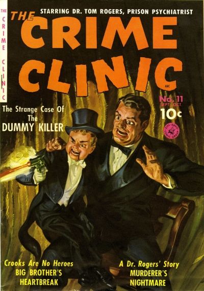
8. Crime Clinic #11- October, 1951
Cover by Norman Saunders
As I may have mentioned once or twice (or a million times), I'm a big fan of Norman Saunders' artwork. He painted some of the best covers of the 50s, working for the likes of Fawcett and Ziff-Davis. I can't believe anyone in their right mind would have passed this one up if they spotted it on the spinner rack back in 1951. It is both creepy and compelling - a nice blend of crime and horror. Saunders was an amazing talent and compiling a list of his top 12 covers would be a blast.
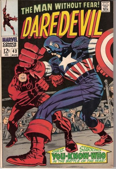
7. Daredevil #43 - August, 1968
Cover by Jack Kirby and Joe Sinnott
The first and only Kirby cover on my list (I hardly believe it, myself). It's also strange that it comes from Daredevil - not exactly a series associated with Jack. I really don't have much to say about it, except that this cover tells you everything you need to know about Jack Kirby. The action is in your face, as Cap's right fist flying off the cover. Thank goodness the cover captions were kept to a minimum with this one (a true rarity for Marvel back then). It's perfect and should be a poster hanging on walls around the world. Actually, I think someone told me that this was indeed produced as a poster in the late 60s.
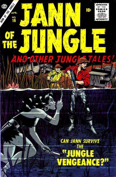
6. Jann of the Jungle #16 - April, 1957
Cover by Bill Everett
When I first saw this image, I just knew that I had to have the book. I still don't have it, but that's half the fun, isn't it? I love a cover that tells a story - and this one pretty much tells the reader that he (or she, in theory) is in for a very suspenseful ride. The colour effects for the underwater portion are just amazing. Bill Everett was such an amazing talent.
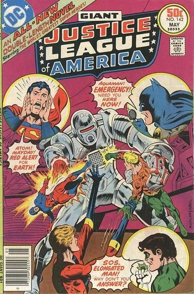
5. Justice League of America #142 - May, 1977
Cover by Rich Buckler & Jack Abel
Although I think this is a wonderfully designed cover, I must admit that nostalgia plays a large role in its selection, as this is my all-time favourite comic book. When I was a kid, this cover got me hook, line and sinker. This was my introduction to many DCU characters who would become near and dear to my heart over the next 30 years. So many questions popped into my head when I saw this book. Who were these 3 guys in the middle? Why were the likes of Batman and Superman so desperate for their help? How cool is that robot? How awesome it would have been had it been inked by someone other than Jack Abel?
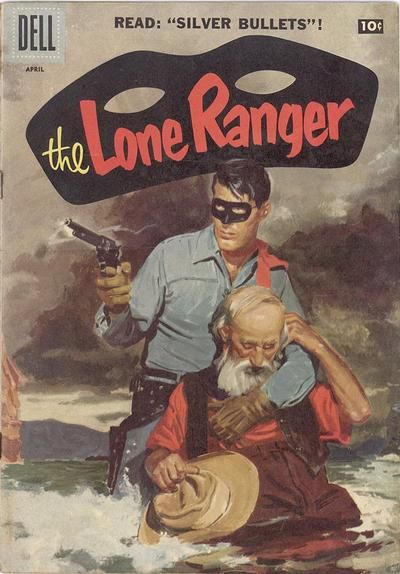
4. Lone Ranger #106 - April, 1957
Cover by Hank Hartman
As you may have figured out by now, I'm more than a little nuts about the painted covers for Dell's Lone Ranger series and I've managed to track down about 80% of 'em. The covers were painted by a trio of talented artists: Hank Hartman, Ernest Nordii and Don Spaulding. This masterpiece is by Hartman and although I've flipped flopped over the years over which LR cover is my favourite - this one has been topping the charts for quite a while now. It's wonderfully moody, with dark clouds and turbulent water. The Ranger is obviously in the midst of a terrific battle as he has lost his hat and is cradling to a dying man. By the end of the year, the series would switch over to Clayton Moore photo covers, and while those are much more coveted by collectors, I'll gladly stick to my painted covers, thank you very much.
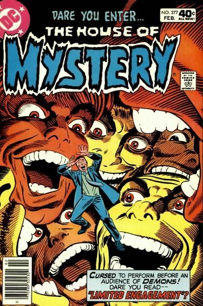
3. House of Mystery #277 - February, 1980
Cover by Steve Ditko
Ditko used this 'Menacing Floating Heads' theme on several occasions, but never better than on this cover. Blake Bell has pointed out that Mort Meskin's cover to Golden Lad #3 was the likely inspiration. Ditko is a master of design, as well as establishing an atmosphere. So many of his protagonists are haunted by their conscience and this wonderful images blends oppression, paranoia and claustrophobia. I bought this one off the racks when I was 7 years old and I had a really visceral emotional response to it. When I started featuring Ditko covers at my blog, this was the natural starting point. Ditko is the best at bringing out mankind's ugly side. It's a beautiful thing.
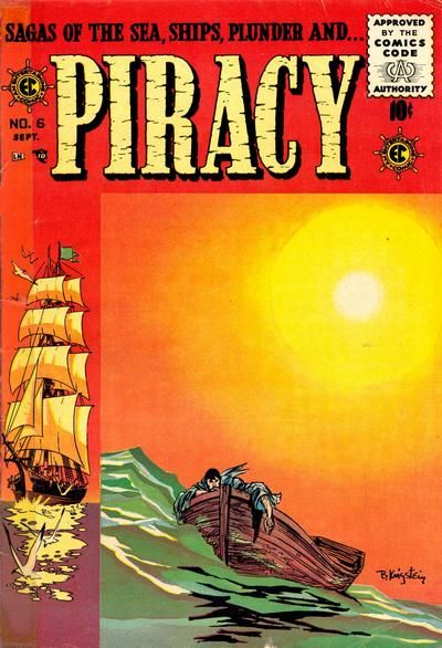
2. Piracy #6 - September, 1955
Cover by Bernard Krigstein
It's no surprise that Krigstein was also an accomplished "fine art" painter. His choice of colours is amazing - from the scorching sun to the less than inviting water. I'm just amazed by the amount of emotional punch contained in this relatively simple, static image - the man's 'defeated' posture tells you that some very interesting events have led to this moment. With each passing year, Krigstein climbs higher and higher on my favourite artists list.
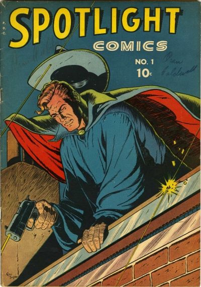
1. Spotlight Comics #1 - 1944
Cover by George Tuska
Yeah, I know it's from an obscure title and I know that most people simply see Tuska as a capable, journeyman artist but I happen to think that this is the most gorgeous comic book cover ever created. It has that wonderful Golden Age blend of superhero and pulp hero - superbly designed and executed. Of course, the interior contents do not come close to living up to the promise of the cover, but that was par for the course back then. Any time anyone starts to diss Tuska, I simply introduce this cover as evidence and that ends the argument.
So that's it. I compiled this over 6 months ago, and can't see making any changes right now. The great thing about classic comics, is that there's always something new to be discovered. 10 years ago, I never knew Spotlight Comics #1 existed and here it is #1 in my heart.
For more comic book chat - stop by my blog: Seduction of the Indifferent

