With the passing of Russ Heath recently at the age of 91, there are very few comic book artists alive today that saw their work adapted by Roy Lichtenstein into one of his pop-art paintings. It appears as though John Romita and Ted Galindo are two of the only artists still with us that received the Lichtenstein treatment in the past. We thought it would be interesting to see what we know about how the comic book artists themselves felt about Lichtenstein.
In case you are unfamiliar with Lichtenstein's pop art paintings that involved comic book panels, Lichtenstein would take images from comic books and then transform them into large paintings spotlighting small panels from the comics.
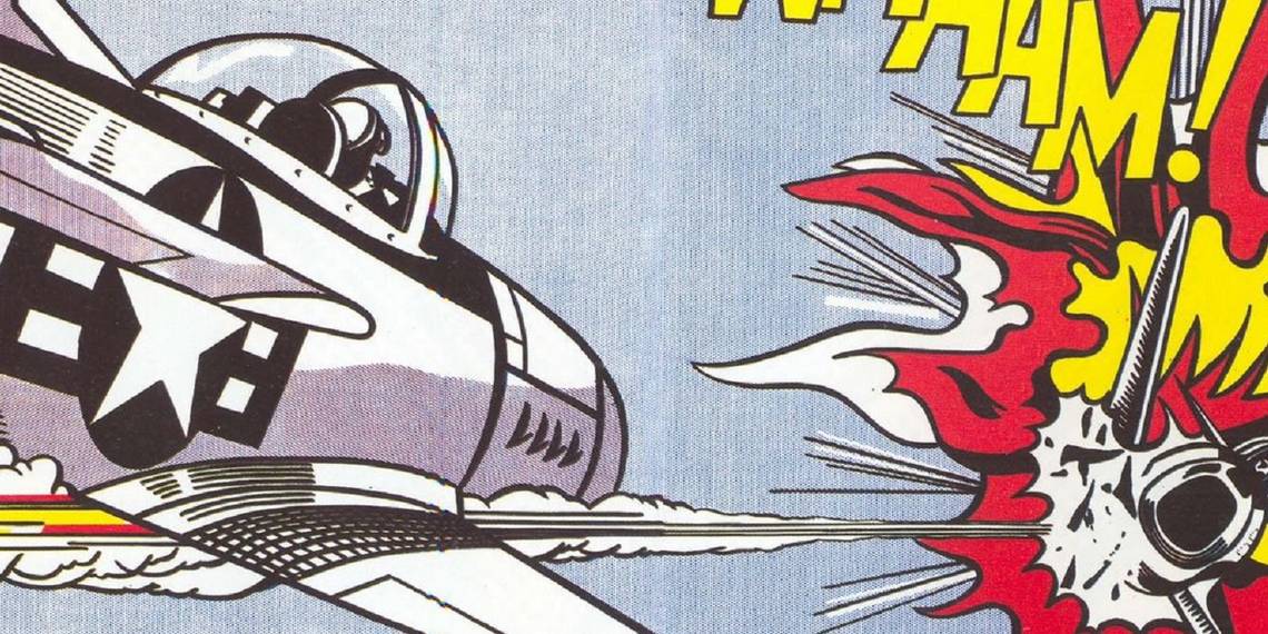
Here's one of his most famous paintings, "Whaam!," which currently is on display at the British modern art museum, Tate Modern ...

Here is how the Tate describes the painting at their museum...
Whaam! is based on an image published in 1962 in the DC comic, All American Men of War. Lichtenstein often drew on commercial art sources such as comics and advertisements. He was interested how they depict highly emotional subject matter relating to love or war in a cool, impersonal way.
RELATED: Comic Book Legend Russ Heath Passes Away At Age 91
As we're sure you have noticed, while the comic book itself is credited, they did not credit the artist who drew the original panel. That would be Irv Novick.

Alastair Sooke, one of the biggest proponents of Licthestein's work, discussed the changes Lichtenstein made to the work in a piece for the BBC:
Comparing the source for Whaam! with the finished painting banishes the hoary idea that Lichtenstein profited on the back of the creativity of others. Lichtenstein transformed Novick’s artwork in a number of subtle but crucial ways. In general, he wanted to simplify and unify the image, to give it more clarity as a coherent work of art. For this reason, he removed two extra fighter jets to the right of the original panel. He also got rid of the lump of dark shadow representing a mountainside that was an ugly compositional mistake to the left of Novick’s picture. The result is that the two panels of Whaam! feel much more evenly balanced, producing a satisfying and well-structured visual effect.
While Novick’s explosion is a measly, scratchy little thing slipping out of frame, Lichtenstein’s self-possessed fireball unfurls like a blooming flower. Lichtenstein changed the colour of the letters spelling out “WHAAM!” from red to yellow, so that yellow would become another means of yoking everything together. As a result, the eye is cleverly led from the yellow of the speech bubble above the jet through the onomatopoeic sound effect to the explosion itself and back round to the horizontal vapour trail left behind by the missile.
Then, of course, there is the question of scale. Lichtenstein took something tiny and ephemeral – a throwaway comic-strip panel that most people would overlook – and blew it up so that it was a substantial oil (and acrylic) painting more than 2m (6.5 ft) wide and 1.7m (5.5 ft) high. Here, he was saying, was a contemporary equivalent of a grand ‘history painting’, once considered the highest and most challenging branch of art. In the years after it was executed, people began to understand Whaam! as a prophetic critique of America’s involvement in the Vietnam War.
Interestingly, Novick and Lichtenstein actually knew each other. Here's Novick on Lichtenstein from Mike Richardson and Steve Duin's Comics: Between the Panels...
He had one curious encounter at camp. He dropped by the chief of staff's quarters one night and found a young soldier sitting on a bunk, crying like a baby. "He said he was an artist," Novick remembered, "and he had to do menial work, like cleaning up the officers' quarters.
"It turned out to be Roy Lichtenstein. The work he showed me was rather poor and academic." Feeling sorry for the kid, Novick got on the horn and got him a better job. "Later on, one of the first things he started copying was my work. He didn't come into his own, doing things that were worthwhile, until he started doing things that were less academic than that. He was just making large copies of the cartoons I had drawn and painting them."
As you can see from Novick's description of the scenario, he was not a fan.
Page 2: [valnet-url-page page=2 paginated=0 text='Dave Gibbons Debates Alastair Sooke']
Interestingly, Steve Roper comic strip artist William Overgard actually wrote into Time Magazine back when Lichtenstein was at the height of the world's fascination with him and Overgard had this to say about the following Lichtenstein work...

Sir: As a cartoonist I was interested in Roy Lichtenstein's comments on comic strips in your article on Pop Art. Though he may not, as he says, copy them exactly. Lichtenstein in his painting currently being shown at the Guggenheim comes pretty close to the last panel of my Steve Roper Sunday page of August 6,1961. Very flattering...I think ?

RELATED: Why You Should Know the Work of Russ Heath
In recent years, comic book legend Dave Gibbons has been very vocal in his criticism of how Lichtenstein's work exploited the work of the original comic book artists. He organized an exhibition of works by comic book artists parodying Lichtenstein's work as a sort of protest of the Tate Modern doing a whole big Lichtenstein exhibition. Gibbons and the aforementioned Alastair Sooke had a fascinating debate about Lichtenstein at the exhibit. Sooke purchased a copy of the original Novick comic book for a little under six pounds.
He and Gibbons then discussed the comic vis a vis Lichstentein (as transcribed by Paul Gravett in a great article on the Lichtenstein debate)...
Alastair Sooke: “Lichtenstein has not only transformed it, he’s seriously improved it.”
Dave Gibbons: “I would disagree. This to me looks flat and abstracted, to the point of view that to my eyes it’s confusing. Whereas the original has got a three-dimensional quality to it, it’s got a spontaneity to it, it’s got an excitement to it, and a way of involving the viewer that this one lacks. For instance, the explosion here just looks to me like a collection of flat shapes, whereas the explosion in the original, because there are no lines in there, because it’s all left to the colour, seems to me to have to me much more of the quality of an explosion.”
Sooke disagrees, considering the original comic book explosion a bit “weak and measley”, whereas Lichtenstein’s version, “considered as a painting and not as a piece of comic book art, but as a piece of art, is far more successful than if this had been reproduced and placed on a wall. For a number of reasons: he’s got rid of extraneous details like the planes on either side. He’s removed the mountain, which I think is an unfortunate compositional device. He’s made the balance of the explosion on the right and the plane much clearer. It is much more balanced, they are more equal. I think those are several compelling reasons why formally this is a much more successful image than the source.”
Gibbons: “Well, I think there is a fundamental error in what you’re saying, which is that in fact a comic book is not anything to do with a single image, it’s to do with a series of images and it’s the images in juxtaposition to one another which give them their power. This is like a quotation, it’s like three notes out of the middle of a symphony.”
Sooke concedes and agrees with this and goes on: “But this [Lichtenstein’s WHAAAM!] we have to think of as a painting. Does it work as a piece of art in its own right? If it simply imitated this panel here, I’m suggesting, I think that it wouldn’t work as such an effective painting as in fact it does.”
Gibbons: “I bet you that if that Irv Novick panel was shown that size, it would have a huge graphic power of its own and it would have a cohesiveness, whereas this, to me, isn’t cohesive. Everything interesting about that [comic book] image, which is a representation of three-dimensional space, of a real event happening, to me is just flattened…
Sooke: “It’s an abstract painting. He said he wanted to hide the record of his hand, he’s bouncing off a previous generation of artists, abstract painters, people like Jackson Pollock, who were all about gesture, expression. He’s saying ‘I want it to appear flat and impersonal and mechanical, because that is the world I live in. And in fact that’s what I want to get across.’ So everything you’re saying, I think, you could argue, plays into his hands. Have I convinced you at all?”
Gibbons: “I’m afraid you haven’t convinced me at all. From the point of view that I come from, I find there’s something slightly dishonest about it, there’s something that is trying to be ironic that I think doesn’t actually work. It seems to be doing a disservice to comic art because of that.”
Sooke: “Although Lichtenstein’s work is so phenomenally popular, you could argue that he’s on the side of comics.”
Gibbons: “Yes, I’d have to agree, to try and find a point of harmony, that in the Sixties, for a short while, the mighty Marvel Comics group rechristened itself ‘Marvel Pop Art Productions’, because stuff like this in the eyes of ‘culture’ had said, ‘Hey, these aren’t just comics for kids, these could be the next big artistic wave.’ It lasted about three or four months, I think.”
Sooke: “Be honest. Is there any part of you that is narked by the fact that I could buy this comic book for £5.95 and clearly, if this [painting] ever came up on the market, it would be worth tens and tens of millions of pounds.”
Gibbons: “It doesn’t nark me at all. I mean, this is worth, to me, far more than that.”
Sooke: “What, for real? If you were offered this, you wouldn’t have this? You’d take the Irv Novick original?”
Gibbons: “Absolutely.”
What an interesting debate.
Page 3: [valnet-url-page page=3 paginated=0 text='Russ Heath Shares His Thoughts...in Comic Form']
Finally, we turn to the late Heath, who saw his work adapted for the famous Lichtenstein work, "Blam," which is at the Yale University Art Gallery and they, too, do not mention Heath at all.
Heath wrote and drew a one-page comic for the Hero Initiative (lettered and colored by the late, great Darwyn Cooke) that discussed his thoughts on Lichtenstein, as well as his gratitude for the Hero Initiative itself (note that Heath mistakenly mixed up "Blam!" which was based on his work with "Whaam!" which was based on Novick's work)...

A fine statement.
A problem that we have, of course, is that so many of the comic book artists that Lichtenstein used as part of his work (by the way, Lichtenstein himself professed an appreciation for comic books, stating, "The things that I have apparently parodied I actually admire") died a long time ago. Tony Abruzzo, for instance, the brilliant romance comic book artist who drew the page...

that became Lichtenstein's famous "Drowning Girl"...

passed away in 1990 and he was not exactly a guy who was giving interviews left and right even before he died. I believe some of the best information that we have about Tony Abruzzo's life is an article that was written about him back in 1942! Heck, while Jack Kirby obviously was so famous that he gave many interviews over the years, Kirby also passed away nearly 25 years ago and as such, there is little in terms of what Kirby thought about his work being used by Lichtenstein, either.
Lichtenstein himself passed away in 1997, so for over two decades, we have been without both the controversial artist and most of the artists whose work that he adapted.
Even someone like Jerry Grandenetti, another war comics artist who had his work adapted by Lichtenstein, who lived well into the 21st Century, did not talk about Lichtenstein much in public. Perhaps in private these guys all were quite vocal about their thoughts, but in public interviews they typically remained tight-lipped. It has been left to later artists, guys like Dave Gibbons and Art Spiegleman (Spiegelman has the famous line “Lichtenstein did no more or less for comics than Andy Warhol did for soup"), to take up the charge against Lichtenstein.