
Yeah, I get comics sent to me occasionally. We all do, and it's always fun. I review everything that is sent to me as a physical copy, but occasionally I forget to review stuff that is sent to me electronically. If it's not right in front of me, my oldness kicks in and it slips my mind! So today I'd like to review a few things that two Facebook friends sent me recently (meaning in December and January). Plus, on the 26th of January I went over to the Amazing Arizona Comic Convention, and I bought a few comics there that I'd like to review as well. Finally, I just got another comic via email, so I'll check that out, too. So let's get going, shall we?

First up we have Nancy in Hell: A Dragon in Hell, which has one too many references to Hell in the title but otherwise is a pretty decent comic. It's written by El Torres, drawn by Enrique Lorenzana, colored by Sandra Molina and Esther Sanz, and lettered by Malaka Studio. It's published by Amigo Comics and costs $3.99.
I read the first few issues of Nancy in Hell a few years ago, but it didn't really grab me all that much. Torres seemed to be trying to have his cake and eat it too with Nancy, a "bad girl" in the most stereotypical way - lots of shredded clothing, in other words - who also seemed to be a parody of the Bad Girl Phenomenon from the 1990s.

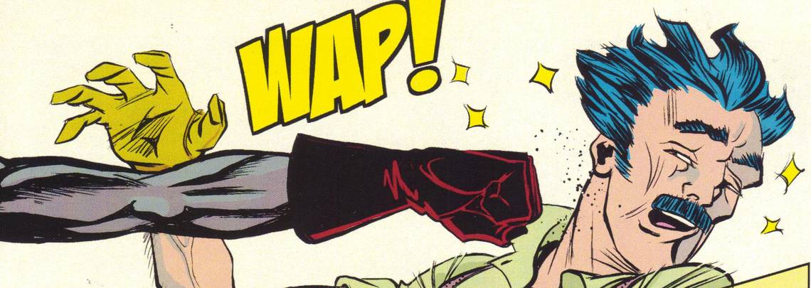
It wasn't a bad comic, but it wasn't all that great, especially when I knew Torres could write some very good comics. So I didn't keep up with the series. Torres was nice enough to send me a digital copy of his latest Nancy in Hell adventure, though, which was cool of him. The concept of the series, as Nancy explains on page 1, is simple: She died and went to Hell, because everyone who dies goes to Hell - Heaven doesn't exist. She wanted to get out and live again, so she teamed up with Lucifer, who's kind of a whiny baby, to escape from Hell. She then reminisces about the time she met the Savage Dragon, because this is a crossover! Torres explains in the back of the book that he asked Erik Larsen if he could use the character, and Larsen said it was cool. This is Malcolm Dragon, the son of the original Dragon, and he rescues a girl from a demon, who then drags poor Malcolm back to Hell with it. The demons think Malcolm is a pushover, but Malcolm proves that he's a bit tougher than they expect. As he's bashing the poor demons around, Nancy and Lucifer stumble across the carnage and eventually meet him. Malcolm doesn't take kindly to the fact that it's Lucifer, and he punches him really, really hard before Nancy manages to calm him down. Then it becomes a rescue mission, as the original demon who dragged Malcolm to Hell has kidnapped Lucifer because he's a valuable commodity for exchange.
Torres does a pretty good job with the story, considering this is a one-shot - he has to establish Malcolm as an interesting character but still pack a lot of action into it. That means we get a bit of exposition from Nancy, which is perfectly fine, but also Torres gets to reveal Malcolm's character through his actions. Malcolm acts heroically, which means in this issue he doesn't develop too much, character-wise, but Torres still does a decent job with his two main characters.

Nancy is his own, so of course he's going to be a bit better with her, but he manages to get in some good banter between them that shows exactly how heroic Malcolm is, how heroic Nancy is (even though she doesn't want to be), and how much trekking through Hell has taken out of her. She's obviously much more cynical than Malcolm is, but Torres does a nice job showing how difficult it is to hang out in Hell, and he implies that the more heroic Malcolm would have a far tougher time of it. There's a good showdown at the end, as Torres manages to make it more personal to Malcolm than the set-up would indicate. Of course, the status quo is reset - it's a flashback, after all, and we know Nancy is still in Hell - but Torres manages to make some good strides with both characters, even though he'll never get to write Savage Dragon again (well, presumably not).
Lorenzana has a very clean style, with very crisp line work that works pretty well for Malcolm, as he's an upstanding superhero, but doesn't work quite as well for the rest of the book. It's not bad art by any means, but Hell looks a bit too clean, even though Lorenzana has a nice imaginative touch with the many demons. When Malcolm is covered in demon blood, for instance, it doesn't look awful enough - it's as if someone smeared him with red Jell-o (which, you know, he might be into). Toward the end, there are a few scenes of Lucifer watching a movie, and the images he sees are really well done - they're fuzzier, with fewer holding lines, and they look far more morally murky than everything else - and it shows that Lorenzana can do other styles, but he chose to draw this in one particular style. It's a nice-looking book - there's a bit of Geof Darrow in the art, and some of Juan Jose Ryp - but it feels a bit too sterile for the subject matter. That could just be my problem, though.
I'm not sure if the book is enough to get me to read either The Savage Dragon or Nancy in Hell, but it's an entertaining crossover that manages to build on the characters, which is always a bit surprising in crossovers between separate companies. Nancy in Hell: A Dragon in Hell is supposed to be out this month, but I'm not sure if it came out last week or will be coming out later. Give it a look if you see it, though - it's pretty fun.
Rating: ★ ★ ★ ★ ★ ★ ☆ ☆ ☆ ☆

Up next is Tales to Admonish #2, which Andrez Bergen sent over to me. This is an anthology book he wrote and which Matt Kyme drew, and which is published through their company If? Commix, where you can get it on-line or order a print version.

This came out in January, but considering that the gentlemen in question are Australian (Bergen lives in Tokyo, but he's still an Aussie), I imagine if you live in the States, it might be a bit difficult to find this.
The three stories in the issue are all darkly humorous horror stories, in the grand tradition of the old House of Mystery/House of Secrets kinds of things that DC used to publish. In the first story, a vampire hunter named Roy who looks and acts like a 1940s noir detective gets in a bit of a modern argument with his assistant, Suzie, who wants to make sure the guy they're about to kill is really a vampire (Roy and Suzie are characters from one of Bergen's novel, but unlike the next character, I haven't read the one they appear in). It's a clever tale, made better by Roy's seemingly lackadaisical attitude toward his work, which of course masks how good he is at it. He has a sardonic wit, as well, and that helps turn the story into something a bit more clever than a simple vampire killing. The second story features Bullet Gal, a character from Bergen's recent novel (which I reviewed here), and it's a fairly simple crook bust-up with a bit of sexiness thrown in for fun. The third story features two survivors of a nuclear holocaust who find a machine that promises "salvation."

This is the most reminiscent of something Warren Publishing would have put out in the 1960s or DC would have done in the 1970s - it features two twists at the end and a huge dose of irony, and it's also bleakly hilarious.
Kyme's rough style works well with the first and third stories and less with the Bullet Gal one. She's not glamorous enough for the story to really work well, although the opening page is quite nice. In the first story, his use of hatching helps create a nice noir tone for the story, and his subtle facial expressions work really well to convey Roy's steely exterior. The third story opens with a wonderful splash page of a devastating explosion, and later, Kyme gives us another beautiful page of the inside of the lab where the two survivors find the device. He uses fewer holding lines in this story, so it feels more open and airy, unlike the claustrophobic first story. Kyme is channeling Kirby a little in the third story (Bergen's script even mentions the Kirby-esque quality of the lab, as you can see if you click the scan above this to embiggen it), but it works quite well.
Tales to Admonish is a nifty comic, and according to If? Commix, you can get it for one thin dollar (the cover says $5, so I'm not sure if the print version costs more). I dig anthologies, of course, so I might be a bit more pre-disposed to like this, but it's entertaining and clever, and that's not a bad thing at all.
Rating: ★ ★ ★ ★ ★ ★ ½ ☆ ☆ ☆

Famed commenter and brilliant critic Seth T. Hahne asked me to take a look at his first comic, Golden Rules, and I asked him if it was okay to review it on the blog, where his humiliation will be public and total! He said that was fine, so here it is!

It's completely digital, and Seth is selling it for $1 at least (I guess you can pay more if you want to) right here.
Golden Rules is a pretty funny comic about bathroom etiquette, specifically men's bathroom etiquette, specifically how the fact that men pee on the toilet seats means that we're all just a bunch of animals. Seth examines the philosophy of "total depravity" - that deep down, humans just aren't good at all - from the viewpoint of the use of public toilets. He claims that because people are "alone" and acting without "social constraints" in a public bathroom, their behavior at the toilet is how they truly are, and since "97%" of the time, there's pee on the seat when you enter a public toilet, people are naturally depraved. It's a hilariously twisted idea that Seth takes to the logical extreme - he examines the many ways pee can hit the seat, from the weird way a penis acts sometimes when you pee (guys know what I'm talking about) to the age of the urinator. He also asks about those few "good guys" who don't pee on the seats (like me, man! - I learned a long time ago to pee with the seat up, even in public bathrooms) and how we can account for them, and he's up for that, too.

He arrives at his final thought very cleverly, and although it's a depressing one, the way he gets there is very funny. When you begin your comic with Anne Frank and manage to shift to a toilet without being offensive, it's fairly impressive.
Seth's art is rather good, too. Even though this is his first comic, it's obvious he's been drawing for a while, and even though it's rough, it's still much better than you'd expect from a first-time creator. He keeps the drawings fairly simple, and there's not a ton of innovation, but he has a good eye for details and he does a nice job framing some of the more humorous stuff so that it looks even funnier. The "elastic band snafu" panel is hilarious - we see the dude from behind, and the way Seth draws the guy leaning backward as his stream flies upward is quite well done. He uses a lot of different tricks to make the recitation of his philosophy work better - a nice graph of men and the likelihood they're going to hit the seat (and one dude is wearing a Nao of Brown T-shirt, which is awesome and which Glyn Dillon should totally sell), a fun drawing of a dude ignoring his brain telling him to pee straight.

There's a beautiful drawing made to look like a woodcut, citing the historical precedent of keeping the seat clean. Seth told me in his email that he doesn't love the coloring, but for the most part, it works really well - the aforementioned woodcut panel is a good sepia tone, and some of the backgrounds are nice watercolor tones. The reds on some of the pages are a bit heavy, but not to the detriment of the work.
I always hate when someone sends me stuff for free and I really like it, because I always wonder if I'm not being as objective as I can be, given that I read it for free. I feel that way even more because Seth and I have a pretty good on-line relationship, even though I've never met him in person. But Golden Rules really is a fine comic book - it's about the perfect length for the joke (whether Seth actually believes his philosophy or not, it's still presented somewhat jokingly), it's lowbrow without being icky, it deals with a gross subject without being offensive, and it looks really good. Go give Seth your money, and then join me in cursing him for creating a good comic AND being such a good comic critic!
Rating: ★ ★ ★ ★ ★ ★ ★ ★ ½ ☆

Up next is Thaniel #1, which is written by Omar Spahi, drawn by Terry Huddleston, lettered by Steve Wands, and edited by Vincent Moore.

It's published by OSSM Comics, which is Spahi's own company. It will cost you $3.99 to purchase it! Spahi was at the Amazing Arizona Con at the end of January, and he had copies of both his titles - Xenoglyphs and this one. I got this one because it looked a little more up my alley.
Thaniel is an interesting comic - it relies heavily on clichés, but as with so many comics by independent creators, there's a ferocity to it that helps power through the clichés and make the book a bit more interesting. I'm not totally sold on the book, but as with a lot of smaller press books, I'm willing to give it more time to develop. Thaniel is a typical comic book character - a mysterious dude who believes everyone who commits a crime is better off dead. He reminds me most of the Reaper from the "Year Two" story in Detective Comics, because he carries two scythes, but I suppose a closer analog would be the Punisher. In the first scene of the book, he carves up some drug dealers - I guess, although we never find out what they're transporting - and later, he kills a mugger after finding out where he scores his drugs. Then, of course, he goes after the main dealer, and the book ends on a cliffhanger that anyone can see coming.

The comic is exciting, certainly, but it does move along in a fairly predictable manner.
Part of the problem is that Spahi really zips through things, so by the end, we don't really know much about the characters. Thaniel is a kid who dropped out of high school, and I guess he's about 18. He meets two people during the book - an old friend, Carey, who's up to no good and mocks Thaniel because he's trying to do the right thing; and MacKenzie, a long-time friend (and, needless to say, a hottie) who wants him to go back to school. Thaniel has a mysterious power that turns him from a regular dude into the Reaper-type avenger, and while it's okay that Spahi doesn't explain how he got this weird power (he doesn't seem to have any strange power early on - he's just killing dudes with scythes - but at the end of the book, his clothing magically transforms into his "costume," so obviously something is going on), it is something that feels like it should be addressed a bit more. When Thaniel talks to Carey, the dude he knew in school, it's implied that something bad happened, and I wonder if it's connected to his power. I assume we'll find out more about his power as we move along, so it's not too big a deal, but it feels that Spahi is trying to rush to the end so much that he skips important things. As I noted, Thaniel's chats with the two other people in the book hint at certain things but don't really give us much insight into the characters - they say things that characters of their type would say, from Carey talking about hustling to MacKenzie appealing to their long friendship. None of it really delves into the characters too much.

Spahi is trying to show a lot of violence and still include these character moments, but his balance is off, so the violence is well done, but the character moments are lacking.
Huddleston's art is quite good, though. In a few places, it looks a bit stiff, but overall, it flows well. Huddleston's design of Thaniel's costume is pretty cool, and he uses the blacks in the costume very well, turning Thaniel into a terrifying silhouette stalking his prey. As violent as the book is, Huddleston does a nice job putting most of the gore off-panel, so we get dirty streaks of red blood over the black-and-white but don't see too much of the bodies getting ripped apart. When Thaniel attacks someone, Huddleston is really good at using heavy streaks of black to show the speed of his actions. He does a good job with the terror on the faces of those Thaniel attacks, although the conversation between Thaniel and MacKenzie is a bit odder, as their expressions don't always seem to match what they're saying. Huddleston uses a lot of silhouettes and scruffy cross-hatching in the backgrounds, which turns the city into a fearful and grimy place. He uses cross-hatching on Thaniel a lot, too, which turns him into more of a supernatural avenger. There are a few issues with the art, but for the most part, it's very good.
Both issue #1 and 2 are currently being offered in Previews, as Spahi plans a four-issue mini-series for the book. This isn't the greatest first issue, but it's not bad, and the mystery of Thaniel goes a long way toward making it work. I'll probably get the rest of the mini-series, because I'm curious about the character and I dig the art. That's not a bad thing!
Rating: ★ ★ ★ ★ ★ ★ ☆ ☆ ☆ ☆


Another comic I bought at the con is Albert Einstein: Time Mason #1 by Tony Donley, who came up with the story and does the art, and Marcus Perry, who scripted it. This is also self-published through Tiny Donkey Studios, and it costs $4.
This is the kind of comic I should not have enjoyed, because it takes stuff that used to be fresh - a historical figure who's not what he seems, for instance - and throws it into a blender. In this case, Albert Einstein is working for a group called the Time Masons, who apparently make sure that megalomaniacs don't destroy the time stream. It's a nice, single-issue story in which Einstein goes to the year 2214 to thwart a mad scientist from enslaving all of existence. You know, like you do. The mad scientist (I won't give away his name, because it's a groan-inducing pun) has a sexy, vaguely Nazi-ish female assistant who is both smarter than he is and far tougher, and of course Einstein has to fight her and the doctor's "time robot" in order to retrieve something they stole from the 20th century (which is something else I won't reveal, because it's kind of neat). Einstein, unsurprisingly, kicks a lot of ass.

So why don't I hate this? Well, Donley and Perry embrace the clichés and make sure Einstein is aware of them, which helps. I've often written that making your characters aware of the clichés doesn't mitigate your use of them, but it does help a little. Perry doesn't linger on the goofiness too long, and the energetic pace of the book does keep us from worrying about the fact that we've seen a lot of this before. Perry's script is fairly humorous, too - Einstein obviously knows what he's doing, so he's not too worried about what's happening, the doctor is a good mad scientist, and his assistant is stereotypically evil but the fact that she's wildly disrespectful of the mad scientist makes her a bit more interesting. Einstein as a rakish sex symbol is really odd, but it works, somehow. I'll ignore the fact that in 1937, Einstein was 58 years old - here he looks no older than 40, and maybe not even 30 - but his open shirt, abundant chest hair, and stylish vest are so incongruous they actually make the book more humorous. Donley and Perry are walking a fine line with regard to using some many tropes that have been used before, but the execution does overcome the familiar plot points.
The other reason the book works is because Donley's art is excellent. His frenetic style suits the action-oriented plot very well, and his cartoony line is very flexible, so he can draw very good figures but also believably stretch the characters when they're engaged in wild action.

As I noted, his Einstein looks like he should be hanging out in Studio 54, but that helps sell the silliness of the book, and the mad scientist is wonderfully crazy and his assistant is gigantic and sexy. Donley lays the pages out really well, with some interesting camera angles and panels to change things up and speed up the book's pacing. He also uses Ben-Day dots (or possibly screentone) to good effect, using that and some heavy inks to create a good texture to the drawings. He knows when to go big - the time robot, for instance, gets a full-page splash - and he colors the book really well. It's a beautiful comic, and it certainly helps paper over some of the weaknesses in the story.
Albert Einstein: Time Mason is a solid book that has room to improve - if Donley and Perry try to make Einstein a more interesting character, that will certainly help overcome the clichés. But that's not impossible, of course. You can buy the book at the Tiny Donkey web site, and you can check out some uncolored pages for issue #2. It's not a bad start for the series - it always nice to hit the ground running - and I hope that Donley works out some of the kinks.
Rating: ★ ★ ★ ★ ★ ★ ★ ☆ ☆ ☆
So those are some smaller comics you might not have heard of yet. It's always fun to see what's going on with people just making comics because they love them so much and trying to make a living at it. It's one of the reasons why I always like going to conventions. I hope you found something interesting in these books!