
Much like I did with the "New 52," I'm using my store credit to check out the "DC Rebirth" titles. As they're being released on a staggered schedule instead all in one month, I figured I'll do them week-by-week rather than all at once. But after one week, will I really feel like getting the rest? Let's find out!

Batman: Rebirth by Scott Snyder (writer), Tom King (writer), Mikel Janín (artist), June Chung (colorist), Deron Bennett (letterer), Rebecca Taylor (associate editor), and Mark Doyle (editor). $2.99, 20 pgs, FC. Batman and Jim Gordon created by Bill Finger and Bob Kane. Alfred Pennyworth created by Bob Kane, Bill Finger, and Jerry Robinson. Duke Thomas created by Scott Snyder and Greg Capullo. Julian Day created by Bill Finger. Lucius Fox created by Len Wein and John Calnan.
I don't know how much input Snyder had on this book (much like I don't know how much input Johns had on Green Lanterns below), but this is King's launch of Batman, and ... it's fine, I guess. It was the first one I read, and I got a sinking feeling in my stomach as I read it, because I fear that a lot of these "Rebirth" books are going to be like this one - much like last week's DC Universe: Rebirth, this one was almost all set-up. Duke Thomas seems set to be yet another Robin (we're almost up to a full flock!) before Batman shows him a new costume and says he wants to try something different. Julian Day has a vague scheme that gets thwarted, but it seems like he has more in mind. Alfred throws an avocado into a hole in the Wayne Manor backyard. Yes, he really does, and yes, this is the dramatic ending to the issue. SEE ALFRED THROW AN AVOCADO INTO A HOLE!!!!! CAN YOU HANDLE THE EXCITEMENT?!?!?!?
Then there's this idea of Julian Day having supernatural powers. This is unbelievably stupid, because everyone - well, everyone but certain people at DC, it seems - knows that Batman works best when he's not fighting supernatural bad guys. It's fine to drop them in every once in a while, but they're usually best as one-offs, not recurring villains. Are any of Batman's great villains supernatural? Joker, Penguin, Two-Face, Catwoman, Poison Ivy, Riddler, Man-Bat, Killer Croc, Ra's al Ghul ... the list goes on, and none of the greats are supernatural. So this new Calendar Man, who sheds his skin each winter and regenerates, is just dumb. Plus, he apparently has the ability to speed up the seasons, which is why Gotham goes through a season a day in this issue. Although Day released some "spores" that may or may not have something to do with the sped-up seasons. As I noted, it's vague.
Part of the problem comes from the way comics are made these days and the way DC is choosing to handle this non-reboot reboot. Batman mentions Calendar Man's powers as if it's established fact, even though this is the first time they've ever manifested. He doesn't even seem surprised. So is this part of the reboot, and this is the "first" time we, the readers, are ever seeing Calendar Man, and Batman is just familiar with it? This is a big change to the character, yet Batman talks about it as if it's always been this way. Apparently in the DCnU, he wasn't much of a character, but now he's all Tim Saled up (with the baldness and the Roman numerals tattoos ringing his head), and he's this weird regenerating character? I suppose if you're a brand new reader, this might not faze you, but isn't DC specifically trying to reconnect with readers like me, who remember their post-Crisis Golden Age and wish their comics were more like that? Everyone reading this has read The Long Halloween, I reckon, so they know this is the Tim Sale version and not, say, the Walt Simonson version (which the New New New DC really should embrace), so won't they be a bit puzzled as to how he's retching up a new version of himself (yep) and making Gotham reach 137 degrees in the "summer"? There's also the continuing problem with the 20-page single issue. It's been standard from DC and Marvel for some years now, yet writers still don't seem to know how to handle it. King, I would imagine (I'm giving him the lion's share of credit/blame for writing the issue, if you don't mind), has never written a comic longer than 20 pages. Yet the scripts and the artwork still waste space that the comics don't have. I'm amazed that writers still give artists splash pages that don't do anything when space is so limited. Janín's first double-page splash in this comic, pages 2-3, is wonderful. It's the title page, so the credits are there, but he has a big scene at the top that shows Batman attacking Day, who's shooting two guns at him. At the bottom are panels shaped like a bat, with seven spread out over the bottom of the page, giving us some information and some fighting. It's wonderfully designed and drawn very well, and I guess we really shouldn't call it a double-page splash, just a double-page layout, but it feels like a splash nevertheless. That's the good part. Then Page 6 shows up, and it's a full-page splash of ... Bruce Wayne hanging from a helipad on top of a building. As exercise, mind you. It's not like he was pushed and is holding on for dear life. He's exercising while conversing with Lucius Fox. Ignoring the idiocy of Bruce Wayne hanging from a helipad and therefore maybe, just maybe, a random passerby on the street below looking up and seeing a man hanging from a helipad and calling 911 and getting the police involved, it's a full-page splash of a man exercising (compare it to, say, this full-page splash, in which Spider-Man avoids getting socked by Kraven the Hunter while also fighting off two big leopards). Now, considering that this is 4 pages in a 20 page comic and it's a conversation - a necessary one, sure, but still - perhaps King and Janín could have used their space better? The page with Bruce hanging from a helipad contains 7 words, and I guess it's just there to show us how awesome Bruce is, but anyone reading a Batman comic probably already thinks Bruce is pretty awesome. The page following the full-page splash contains a long thin panel of Bruce hanging from the helipad and three stacked panels on the right of Lucius Fox talking with three smaller panels inset between them showing Bruce slowly slipping from said helipad (he's about to switch hands, and he has to do it in the most awesome way possible). In a 20-page comic, 4 pages is a lot of space for what is essentially Lucius Fox telling Bruce he's rich again and that Thomas Wayne was a bit nuts for being a doctor. Important information, sure (well, maybe not the Thomas Wayne part), but 4 pages? Really? Especially when Batman doesn't really do much in this issue. He fights Calendar Man (and beats him by Page 4), talks to Duke Thomas, and disarms a "spore bomb" that will kill everyone in Gotham if it goes off (which also takes 4 pages). I get that DC is trying to set up the "new universe" in these "Rebirth" comics, but they're taking it a bit too far - this is Batman we're talking about, after all (see also: Superman, below). I mean, we kind of know Batman's deal. I guess I should just be thankful we didn't see his parents get shot again.
Janín has gotten better since I first saw his art on Justice League Dark five years ago - not that that was bad, it was just a bit too slick for me. I liked his work on Grayson, and this is even better. It appears he's using enough shading to "roughen" the art a bit, which makes it look less digital and more organic. Even his "special effects" - the dandelion-like spores on pages 2-4 - are not too "digitized," as they fit into the artwork fairly well. Janín's Batcave is a bit sterile, which probably comes from using a lot of computer effects, but it's still impressive (oh, yeah, there's another double-page spread of Duke and Bruce walking through the Batcave, and while I was typing that, I accidentally typed "Batcafe" and now I really need to see something like that in my lifetime). The way Day "resurrects" himself is well done and absolutely gross, and Janín really draws the shit out of that avocado. The book looks nice, is what I'm saying, even if King and Janín waste far too much space on it.
So this is a comic. It's okay, I guess.
Rating: ★ ★ ★ ★ ★ ★ ½ ☆ ☆ ☆
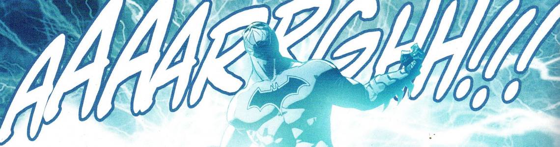
One totally Airwolf panel:


Green Arrow: Rebirth by Benjamin Percy (writer), Otto Schmidt (artist/colorist), Nate Piekos (letterer), Harvey Richards (associate editor), and Andy Khouri (editor). $2.99, 20 pgs, FC. Green Arrow created by Mort Weisinger and George Papp. Black Canary created by Robert Kanigher and Carmine Infantino.
One of the things that Geoff Johns apparently missed in the New 52 DCnU is the grand romance between Oliver Queen and Dinah Lance. You know, the one where they throw things at each other and then fuck, because that's how romance works in popular culture. So in the Brave New Really New DC Universe, Green Arrow meets Black Canary in his "Rebirth" issue and they have some sparks. Pop culture always has a weird thing about romance, as if some people are "fated" to be with each other, and Oliver and Dinah are two such people. It's tiresome, but I guess that's that. Oh well.
Percy does a slightly better job telling an actual story than King and Snyder do in Batman: Rebirth, which doesn't necessarily make this a better comic, but it's not a demerit, certainly. Much of the book is taken up with Oliver and Dinah arguing (because grand romances never begin with the characters getting along, don't you know) about all sorts of things, mostly the fact that Oliver is rich and Dinah ... isn't? Oliver mentions that she's a rock star, which I guess is his way of implying that she has money, but we don't really know if she does. Anyway, a lot of this is bickering, and as it's not quite up to the level of Cary Grant, Katharine Hepburn, and Jimmy Stewart, it grates after a while. We get it.
That's a big problem with this comic and comics in general, a problem I've mentioned before and will do so again: the trafficking in nostalgia to make readers care about things. This isn't limited to comic book characters, of course - putting a "This machine kills fascists" on the homeless woman's guitar in the beginning is shorthand for "She's a good person" without Percy having to do any work to convince us - but it's most prevalent in comics, with their serialized storytelling. Dinah and Oliver's arguing is facile, but Percy knows he doesn't have to do a lot of work because readers are bringing their own preconceived notions to their relationship. So we're doing a lot of heavy lifting with regard to their arguing, and when they finally reach a bit of a rapprochement at the end, we say "awwww" not necessarily because Percy earned it (although he doesn't NOT earn it, exactly) but because we are bringing years and years of experience to the page (and Oliver's final words don't mean anything in the context of the actual issue; they're more a metatextual reference to the DCnU and its lack of Oliver/Dinah bickering and banging - bangickering?). It's hard not to indulge the readers' nostalgia when it comes to comics - the Big Two are steeped in nostalgia, but comics are better when writers can resist it. How much more interesting would Oliver and Dinah be if Percy wrote a good romance rather than allowing us to remember the writing of others? DC is reprinting Mike Grell's run on the character - if I want to remember his take on their romance, I'll read those damned comics.
The story itself is fine, as it allows the bickering to go on - someone is abducting homeless people and selling them, a crime no one notices because no one notices homeless people. But it also highlights how stupid the bickering is - something Oliver points out - because Oliver never acts like anything less than a hero in this comic. He sees a kid being dragged away by a hooded figure and intervenes, which allows Schmidt to draw an original-art-print-ready page of Black Canary standing sassily. Oliver asks the kid what's going on and goes to the rescue. Yes, he takes the kid (and Dinah) to his penthouse to get the kid cleaned up, but Oliver never acts like the ivory tower-living, limousine liberal that Dinah accuses him of being. She's just angry that he lives in a nice place. So what? It makes Dinah look petty, which makes the bickering far less effective. Oliver never acts like a "sanctimonious jerk" in the book, as Dinah says the Justice League views him, so all we have is her word. Again, it gets back to nostalgia - Oliver has been a jerk in the past, but that was decades ago, and his behavior in this comic doesn't justify it. So why bring it up? To appeal to old-timers. It's not exactly good writing.
Schmidt does nice work with the art, however - it doesn't quite fit into DC's house style, but it's not quite as cartoony as, say, Babs Tarr's work on Batgirl, so it straddles a nice line between idiosyncratic and serious enough to carry the weight of a slaving ring in the dark places of Seattle. We only get two unnecessary full page splashes, one each of our heroes, and so the book, which also clocks in at 20 pages, feels a bit more packed than Batman: Rebirth. Schmidt's layouts are quite good - there's a frenetic quality to the panel arrangement that speeds up the action, making it more exciting. We never see Dinah out of costume (and, interestingly, only a little of Oliver, but not his face, implying that "Oliver Queen" isn't the real person), but Oliver's date on page 1, despite being a vile Republican, is dressed to kill, and Schmift also does nice work making Seattle look like a real place, so he can handle other things than just the superhero aspect of the comic. He colors the book, too, and the way he creates Dinah's "scream" effect is quite neat, as he uses jagged rings of color that look painful to anyone hearing them. I don't think I've seen Schmidt's art before, mainly because he hasn't been in American comics for long, but he's quite good. His art is definitely the highlight of the book.
So this isn't great, but it's slightly better than Batman: Rebirth. Success!
Rating: ★ ★ ★ ★ ★ ★ ★ ☆ ☆ ☆
One totally Airwolf panel:


Green Lanterns: Rebirth by Geoff Johns (writer), Sam Humphries (writer), Ethan van Sciver (artist), Ed Benes (artist), Jason Wright (colorist), Travis Lanham (letterer), Andrew Marino (associate editor), Mike Cotton (editor), and ALLEGED SERIAL SEXUAL HARASSER Eddie Berganza (group editor). $2.99, 20 pgs, FC. Simon Baz created by Geoff Johns and Doug Mahnke. Jessica Cruz created by Geoff Johns and Ivan Reis. Hal "Douchebag" Jordan created by John Broome and Gil Kane. Manhunters created by either Jack Kirby or Steve Englehart and Dick Dillin. Atrocitus created by Geoff Johns and Ethan van Sciver. Bleez and Dex-Starr created by Geoff Johns and Shane Davis.
So, Geoff Johns goes on and on about creating a new atmosphere of hope and love and optimism in DC comics (even though he hedged his bets by saying that didn't mean things wouldn't get bad, but presumably it meant fewer people would be losing limbs), and then, in the first issue of Green Lanterns in this new atmosphere, we get ... blood-vomiting Red Lanterns. Okay, so they don't actually vomit blood in this issue, but one of them does have blood dribbling from her mouth (as well as exhibiting the ever-popular "blood on tits" motif) and they're all sitting on a pile of skulls, so ... yeah.
Anyway, that's the last page of the book (whoops - SPOILERS!), so let's not dwell on it. Let's dwell on another boring set-up comic, this one even more settingy-up than Batman: Rebirth, if that's possible (and it is - I just said it was!). We get a full page splash to begin the comic of ... the cosmos. Yep, outer space. No spaceships flying through it blasting each other with lasers, either. No supernovas. Just ... space. It's pretty space, but it's just space. And writers Johns and Humphries use it to give us a rundown of all the Earth's Green Lanterns - Jordan, Stewart, Gardner, Rayner - in as obnoxious a way as possible. I mean, the narrative boxes actually clutter up the pretty drawing of space - Jason Wright really did a nice job with the colors in space! - and tell us absolutely nothing new except that, wow, Earth's Green Lanterns must be incompetent if they keep changing them.
Then there's a Guardian getting chased by Dominators (exactly like these in this "DC" comic!) who unleashes a ... rainbow weapon? Is Green Lanterns about to have a crossover with My Little Pony? Because I would read the shit out of that. Anyway, that's just the tease, because we have angry Green Lanterns to meet!
So in the set-up that this comic is, all we get is Simon Baz being angry because "The Man" thinks he's a terrorist (and hilariously, DC puts him in that costume, which in NO WAY WHATSOEVER looks like something a terrorist would wear) and Jessica Cruz inexplicably gets to be a Green Lantern even though she never leaves her apartment. How is that a smart idea? She does go out in the world, however, and gets summoned to the desert, where she and Simon (who was also summoned) get into a dick-measuring contest when a Manhunter robot attacks them. Both their dicks are inadequate, though (wow, this metaphor got out of hand in a hurry) because the biggest dick-swinger around, Hal Jordan, shows up, saying it was all a test to see how they work together. He forces their power lanterns to merge (man, there has to be a sex metaphor there somewhere), turns them over to the Justice League (where the fuck did they come from?) and tells them he has to leave to star in another comic. And ... scene!
This is a pretty dull comic, because it tells us stuff we already know, tells instead of shows (we see Simon cleaning "terrorist" graffiti off of his sister's garage - they live in Dearborn, because like how all Indians in pop culture live on reservations, all Muslims in pop culture live in Dearborn - but we never see anyone actually treating him like a terrorist, we just have his word for it), and the only action is three pages of Simon and Jessica trying to blow up a robot. I know that I've complained about writers not using the space and then I complain about the endless narration like Wally West's in DC Universe: Rebirth, but what I want is writers using the space to give us interesting information, not telling us all the stuff that happened but not showing it. We get Simon's back story courtesy of his government contact and Hal Jordan expositing the entire theme of the upcoming title, and it's just deadly dull. Neither Simon nor Jessica has much personality beyond "angry," and even though they might have reason to be - accusations of being a terrorist might be a bit upsetting - it doesn't make them particularly interesting characters. When Hal Jordan - even Geoff Johns's Hal Jordan - is the most interesting Green Lantern in a comic, you have a problem, because a piece of driftwood has more personality than that guy.
The two artist doesn't help, either. Benes's art has calmed down a bit from his 1990s heyday, mostly because his inking is a bit rougher, which makes his pencils look less sterile. It's still not great art, mainly because it's far too bland, but it's not awful. Van Sciver is van Sciver - I've never been a huge fan, but he's one of DC's stars, so he shows up and gives us a sale-ready full-page splash of Hal Jordan descending like Jesus to tell Simon and Jessica that they suck. Van Sciver's storytelling is wonky on a few pages, too - after Hal merges the lanterns, he gestures and the Justice League appears. The Flash waves at them, so it's clear that they are in the presence of the Justice League, but how the hell did they get there? They were in the desert the page before, and suddenly they're ... in outer space? Wha-huh? And what the hell's up with Flash? He's standing on one foot. It doesn't appear like he's walking, he's just ... standing. On one foot. Is he doing tai chi? I have no idea. The rest of the page is terrifically awful, too, because years of reading Kelly's columns (we miss you, Kelly!) has made me sensitive to these kinds of things. So let's check in on how the members of the JLA are posed. Flash stands looking straight ahead, and even with the one foot thing, he's in a pretty standard pose. Cyborg and Aquaman stand facing Simon and Jessica (who are in the foreground) in typical "power poses." Batman, like he does, crouches in the back, looking tough. Wonder Woman is in the middle of the page, and while she also looks tough, she's turned to the side with her right leg up on a stoop. So we see her unclothed legs (no long pants for her!), but instead of them together, they're spread just enough for innuendo. And because she's turned, we can see the curve of her right breast clearly. Why is Wonder Woman standing that way? The others might look tough, but they're facing Simon and Jessica, as if to welcome them. Wonder Woman is turned away, a bit more sexualized than the others, and far less welcoming. I know why van Sciver drew her this way - the composition is better for when he sells the original art page, but in the story, it doesn't make much sense. But that's the way comics are these days.
So this isn't very good. It's not terrible, as no one loses a limb or a head, but it's just kind of there. The presence of Atrocitus, Bleez, and that idiotic evil cat (that wears its red ring on its tail?!?!?!?) doesn't help, either.
Rating: ★ ★ ★ ★ ★ ☆ ☆ ☆ ☆ ☆
One totally Airwolf panel:


Superman: Rebirth by Peter J. Tomasi (storyteller), Patrick Gleason (storyteller), Doug Mahnke (penciller), Jaime Mendoza (inker), Wil Quintana (colorist), Rob Leigh (letterer), Andrew Marino (assistant editor), and ALLEGED SERIAL SEXUAL HARASSER Eddie Berganza (group editor). $2.99, 20 pgs, FC. Superman created by Jerry Siegel and Joe Shuster. Lana Lang created by Bill Finger and John Sikela.
And then there's Superman: Rebirth. Boy howdy, is this a dull comic. The other DC Rebirth titles this week were not great in varying degrees, but at least they tried to tell a story. Tomasi and Gleason (who are, yes, credited as "storytellers," ironically enough) don't even try that, as they give us Old Man Superman (we know he's old because he's bearded?) talking to Lana Lang and memorializing Young Dude Superman. That's it. Again, it's nice when writers calm down and don't give us wall-to-wall action, but the problem then becomes that you need to be good at writing these characters, and Tomasi and Gleason don't quite manage it. I don't mind Tomasi - he's written some decent comics, although even his "great" works are only just decent - but he and Gleason give us cliché after cliché about Superman coming back from the dead, beating that dead horse into the ground as Original Recipe Superman continues to reassure Lana that "Clark" will come back. In the middle of it all, we get a flashback to the time when he died, which is the most egregious example of space-wasting in this week's crop of DC comics, where wasting space is something of an art form. Doug Mahnke gets to draw a double-page spread of Superman and Doomsday about to smash into each other, which at least is an exciting moment, and we get seven (7) pages of retelling Original Recipe's fight with DD and his resurrection (five additional pages after the double-page spread, that is). This is, not to put too fine a point on it, one of the most famous Superman stories EVER, and anyone reading this comic either owns Superman #75, read Superman #75, or has seen images from Superman #75. Maybe Doug Mahnke (who, again, draws the hell out of it) is mad because Dan Jurgens got to draw Original Recipe's death and he really, really wanted to, so he lobbied Tomasi and Gleason to throw it in there, or Tomasi and Gleason thought, "God, this is a boring issue, so let's simply lift a bunch of pages from a 23-year-old comic!" Whatever the reason, it doesn't make the rest of the issue less boring (after OG Supes gets done telling his tale, he launches back into his "Nu-Skool Supes will be back, I swear!"), as it just highlights how boring the rest of the issue is and reminds us of a time when comics, as poorly-done as they might have been (and make no mistake, Superman #75 is a bad comic), actually had an impact. Yes, Superman came back, as we all knew he would, but it was still a big deal that he died in the first place. This comic makes me nostalgic for a Dan Jurgens comic - for that, there is no forgiveness!
Mahnke's art is strange, too. I love Mahnke and I'm very sad that he's spent so long drawing comics for DC that I have no interest in (Gleason falls into this category, too, to be honest), but the art on this book is odd. It's as if the flashback is "classic" Mahnke - it has that crisp line, angular style, and use of blacks that we've come to expect from Mahnke. The "current" stuff is not as good, as his line is softer, which weakens the impact of the work. I don't know if it's because Mahnke and Mendoza wanted to distinguish the two different time periods of the book, but I wish they hadn't. Mahnke's art has been able to transition to the overly rendered coloring that is all too common in comics these days mainly because his lines are so strong, and softening them doesn't help, and the "current" story in this comic looks a bit sloppier, even though Mahnke's strong lines are in there if you squint hard. I hate the beard on Original Gangster Superman, too, even though that's just a personal preference (I know I've grown a beard twice in the past few years, but I'm really over the scruffy/beard trend among men ... but I suppose men don't do it for me, as I assume the straight ladies and gay men like it, so who am I to judge?). However, the beard does something interesting - in the final panel of the book, Old Man Supes looks downright evil. He's smiling, which might be part of it, but the smile and the beard just makes him look evil. I doubt if DC would do that - make their only remaining Superman evil - but that would be an interesting plot to go forward with, especially if they kept it a secret for a long time and just had some clues dropped throughout the Universe. DC would never be that subtle, though, so I doubt they're going this way. But the dude doesn't look trustworthy in that final panel!
This is a lousy comic, because if there's one thing we don't need, it's another memorializing of another dead superhero, especially when the writers deliberately evoke the same plot from a time when it was, if not good, at least fresh. An entire issue about OG Supes trying and failing to bring Dick Sargent Superman back to life? No thanks. Oh well.
Rating: ★ ★ ★ ★ ½ ☆ ☆ ☆ ☆ ☆
One totally Airwolf panel:

Well, that went ... somewhere. What could you have spent your hard-earned cash on this week instead of mediocre DC comics? Well, there's a new Casanova out, and it's as amazing as ever. Ryan K. Lindsay's and Sami Kivela's Chum is on its second issue, and it's a fun, twisty noir tale. Cinema Purgatorio also shipped its second issue, and both have been excellent so far. Richard Starkings finishes his two-part "White Elephant" story in Elephantmen #71, and it's a neat little story that brings in a bunch of plots from earlier in the series. And Stray Bullets continues to be amazing, and the latest issue features a wonderfully violent gun fight, which Lapham pulls off with aplomb. And then, of course, you could have dropped 125 ducats on this:

Yeah, it's danged cool-looking. I can't wait to read it!
So that's Week One of DC's Rebirth titles. Will I continue with this exercise? Probably, because I live in hope that DC will excite me once more. I don't have a lot of hope, but I have some! Have a nice day, everyone!