RAT QUEENS


I love this book. No other comic has put a smile on my face faster or made it stay there longer than "Rat Queens," the aggressively in-your-face sassy fantasy magic-and-swords comic with a heart of gold and a mouth like a sailor. Like any good comedy, it's more than the sum of its parts. The comedic moments come straight out of the characters and their situations. They don't drive the book. Just when you think the book is silly and sprawling, it reels you back in and smacks you in the face with a plot.
"Rat Queens" is about a girl group of roughhousing, bar brawling enemies of peace and quiet in the town of Palisade -- Hannah, Betty, Dee, and Violet. They're enough of an issue that the local Chamber of Commerce even hates them. Not to mention the Mayor. And his head of security, who has a relationship with Hanna. Picture Dungeons and Dragons with lots of blood, some local politics, and a murder mystery. But give it a wicked twist of humor that makes it stand out from a sea of such fantasy comics that have played it straight over the years.
"Rat Queens" is a constant stream of terrific one-liners from characters who are particularly giddy about enjoying warfare, putting down other species, getting drunk and sticking together.
In the recently released first trade paperback, "Rat Queens: Sass and Sorcery," the Queens are sent on a menial quest (in exchange for time served) that turns out to be a set-up. It was an ambush meant to kill the Queens and several other gangs from the town. That sets off a series of events as the Queens search for who is responsible. There are other unexpected consequences, such as when the army of trolls shows up at the front door of the town and declares war. That culminates in a battle scene in issue #4 that's one of the funniest comics I've read in years. It's fast-paced and unrelenting. When a moment needs to be taken for the sake of plot, the bit ends with a one-liner that's timed and worded just so perfectly that you'll instantly forget you just dealt with exposition or talking heads. And just when you think you know where things are going, you'll get whiplash from how hard the rug will get pulled out from underneath you.


Kurtis J. Wiebe's scripts for the series are sharp and well timed. He packs pages with things that are visually interesting, but also very funny. He pulls off moments of verbal put-down humor, slapstick, and the occasional show-stopping curse word. That's right, small children, this book is most definitely not for you. I tried to find some pages to scan in to show some good examples of the humor, but there'd be too much work to put the black bars over the word balloons... Let's go with PG-13 on this one for language, graphic violence and more language.
Roc Upchurch's artwork fits the book perfectly. It's a softer look, with a soft line and an often blurred background that reminds me a bit of some of the techniques Fiona Staples uses on "Saga." He can blur the tip of an arrow sticking out at the reader to give it a three dimensional look, and then blur out a distant background to help the characters stand out.
His colors work best in the brighter scenes. There aren't that many of those, though. The book tends towards the darker tones where things can sometimes get a little muddy. He's good with separating foreground and background with color, but the foreground can sometimes get less precise from the singular sea of brown or dark gray that competes with the details of the art. I'm looking at the trade paperback for this review, though. A quick glance at some of the preview pages hosted here at CBR shows a much brighter looking book. It might be worth going with the digital copies for the better color reproduction. It cleans up the one qualm I had with the book's art.

Upchurch's art is a revelation. He can draw characters of all stripes and infuse them all with humanity and personality. Most of all, he has a natural instinct for selling a gag. The body language, the facial expressions, the gestures are all just perfect for all of them. It's what sells the book so much for me -- the fact that the art and writing get along so well.
"Rat Queens" is pure raucous joy, a rare comic that made me laugh out loud more than once. It's dark, twisted, and hilarious all at the same time. I like that combination. And I want more. Thankfully, the series resumes in May with issue #6.

If you're curious, here's the original CBR Preview for issue #1.
AMAZING SPIDER-MAN #301: "The Sable Gauntlet"

Silver Sable takes on a private security contract that only Spider-Man can save her from. Plus, Peter Parker goes back to school, and -- a Nazi!
David Michelinie's script only has a couple of pages' worth of soap opera this month, as Peter Parker thinks about going back to school, only to get cornered into teaching a class. And Mary Jane doesn't get along with another model. I assume that's building up to something in future issues, but I'll let you know when we get there.

The majority of the issue is split between Spider-Man and Silver Sable. Sable's Wild Pack has been reduced to taking on private security contracts that she thinks are beneath her, but the economy of Symkaria depends on her business. So off she goes. Her new contract comes from an overzealous security chief at a new New York City high rise who's vowing security, but hiding a secret agenda. He's a Nazi out to get Sable, who comes from a Nazi-hunting tradition.
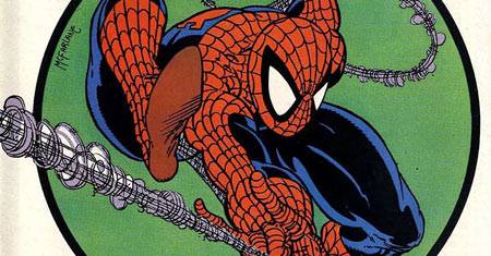
The Wild Pack gives McFarlane a chance to go back to the drawing board to create another pack of pseudo-military guys wearing lots of bandoliers, pouches, armor, boots and jumpsuits. I seem to recall a lot of variations on this combination over the years with McFarlane's art. We saw straight-up military guys already, but now we're venturing into more of the fantasy/comic book military organization types.
Todd McFarlane wasn't entirely new to inking when he started "The Amazing Spider-Man." He had done some of it on "The Incredible Hulk" just before it. "Amazing Spider-Man" #300 was a great introduction to the young inker's skills, but issue #301 was a step back in some ways. It doesn't looks quite as finished. I wonder if #301 had to be done in a hurry to catch up from any excesses in getting out the bonus-length #300 on a monthly schedule.

There's definitely moments and lines in this art that scream the McFarlane style that we all know and love, but it's always uncertain. It's still looser than you might remember. The art is a little shakier and a little less perfect, but the inks aren't helping it at all. Flip ahead in the Omnibus by about a year or so and you can see a vast difference in the final line, in both the superhero scenes and in the "normal people" pages.
In particular, watch Spider-Man's legs as we go through this evolution of McFarlane's Spider-Man style. It'll eventually grow to be a really tight, thin line-laden technical style. Here at the beginning of the return to the red-and-blue costume, McFarlane is feeling his way out. The black on Spider-Man's legs is much smoother and more rubbery than what it will eventually become. There's very little, if any, crosshatching or feathering of his lines the way there would later be.

He's also using an angle on Spider-Man drawn directly head-on on that isn't flattering to his head. The head looks small or the neck is too wide. It's apparent in a couple of panels this issue. It's something McFarlane quickly gave up on. Check out later issues in the Omnibus, again, to see how the three-quarter angle on Spider-Man's head worked a lot better for McFarlane. He stuck to it religiously and to great effect.
The Spider-Man poses are no doubt McFarlane's, and you'd recognize most of them from a mile away even if he had done just the layouts. It's the final line that looks more variable in this issue. Sable's face also morphs across the issue, never quite looking like the same person from panel to panel. Sable fills many roles in this issue, from superhero to diplomat to high-end fashion plate. McFarlane looked more comfortable in his art with the men than the women at this point, with the possible exception of Mary Jane, who he seemed to have a lock on from very early on.

All in all, the issue makes for a nice action set piece, focusing on the secure high rise towers where Spider-Man and Silver Sable fight it out. Michelinie strains to fit the soap opera parts in, but we still get a page of Peter and Mary Jane at home, so it's par for the course. McFarlane's art is a step back from the last issue, but is not without its moments where it still shines.
The good news is that the next issue is one of the most ludicrous of its time. We'll get to have fun talking about the man imbued with the proportionate strength and skills of a -- jack rabbit?!?
Fun Trivia Fact: The colorist to this issue, Greg Wright, would go on to write the "Silver Sable and the Wild Pack" series for 35 issues starting in 1992.
APRIL THE FIRST
This column will see print on April 1st.
Just to be clear: This column does not condone, nor does it include itself in any April Fool's pranks. Sadly, people have forgotten the true "fun" of the day, and the internet has become a gutter of wasted talent on this day every year. I won't engage in it.
I suggest a new April 1st holiday: Write Only Day, in which we're allowed to get things out of our system when we feel the need to say something, but that nobody will ever read it for fear of thinking it's a joke. And we're not allowed to read anything anyone else says. Nobody is fooled; everyone feels better. Win/win!
EMERALD CITY COMICON
ECCC is the new San Diego Comic-Con, isn't it? It's the ultimate fan-run comics convention. It doesn't aim to bring pop culture to the general public. It aims to bring comics to Seattle. Sure, there are some "multimedia guests" there, but Hollywood isn't calling the shots.
Maybe this is a selective reading from reports of the show by comics folks? I don't think so, though. I think it really has maintained its comics focus, which is awesome. I'm glad we have more conventions like this one to help keep the "comic" in "Comic Con."
ULTIMATE CEREBUS
Dave Sim is entertaining the notion of someone else redrawing the first 25 issues of "Cerebus" for IDW, since he doesn't like his original art anymore (he was young and it's obviously weaker than latter efforts) and getting a big name artist on such a project might mean more publicity.
It's a crazy enough idea that it might just work.
If I had the time, I'd be drawing a Smurf Cerebus right now for practice...
IDW already keeps John Byrne busy, but could you imagine -- ?!?
THE END IS NEAR. OR NOT.
Does it affect how you read a comic when you know the end is coming? I read a recent story that ended sooner than I expected it to, and that affected my enjoyment of it. It was part of an anthology book, so I knew the story didn't end on the last page of the book, but I thought it was going to go on longer still.
Other times, I've had collected editions pack in so much back matter that the story ended two-thirds of the way through a book. I thought the story was still mid-way through its second act when it suddenly ended.
Do you pay attention to how many pages seem to be left to figure out where in the narrative you are? When that fails you, does it throw you out of the story? Or am I a freak case?
BIG LETTERING
I don't regret a single "Absolute" format book on my bookshelves, but I do admit that they read a little weirdly because the words balloons are so big. The original lettering has to be that big so it can be readable when shrunken down for the standard-sized comic. When seen at a larger size, they look huge.
One of the reasons that the "Artist's Edition" format works so well is that it removes the abstraction of a final comic. You're looking at the raw materials, so your brain compensates for the blue lines and the margin notes and the seemingly large lettering.
That's my theory, at least.
A SPADE IS A SPADE IS AN OGN IS A TPB
I won't fight anymore over what is a graphic novel versus what is a collected edition. To me, it's clear. A "graphic novel" is a single original work published for the first time in one pice. A "collected edition" is a "graphic novel" that was a series of single issues first.
But I don't care. Call them all "graphic novels" if that will help speed up outside adoption of a given work. To the bookstore/online market, that book that's 144 pages long or so is a one-shot. It's a big novel done in sequential art. If they want to think of it as a graphic novel, let them. I'm all for it, so long as the book gets in their hands.
I don't say this to drive a wedge between the world of Wednesday Regulars and everyone else. Just the opposite. I deny the distinction just for the sake of inclusion.
Twitter || E-mail || Instagram || Pipeline Message Board || VariousandSundry.com || AugieShoots.com || Original Art Collection || Google+