If you hadn’t noticed, superhero films are all the rage right now, so it makes sense that film studios would put a lot of thought into how they look on screen. Marvel Studios and Warner Bros. are investing millions of dollars into these productions, so of course they would want to make sure their characters look their absolute best. This has no doubt led to hours spent designing and redesigning even just the clothing these superheroes will wear in the movies. Not all of those designs make it out alive.
Over the years, more than a few costume designs have ended up on the cutting room floor. Sometimes those designs are better than the final product, and sometimes they are much, much worse. We have seen many of them ourselves as concepts leak online or get added to special art books, but there are many others you might never see, or at least shouldn’t. Sometimes the design direction changes and other times an entire film is thrown out the window and cancelled with no chance of seeing any of the concept art coming to life. Here are 15 superhero movie costume concepts that will never see the light of day.
15 JIM MARTIN’S GREEN GOBLIN

Concept artist Jim Martin worked on the first Spider-Man movie released by Sony. According to him, both the Green Goblin and Doctor Octopus were expected to appear in the film before Doc Ock was shuffled off to the sequel. While Martin’s design for Octavius has him bald, his concept for the Green Goblin was radically different from the final product.
Instead of a goblin-themed villain on a sci-fi flying machine, Norman Osborn looked like a member of a paramilitary squad who turned evil. His advanced tech looks like something only a top secret government project could develop and his camouflage uniform merely hints at the Green Goblin identity. While this is a drastic departure from what we know, it’s certainly interesting to look at.
14 JOSH NIZZI’S VALKYRIE

Concept artist Josh Nizzi created concept art for the character Valkyrie for the movie Thor: The Dark World. She more or less resembles her comic book depiction as a caucasian character with blonde hair. You may have noticed that the character never actually ended up appearing in the film, so when Taika Waititi came on for Thor: Ragnarok, he was able to do whatever he wanted with the character.
He ultimately opted to cast Tessa Thompson in the role, who looks nothing like Nizzi’s concept art for obvious reasons. She also wore a much better costume than the medieval viking attire the Asgardians wore in previous movie installments. It might be a good idea for everyone to just forget Nizzi’s designs even existed because the finished product turned out so much better.
13 KEITH CHRISTENSEN’S BONEBREAKER

The late-80s and early-90s of comic books produced a lot of bizarre concepts and character designs that have no job being in a superhero movie. One of those characters was Bonebreaker, a member of the Reavers who was just some dude with a tank for legs who didn’t like the X-Men. It was a bizarre design that maybe went a little too far with the popular cyborg theme of the time.
Somehow the group made it into Logan with Bonebreaker counted among them. Instead of the human tank comic book fans would be familiar with, he was given actual legs in the film. Concept artist Keith Christensen played with the idea of a more comic book accurate Bonebreaker, though. His version would have a legless character strapped to tank treads, which just felt very Mad Max.
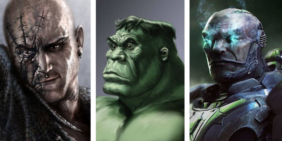
12 BENTON JEW’S HULK

Remember Ang Lee’s Hulk and how bad it was in practically every way imaginable? It could have been even funnier if the director went with his first choice for Bruce Banner in actor Billy Crudup. Instead of the swollen face of Eric Bana, we would have had some incredibly weird looking neanderthal Hulk that would have gotten laughed out of the movie theaters.
Industrial Light & Magic and concept artist Benton Jew were attached to the project long before Lee got involved. When trying to bring Lee’s initial vision to life, things didn’t exactly come off as smoothly as one would wish. Whether or not these designs were finalized doesn’t really matter. It feels like Crudup’s face didn’t really translate well, and that caveman Hulk would have been far too cartoony.
11 JAMES CARSON’S SUPERMAN

Over the course of developing the Superman Lives movie in the 1990s, Tim Burton was going to direct Kevin Smith’s film script. It would have seen Superman die before being resurrected and requiring a suit to temporarily simulate his powers for the finale of the film. Tim Burton being Tim Burton wanted the movie to look as Tim Burton-y as possible by basically making everything look like his Batman films.
Superman would have been played by Nicolas Cage, of all people, and come back to life as some weird Edward Scissorhands zombie. James Carson’s designs for the new Supersuit makes the Man of Steel look like a monster in a metal costume, so it’s very much a good thing that this movie did not end up getting made in the end.
10 JUSTIN SWEET’S GUARDIANS OF THE GALAXY

Before the Guardians of the Galaxy introduced a lively universe full of bright colors and diverse species, it could have taken a much darker turn. Concept artist Justin Sweet, who previously worked on the Chronicles of Narnia trilogy, and several superhero films, developed some designs for the film that some might deem to be a more earthy, “realistic” style.
His depictions of Star-Lord, Gamora, Drax, Rocket, and Groot make them look like something off the cover of a science fiction novel published in the 1980s. It’s not exactly the original Star Wars trilogy, but it is definitely close to it. There’s nothing wrong with this direction, but with the success of James Gunn’s movies, the characters will never be rendered in this style on the big screen.
9 GREGORY SEMKOW’S ZORDON

Before we saw the very alien-like Power Rangers movie, there were questions over what exactly it was going to look like. Lionsgate eventually chose Dean Israelite to direct the film, but before the studio came to that decision, there was another pitch from an unnamed director who had hired concept artists Alex Ruiz and Gregory Semkow to create a few general designs.
One image that really stood out was Semkow’s depiction of Zordon, the team’s mentor. While he has always been depicted as a giant head in an energy tube, this version was to be wholly alien. Zordon would have remained inside of some kind of stasis chamber, but pictures show his full body with features that are far less human. This was what they had going on behind the scenes before Bryan Cranston came on board.
8 JEFFREY HENDERSON’S MYSTERIO

Before Sony rebooted the Spider-Man franchise, it made one last attempt to keep the old continuity going with Sam Raimi’s Spider-Man 4. The film would have had John Malkovich playing the Vulture with Anne Hathaway as a version of Felicia Hardy becoming the Vultress instead of the Black Cat. Things didn’t go very far before production fell apart and the reboot happened.
Before the studio changed direction, Jeffrey Henderson created storyboard art for the film’s opening montage that saw Spider-Man defeat several lesser villains. One scene shows an overweight Mysterio getting hauled into the police station, and when his helmet comes off, we learn that Bruce Campbell plays the man under the mask. It would have been a fun sight to see after the debacle that was Spider-Man 3.
7 ERIC RIGLING’S BRAINIAC

During the production of Superman Lives, Brainiac was devised as the ultimate villain of the movie. Considering who was going to be directing the film, designs looked as dark and macabre as you might expect from a Tim Burton movie. Eric Rigling’s designs for Brainiac looked like they came right out of the movie Mars Attacks! and the similarities aren’t even very subtle.
In 2015, concept art for the proposed film surfaced online when some original artwork went to auction. The images depict Brainiac as just a head inside a glass helmet with long robes hiding what is underneath. In various pictures, he is either supported by a robotic, insect-like body or by simply giant spider legs, which make him look like he just emerged from a John Carpenter film.
6 JARED KRICHEVSKY’S APOCALYPSE

Very few people were impressed by Oscar Isaac’s presence as the villain En Sabah Nur in X-Men: Apocalypse from 2016. Why the film ultimately opted to make Apocalypse look like the child of Ivan Ooze and Arnold Schwarzenegger Mr. Freeze is anyone’s guess. We have seen plenty of concept art that delivered a more familiar and menacing look to the major X-Men villain.
In particular, Jared Krichevsky’s concept art for the villain makes him look far more like a space-age alien than the Egyptian deity the film decided to go for. While neither are exactly right, Krichevsky’s design brought in the idea that the character was more inorganic than flesh and blood at this point, which probably would have made X-Men fans a bit happier.
5 RYAN MEINERDING’S NIGHT OWL

It’s no secret that Zack Snyder’s Watchmen film didn’t exactly win universal approval from fans of the graphic novel, but you can tell there was a real effort to bring the 1986 masterpiece to life. It’s just too bad that the character designs and the aesthetics of the movie were all off. While the unused concept art didn’t exactly try to capture the retro style of the original, there were a few differences that will likely never see the light of day.
Ryan Meinerding, who is now one of the artists creating the look and feel of the Marvel Cinematic Universe, created a costume for Night Owl that never made it into the movie. It’s unclear if this was a take on the character’s winter suit or just a more metallic costume in general, but it likely looked a little too Batman for everyone involved.
4 WARREN MANSER’S BULLSEYE

We all remember the 2003 Daredevil movie with Ben Affleck as Matt Murdock, Jennifer Garner as Elektra, and Colin Farrell as someone claiming to be Bullseye. It managed to be both dark and campy at the same time, with Bullseye’s nu-metal costume being a bit of a departure from his traditional comic book getup. Concept artist Warren Manser had something else in mind, though.
While Bullseye was never going to look the most accurate, Manser gave him more of the cyberpunk aesthetic he helped popularize in The Matrix just a few years ago. That meant a dingier look with a giant bullseye-like scar over his eye. It was still nothing like the real Bullseye, but it was far superior to the bullseye stamp Farrell had on his forehead in the final movie.
3 ANTHONY FRANCISCO’S NINJA TURTLES

When it was announced that Michael Bay would be rebooting the Teenage Mutant Ninja Turtles film series, he mentioned that the group would have alien origins, inciting displeasure from fans. In response to this reaction, Bay had a change of heart and the Turtles were presented according to their familiar backstory. However, that doesn’t mean there weren’t plans to go ahead with the alien turtles.
Concept artist Anthony Francisco, who has worked on Guardians of the Galaxy and G.I. Joe: Retaliation, came aboard to redesign the Turtles according to Bay’s original vision. As a result, we very nearly got reptilian alien beings that somewhat only resemble turtles. Thankfully this concept was ultimately rejected and we got better character designs (even if they weren’t perfect).
2 KERRY GAMMILL’S DOOMSDAY

A comic book artist from the late ‘70s to the early 1990’s, Kerry Gammill was noted for working on Power Man and Iron Fist, Marvel Team-Up and Superman. By the late ‘90s, when Superman Lives was still battling to stay alive, Gammill served as concept artist on the project, and he developed a design for the monster Doomsday, which spoke directly to his expertise.
Given the popularity of "The Death of Superman," it makes sense that Doomsday would be a central character in the film. However, despite the seeming simplicity of the monster’s overall look, studios have changed what he looks like every time out — that includes this movie, Superman: Flyby, and Batman v Superman. This design, which looks more like a Parasite than Doomsday, is no different.
1 ED NATIVIDAD’S AMAZING SPIDER-MAN

Back before Spider-Man was brought home to Marvel Studios, Sony tried to reboot its Spider-Man franchise with an all-new continuity and a brand new man behind the mask. The Amazing Spider-Man seemed like a good place to start with regards to a new movie universe, and the studio produced a shiny new suit for the hero to wear too.
Though the franchise soon stalled following the release of the sequel, the spider suit was a standout part of the series. Concept artist and sci-fi/superhero film veteran Ed Natividad decided to share some of his designs for the movie back in 2012. Unfortunately, one of the suits he made seems... questionable. The bright blue and red splotches through the body just doesn’t really work for a definitive Spider-Man costume.