I've ended up with several process-related posts in my saved links file, so I thought I'd share them all in one swoop.
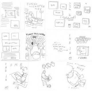
• Let's start with Jeffrey Brown, who has been posting up a storm of process goodness on his blog. Brown's new book, Funny Misshapen Body, was just released; here are some early cover "brainstorming" sketches:

Here's some of the initial brainstorming for the 'Funny Misshapen Body' cover. There were about a dozen more ideas, but these were the strongest ones. All the ideas were passed along to the editors at Touchstone, who then looked at them and decided which parts and aspects of the concepts they liked most.
In another post, he develops the concept further, and then later shares the final art before it went to the designer. He also shares a flow chart he used to put together the story.
• Next, Joshua Middleton covers Supergirl #45 ...

Once again, I inked this with markers. As you can see, I started with the outer contour line, which I inked slightly heavier to help the figure pop off the background (well, the eventual background in PS). I don't always start on the outside of the figure, I just really wanted to clean up her hair.
• At Comicmonster.com, Rob Guillory walks through his process of creating a page of artwork for his upcoming Image book with John Layman, Chew:
Technical Fun Fact: I pencil using a technical pen filled with red graphite. A lot of artists use Blueline pencils, but I find them waxy, hard to ink on top of and a bit hard to see (which is the point, I know). Red graphite serves the same purpose, is invisible to scanners and easier to see.

(Plus, it kind of looks like blood, which goes with the theme of the book, no?)
• Paolo Rivera talks about creating his cover for Wolverine Art Appreciation Month:

This is the monochromatic underpainting stage — nothing but watered-down sepia gouache on bristol. The face is the only real clue that's it's based on Wyeth. But even the classic Wyeth uni-brow probably isn't enough to reveal the source of inspiration.
• Todd Klein praises Doug Braithwaite, Bill Reinhold and Art Lyon for thier work on Brave and the Bold:
When computer coloring took over from hand-colored guides and hand-separations in the 1990s, and paper quality improved greatly, gray tones began to appear everywhere. Sometimes they enhanced the storytelling and art, but often they just added murk, in my opinion, and encouraged the modern tendency toward too-dark coloring overall. So, the gray wash inking on these books, especially when artfully colored by Art Lyon on issues 20 and 21, was a refreshing surprise. Doug Braithwaite is a fine penciller. He drew the JUSTICE 12-issue series for DC, where his pencils were painted over by Alex Ross. Alex begins his painting process with gray washes to establish values, then adds painted color over that for a very effective and realistic look. Worked great over Braithwaite there. Bill Reinhold’s washes and Lyons’ colors are nearly as good here. I contacted Bill, and he was kind enough to share these process images:

• And finally, moving from art to the written word, Robot 6's Tim O'Shea interviews novelist and comics writer Cecil Castellucci on her creative process, among many other topics.