MAKE COMICS LIKE THE PROS

If you were inspired by Brian Bendis' "Words for Pictures" book earlier this summer, your next logical step is "Make Comics Like the Pros" by Greg Pak and Fred Van Lente. It is the nuts and bolts guide to making comics you're looking for, breaking down the process step by step and giving you more of the gnarly details than I've seen in a book like this before. It's a modern book, too. It's not content with just explaining a scripting format; it also describes the specific macros used therein, the online services they use to share documents, and the realities of marketing in the digital age.
It is an impressive book packed with all the information you could ask for to produce a comic. Almost everything in the book applies whether you're doing a printed comic or a webcomic. You need to provide the inspiration and the story alongside the hard work, but Pak and Van Lente do an amazing job in lining everything else up for you. Seriously, this the bible of How To Do Comics books today. And it's in stores today from Watson Guptill for $22.99.
As you'd expect from a pair of writers, Pak and Van Lente focus mostly on the writer's side of things, walking through that process with plenty of examples from their own careers (both independent and through Valiant and Marvel). The book feels real every step of the way. You can apply the lessons they're giving you instantly. They don't discuss story structure or characterization in particular, though; this isn't about one point perspective or proper anatomy. This is about the process of building a comic book from the blank page. It's about how to work with other creative people, how to format your work, and then how to sell it. In addition to the examples from their previous work, the book also includes an original eight-page comic drawn by Colleen Coover, which they break down the creation of, from inception to finished colors and letters.
The only slightly weird part of the book is the way the text is written collaboratively to form one narrator's voice. But then the examples create sentences like "In Greg's script, he had to so such-and-such." When you know that's Greg writing about himself in the third person, it feels weird. And if it's Fred talking about Greg, then it feels like a cheesy two man vaudeville act where the two guys on stage trade off on telling stories about each other or something.
That minor quibble aside, the book is sprinkled with humor and easy to read. Plenty of the pair's collaborators were interviewed, as well, with quotes sprinkled across the book rather than separated out into sidebars. When you get Jordie Bellaire talking about coloring and Nate Cosby talking editing, with Klaus Janson discussing inks, you're in for some respectable work.
The most original part of the book is the sixth chapter, which deals with the business side of things in specific detail. There's a theoretical outline of what it would cost to print up their Coover-drawn comic and the realities of how much money it's likely to make. There's talk of self-marketing, using your website, doing interviews with the comics press (Hello!), and appearances at conventions. I've never seen a printed book deal with it in this much detail, despite how necessary a part of the modern comics market it all is.
The books' production qualities are high. It's a full-color, 152-page book with slick and heavy paper stock. The colors pop. The text is straight-up black on white backgrounds, without looking to clutter things up with excess imagery or look too "designed" by adding distracting backgrounds. Everything fits together, with images that relate directly to the text, not merely being decorative.
"Make Comics Like the Pros," of all the How To books I've reviewed in recent memory, is the best. If you can read only one, make it this one. It's mostly for writers and those who want to "produce" a comic, and not for those looking for art tips like how to ink or how to use one point perspective. If you fit the right category there, though, you're in luck. Pick this one up today.
DON ROSA'S DONALD DUCK AND THE THREE CABALLEROS

There's a certain blind spot in my reading Duck history. About a decade back, I took a little break from reading the Duck books. I kept buying them, though, certain that someday I'd get around to them. Trust me, I have longboxes filled with comics I bought under that assumption. I could reel off the series I purchased and never read, and a few of you would call me a comics charlatan. I'm only human.
In retrospect, it's not surprising that a story like Don Rosa's "The Old Castle's Other Secret" fell through the cracks.
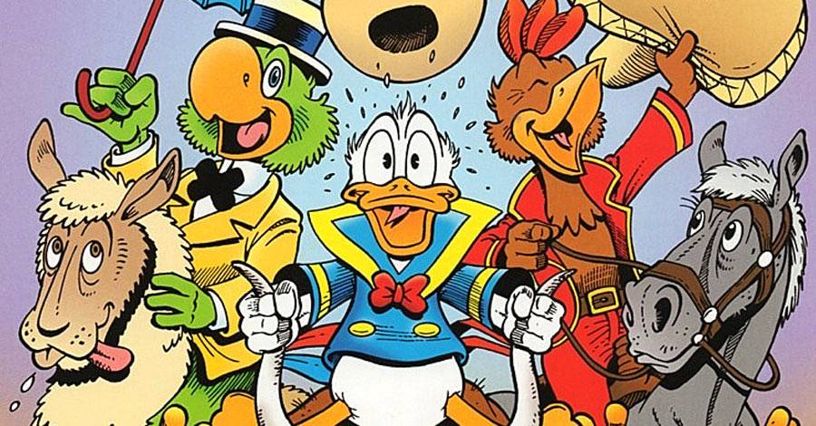
Right on its heels comes another one, 2005/2006's "The Magnificent Seven (Minus Four) Caballeros," a Donald Duck story spread across "Walt Disney's Comics & Stories" #663 - 665. As you might have guessed from the title, it co-stars Jose Carioca and Panchito Pistoles, from the 1944 movie, "The Three Caballeros."
Unfortunately, it's a bit of a let-down.
The biggest problem is that Rosa's story starts very slowly. The overall plot has Donald and his two buddies reunite to find a lost city filled with riches, only to have to fight their way out against the bad guy who wants it all for himself. I could deal with that, but the problem is the story doesn't start until well into the second issue. The three friends don't go off to search for the city, they luck into it. They ride off, aimlessly looking for adventure and accidentally stumble across it. It feels like the comic is a series of gags and cute moments in search of a story to hang them on. By the third part, we're well into a classic Duck adventure tale, but the best parts are the humorous bits. This might have worked better as a 10- or 12-page gag story instead of a three-part adventure tale.
There's also the feeling this was a story done at the behest of a South American editor looking to push some local color into his comics. Was there an editorial dictate for someone to draw a Donald Duck story that could serve as something the Tourist Bureau in Brazil might use in its advertising? The amount of exposition to introduce the sights and sounds of the country get in the way of the story. I felt like I was in a Very Special Episode of "Dora the Explorer." I love learning about new areas and new animals through Duck comics, but this one was over the top.
The overall message is a cute one, though. Donald, feeling unappreciated and sad, is set up on a trip to Brazil by his nephews, to have fun with his two Caballeros buddies there, and adventure ensues. The gag, though, is that they think Donald leads a wondrous and adventurous life because he's had all the amazing adventures with Uncle Scrooge. They actually look up to him and see everything he does through the filter of an amazing spirit and rugged determination, when it's usually his temper.
It is nice to see Donald get his moment or two in the sun, but I'm more of an Uncle Scrooge fan, I guess. I prefer my Donald stories to be wackier; I like my adventure stories to be Scroogier.
It's not all a waste, though. Rosa has some nice artistic moments, such as the wide angle view of Rio, or the jewel-encrusted carved-out lost city that Donald eventually lucks into. The gags are funny, highlighted in the second part by a page-long visual gag that's literally laugh-out-loud funny. (It's the Mickey Mouse sight gag with local animals.)
Todd Klein did not letter this one, but DC veteran letterer Willie Schubert works very well in his place. Scott Rockwell handles the coloring instead of Susan Daigle-Leach, but I have no complaints there. Rockwell works well in the style and everything remains legible and attractive.
Rosa explains the genesis of the project in a text page at the end of the third part. Nope, it wasn't done to please Brazilian editors. Rosa did it because he wanted to. He liked doing a story with that angle on Donald Duck. And, as it turns out, this is the second story he did with the Three Caballeros. I guess that first one is in my blind spot, too, as I don't remember it at all.
I think I'll go back to the classics and give "His Majesty, McDuck" another re-read. That one never gets old for me. Unfortunately, "The Magnificent Seven (Minus Four) Caballeros" is a miss.
JACK THE RIPPER
We have yet another piece of conclusive evidence of the identity of Jack the Ripper. This time, it's that Polish hairdresser guy, Aaron Kosminksi. In an interesting turn of events, the fellow who came to this conclusion did so by buying a piece of evidence from one of the crimes and then doing a DNA test on it to descendants of the presumed killer.
Here's the comics link to the whole thing, from the gentlemen who laid out the cash on this investigation:
When my involvement in the 126-year-old case began, I was just another armchair detective, interested enough to conduct my own extensive research after watching the Johnny Depp film From Hell in 2001. It piqued my curiosity about the 1888 killings when five - possibly more - prostitutes were butchered in London's East End.
This person is the first person ever to claim to be inspired by that awful movie. I suppose we should just be happy he wasn't inspired by "League of Extraordinary Gentlemen" to go in search of Sean Connery's career.
"THE AMAZING SPIDER-MAN" #317: "The Sand and The Fury"

Spider-Man and Venom face off, but not before Aunt May gets dragged into it and Peter asks for help.
There are elements of this issue that are tense and creepy. A lot of things that have built up over McFarlane's run on the series hit home directly in this issue. Namely, Venom had been established as Spider-Man's most dangerous foe with issue #300, and after a couple of issues hinting at his return, last issue saw him back in action. This issue is the one where you can feel things about to pay off. It's that moment at the second act of the movie when you know the hero has been backed into a corner, things look pretty bad, and now the big finish is on its way.

David Michelinie's script works well that way. Venom builds to a confrontation with Spider-Man at an abandoned beach house at the end of Long Island, and sets it up so it'll be mano a mano. An attempt to enlist the Fantastic Four's help went awry, so Spider-Man's only help comes from a psychiatrist, who helps him psychoanalyze Eddie Brock and the symbiote. The fights goes entirely Venom's way at first, with Spider-Man using his wits and prior fights with Venom to make some attempts at defeating him. Venom, though, has learned from his mistakes and works around them.
The climactic finish involves Peter Parker appealing to the symbiote's love of him, rather than fighting Eddie Brock's personality. By drawing the symbiote to him -- well, things get a little hazy here. The grand finale is that the symbiote tries to tear itself away from Eddie to re-join Peter, but has a hard time fighting Eddie off, then, uhm, passes out from the struggle. Peter wakes up first, but Venom and Eddie Brock are still out, presumably for long enough that the Fantastic Four can come and pick them up.
Did you willingly suspend your disbelief before reading this issue? I hope so. In a way, it's just typical superhero fight scene shtick, right? There's a fight. It's won not by power but by logic or science or reasoning. You just have to accept that the chips fall the way they do in the story and move on.
This is an issue that probably should have been double sized. As soon as the fight ends, the issue ends. It feels abrupt. The moment needs a denouement. At the very least, I want to see Mary Jane's reaction to Peter's victory. I want to see the Fantastic Four pick up Venom and tell Peter where he's going. (The Negative Zone would have been nice.)

There's a two-page sequence where Spider-Man is swinging through the city and saves a construction worker falling from a skyscraper. It's a nicely drawn sequence and Spider-Man's thoughts tie it into the story vaguely, but it's completely unnecessary in an issue that feels this important. I'd rather have seen those two pages saved for the end of the issue to give us more there, where the story might benefit from it.
Instead, things just reset and we're back to normal in time for issue #318.

McFarlane's art in this issue is strong. The Venom/Spider-Man fight scenes are awesome, with lots of little tricks being strung together to make a great superhero fight scene. You get the speed lines, the forced perspective, the point of view shot, and more. The art doesn't have any shortcuts in it. This is prime McFarlane, at a time when he wasn't forced to draw issues at a bi-weekly pace.

Felix Watch: No sign of him.
Sign of the Times: Check out that copy on the front cover: "Has Venom become kinder and gentler? Read our lips, Spidey: No Way!" For those of you who weren't following politics back in the late 1980s, specifically the 1988 presidential election, those are both phrases associated with the first President George Bush. You might just know them better from being punch lines in countless Dana Carvey routines on Saturday Night Live reruns. This issue was released early in the spring of 1989, so it would have been written after the election or maybe even around the inauguration time period. In the days before the internet, a few months delay on a timely joke was more typical.
Next Issue: At last, it's "Amazing Spider-Man" #318, the comic I refer to as my "first." It's the reason I've done this whole series. I can't wait to look at this one again.
Twitter || E-mail || Instagram || Pipeline Message Board || VariousandSundry.com || AugieShoots.com || Original Art Collection || Google+