Everyone loves a good movie monster, the best of which tend to be creepy to some extent. Even the lovable friendly ones have at least some tiny degree of the uncanny, while the evil ones can feel as if they've been ripped straight out of your nightmares. But there is a such thing as being too scary, and sometimes in pre-production the creature designers get a bit carried away...
RELATED: 16 Unused DC Movie Costumes (That They Don’t Want You To See)
Movies take a long time to make, and effects-heavy sci-fi and fantasy movies require especially lengthy production schedules to get everything right. The original ideas for a movie can change a lot over the course of production, and tons of designs and concepts will get changed or dumped. The following 15 creature designs made it to different stages of development, some only existing as concept art while others got full models. All of them got dumped in the end, and while a few might feel like missed opportunities, you'll generally understand why Hollywood got scared off by these designs! They have been ranked from least scary to most horrifying, and the #1 is particularly frightening... and maybe not safe for work? Don't say we didn't warn you!
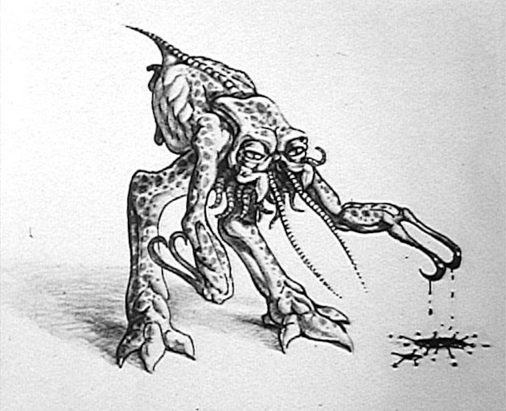
15 THE XENOMORPH (ALIEN)
This design ranks the lowest on the list because, while creepy, it's the one entry that's decidedly less creepy than the final H.R. Giger design Ridley Scott eventually settled on for his sci-fi horror classic Alien. Drawn by the original screenwriter Dan O'Bannon, this alien design is admittedly a bit freaky and gross.
It feels more like something you could have seen in any preexisting science fiction story rather than the distinctive disturbance of Giger's iconic design. A head shaped like a penis is always going to be scarier than a body that only vaguely resembles a ballsack. If you want to see what happens when a filmmaker tries to update the Giger xenomorph and somehow makes it even MORE disturbing, then keep reading on!
14 SMAUG (THE HOBBIT)
If only we got to see Guillermo Del Toro's version of The Hobbit. It would have been only two movies instead of three, it would have been filmed in traditional 2D instead of awkward-looking high frame rate 3D, and it certainly would have looked amazing! Watch any of his films from Pan's Labyrinth to Hellboy to Pacific Rim and you'll know he has a knack for designing memorable movie monsters.
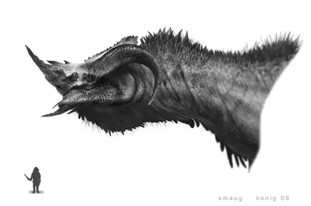
Most of the concept art for Del Toro's Hobbit has remained buried, but designer Peter Konig has posted some concept art for Smaug from early in development. While Smaug was one of the stronger elements of the Peter Jackson Hobbit trilogy, it still would have been cool to have seen them use this more distinctive, imposing design.
13 DEVOLVED HUMANS (WALL-E)
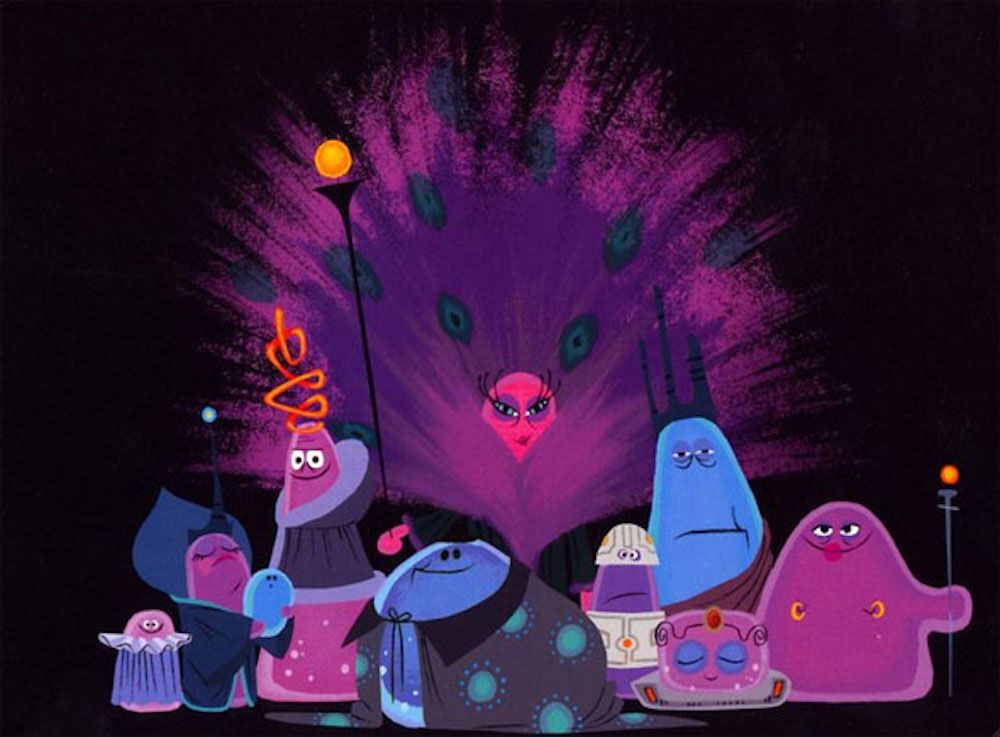
Every Pixar movie goes through serious rewrites long before animation begins. Wall-E, originally titled Trash Planet, was an unusual case because the movie's silent Earthbound opening act stayed more or less unchanged from the original pitch. After the opening, though, the pitch and the final project were radically different stories. Both versions have Wall-E wandering a spaceship with devolved humans, but in the original pitch, the humans were a lot further devolved.
Where the humans in the final movie are bloated and weakened from lack of gravity but still recognizable as humans, the humans in the original were jibberish-speaking blobs of jello. It wasn't even revealed these creatures were humans until a twist ending. Ultimately, the story was too complicated and the jello humans too unlikable, so Wall-E evolved into the film we know and love today. Also, that jello blob with nipple piercings will haunt your nightmares.
12 BRANIAC (SUPERMAN LIVES)
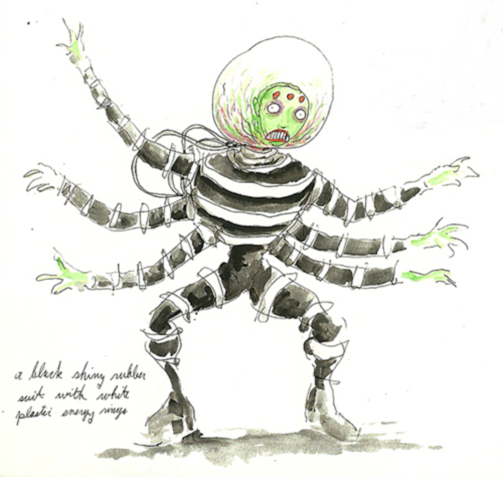
The abandoned mid-'90s Tim Burton/Kevin Smith/Nicolas Cage clusterfuck known as Superman Lives was a veritable treasure trove of awesome monster designs. Above is an illustration of Brainiac drawn by Tim Burton himself in the auteur's signature cartoon-gothic style. Producer John Peters was insistent the film needed a giant mechanical spider, which explains why this version of Brainiac has eight limbs.
Who knows if the movie would have been any good but it sure would have been fun to watch, with the enjoyably creepy sense of art direction that Tim Burton brings to all his projects. You can learn more about the film's troubled production and get glimpses of tons of awesome concept art in the documentary The Death of "Superman Lives": What Happened?
11 ALIENS (ARRIVAL)
Designing the aliens "Abbott" and "Costello" for Arrival must have been one of the hardest design jobs in Hollywood. The aliens in the film need to be profoundly inhuman, resisting the normal instincts to anthropomorphize aliens, but they're also peaceful and sympathetic creatures, so they can't be too scary in their inhumanness. The final designs, which resemble a mix of octopi, spiders, and Kang and Kodos from The Simpsons, manage to pull off just the right balance.
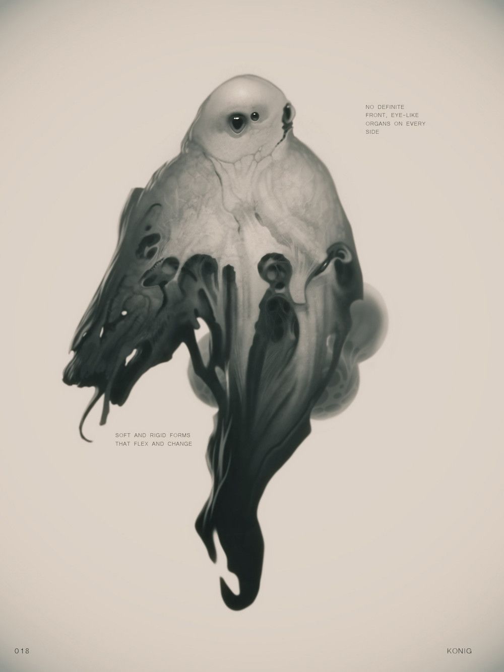
Much of the concept art, while beautiful, does lean maybe a bit too far into scariness, so it's understandable why such concepts got dumped. The Peter Konig design above envisions the aliens as ghostly shapeshifters with eyes on every side of their body. Also, is that alien's arm shifting into Smaug's face?
10 MIMICS (EDGE OF TOMORROW)
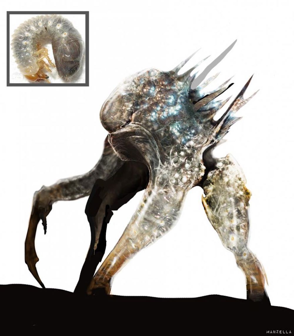
Unlike the Arrival aliens, the Mimics in Edge of Tomorrow are supposed to be evil, so aiming for scarier designs made sense. Character designers were instructed to do crazy with their concept art, to make the creepiest and most alien designs possible. The above piece of concept art by Ivan Manzella is one of the stand-out examples in regards to its creepiness. The design applies a maggot-like texture and bioluminescent coloring to the flesh of a spindly and nearly faceless alien creature.
The final designs of the Mimics, with their bodies composed almost entirely of tentacles except for their heads, are appropriately creepy for the purposes of Edge of Tomorrow's action adventure. Their mechanical appearance and texture, however, is perhaps less viscerally icky than some of the more organic-looking designs that were thrown around initially.
9 TEENAGE MUTANT NINJA TURTLES
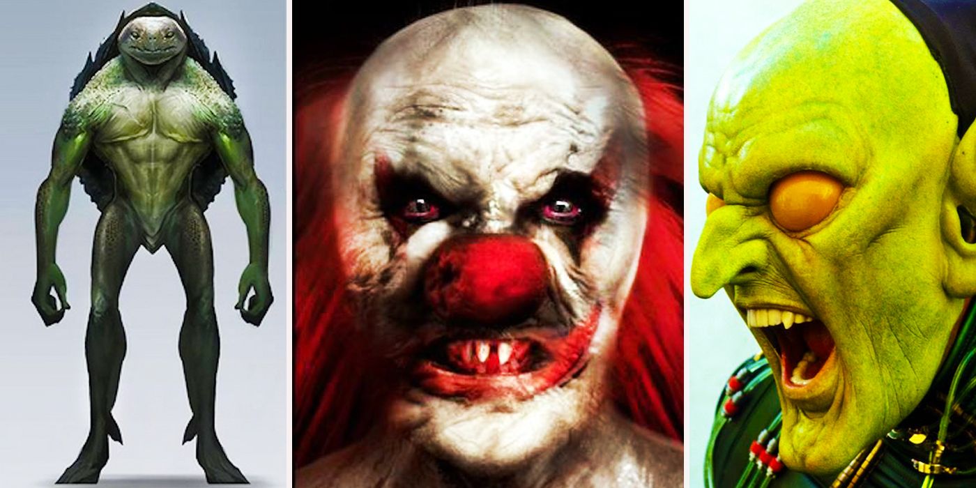
The final designs of the new Teenage Mutant Ninja Turtles movies aren't exactly high points in the world of creature design. For characters that are supposed to be fun and cartoony, they're too uncanny valley, and when the latest in big budget CG can't live up to the Jim Henson Creature Shop puppetry from the first live-action movie, you've got problems. But it could have been worse. So, so much worse.
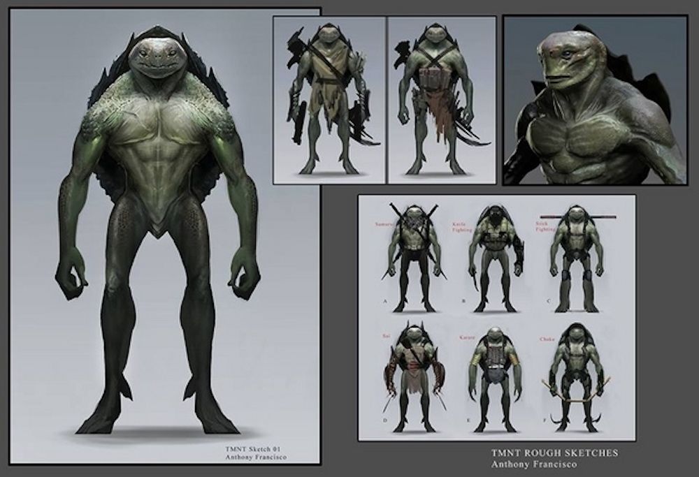
These rough concept designs by Anthony Francisco are impressive in their own right. If you needed designs for a creepy race of turtle-people, this is a pretty cool look. But judged as a Teenage Mutant Ninja Turtles adaptation, these freaky faced reptilians still show us just how discomforting it can be to see cartoon characters made to look too realistic.
8 REPTILLIANS (JURASSIC PARK IV)
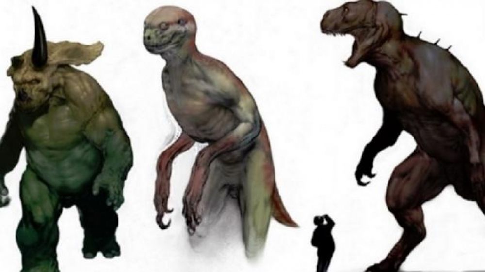
If humanoid turtles could be that creepy, just imagine what humanoid dinosaurs could be like! Yep, before Jurassic World got released to mega-blockbuster status, Jurassic Park IV was languishing in development hell, with various screenplay ideas thrown around, none of which satisfied Steven Spielberg. The script that got the furthest along before Jurassic World came about was by William Monahan and John Sayles. The plot of this one? Dinosaur-human hybrids battling regular dinosaurs!
The hybrids, as designed by Carlos Huante, are a bit too nightmarish for the supposed heroes audiences are meant to be rooting for. Drew McWeeny, reviewing the script for Ain't It Cool News in 2007, described it as "the single most bugfuck crazy franchise sequel I've ever read." To be fair, it isn't THAT much more stupid an idea than some of the crap they pulled in Jurassic World...
7 GREEN GOBLIN
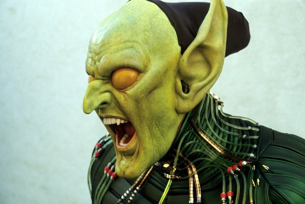
Of all the first Spider-Man movie's various strengths and weaknesses, one aspect of the movie that's generally regarded as a weak point is the Power Rangers-y mask they used for the Green Goblin. However, before they settled on that mask, there were tests to develop a Goblin mask closer to the expressive face in the comics. The results are... pretty terrifying.
The test mask, designed by Amalgamated Dynamics Inc., was a combination of prosthetic make-up and complex animatronics that would be able to capture the actor's performance. Ultimately this plan was scrapped. Perhaps it was too complicated to use on-set. Perhaps it was too confusing to justify the moving mask in the universe set up by the script. Or perhaps it was just too fucking scary. ADI has posted test footage of the mask in motion on Youtube, if you dare to watch.
6 THE SPIDER PIT IN KING KONG
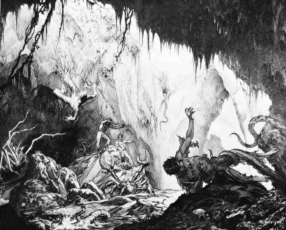
Remember that one scene in the 2005 King Kong where everyone got attacked by giant bugs and it was suddenly a horror film? There's a reason Peter Jackson included that seemingly out-of-nowhere moment of terror, and it was to pay homage to one of the most infamous deleted scenes in all of cinema: the "Spider Pit" sequence from the original 1933 King Kong. The sequence featured not just giant spiders, but crabs, lizards, and tentacle monsters. Reportedly it had people fleeing the theater, and director Merian C. Cooper had the footage destroyed.
Evidence of the sequence's existence can be found in the screenplay, the original novelization, a radio serial, and a few photos published in Famous Monsters of Filmland, but nobody's been able to recover the footage. Jackson tried his hand at mixing existing footage from the film with original stop-motion recreations of the script as a DVD bonus feature.
5 ET
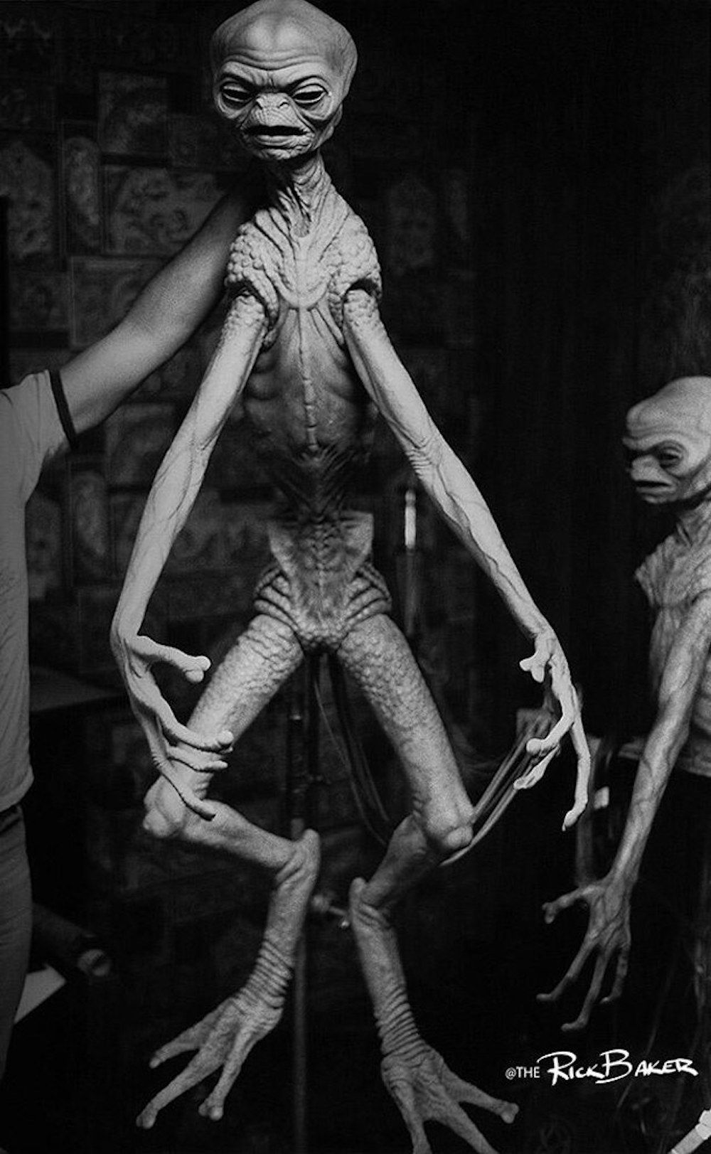
E.T. The Extra-Terrestrial was almost a horror movie titled Night Skies, which explains why the $70,000 prototype alien animatronic designed by practical effects legend Rick Baker is scary as hell. The original screenplay had five aliens, four of whom would terrorize a human family while one would befriend them. Exhausted from the constant action on the set of Raiders of the Lost Arc, Spielberg found himself longing for a calmer, more spiritual project, and ultimately decided to keep the friendly alien storyline from Night Skies while scrapping the rest.
Rick Baker was furious and left, but elements of his development work were adapted for Carlo Rambaldi's much cuter final design for E.T. For those curious about what Night Skies could have been like, the horror elements of the script were repurposed by Spielberg for Poltergeist, Gremlins, and later on his War of the Worlds adaptation.
4 CREECH IN MONSTER TRUCKS
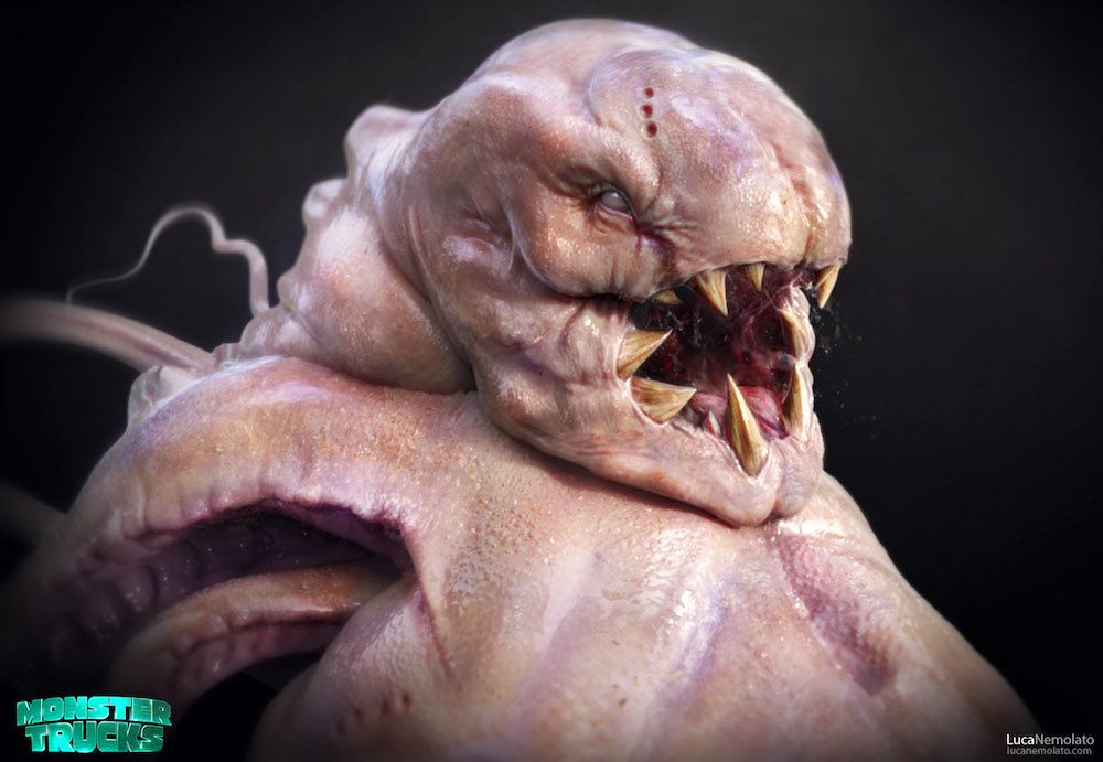
OK, WHO THE HELL THOUGHT THIS WAS AN ACCEPTABLE DESIGN FOR THE HERO OF A CHILDREN'S MOVIE!? The 2017 mega-flop Monster Trucks had an interesting path to the big screen, to put it mildly. Based on an idea by a four-year-old, the movie about about a monster that lives inside a truck went over-budget and its release got delayed for years because of one terrible test screening. Kids watching the nearly-finished movie broke down in tears of terror at the sight of the monster Creech.
In the end, the studio had to go back and reanimate all of the special effects, changing Creech into a cuter "squishy pile of squish." The old footage never leaked so we don't know exactly what design frightened all those kids, but various pieces of concept art floating around the internet showcase a litany of Lovecraftian abominations that will have you asking "What were they even thinking!?!"
3 PENNYWISE
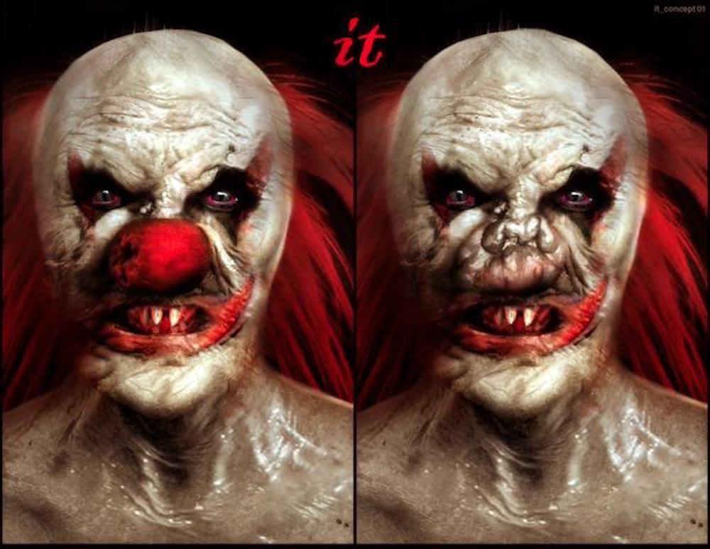
Why are clowns so scary? Characters like The Joker and Pennywise play off the irony of being both children's entertainers and violent monsters, but even normal, non-murderous clowns are one of the most common phobias. What about clowns causes such discomfort for so many? Maybe it's the noses. Round red clown noses look unnatural.
In the grotesque concept art for a cancelled adaptation of It by Cube and Splice director Vincenzo Natalli, the red clown nose becomes even creepier, a cover for Pennywise's disgustingly misshapen flesh underneath barely even resembling a nose. A remake of It has gone through numerous directors, but a version directed by Andres Muschetti is finally being released on September 9th. How scary will it be? You have to wait and find out.
2 JABBA THE HUTT
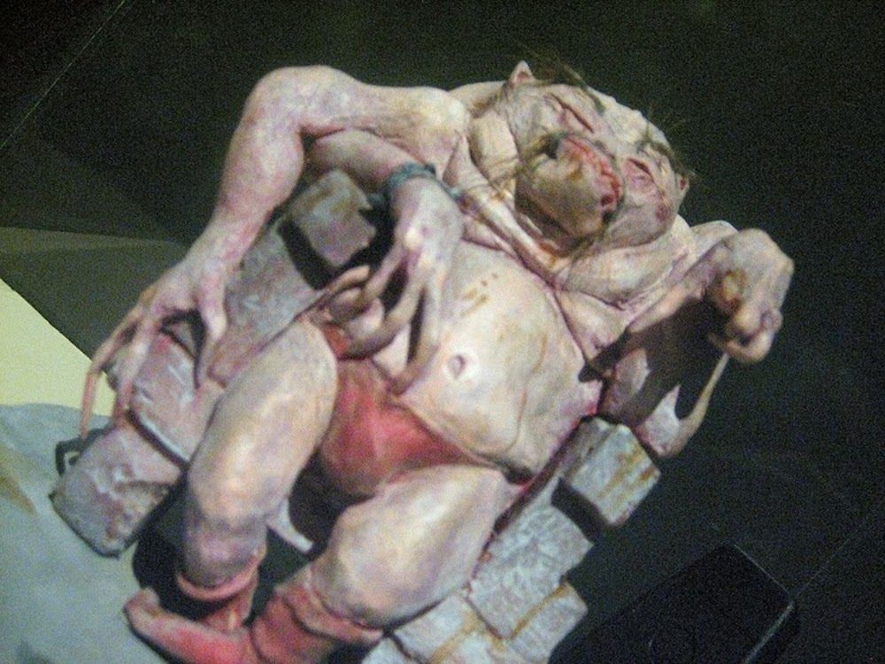
In the original script for A New Hope, Jabba was described as a "fat, slug-like creature with eyes on extended feelers and a huge ugly mouth," but George Lucas changed his mind on Jabba's appearance multiple times throughout the production of the original trilogy. The deleted Jabba scene that eventually got completed for the Special Editions of New Hope was originally filmed with actor Declan Mullholland in a furry suit, who was supposed to be replaced in post-production by a stop motion Wookie-like creature. Early tie-in comics drew Jabba as a green monkey.
Pictured above is the first model of Jabba designed by Industrial Light and Magic. Lucas rejected it for looking too humanoid. Unstated but implied in the rejection is that it's just too scary to look at. The final obese slug design might not exactly be pretty, but it's actually less disgusting than what they almost went with.
1 THE NEWBORN/"PEENOMORPH"
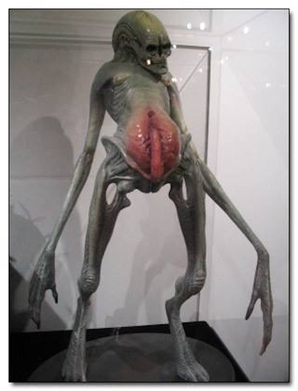
You were warned. You could have back away. But no, you read all the way through and now you have to look at a xenomorph with a giant... something emerging from/penetrating through its own huge vagina-belly. The craziest part of this monster design isn't that someone thought it up; genital references are so ingrained into the classic xenomorph design that it's not too far a leap of imagination to give one actual genitals.
No, the crazy part is that this was the final design for the Newborn in Alien Resurrection THEY ACTUALLY FILMED THE ENIRE MOVIE WITH IT! The FOX executives were not fans of the decision, and upon viewing the footage, director Jean-Pierre Jeunet, was adamant in wanting to use the "peenomorph" design, later conceding that "even for a Frenchman, it's too much." The naughty bits were edited out in post-production.
Do you know any other abandoned movie monster designs? Let us know in the comments!

