The Nintendo Switch firmware has been updated once again, this time to version 10.2.0. Avid Nintendo fans who were around during the Wii U/3DS era will be intimately familiar with the content of this patch: general stability. It became a meme how often Nintendo would push stability patches live for the 3DS in particular in a constant effort to stomp out any potential exploits. A new vulnerability would crop up, and it would be only a matter of time until a stability update would fix the problem.
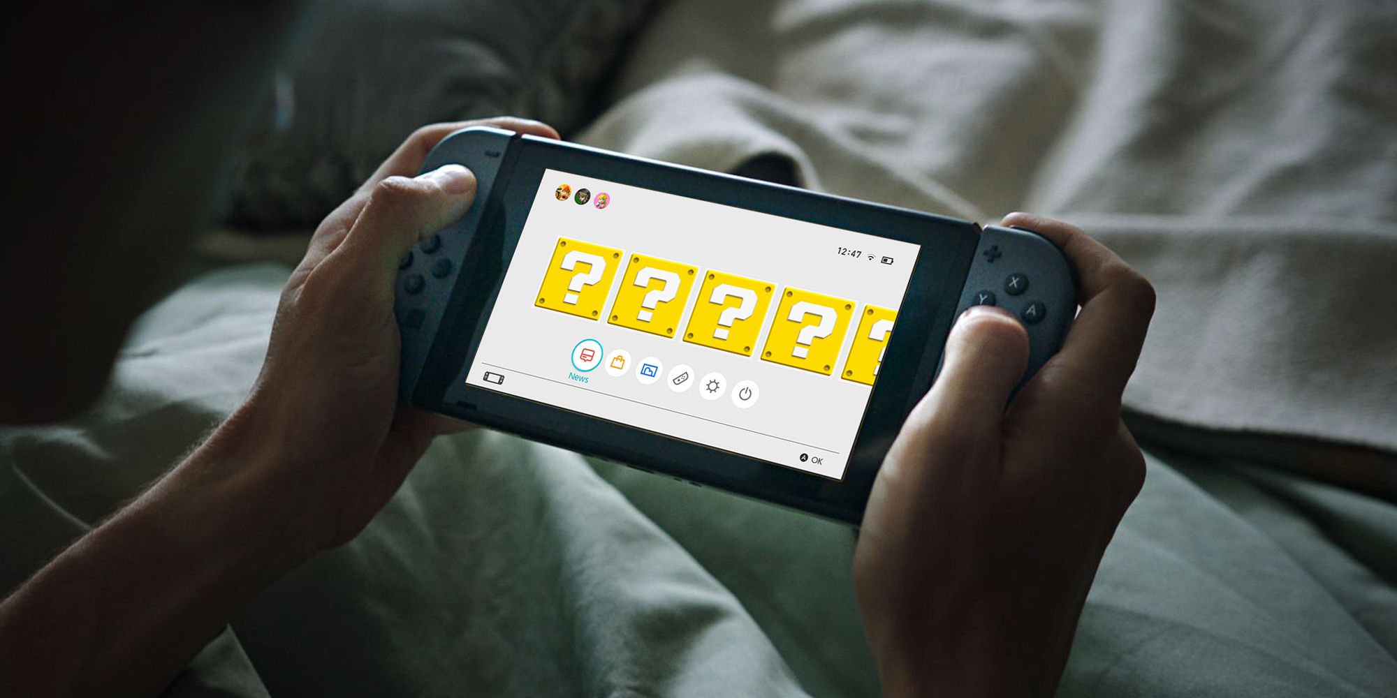
However, the Nintendo 3DS already had a shockingly robust user interface by the time stability became the last word in patching. The Switch, by contrast, does not. When juxtaposing the Switch's UI against the UI of the 3DS or Wii U, the difference is stark. It's past time for Nintendo to revitalize its hybrid before its flimsy UI simply becomes too brittle.
To its credit, the Nintendo Switch UI has one advantage over its predecessors: speed. The Wii U menus were notoriously and painstakingly slow. While the 3DS fared better in some respects, its user experience was significantly dampened by crawling load times too. Being able to boot up a game or load into the eShop snappily on Switch is a great change of pace. But in 2020, that isn't enough. Both the PlayStation and Xbox ecosystems have demonstrated what a robust UI/UX combination on a home console can be, so the Switch needs to catch up.
A Matter of Function
The issues with the Nintendo Switch's UI are twofold: a lack utility and personality. Naturally, the former is far more pressing. The Nintendo Switch user interface is a disorganized and isolating place. It lacks many vital features, from on-board messaging to game folders. While Nintendo's persistent inability to create a worthwhile online experience is a separate conversation, the UI lacks even the most basic communication features.
This is even more frustrating in light of the cheeky workarounds that the Wii U and 3DS implemented. Without a Miiverse, Swapnote or Wii U video chat analog, getting in contact with friends must happen external to the system itself. This would be where the Nintendo Switch Online App would come in. However, when most players have to communicate off-platform, they'll migrate to a service like Discord that offers a more user-friendly suite of tools.
Then, there is the general disorganization that expands to so many facets of the UI experience. Most obviously, the console lacks game folders. Due to the nature of the device and its attach rate, many players have loads of titles on Switch, but it's hard to manage a sizable library on the system in any functional way. There are only the most basic sorting options available.
Still, this isn't nearly as baffling as the way the system passively tracks playtime. Displaying playtime rounded down to the nearest five hour interval makes this data largely useless. For reviewers looking for exact playthrough lengths or regular players simply looking to exchange data, these ballpark figures hold little material relevance. Considering that folders and exact play logs were both available and allowed for granular customization on the Wii U and 3DS, it's puzzling why such features are absent on Switch.
A Matter of Aesthetics
Beyond simple utility, the Nintendo Switch UI lacks personality. While it's a secondary concern, turning on the 3DS, Wii U and even the original Wii felt exciting. Those systems had unique aesthetics, both in visual design and in background music. The user experiences truly felt like experiences, complete with unique and engaging flourishes.
The Wii U had an entire social network for Nintendo fans with Miiverse and the Mii Plaza. The 3DS had home themes and collectible, decorative badges and Nintendo's greatest metagames: StreetPass. Even the original Wii had more channels and widgets than you'd know what to do with and a lovely mailbox to complete the package.
In comparison to all that, the Switch doesn't have much. At the end of the day, it's a superfluous concern and a rote critique. What really matters is the software library, and this is far from the first appeal to the Switch's lacking UI. But this apparatus felt dated the moment the system launched. Plus, with the imminent launch of next-gen consoles, this UI is going to feel all the more antiquated by comparison soon.
On a macro level though, the issue lies in the menu's hollowness. Simply turning on the Wii, Wii U or 3DS. felt fun and exemplified Nintendo's creativity and charm. Those interfaces embodied the cozy feeling that Nintendo exudes. Powering up these systems was akin to taking a peek into a bustling, lively world or an inviting digital home. They weren't simply conduits to launch games from. Hopefully, the Nintendo Switch can return to that ideal with future updates.


