Batman: The Animated Series is one of the most beloved DC Comic book adaptations of all time. Fans were heartbroken when it ended but, luckily, The New Batman Adventures came to fill in the gaps in the fandoms collective hearts. For all intents and purposes, The New Batman Adventures was another season to Batman The Animated Series; the two series had only a year-long gap between them, and shared both a continuity and creative team. However, there was a crucial change between the two series: the art-style
TNBA featured a more modernistic, angular aesthetic in-line with its sister show, Superman: The Animated Series, and many characters wound up looking quite different than they had in the previous series.
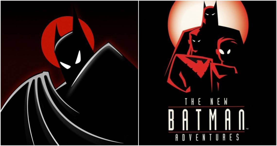
10 Best: Batman

Luckily, Batman's own design was one of the more subtle redesigns, but the changes made were effective. Between TAS and TNBA, Batman devolved into a darker character, losing any sense of warmth or humor while being noticeably more ruthless in his tactics.
The evolution of Batman's costume reflection this; gone was the blue highlights on his suit, with his cape and cowl instead being a sleekly pure black, while the bat insignia on his chest lost the yellow oval encircling the bat itself. This costume upgrade recalled The Dark Knight Returns, which had Batman begin the story wearing his classic Neal Adams blue-and-grey suit before switching to a darker costume.
9 Worst: Killer Croc

When Killer Croc debuted in Batman TAS, he resembled a mutated human much more so than his reptilian name-sake; his lumpy skin was colored a sickly grey and his jaw was malformed, but these subtler deformities helped ground the character into the more down-to-earth world of BTAS.
When Croc returned in TNBA, his mutated had apparently advance; his flesh was now covered head-t0-tow in green scales, to the point he looked more like a crocodile mutated into a human than the other way around. As a whole, the redesign looked a bit too cartoony to be creepy.
8 Best: Robin

As part of the updated status quo, TNBA featured a different Robin; Dick Grayson had left Batman in the interim between the two series and become Nightwing, while shortly into TNBA's run, Bruce took the orphan Tim Drake under his wing and trained him to become the new Robin.
With a new Robin came a new costume; Tim's Robin costume ditched the green highlights which Dick's suit had for black ones, and different color scheme resulted in a darker look which fit the series' new aesthetic quite well.
7 Worst: The Penguin

Batman The Animated Series was put into production as a tie-in to the Tim Burton directed Batman films, so the Penguin's TAS design was modeled less after his comic counterpart than it was Danny DeVito's portrayal of Oswald Cobblepot in Batman Returns. When TNBA debuted, the Penguin had "reformed," going from an open super-villain to a "legitimate businessman" who kept his criminal activities discrete.
To reflect this change, the Penguin's design was radically altered, with his mutations removed for a design ripped from Dick Sprang's Silver Age Batman comics. However, in the end the design ended up looking more comical than anything else, robbing the Penguin of any menace he had.
6 Best: Poison Ivy

Poison Ivy's design was one of the lesser changed between TAS and TNBA; rather than being fully redesigned, her original design was more so a case of the original look being translated into the more stylized aesthetic.
The most noticeable change was Ivy's skin tone; in TAS, there was nothing about Poison Ivy's appearance that differentiated her from any other woman, whereas in TNBA, her skin had taken on a paler, greenish-pigment, reflecting how Ivy's continued experiments were bringing her closer and closer to the plants she obsessed over.
5 Worst: The Mad Hatter

The Mad Hatter's redesign was one of the most extreme; his TAS and TNBA selves look like entirely different people. The TAS Mad Hatter was a normal looking man who simply had a nebbish face, while in TNBA, his appearance has devolved into downright elfin, combined with him losing half his height and apparently aging by a decade or two.
More cosmetically, while the overall design of his outfit remained similar enough across the two versions, the color changed remarkably, going from mostly blue in TAS to predominantly green in TNBA.
4 Best: Batgirl

Barbara Gordon was an ancillary character in Batman The Animated Series, appearing in only four episodes and only suiting up as Batgirl in two of them. By the time of TNBA, however, she'd been elevated to the main cast and became Bruce's main crime-fighting partner, recieving a new outfit as well.
As with the rest of the Bat-family's outfits, TNBA Batgirl's costume had a sleeker and more darkly-colored look than her original design, with blue-and-grey swapped out for more striking black-and-yellow, not to mention a shorter cape, that all-in-all gave Barbara a more distinct identity.
3 Worst: The Riddler

The Riddler never got the spotlight on TNBA, and considering his redesign, that was likely for the best.
In BTAS, the Riddler had worn a green-tinted suit that perfectly reflected his cold, calculating demeanor, but by TNBA, he's swapped this out for a question mark adorned onesie reminiscent of the one worn by Frank Gorshin in the 1966 Batman television series, with only the bowler hat and staff remaining.
2 Best: The Scarecrow

The Scarecrow is one villain the production team of Batman The Animated Series were never totally satisfied with the look of. Crane's costume was even redesigned over the course of the original series; his debut in "Nothing To Fear" had him wear a ghoulish burlap sack-mask, while his appearances afterwards gave the mask a more crooked look reminiscent of a jack-o-lantern. Still, the creators felt he was insufficiently scary, so Scarecrow wound up receiving the most drastic, and acclaimed, redesign for the sequel series.
Taking cues from Leatherface, the Scarecrow now resembled the decomposed corpse of a Southern preacher, with the severed noose around his neck completing the aesthetic. With the redesign came a recast from Henry Polic II to Jeffrey Combs; whereas Polic's delivery had often been caustic, Combs' Scarecrow spoke with a raspy and chilling whisper. Between Combs' performance and the redesign, TNBA Scarecrow finally earned the title "Master of Fear."
1 Worst: The Joker

In an effort at simplifying the Joker's design, his TNBA design stripped the character of his ruby red lips and inverted the color of his eyes (black with white irises). The uncanny result was mostly panned, many fans feeling the Joker now looked simply comical, especially compared to the frightening look he'd had in BTAS.
Even the creative team wound up unsatisfied with this Joker design, prompting a second redesign for the Joker's later appearances in DCAU productions Batman Beyond: Return Of The Joker and Justice League that combined the coloration of TNBA design with the facial features of the BTAS one; fans responded much more positively to this happy medium.