Here are the DC solicits for August, and here are my Top Ten covers for the month!
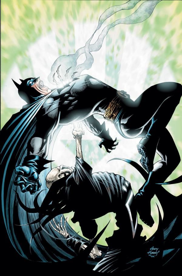
10. I may just be so surprised by such a neat cover from Andy Kubert (who I usually am not too impressed with, cover-wise) that I am overrating this Blackest Night: Batman #1 cover, but I still think that it is well designed cover that maximizes its dynamism in an eye-catching fashion.
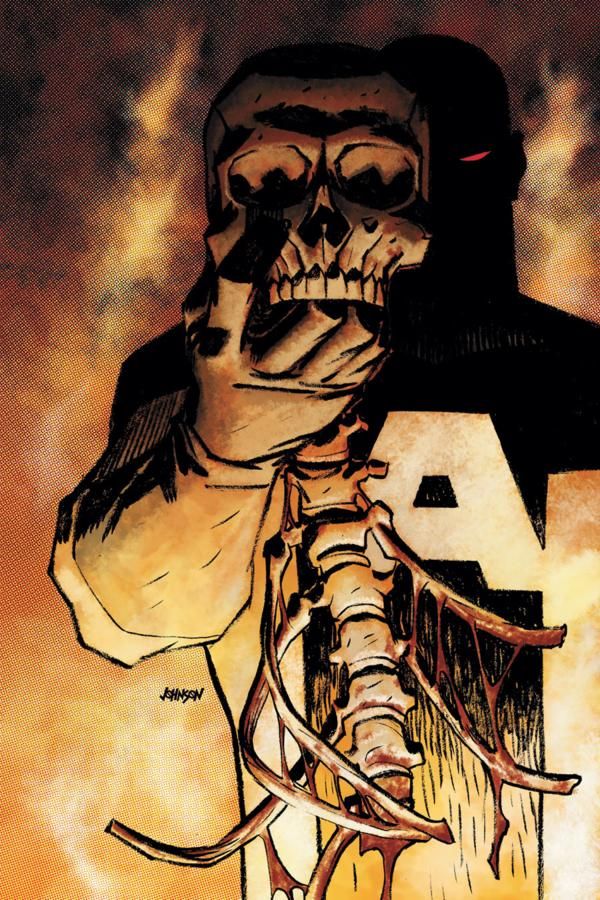
9. Dave Johnson pulls off an interesting twist on the classic "I knew him, Horatio" cover motif that gets used so much.
On this The Mighty cover here, Johnson takes it up a notch.
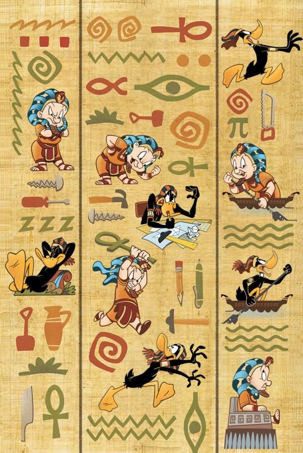
8. Love the design of this Looney Tunes cover by Scott Gross, and I especially dig how he occasionally works the hieroglyphics into the action!
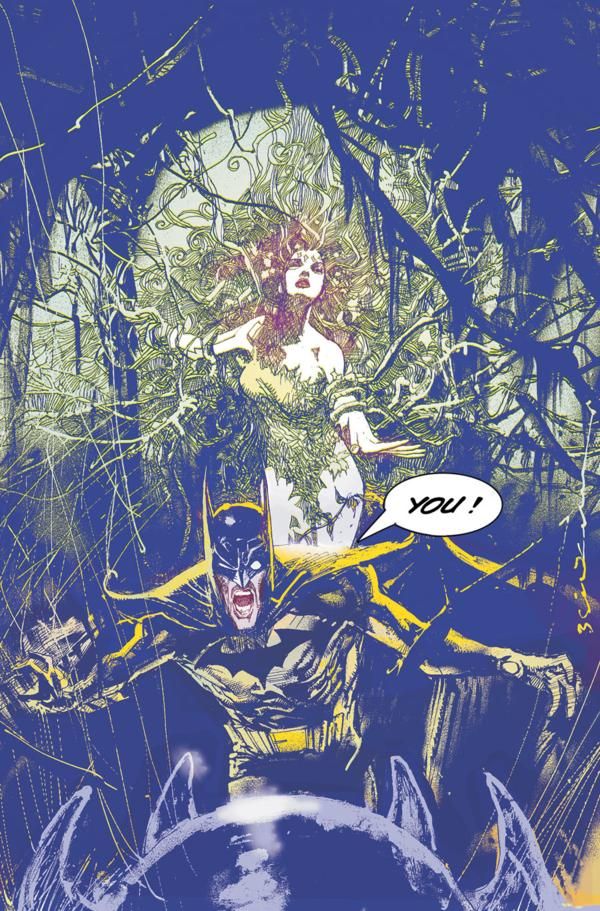
7. Haven't seen a Bill Sienkiewicz cover with this much detail in awhile.
I really like it. And you have to love the old school word balloon on the cover!
This is for a new Kevin Smith/Walt Flanagan mini-series called Batman: Widening Gyre.
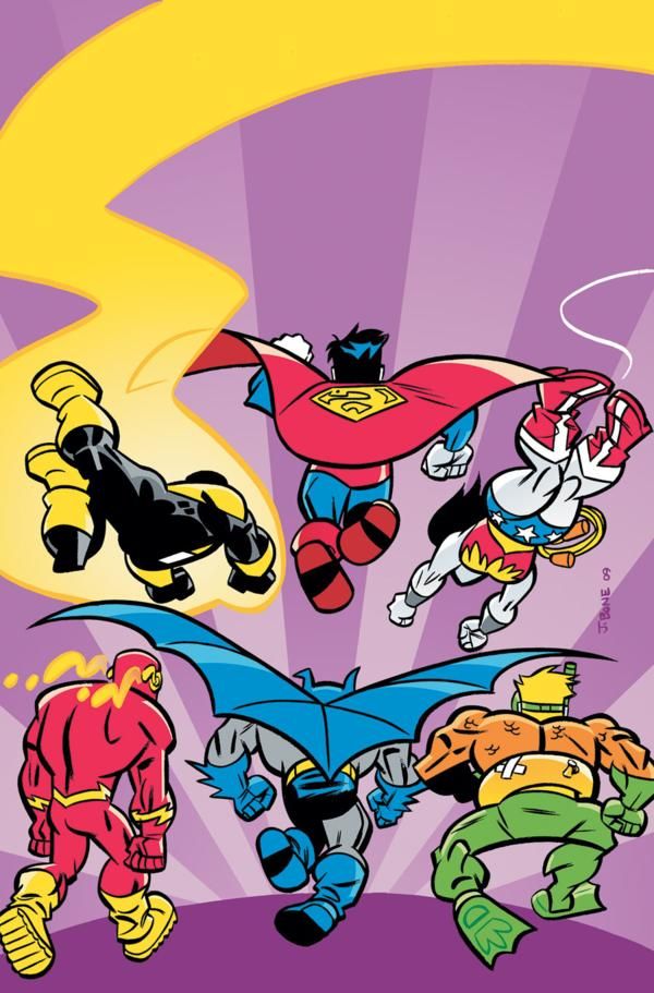
6. Yet another fantastic Super Friends cover by J. Bone.
Only slight demerits (and by slight, I mean not Top Five - that's really not much of a demerit) for the fact that the idea behind the cover, while extremely clever, might be lost on some young readers.
Of course, I imagine that the cover copy (not shown here) might very well address that, which is why it is only a slight demerit!
Great cover idea!
MID-WAY POINT, SO I CAN MAKE FUN OF ONE COVER!!
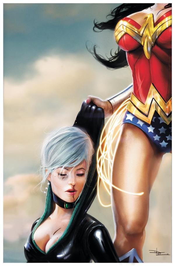
Breaking the one cover rule SLIGHTLY, because I really wanted to make a note of Daniel Lu Visi's Secret Six cover.
I get that when you want to have the iconic "popping" aspect of a character, for Wonder Woman, all you have to work with is the logo on her chest. So I get that this is difficult to depict. And the cover IS certainly striking!
STILL, the end result of this cover looks like it is "And guest starring - Wonder Woman's breasts!"
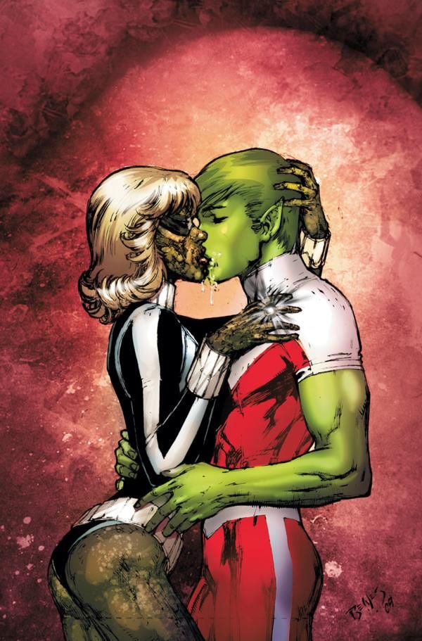
Now, as to the cover I'm REALLY making fun of, you gotta love this Blackest Night: Titans cover...
Ed Benes is so committed to ass shots that he'll even do them for zombies.
Awesome.
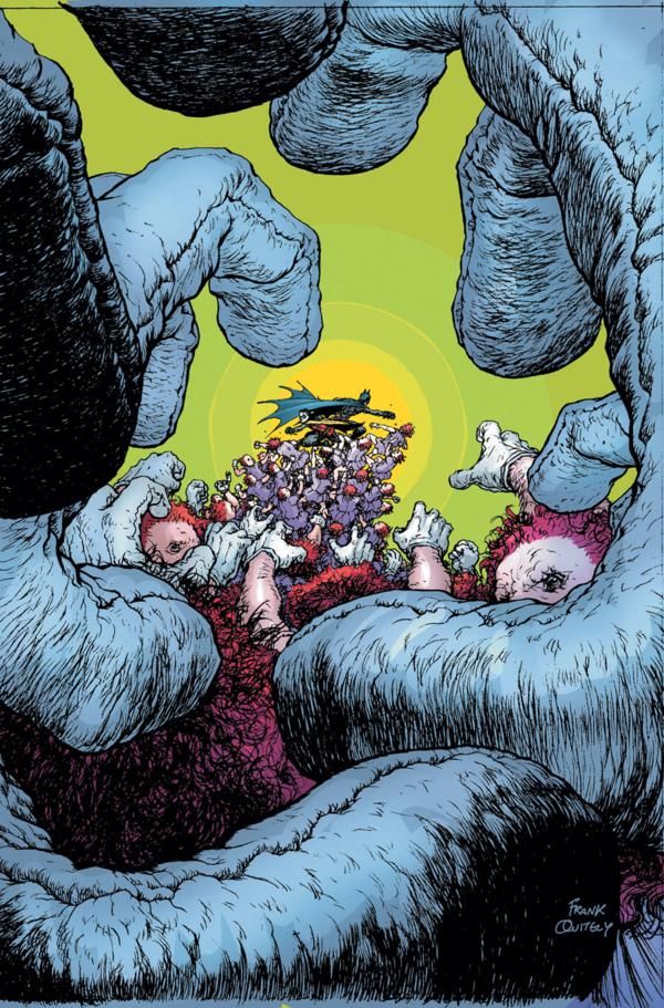
5. Really interesting approach for a cover design by Frank Quitely for Batman and Robin.
I'm surprised, though, at the looseness of the pencils on the figures closest to the reader.
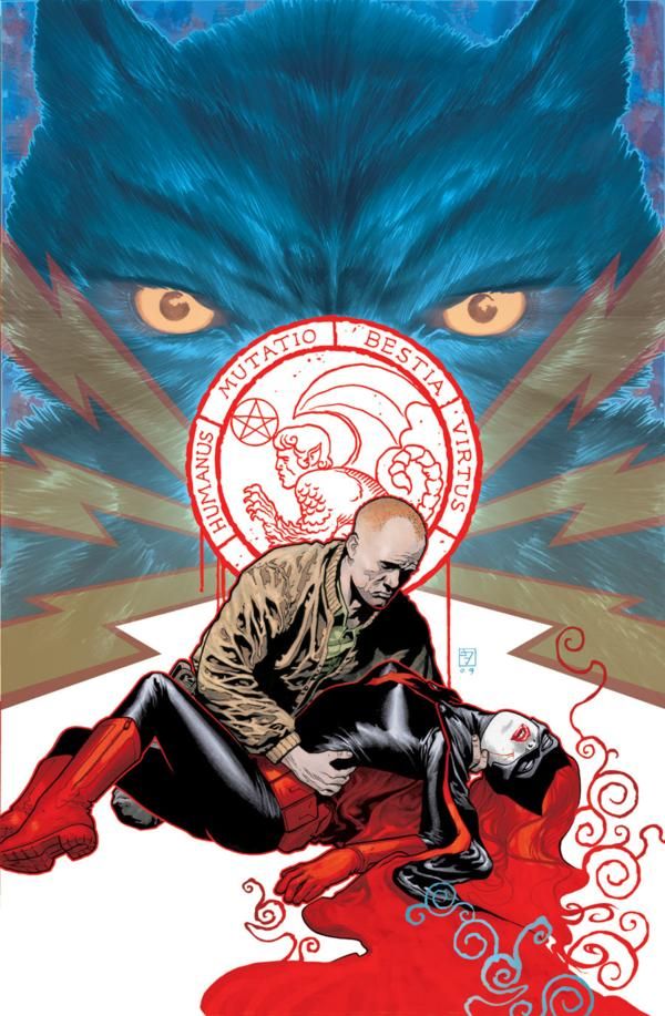
4. I'm slightly less impressed with JH Williams III's latest Detective Comics cover, as it seems to be a bit more conventional of a cover approach than last month's cover.
Still, that's only a difference of "the" best versus "almost the best," as Williams' cover is still excellent, especially the way he uses negative space.
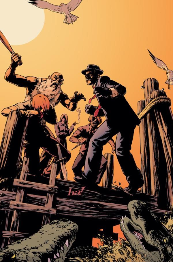
3. This Spirit cover by Gene Ha is an amazingly well done drawing. The way he reveals that The Spirit is not just being attacked by people on the docks, he is also surrounded by feisty critters is sublime.
My only tiny concern is whether it is TOO sublime, in that he is trying something here that perhaps a casual rack viewer won't catch on a quick glance.
Still, an amazing drawing.
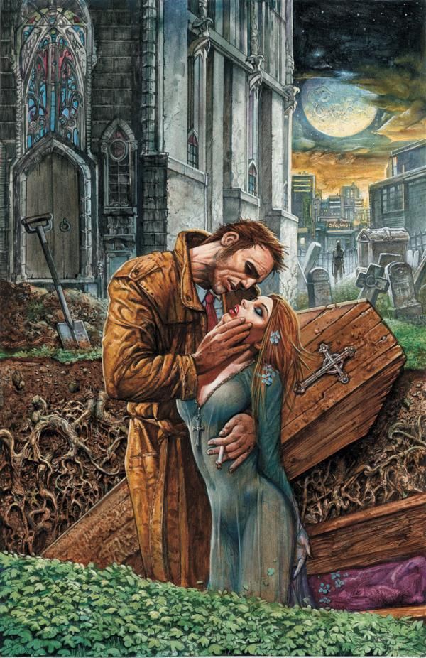
2. This Simon Bisley Hellblazer cover, on the other hand, has a LOT of things going on on it, but it is also extremely striking, so a casual reader can't help but be struck by the harsh imagery Bisley uses - a man grasping the beautiful woman out of a coffin - sharp stuff right there.
Once you see that, though, you also appreciate all the other impressive details Bisley put into the work. Bisley has been great since he's taken over cover duties on Hellblazer.
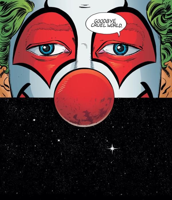
1. I'm probably putting this a little high just because it is so darn perfect, but if so, who cares - this is about as perfect of a send-off to Young Liars by David Lapham that I could imagine.
It captures the very essence of the absurdity of the book while also managing, somehow, to convey plot points from the book (the Mars aspect of the comic).
How awesome is that?!?
Lapham, you rule! I can't wait to see (and read, of course) what you do next!
That's my top ten! What's yours?

