If you haven’t noticed, movie poster art just isn’t what it used to be. Gone are the days of beautiful hand painted posters by the likes of Drew Struzan and other artists who created posters as iconic as the films themselves. Nowadays, posters are usually made up of publicity shots poorly photoshopped together in hopes that it will create some buzz for the film. Thankfully for us, this has given fans the drive to go ahead and make their own poster art for the films. And no one makes better poster art than Mondo. If you aren’t familiar with Mondo, they commission artists to make amazing artwork and sell prints of it in limited runs.
RELATED: 15 Pieces Of Jaw-Dropping Unused MCU Concept Art
While the prints can be hard to come by, thankfully their awesomeness is preserved forever as image on the internet! Mondo does more than just alternative posters, they also make posters for things that might have never had them (like individual television episodes) or other cool pop culture themed artwork that is a level above the typical kind of stuff you find online. But for this list, we’re gonna look at posters that are improvements over the original, studio sanctioned ones (or at least give them a good run for their money!)
15 STAR WARS

Now, before you get you pitchforks out, take a good look at the original Star Wars poster. Not the special edition one, but the original. Beefcake Luke? Leia in a low-cut shirt? The Mondo poster might not convey the scope or epicness of the film. But having the twin suns of Tatooine be Threepio’s eyes? That’s a brilliant concept and the minimalist style is a refreshing change of pace from posters that try to work in every character who appears in the film.
Mondo and artist Olly Moss would continue with the rest of the saga in this style. It works as more than just a poster for one of the most popular films of all time, it works as its own piece of art.
14 BATMAN RETURNS

The original Batman Returns poster is pretty basic. Batman, Catwoman, the Penguin, and some of the penguins from the end of the film. This poster is clearly banking on the actors and the roles they are playing. Mondo’s take on a Batman Returns poster does a much better job of presenting the tone of the film. The twisted tree in the foreground and hand drawn style of the poster reminds one of a Tim Burton drawing, while maybe not as exaggerated.
The falling snow, the graveyard, and looming Shreck building really gives off the atmospheric, dark tone that is found within the film. Another important detail is that nowhere on this can Batman be found. Because this really isn’t Batman’s film, it belongs to the Penguin. Also, the cat at the top of the tree is a really nice touch.
13 IRON MAN 3

Were the official poster for Iron Man 3 painted, it might actually be a cool poster. But as it stands? It’s an ugly, cluttered mess. It has the orange and blue color scheme that is all to common in movies and movie posters. The Mondo poster has a lighter shade of blue, a more metallic shade of yellow, and throws in red for good message.
It does a good job of showing the Iron Man looking cool. But with the close up of Tony’s face, looking as if he’s deep in thought, it gives a hint at the more cerebral aspects of the film and Tony dealing with PTSD after the events of the Avengers. It does pretty much everything the original poster sets out to do but does it better.
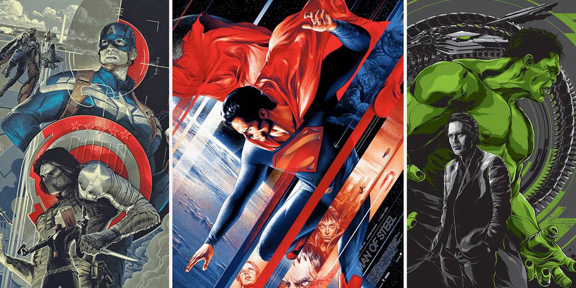
12 MAN OF STEEL

The Man of Steel Mondo poster actually makes the film look better than it is. The official poster for Man of Steel does a good representation of the film. Superman is just standing there looking bored with an unnecessary lens flare in the background. The Mondo poster is the opposite of the film and original poster.
Superman is floating over the earth and that, along with the painted style of the poster, give Superman that epic, godly feel that the character deserves. The streaks that feature characters and scenes from the movie and bring to mind the shards of crystal that make up the Fortress of Solitude. Like all those shlock, straight-to-video VHS covers used to do in the past, the Mondo poster for Man of Steel sells us on a fairly disappointing film.
11 SPACED

Okay, now this one might count as cheating. Being a television series, Spaced never had real poster art. However, when it was released on DVD it did have cover art that was supposed to conjure up images of some of the classic posters, specifically the ones for the Star Wars Special Edition rereleases. However, while that nostalgic angle is nice and fits with the show, the execution is shoddy at best.
The title and the artwork might make a person think they’re watching a cheap sci-fi movie. The Mondo poster gives potential viewers a bit of a better idea of what they’re getting themselves in for. The characters are surrounded with pop culture touchstones and things found in the series. While a “less is more” approach might work for more popular movies and series, Spaced needs a poster that gives a taste of what the series is all about.
10 JURASSIC WORLD

The original Jurassic World poster is a visual callback to the Jurassic Park poster, which would be okay if they hadn’t already done it with the two previous posters. Jurassic World caught flack for being too derivative, so why not have a poster that shows off something new from the film. Mondo put the Indominus Rex front row center. Putting the creature’s whose DNA it is composed of is a nice touch.
It makes you just want to stare at the detail drawing of the dinosaur and find where the different species can be found in it. This kind of poster probably wouldn’t float in multiplexes across the world, but is a cool alternative for fans of the films and highlights the fact that there was some original, cool additions to the series in Jurassic World.
9 ALIENS

This is an example of the original poster not being bad per say, but the Mondo one poster for Aliens is just better. Ripley holding Newt and strapped with a huge gun surrounded by Xenomorph eggs is a cool image. But Newt, walking alone down a creepy Gigerian tunnel with the Alien Queen not only looming above her, ready to devour her, but a part of the tunnel? It’s creepy and original.
We can’t decide if we want to stare at this poster for hours, looking at all the details and Giger designs that make up the tunnel, or if we want to look away and hope to completely forget this creepy image. Regardless of how hard we may try, this unsettling poster is one that we won’t soon forget, which can’t be said about the original poster.
8 CAPTAIN AMERICA: THE WINTER SOLDIER

Captain America: The Winter Soldier is one of the greatest films of the 2010s and certainly deserves a better poster than the one it got. This photoshopped snooze fest is, like other posters for these kinds of films, putting the actors (and the characters they play) front row and center. The background may give us a glimpse of the film’s climax, but it doesn’t impart the tone of this film.
The Mondo poster, however, looks like it could be the cover to an espionage thriller from the '70s, which is where The Winter Soldier is rooted in. Samuel L. Jackson and Robert Redford have disappeared, but now the Falcon is flying around. The color palette is a bit more colorful than the official one but not too colorful and out of place with the film.
7 GODZILLA [2014]

The official poster for Godzilla is by no means ugly. Godzilla towers over the buildings as a fire rages. In the sky you can see the missiles reining down to try and stop him. But the film goes out of it’s way to hide what this iteration of the King of the Monsters looks like. The original poster may only show his backside, but the Mondo plays off the iconic nature of Godzilla without giving away what he looks like in this film.
Having the building rubble for the shape of Godzilla is the kind of clever design choice that makes Mondo great. The film goes so out of its way to hide what Godzilla looks like, a poster that doesn’t actually show his new design yet still have the iconic image of Godzilla is a perfect compliment to the movie.
6 BACK TO THE FUTURE

This may be the most blasphemous entry on this list. The three original Back to the Future posters are clever, iconic, and just look good. But these three Mondo posters just have so many clever touches to them that they edge out the original. The Delorean going towards the left (or backwards, if you will) catches you off guard and draws your attention.
The evolution of the courthouse in the background from the original to Biff’s to its construction in 1885 does a good job of showing the passing of time and what better way to do it than with one of the films’ most iconic visuals. Even the treatment of the title represents the time period in which each film is set. the only, minor complaint we have about it? No whitewall tires for Part III.
5 SWAMP THING

The original Swamp Thing poster makes it look like a low budget, shlocky horror film… which is exactly what the Swamp Thing film is! The tagline of “Science transformed him into a monster, love changed him even more!” is nothing spectacular and pretty tame when you consider the film is about a guy becoming a swamp monster.
The Mondo poster brings to mind all the great artists who worked on the character over the years in the comics, specifically Steve Bissette’s artwork during Alan Moore’s historic run. The abundance of green is fitting for the character and makes the red flower pop that much more. It’s a visually impressive portrayal of the character and were it not for the film credits at the bottom of the picture, this could easily be a cover of a Swamp Thing comic.
4 AVENGERS

Does this Mondo poster give a glimpse at all the wonder and scale of the Avengers? No. Does it even let you know that there are superheroes other than the Hulk in it? Nope. Do we care? Hell no. What makes this poster so great is that it could be for a Hulk film staring Mark Ruffalo that we will sadly never get.
But since he didn't get his own movie AND stole the show in the Avengers, why not let him have a poster to himself? The symbolism of having the Hulk looming behind Banner is obvious, but that doesn't make the image of it any less cool! Plus it even finds a way to include one of the giant beasts from the film's climax.
3 TRON

Tron is another film with a very iconic poster. But the best part of the Mondo poster? It manages to incorporate that image into a larger one. While the original Tron poster was trying to sell people of the eighties on a trip into a computer and into the future, the Mondo poster made years after the film was released has a completely different feel which matches how the film’s effects and content has changed over time.
The color and art style used is a throwback and brings to mind the grid of early computer imagery. Not only that, but when combined with the Mondo poster for Tron: Legacy, it creates a stunning, complete image that will no doubt catch the eye of any Tron fan.
2 KONG SKULL ISLAND

The official poster for Kong: Skull Island is incredible and a vast improvement over some of the junk that studios put out today. That said, Mondo manages to top even the studios' best efforts. This poster looks almost like a travel flyer to an exotic location or the kind of piece of art that might be found around the time of the original King Kong's release.
The only difference is King Kong is on the attack! Yes, he is not quite to scale, but who cares? Kong looks pissed off and awesome! He might not be too frightening but, again, who cares. Plus it manages to work in the film's color palette. An example of Mondo going for a totally different feel than the official poster and making it amazing.
1 GUARDIANS OF THE GALAXY

Guardians of the Galaxy is the kind of movie that is just calling out for fans to make their own posters for. You’ve probably seen ones modeled after iconic franchises that inspired the film, but Mondo, as they usually do, went for something different. This comic book inspired poster is colorful, vibrant, and fun, just like the film itself.
Guardians comics don’t have any iconic covers like Spider-Man or other Marvel heroes that can be recreated when it’s time to make the poster for the film. Instead, this poster shows how it’s fun and loud and a thrill ride, just like a comic. And, in typical Mondo fashion, it includes nice little touches, like the approval by the “Comic Code Authority” and the inclusion of the orb that holds the Infinity Stone of the film.
Are there any other Mondo posters that you think look better than the original? Let us know in the comments!