
Earlier this week many of us delighted at the reveal of Ming Doyle's homage to John Byrne's classic X-Men #137 (Phoenix Must Die!). The commission was done for Rachel Edidin in anticipation of the first episode of Rachel and Miles X-Plain the X-Men, Edidin's new podcast with Miles Stokes that debuts this weekend.

As a fan of Doyle's work (I first interviewed her for ROBOT 6 in January 2013) I contacted her in hopes she'd be willing to share process pieces in the development of the pinup. To my great pleasure, she not only offered pieces but wrote up a brief account about working on the commission.
On a whim, I reached out to see if Edidin would want to share her perspective. She did. My thanks to them both.
Ming's Explanation
Rachel and I have known each other for years now, so when she emailed asking if I'd have time to take on a commission for her, I was happy to say yes! I usually can't take on commissions outside of conventions since my schedule is pretty packed with sequentials, but I love to draw for friends when I can find the time. That being said, Rachel still had to wait several weeks before I could manage to sneak this in, but she was very patient and, knowing well how tough creative schedules can get herself, had planned well ahead!
Every aspect of this piece, from the "character's" mutant identities to their casual-cool wardrobes, was conceived by Rachel. She gave me a ton of photo reference of herself and Miles, some really great artistic direction, and the beyond fun task of replicating John Byrne's famous cover for X-Men #137 in my own style, which was a rare treat. With so much groundwork already laid out, the actual drawing only took a day or two.

What I struggled most with was actually hand-drawing the X-Men logo. That perspective wasn't easy! And you can see in the finished piece that Rachel went ahead and put a very attractive computer font letterhead over my first attempt at "Rachel and Miles," which I think was a good call. I have very little experience doing my own lettering or even sound effects, and it's actually a big goal of mine this year to start working more native SFX into my inks.

What I loved most about this commission, aside from the opportunity to draw two such fun and awesome looking people, was the chance to look more closely at John Byrne. Several times as I was working on my inks, with Byrne's original cover at 10% opacity on a hidden layer, it occurred to me how similar this process was in some ways to the art school practice of sketching copies at a museum. It's always a gift to examine the masters.

Rachel's Explanation
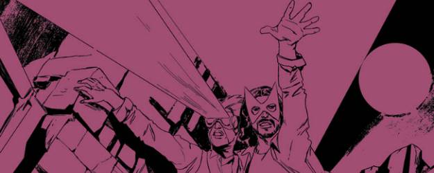
For the podcast promo/cover art, we knew from the start that we wanted something that riffed on a classic cover, with us dropped in as the characters. If you want a really iconic two-character X-Men cover, you're going to end up with one of two obvious choices: X-Men #137, with Cyclops and Marvel Girl's last stand from the Dark Phoenix Saga; and X-Men #141, with Wolverine and Kate Pryde up against the wall. We ended up going with 137 because it's a personal favorite, and because in a lot of ways it's instantly recognizable as the iconic X-Men cover, from the iconic arc. Logistically, we liked that the characters are on more equal footing--and we were pretty tickled by the (accurate) implication that trying to explain the X-Men is a heroically futile gesture on par with going toe-to-toe with the Shi'ar Imperial Guard.

Plus, if you want to get sentimental about it, we're an uptight jerk and a warm, charismatic extrovert (you can work out which is which from the poster) who've been together since we were teenagers: Scott and Jean have always kind of been *our* X-couple.

The thing about X-Men #137 is that its recognizability makes it a difficult image to cover well. John Byrne's art is so iconic that we felt like we needed to move very deliberately away from it style-wise--to find someone who could do a recognizable homage to the original, but in their own voice. As Ming wrote, we've known each other for years. I love her work--her line art in particular is so lush and so definitively hers--and the few times we've gotten to work together, it's been an absolute pleasure, so she seemed like an obvious choice for this, and she was kind enough to squeeze us into her super busy schedule. We e-mailed some about what we were looking for and sent a bunch of reference photos and rough descriptions of how we each dress. (Originally, the only references to the original characters were going to be the pose and the masks; it was Ming's idea to also make our clothes Cyclops blue and Marvel Girl green.) I think we went through three stages on the art--pencils, and then two color iterations.
We couldn't be happier with the way it turned out. Ming took this frankly ridiculous idea and made it into an absolutely awesome piece of art that is, realistically, way cooler than we are--even podcast notwithstanding, this is probably going to be on our holiday cards for the rest of our lives. The only part we'd do differently if we did it again would be to ask Ming to do the line art in traditional media so we could buy it and hang it in our living room.
I think the only major change after was using the ribbon with our names rather than the hand-lettered version Ming had done, both for the cleaner style and as an additional nod to the original design--I should mention, too, that Indigo Kelleigh was the artist who came up with that idea and did the actual design.