The MCU hasn't been afraid to use some popular villains in their movies. While most of them have been nothing more than one-note characters with little bearing on the entire universe, the designs that went behind them are still fairly impressive. Characters like Kaecilius and Iron Monger have some interesting visual queues that make them look interesting. While Marvel has been fairly good with how their villains look, there is always room for improvement. As the creators release concept art for their characters, we get a good look as to what they imagined for their antagonists at one time or another. It's fun to imagine what could've been if different designs won out in the end.
We also have to admit that some of these designs are so darn good that the theatrical versions look uninspired by comparison. There were clearly some choices that Marvel had to make in order to fit the tone of the MCU that resulted in some of the best designs being thrown by the wayside, which is a darn shame. Now we'll be digging through Marvel Studios production history as we dig up 25 insane pieces of MCU villain concept art that will blow your mind.
25 LOKI

Loki is the adopted brother of Thor, the God of Thunder and heir to the throne of Asgard. After Odin assaulted the Frost Giants, there was a baby who was left for dead, as he was smaller than most Giants. Odin took him in as his own and never told him of his true heritage. Unlike his brother, Loki was a much more intelligent fighter, using his magic and illusions to outsmart his foes rather than overpower them. This difference in fighting led to a different style of leadership, which brought him and his brother to blows.
Being the God of Mischief, Loki had to have a design that properly reflected it, which we feel was expertly done in the final film.
However, there were many alternate designs planned for the character that imagined him with much more armor. Considering that Loki is more of a person who plays mind games than one who rushes into battle, the more subtle design of the character is much more fitting. His costume also gets subtle changes as the MCU goes on, and they're all equally good. The only time it might be a bit over-the-top is when he constantly wears that helmet in The Avengers.
24 RED SKULL

Steve Rogers thought he was the strongest man in the world after he was given the Super Soldier serum and turned into Captain America. You could imagine his surprise while rescuing the prisoners of war when he fought Johann Schmidt only to find that he too had been injected with the same serum, albeit with much more disastrous consequences. Schmidt was the leader of HYDRA and incredibly menacing, but he lost his face when taking the serum, which turned him into the biggest threat to Captain America, the Red Skull.
With the help of Hugo Weaving's performance, the Red Skull was a terrifying foe for the Captain to face, but there were other designs in the concept phase that played into his name much more. Lacking pupils, this version of the Red Skull would be much scarier and leave a much bigger impression than the one we saw in Captain America: The First Avenger. While the design is more impressive, it would've felt out of place in the tone of the MCU, as there were no characters in the franchise that were total and complete nightmare fuel. It also allowed Hugo Weaving the opportunity to better express his acting chops.
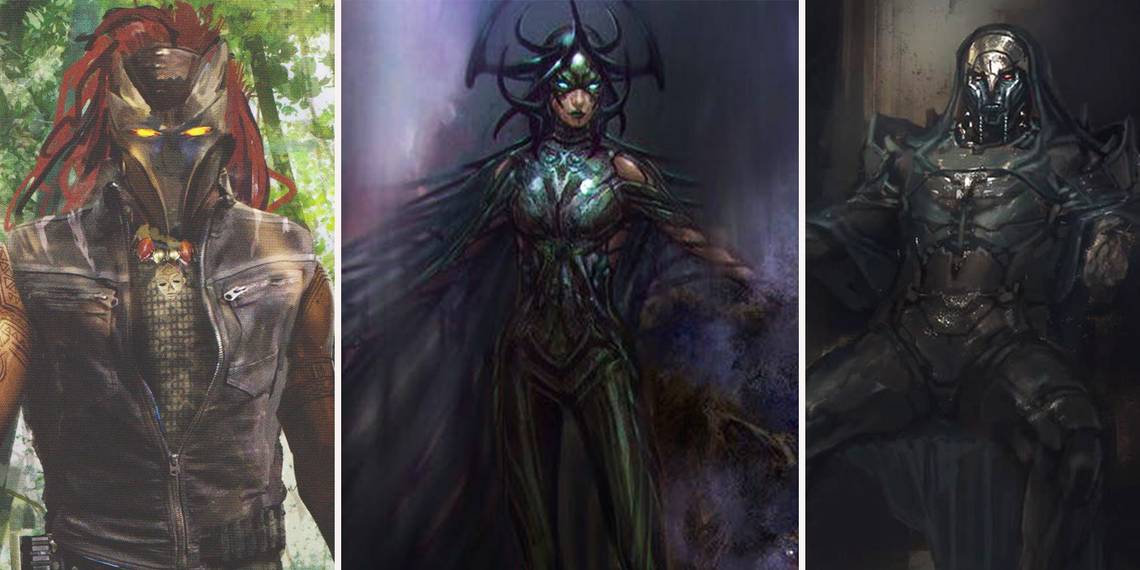
23 CHITAURI

When Loki returned to Earth in The Avengers, he wasn't alone. After having a run-in with the Mad Titan, he was sent to Earth to retrieve the Tesseract and unleash the Chitauri on New York. His actions would then inspire the creation of Earth's Mightiest Heroes, the Avengers. The aliens that came with him to New York were the Chitauri, which were little more than simple cannon fodder. Still, they had a fairly menacing design that helped elevate them from just being regular minions.
Some concept art for the film imagined them as having a much more futuristic look.
The final design was much more bug-like and unrefined. This version saw them as a much more established race. However, this design might've not fit in with the MCU very well, considering all of the high-tech armor. That being said, seeing them be able to stick to the sides of buildings with just their feet is fairly exciting. Either way you look at it, the Chitauri were always going to be an excuse for the Avengers to fight so we can have some cool shots of them working together. They never appeared in future movies until some murderous Thanos flashbacks in Avengers: Infinity War.
22 THE MANDARIN

Iron Man 3 followed Tony Stark as he was reeling from the events of The Avengers. On top of that, Marvel decided to take the opportunity to introduce the billionaire's arch nemesis from the comics: the Mandarin. This time around, he was to be played by Ben Kingsley but still have a terrifying presence that would force Tony Stark to think like he never did in the past. However, many people were disappointed that the Mandarin was just a fake out to allow the real villain, Aldrich Killian, to make his move against Stark and bring his life and company to an end.
While this twist was extremely disheartening (especially considering how much more interesting the Kingsley's Mandarin was to Killian), it seemed that there were some original designs for the character that were going to keep Kingsley as the main antagonist. One concept art featured him in a third-world base with the helmets of soldiers sprung up around him like some sort of demented trophy system. Considering how the final film turned out, we definitely would've liked to see this different take on the Mandarin as opposed to an actor just filling in for someone that's not nearly as cool.
21 IRON MONGER

Iron Man's main antagonist, the Iron Monger, was the MCU's very first villain. Obadiah Stane was the man who helped guide Stark Industries until Tony was old enough to follow in his father's footsteps. Unfortunately for Stark, Stane was a bit of a madman and willing to kill whomever he wanted in order to get ahead in the business world. When Tony developed the Iron Man suit, Stane was a bit jealous and shocked. He wanted that kind of tech that he could sell to the world and become the richest man alive.
His first suit was a variant of the Iron Man Mark I armor and as such, it was a bit rugged and unrefined.
Clearly meant to show that Stane didn't have the same level of technological brilliance as Tony, there was an initial design that showed a much more impressive take on the character. This version of the Iron Monger suit was just as big as it was in the movie, but it looked more complete and futuristic. It also less resembled the Mark I armor than the final version of the movie. We understand the thinking behind changing the design to make it look bigger yet inferior to that of Tony Stark's version.
20 ABOMINATION

The Incredible Hulk is the one MCU film that Marvel wants its audiences to forget (right next to the Thor franchise preceding Thor: Ragnarok). In it, we get our first look at the new version of the Hulk starring Edward Norton and while the green monster is fighting and roaming his way through the world, he gets targeted by Thaddeus Ross and Emil Blonsky. Blonsky stands no match to the Hulk and nearly gets killed as a result. However, he injects himself with the same serum that Banner was exposed to in order to become a more monstrous version of the hero.
Appropriately dubbed the Abomination, Blonsky immediately went to Harlem and picked a fight with the Hulk. While the two were nearly identical in build, there was some concept art that imagined Abomination as much larger. Playing into its name much more, he resembled a monster more than a burnt version of the Hulk. It imagined the villain as a creature that towers over the Hulk, which would've been a testament to the raw strength of Banner's alter ego. Still, it was cool to see the two at the same size so we could get awesome sequences like the car boxing gloves.
19 WHIPLASH

Among the villains in the MCU's first phase, Whiplash is definitely at the bottom of the barrel. Being flat and uninspired, not even Mickey Rourke could save this blandly-written character. His father was a partner to Howard Stark, but deported, bringing dishonor on their entire family. After his father passed away, he heard that Tony Stark announced to the world that he was Iron Man. Because of this, he decided that it would be the perfect time to enact vengeance on the name that brought his to shame and using his intelligence, he got to work.
Whiplash developed a bare-bones suit that allowed him to have electric whips that he could use to cut through just about anything.
At the climax of the film, he would later don a suit much similar to Tony Stark's, just with the added whips. It's clear from the concept art that was always part of the plan for Whiplish, even early on, but this art depicts him still wearing the suit. There isn't much else to say other than this wouldn't have been any better or worse. We're still wondering why Marvel didn't want to use the comic book costume of Whiplash rather than just making him another Iron Man clone with whips.
18 MALEKITH

If you don't remember who Malekith is, then don't feel bad -- he was the main antagonist of Thor: The Dark World. This movie took Thor back to Earth, as well as introducing the Aether, one of the six Infinity Stones, to the MCU. Being one of the most powerful objects in the world, it was heavily sought after by Malekith, the ancient leader of the Dark Elves. Malekith took his Elves, raided Asgard, killed Thor's mother, and kidnapped Jane Foster in order to get the Aether. It says a lot to how boring the character was that he did all that and yet nobody remembers him.
Malekith was a much more menacing character in the comics (in his appearance at least). In some original concept art, it was clear that Marvel were taking some notes from the concept for the Dark Elf's final design. Featuring the dual skin and hair color that he was known for in the source material, he looks a bit more wild and unpredictable. However, they eventually decided to throw that concept out the window in favor of making Malekith look like something a bit more in line with something we would see in The Lord of the Rings with white skin.
17 ARNIM ZOLA

Arnim Zola was the top scientist at HYDRA during World War II. He was the one who helped mass produce the Tesseract weapons for use in the war. However, his life took a turn for the worse following the disappearance of the Red Skull into the Space Stone as well as the surrender of Germany. After the Allies won the war, Arnim Zola was brought into S.H.I.E.L.D. to help their cause under close supervision. Still loyal to Red Skull and HYDRA, Zola helped plant a parasite in the organization where they could bide their time. His consciousness would later be preserved in a computer.
Zola, in the comics, was a much more active person as his consciousness was kept alive.
Instead of being a massive computer, he was a complete robot with a screen where his face would be. Some initial concept art for the character in Captain America: The Winter Soldier showed him in this more active appearance. There are a few different versions of the robotic design, however, Marvel eventually decided that the character would fit more with the movie if he were just a computer. After all, he wasn't planned to return to the franchise.
16 KORATH

When we first meet Star Lord in Guardians of the Galaxy, he's going after a special orb on a distant planet. After he finds it, he is discovered by a group of Kree soldiers, the leader of which is the murderous Korath, who is a gun for hire in the Kree Empire. If you don't remember who he is, Korath is the guy who didn't know who Star-Lord was. He would later join the fight against the Guardians when Ronan tried to destroy Xandar by bringing the Dark Aster to its surface. That said, Korath stood no chance against the Guardians and was destroyed as well.
Being portrayed by a real actor, Korath looks more human than alien. However, there were some original designs that imagined him looking more like how the movies imagined the Kree. This iteration of the character turns him into a massive blue figure. Considering the fact that he was just as tall as a regular man in the movie, this upgrade might've better serviced his presence. The reason that he doesn't quite look like the rest of the Kree is likely because he is part cyborg and has plenty of mechanical parts that aid him in battle. That could get further explanation when he reappears in Captain Marvel.
15 SAKAARANS

Ronan the Accuser wouldn't just use the Kree in his fight against Xandar and the Guardians of the Galaxy. Helping his cause this time around would be a race of aliens known as Sakaarans. Comic readers would better know them as the inhabitants of the planet Sakaar, which would be used in the popular Hulk storyline, "Planet Hulk". Sakaarans would later reappear (in a sense) in the MCU during the events of Thor: Ragnarok.
That said, they look much different in both movies, as the latter doesn't seem to have a reference to the former.
The Sakaarans in Guardians of the Galaxy are bug-like and dark like the Chitauri but more humanoid. From the start, it's clear that Marvel knew what they were going for with these characters. The differences in design came from how their armor looked. This concept art imagined them wearing armor that covered their entire faces and had a little more color than they would have in the final version of the movie. Much like the aforementioned Chitauri, the Sakaarans were always meant to be just another set of soldier for the Guardians to fight together near the climax of the movie.
14 RONAN THE ACCUSER

Ronan the Accuser was easily the most radical member of the Kree Empire. When the Empire and Nova Corps of Xandar decide to sign a peace treaty preventing all war between them, Ronan won't comply easily. Because of this, he begins putting together a plan to get the Power Stone, give it to Thanos, then watch as the Mad Titan destroys Xandar for him. Once he finds out that the Power Stone is, indeed, one of the Infinity Stones, he decides to use it himself in order to blow up the planet, which spawns the forming of the Guardians of the Galaxy.
Ronan's final design in the movie was dark and had some bright blues, which fit in with the color palette of the villains in that movie. That said, early versions of the character imagined him looking more like an imposing ruler (much like how he did in the comics). Instead of having a regular headdress, Ronan would be given an actual helmet. He would also have a long cape that would drape down his throne as he sat. This take on the character might've made him more memorable than the one in the movie. Still, Marvel has a chance to redeem him in Captain Marvel.
13 ULTRON

When Marvel announced that the second Avengers film would be bringing in Ultron, one of the most infamous foes that Earth's Mightiest Heroes faced in the comics, everyone in the world was losing their minds. There was talk of Avengers: Age of Ultron being the darkest movie the MCU ever put out, especially when considering how haunting that first trailer was. He was also being voiced by James Spader, meaning that all of the pieces were there for an extremely memorable villain.
Unfortunately, he ended up being little more than a bad guy who kept telling jokes through the entire movie, disappointing fans everywhere.
His design was fine, but there was potential for it to be much more fitting for the hype surrounding the character. There were a few older designs for Ultron. Some of them imagined him as much more futuristic, but the one that gets us excited the most is the one where he has six arms, perfectly encompassing the evolution of the character and how terrifying of a villain he is in the comics. Had this version showed up in the final version of the film without the jokes, he might've been more terrifying and even more memorable.
12 YELLOWJACKET

Darren Cross was a student of Hank Pym. Long after the latter developed the Pym Particle and became the Ant-Man, Darren wanted a piece of that action. Unfortunately, Hank saw too much of himself in Darren and decided to shut him out permanently from the formula of the Pym Particle. This sent Cross on the path to becoming a villain. He managed to vote Hank off of the board at his own company and became the CEO. He also unlocked the secret to the Ant-Man suit and developed a suit designed for war known as the Yellowjacket suit.
Early designs for the Yellowjacket suit played more into the tech side of the character rather than the bug side. He was always going to have those robotic tendrils that shot lasers out of them, but its in the look of the suit where things were changed a lot. Many of the early designs imagined him having some blue accents and a more tech-heavy helmet. However, the final version of the character did away with all of that. Wanting to play around with the name much more, Yellowjacket looked more like a bug than a technologically enhanced bad guy, which was arguably the smarter approach.
11 HELMUT ZEMO

The third Captain America movie was always planned to be big, and it wasn't long before Marvel announced that it would actually be titled Captain America: Civil War. This film was going to take Iron Man and Captain America and put them at odds with each other when the Sokovia Accords are introduced to have them operate only under the authority of the United Nations. However, there was one person in the background pulling the strings to ensure that the Avengers would tear themselves apart and go into Avengers: Infinity War divided and not on speaking terms: Helmut Zemo.
This character is based on Baron Zemo from the comics, but he looks nothing like the character.
Early designs for Zemo imagined him closer to his comic counterpart, wearing the trademark purple hood. However, it seemed as if Marvel never intended him to be the HYDRA villain that we all knew him to be, let alone wielding a sword. Instead, their interpretation of Zemo made him a much more personal character as he explained that the actions of the Avengers inadvertently caused the deaths of his family in Avengers: Age of Ultron. For that version, it definitely makes more sense to ditch the purple hood.
10 KAECILIUS

Kaecilius was a student of the Ancient One who was strong enough to become the next Sorcerer Supreme. However, he let the power go to his head and had problems with a lot of the hypocrisy that went on in that building. Because of this, he left the realm of the Ancient One and decided to instead harness power from the Dark Dimension. The more power he used, the more he went into service of the evil Dormammu. He also began to have some wicked eye designs as the corruption from the Dark Dimension transformed him even more.
Looking at the concept art and final design of Kaecilius, Marvel had a vision and stuck with it. The character was always meant to have garb similar to what the magic users wore as well as the creepy eye designs. However, this piece of art imagines a much more ethereal look to his eyes. It goes a long way to explain the sorcery behind the Dark Dimension as well as the consequences of drawing power from that realm. While Kaecilius was never that interesting of a villain (which is a travesty concerning he is played by Mads Mikkelsen), his design was quite impressive.
9 DORMAMMU

Dormammu is the ruler of the Dark Dimension and one of the strongest beings in the MCU. During Doctor Strange, he was the one supplying power to those who tapped into his own dimension. Kaecilius's final plan was to open a portal there and allow Dormammu to come to Earth and rule it for himself. It's a true testament of Dormammu's power that Doctor Strange wasn't able to defeat him with power alone. The only reason he got Dormammu to leave the Earth was because he got the villain stuck in an inescapable loop with the usage of the Eye of Agamotto.
The Dark Dimension is an extremely weird location, so it makes sense that Dormammu would be more abstract to fit the look of it.
However, Marvel was extremely creative when they worked on designing Dormammu. There were several designs that imagine him more like his fire demon look in the comics (although still missing most of his body). One of our favorites happens to be this one where he looks like a living volcano that towers over Doctor Strange. A shot that looked like that would certainly have been worth the wait to see Dormammu's big screen debut. The final version is good, but the potential with Dormammu is so much greater.
8 THE WINTER SOLDIER

Although loved by fans of the MCU now, James Buchanan "Bucky" Barnes re-entered Captain America's life as one of his most fearsome foes. After plunging to his apparent death in Captain America: The First Avenger, Cap's best friend was considered lost having died valiantly in combat. However, just as Cap and the rest of the MCU was going through a major betrayal as it turned out HYDRA was secretly dormant within the ranks of S.H.I.E.L.D., Bucky returned as the Winter Soldier with a new metal arm and a brand new mission, one that included going through Captain America and his allies. Thankfully, in the end, Bucky was restored to his former self and now fights on the side of the good guys.
Early concept art shows a slightly different look for the Winter Soldier. With shorter hair (something he would end up having in the comic books) and a scarf over his face instead of the really cool mask and googles he wore during The Winter Soldier, this version of Bucky looks like a more realistic soldier of fortune than what appears in the movie. But we're glad that the MCU ended up going with the look that they did, as the mask really gives off a much more sinister vibe than the face scarf.
7 AYESHA

After the fairly bland Kree villains in Guardians of the Galaxy, Marvel was ready to go all-out with the franchise in Guardians of the Galaxy Vol. 2. This time, there were two main bad guys for the team to content with. One of them was Ayehsa, ruler of the Sovereign. She was a major uptight leader who had a penchant for pride and making sure that those who wronged her were immediately destroyed. Every member of her race paid their respects to her, but that didn't stop her from being extremely annoying. She was willing to do whatever it took to bring the Guardians to their end, even if it meant having dealings with Ravagers.
Her gold design was striking when she debuted in the movie, and Marvel seemed to always have that vision in mind when adapting her to the big screen.
However, there were versions of Ayesha that made her much more majestic than in the final movie. This piece of concept art gives her a massive headdress and an extremely long dress that would have to be held by several of her subjects. That's a creative look, indeed, but it probably wouldn't have fit the more comedic tone of the Guardians franchise.
6 EGO THE LIVING PLANET

After the first Guardians of the Galaxy, many people were questioning who Star-Lord's father was. Apparently, that became the main focus of Guardians of the Galaxy Vol 2. This time, though Marvel decided to do something a bit differently than the comics. Star-Lord's father in the MCU was Ego the Living Planet. Ego, after searching for many years, heard the stories of the outlaw called Star-Lord, who wielded an Infinity Stone, and knew it had to be his son. Because of this, he went searching for the Guardians of the Galaxy and tried to bring his son home.
Being played by Kurt Russell, it makes sense that Ego would be depicted as an old, traveling man where the audience could see his recognizable face. Considering that he was being based on an entire planet, though, there had to be some creative liberties taken with his design. One piece of concept art imagines him as a mysterious alien-like being who was connected to the planet with various tendrils. While that would've been a great design, it would've taken away the personal touch brought out by Ego as he looks more like a man. It makes him easier to hate.