The third phase of the Marvel Cinematic Universe delivered a lot of changes to the status quo. It was the phase where the most major crossovers occurred and changed the direction of the MCU forever. The looks of the films were undeniably cool and there were some truly amazing shots, costumes, and set pieces. None of those would have been possible without the hard work of the dedicated concept artists putting in the time to make the visions of these heroes confronting one another come to life. It all starts on the canvas at Marvel, and for a production company that makes movies based on comic book superheroes, that's definitely a good place to start. Concept art is an important piece of the filmmaking process, giving the directors and producers a more detailed look at how the film might turn out than a standard set of storyboards might.
The third phase of the MCU was full of new ideas, heroes, villains, and settings to conceptualize, and these artists took those ideas and ran with them. Some of these pieces of concept art ended up greatly influencing the look of their films. Others were pretty imaginative in concept, but didn't make it into the final film, leaving us to wonder what the films might have been like had they followed these looks more closely. Whether or not they had any influence on the final looks of the film, these 20 pieces of concept art from Phase Three of the MCU are pretty incredible.
20 ANT-MAN VS SPIDER-MAN

The battle at the airport in Captain America: Civil War was a turning point for the MCU. Until then, the most heroes that had appeared on-screen was in Avengers: Age of Ultron. This was the film that famously introduced Spider-Man to the MCU, and the debut was one that had people talking. Some of his best scenes started in concept art, like this piece by Andy Park.
Not only did this version of Peter Parker fit in perfectly with the rest of the world, but he added a new element to the fight that might not have been captured otherwise. His use of the strategy from Empire Strikes Back to bring down Giant-Man was as memorable as it was effective in battle.
19 ANT-MAN RIDING THE ARROW

Yet another scene that fans were delighted to see take place in Civil War was the shot of Ant-Man riding Hawkeye's arrow into battle. It was a frame that came straight out of the comics, and it was captured perfectly in the film. However, the shot started in this concept art piece by Andy Park.
Park plays an important role in the creation of Marvel films, having worked for the studio since phase one when he worked as a concept artist on Captain America: The First Avenger. It was probably pretty rewarding for Park to see the entire Captain America story come full circle through his artwork.
18 A VERY DIFFERENT EGO

Guardians of the Galaxy Vol. 2 introduced Ego into the fold of the MCU, and what audiences saw on-screen turned out to be a far more down to Earth and ultimately human version of the living planet. It probably was for the best, as Kurt Russell's portrayal of the villain was far more in line with the feel of the Guardians films.
However, the early concept art for Ego was far more ostentatious and grand, depicting the living planet as something more akin to an ancient god. This concept art by Jerad Merantz almost seems like it would fit more in the Alien series of films, particularly in the late stages of films like Prometheus and Alien: Covenant.
17 ALTERNATE BLACK PANTHER DESIGN

Sometimes you have to be thankful when a certain design doesn't make it into the movie. That's what drawing concept art is all about, testing every kind of possible look to see what works best, and what's best left in the artist's studio. In this case, audiences should be glad that the Black Panther design that wound up in Captain America: Civil War was not this one.
This particular design by concept artist Jerad Merantz almost seems like it was inspired by Batman's cowl. the open mouth section and the revealed eyes underneath recall Batman masks from the films of the past. Luckily, this design is not what ended up in the final film, but it's an ambitious design nonetheless.
16 ALTERNATE MANTIS DESIGN

The addition of Mantis to the MCU was a great choice. She became a valuable member of the Guardians of the Galaxy, and even formed a special bond with Drax the Destroyer, learning about his pain and loss through her empathic powers. Pom Klementieff did a great job playing Mantis, and her look was done perfectly on film.
While Mantis appeared in the film with a much more human look, in spite of her antennae and black eyes, she looked much different in early concept art. Concept artist Andy Park imagined Mantis as having a much more insect-like look, with more segmented antennae and a rougher texture, as well as a more alien color, on her skin.
15 ALTERNATE HELA DESIGN

Cate Blanchett's portrayal of Hela in Thor: Ragnarok was vampy and delightfully evil. Her look just screamed "villain," and it seemed to draw inspiration from old Disney cartoons, particularly Maleficent from Sleeping Beauty. It all started in the concept art, though, and her look didn't seem to change much from there.
This concept art from artist Andy Park nailed down the look of Hela right from the beginning. It's not too different form the look that was used in the film, although there may have been slightly more green accents added to the final costume, perhaps to have it pop more in the colorful film.
14 T'CHAKA IN THE BLACK PANTHER SUIT

Before T'Chala took over the mantle of Black Panther, his father, T'Chaka, was the protector of Wakanda. Audiences were treated to a glimpse of the early Black Panther in the film, but this concept art shows that the original Black Panther suit was somewhat more of a regal affair, complete with a cape and jewellery.
This original design was conceived and draw by concept artist Andy Park for the Black Panther film. Park said that this version of T'Chaka's suit was drawn more in the style of Black Panther's early comic book appearances, but ultimately director Ryan Coogler picked one of his earlier designs.
13 ALTERNATE HAWKEYE DESIGN

Hawkeye has been absent from a lot of the Phase Three films, and his absence was particularly noted in Avengers: Infinity War. However, he did appear prominently in Captain America: Civil War, where he was an essential part of the team fighting against the Sokovia Accords.
This version of the Hawkeye suit, again drawn by concept artist Andy Park, was conceived as being more of a stealth look, as the filmmakers weren't sure if that was the look they wanted to capture in the film. Park wrote that he based this look on Hawkeye's Ultimates suit. It will be interesting to see if Hawkeye's look hews closer to something like this when he finally turns up in Avengers 4.
12 ALTERNATE DOCTOR STRANGE DESIGN

Doctor Strange felt like a completely different Marvel film than many of the ones that came before it. It was the cornerstone of linking the cosmic parts of the MCU with Earth, and Benedict Cumberbatch performed very well as the surgeon who would fall from grace and eventually become a savior of Earth.
Doctor Strange's look in the film seemed to match pretty closely with his appearance in the comics, complete with the high collar and Eye of Agamotto. In early concept art by Andy Park, however, the Doctor was given a much more streamlined look that actually seems to fit much more closely with the MCU's aesthetic.
11 ALTERNATE DORMAMMU DESIGN

One of the more amazing aspects of Doctor Strange was how it introduced one of the most powerful beings in the entire Marvel canon to the MCU. That would be the massively powerful cosmic being Dormammu, who appeared in the film as almost being entirely comprised of galactic energy.
However, in early concept art by Andy Park, Dormammu went through many different variations of how he would look in the finished film. Some of the earliest concepts had Dormammu taking on more of a godlike form. Park wrote on Instagram that he completed this initial Dormammu piece during a 30-minute blast design session.
10 ALTERNATE SPIDER-MAN DESIGN

When Spider-Man first appeared in Captain America: Civil War, audiences were finally given the chance to see the webhead fight alongside all of their other Marvel favorites, and he has since become an important part of the overall cinematic universe. Even though he ended up in a modified version of the classic red and blue suit, there were many variations on the Spider-Man suit in early concept art.
This piece, drawn by artist Ryan Meinerding, was part of a series of passes on the Spider suit that would eventually appear in the finished film. This particular look was based on the Superior Spider-Man drawn by Humberto Ramos.
9 SPIDER-MAN TAKING A BREAK

Sometimes its really rewarding to see a piece of concept art that actually had a really direct influence on the finished film, and such is the case with this keyframe art drawn by Ryan Meinerding for Spider-Man: Homecoming. This small moment of Spidey sitting on a fire escape and taking a break became part of the first sequence of Spider-Man in action.
This is the kind of shot that comes directly from the comics. If there was one thing that Spider-Man: Homecoming got right about Spider-Man, it was the fact that sometimes he just needs to stop and eat a sandwich (with extra pickles, and pressed down really flat). The mask staying over his eyes was also a nice touch from comic book art.
8 ALTERNATE DESIGN FOR THE ORIGINAL SPIDER-SUIT

Spider-Man: Homecoming managed to draw a lot of inspiration from throughout Spider-Man history. One of the small things that made it into the film was the look of Peter's early spider suit. The blue sleeveless hoodie over the red shirt and the totally red hood drew its inspiration from the Scarlet Spider.
Ryan Meinerding drew this concept art as a test for how Spider-Man's original suit might look, and while much of it stayed the same in the film, there were some obvious changes. One of the biggest was obviously the eyes, which rather than being part of the hood, were a pair of early modified goggles stuck through cut out holes.
7 ALTERNATE LOOK FOR THE HULK

MCU fans finally got to catch up with the Hulk when he finally reappeared in Thor: Ragnarok. The storyline of the Hulk working as a gladiatorial entertainer on Sakaar was clearly inspired by "Planet Hulk", and his look in the film ultimately ended up being pretty much standard for what viewers would expect of the Hulk.
However, artist Ryan Meinerding actually took several passes at the Hulk's hair and facial hair. This look would have been fun to see in the film, as it's not often that you get to see a bearded and long haired Hulk (plus there would have been opportunity for some hair jokes between Thor and the big green guy).
6 THOR AND HULK IN THE ARENA

When Thor finally reunites with Hulk in the arena in Thor: Ragnarok, it's fair to say that it was a pretty big moment. The absolute joy that Chris Hemsworth brought to the scene made it absolutely hilarious, and then having it undercut with the fact that Hulk was just going to fight him anyway was just icing on the cake.
However, the meeting could have been much more touching, as depicted in this concept art by Ryan Meinerding. Meinerding notes that this keyframe art was drawn before there was any indication on costumes or the actual setting of Sakaar. This early work shows a much more classic coliseum look for the arena, as well as more traditional gladiatorial armor for both fighters.
5 EARLY WAR RHINO CONCEPT

One of the coolest parts of Black Panther was the battle between the Wakandan tribes that kicked off the third act of the film, and one of the coolest parts of that battle were the war rhinos. These amazingly tough beasts were given an appearance that kept them fairly realistic, but also beefed them up a bit for the finished film.
Texture artist Tristan Rettich designed these textures for the war rhinos that eventually made it into the final film. Accenting the rough rhino hide are the tribal markings that give the rhinos a more war-like appearance. In addition, the armor plating made the rhinos look more like wild animals crossed with actual military artillery.
4 EARLY JABARI HOMELAND CONCEPT

One of the most surprising aspects of Black Panther was how unique each of the separate tribes were in their own way. Right away, the tribe that seemed to stand out the most was the Jabari, led by M'Baku. Their homeland, set in the mountains, was designed to reflect their environment outside of the main city.
Concept artist Till Nowak designed Jabari Land to be in direct contrast to the rest of Wakanda, telling WePresent "While the city has more round shapes and is made of stone, mud and vibranium, the Jabari Land has more straight lines, sharper geometrical shapes and is made of wood."
3 THE GRANDMASTER'S CHAMBERS CONCEPT

Till Nowak also drew early concept designs for some of the environments in Thor: Ragnarok. One of the settings he conceptualized was the Grandmaster's chambers, which in the film ended up looking like a constant party, filled with the residents of Sakaar as well as the Grandmaster's henchmen.
However, Till Nowak's early design took a very different approach to how the chambers would look, giving it more of a sparse, and almost Kubrickian emptiness and cleanliness. The lines of the chamber in this concept art also clearly draw the viewer's attention straight to the Grandmaster whose position, much like it is on the entire planet of Sakaar, is right in the middle of everything.
2 SURTUR CAUSING RAGNAROK

One of the biggest moments in the entirety of Phase Three is the destruction of Asgard by Surtur at the end of Thor: Ragnarok. Of course, it was an essential evil, as it was the only way to defeat Hela. The destruction of Asgard is a huge spectacle, and is given the treatment it deserves in the final film.
However, on the way there, concept artist Daren Horley designed an initial look of Surtur that showed him as less of a being made of flame and more of a traditional demon with glowing skin. This piece of concept art almost looks like it could be a classical work depicting the devil, rather than something that went into an MCU film.
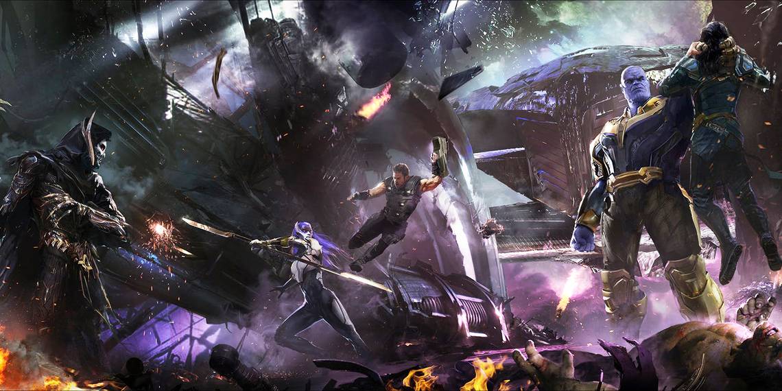
1 THANOS ON THE ARK

The sequence aboard the Ark that opens Avengers: Infinity War was surprising for a few reasons, one of them being the end of Heimdall and Loki. however, it was also the audience's formal introduction to Thanos and the Black Order. In this scene, Thanos displayed his immense strength and willingness to do anything to retrieve the Infinity Stones.
In this piece of concept art created by artist Pete Thompson, it's clear to see that the idea of the Ark being thrown into complete chaos right at the beginning of the film was there all along, with Thor going into battle against Proxima Midnight and Thanos gripping Loki by the skull.