Comics and comic characters sometimes get a bad rap for changing very little over the years. That is, various creators and creative decisions often mean that a big reset button is hit that returns these characters to their roots. And while Marvel Comics has not been completely immune to this, one of the great strengths of its various series is that we see lots of change, ranging from team line-ups to costumes. That’s something that the Marvel Cinematic Universe has really taken to heart, too. We get lots of major changes to things like the lineup of the Avengers, but we also get a new look for most major characters in seemingly every film. This helps to keep things fresh for everyone from casual fan to hardcore fanatics.
However, there’s an open secret when it comes to these MCU redesigns: some of them are better than others. There are a few redesigns that are so good that it makes you completely forget how the character used to look. And there are some so bad that you spend the entire movie wondering just what the creative team was thinking. Don’t believe us? Just keep scrolling to check out the best and worst MCU costume changes over the course of the past decade of movies.
WARNING: Spoilers for Avengers: Infinity War ahead.
15 LIKE: HULK

When you think of elaborate Marvel costumes, chances are that Hulk is the last guy that you think about. This is because his most iconic outfit is arguably the one where he wears the same pair of ratty purple shorts, year after year. Because of this, most of the improvements in Hulk’s look have come from improvements to the CGI that helps bring Hulk to life. However, in Thor: Ragnarok, we got an absolutely awesome new Hulk costume, and one that paid tribute to one of his greatest comic book stories of all-time.
In the movie, Thor is told that he must face off against the Grandmaster’s champion. And as it turns out, this champion is The Hulk, who has been happily fighting on this planet every since he accidentally landed there. When we see Hulk, he has a costume worthy of a gladiatorial champion, complete with intimidating armor and helmet -- he looks as much like a man out of time as a man out of place. Hardcore Hulk fans know this look is an homage to what the character wore when he played a similar role early on in the "Planet Hulk" storyline. While we’ll never get a big screen version of that story, we’re happy to have seen the cool outfit!
14 DON'T LIKE: CAPTAIN AMERICA

Captain America is often presented as the glue that holds the Avengers together. As a man who wakes up many decades in the future, Captain America is someone steadfastly holding onto the virtues of yesteryear, and this is useful when his team of Avengers takes on greater and greater threats. However, we really wish he could have held onto the outfit of yesteryear, too, for a pretty simple reason: Cap’s outfit in the first Avengers movie is downright atrocious, although you may not notice it until he has the mask on.
Back in Captain America: The First Avenger, the movie did the impossible: it took Captain America’s goofy red, white, and blue outfit and made it seem both realistic and rugged. That’s because his look was a deliberate cross between his patriotic attire and traditional army gear. To top it off, he had a realistic chinstrap that made the helmet look more realistic and helped define Evans’ impressive jawline. Flash forward to the 2012 Avengers movie, though, and he has a more comics accurate look that is pretty bad, as the costume looks cartoonish and unrealistic and the mask makes his face look downright jowly. Fortunately, later movies would rectify this mistake!
13 LIKE: SCARLET WITCH

If you’re handing out “most improved costume” awards, then it’s hard not to give one to the Scarlet Witch right away. She has come a long way since her look in Avengers: Age of Ultron, but to be fair, she wasn’t wearing an actual costume in that movie. Rather, her outfit looked like exactly what it was: a stylish red jacket over a simple black dress. Part of the plot of that movie was her defection to the Avengers, and it looks like this defection came with a nice costume upgrade.
While it’s still nowhere near as elaborate (nor as silly) as her traditional outfit from the comics, Scarlet Witch gets a fun upgrade whose complexity represents the growing complexity of her powers. She now has a more stylized red trenchcoat rather than a simple red jacket, and it’s worn over a red corset. Along with her eyes, which periodically glow red, the corset helps sell the idea that Scarlet Witch is a force unto herself as she draws upon ancient magics. In the comics, she eventually became powerful enough to rewrite all of reality, and if she gets that way in the MCU, then we wonder if there’s another costume change around the corner.
12 DON'T LIKE: IRON PATRIOT

Hands down, one of the worst costume changes in the entire Marvel Cinematic Universe concerned the “Iron Patriot.” If you skipped out on Iron Man 3, you might be asking, “who the hell is that?” The story is that Iron Man’s buddy War Machine had a name that sounded a bit scary to government and military officials. Since he was operating in the name of America, they decided to give him a new paint job and name him “Iron Patriot” instead. Pretty much no one is thrilled by the change, and when we see him again in Civil War, he’s back to his old name and colors.
For comics fans, there is a bit of a story behind this “new” look. It actually comes from an old storyline in which Norman Osborn (better known as the Green Goblin) comes back seemingly from the dead and takes control of S.H.I.E.L.D. during a time of turmoil. He has access to some of Iron Man’s tech and decides to wear this piece of armor, calling himself “The Iron Patriot” so people would look beyond his villainous past. Fortunately, he was defeated and jailed, meaning you don’t have to see this ugly redesign on any screens or inside any panels.
11 LIKE: IRON MAN

Iron Man kicked off our Marvel Cinematic Universe way back in 2008, and it’s difficult to imagine now, but at the time, there was a lot of fan concern about how well the big screen could really portray the larger-than-life character of Tony Stark. Obviously, Robert Downey, Jr., knocked it out of the park, and the various directors and writers have really managed to capture the spirit of the comic character. And nowhere is this more apparent than when we see his countless costume changes.
Tony openly refers to himself as a “tinkerer,” and he is seemingly never finished coming up with new Iron Man designs. Because of this, there is a lot of fan debate over which redesigns are hits and which are duds. However, one redesign we can all agree is pretty damn cool is the Hulkbuster outfit. This debuted back in Age of Ultron and was seen again in Infinity War, and it’s a suit that lives up to its name: this is Tony’s attempt to build something big enough and strong enough to take on an angry Hulk. We ended up loving this design, and we hope to see it in many more Marvel movies down the line.
10 DON'T LIKE: HAWKEYE

It feels a little bad to bust on Hawkeye. After all, he already gets a lot of flak for being the weakest Avenger -- he is, after all, just a man, standing next to super-enhanced humans, gods and monstrous beings. And his choice of weapon is weirder than ever: even in a world of comic book logic, it’s odd to see arrows taking on lasers. We ultimately developed a lot of respect for this character based on his scrappy resourcefulness, but the blunt truth is that he really needs a better tailor.
In the first Avengers movie, Hawkeye has a form-fitting S.H.I.E.L.D. outfit that leaves his arms free and generally gives a lot of freedom of movement for the various acrobatic stunts he gets caught doing. In Age of Ultron, his new outfit is basically a long, zipped-up trenchcoat in similar colors. When you think about it, the new design is terrible: his covered arms will encounter more friction when he’s reaching for his arrows, and his covered legs (and generally bulkier outfit) will make it harder to run. In short, this new design takes the two things he is actually very good at and makes it harder to do either of those two things.
9 LIKE: BLACK WIDOW

It may be difficult for younger fans to remember, but Black Widow’s appearance in Iron Man 2 was one of our first clues that the MCU was committed to growing much larger. We had already had the awesome Nick Fury cameo, but he appeared more fully in this movie, as did the fan favorite Black Widow. She was undercover at first, so we didn’t really see her Black Widow ensemble until near the end of the movie, when she helped investigate Justin Hammer’s latest plot. And if we’re being honest, the look wasn’t all that impressive.
Her newer look in the Avengers movie provides some much-needed updates to this old look. For instance, the black leather outfit seems more in line with her comic appearances, and her symbol seems more prominent, while offering a welcome splash of color. Her utility belt seems to match her ensemble a bit better, and in our humble opinion, her hair looks much better in terms of color and style. As befitting a spy character, she would change her looks multiple times (most recently showing up as a blonde in Avengers: Infinity War), but to us, this remains the most accurate recreation of her most iconic comic book appearance.
8 DON'T LIKE: DAREDEVIL

As a show, Daredevil on Netflix did the impossible. It managed to target an entirely different audience and use an entirely different tone than the MCU movies it was housed in, but the show ended up creating quality drama that was very fitting for adults (as opposed to the kid-friendly big screen stuff). The first season was basically a “Daredevil: Year One” kind of thing, complete with an outfit that was much simpler than his most famous comic book design. Unexpectedly, though, fan reaction was nearly unanimous when we saw the new design: bring back the old one.
The first season shows us a character whose “costume” is impressively simple: it’s really just a black suit and a mask covering the upper portion of his face. It looked great on-screen and also helped to sell the character as someone who didn’t care about the pomp and circumstance of a fancy outfit. That all changed when he got the more iconic “red devil” outfit, and that’s when we were confronted with the uncomfortable truth that some comic book designs are always going to look goofy in real life, and this was one of them. One scene with these red horns and you’ll be begging for that old ninja look back.
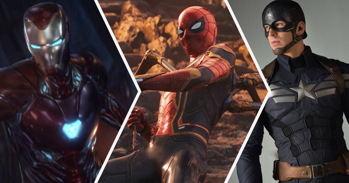
7 LIKE: CAPTAIN AMERICA

There are many different things that can prompt a costume change for heroes and villains. One cynical reason is to sell action figures, as having countless variants of different characters means fans are likelier to buy more and more merchandise. Our favorite reasons, though, are thematic -- we like it when a costume change reflects a change in the character and their overall story. That’s one of the reasons that we love Captain America’s new look in Winter Soldier and its serious upgrade over the goofier appearance in Avengers. The first thing you’ll notice about the new outfit is that it’s a lot darker. The in-movie explanation for this is that this is the uniform Cap is wearing on a stealth mission near the beginning of the film.
However, it is also symbolically appropriate of a movie that explores the darkness hidden inside well-intentioned organizations such as S.H.I.E.L.D. And the outfit also adds some subtle lines to help define Evans’ impressive figure, ranging from the horizontal lines across his chest to the ones outlining his abs. Overall, this costume pulls double duty by helping to sell Captain America to us as this comic book hero brought to life while also selling the idea of a man who is questioning how heroism is truly defined.
6 DON'T LIKE: RED SKULL

As we have said before, there was no one more surprising to see in Avengers: Infinity War than Red Skull. We had previously seen him consumed by the Cosmic Cube (better known now as the Tesseract), and many thought the character was gone forever. Instead, he shows up on a distant planet to offer words of both guidance and warning to Thanos as the Mad Titan quests for the Infinity Stones. Once you get over the shock of seeing Red Skull, though, you’re left with an undeniable truth: his new costume really sucks.
Basically, Red Skull looks like he is cosplaying as the Grim Reaper here, as the new “costume” is just black robes and a hood, which complements his freaky new ability to now float as easily as he can walk. Again, once the excitement wears off, it’s tough not to compare his old look and his new one. His old look echoed the uncomfortable fact that Nazi designs were pretty stylish, and he had form-fitting leather that helped to frame his ghoulish face. The new look makes him look ghostly and vaguely defined, and we’re willing to bet money that the role was designed for another character and Red Skull was substituted in at the last second.
5 LIKE: GROOT

The truest sign of an iconic character redesign is when fans basically forget about the old one and in the Marvel Cinematic Universe, the character that best represents this idea is Groot from the Guardians of the Galaxy. When we first see Groot, he is actually the largest Guardian and a physical threat to anyone that gets in his way. However, he uses his unique powers to help protect the rest of the team, and this act basically costs him his life. Fortunately, Rocket Raccoon is able to rescue a twig and help to grow a whole new Groot. And, strictly speaking, it really is a whole new Groot, as this new team member is more akin to Groot’s son as opposed to being Groot reborn.
The new design was a smash hit. “Baby Groot” is now a full and complete character unto himself, whether he’s running around naked or rocking an adorably miniaturized Ravager jacket. This is basically the redesign that launched a thousand new toys, and it is telling that fans still care more about this miniature Groot than they care about the surly teenager that we see in Infinity War. We’re interested in seeing if Groot eventually goes back to square one and looks like he originally did.
4 DON'T LIKE: IRON MAN

As we said earlier, it’s a key component of Tony Stark’s character that he is constantly redesigning his Iron Man suits. Because his “powers” are based in technology, they also have unlimited potential -- if he’s got the time, the tools, and the know-how, he can make every single suit more powerful than the one before it. However, more powerful doesn’t always translate to better looking, and some of these designs are just plain uglier than others, and it hurts our hearts to say that the Infinity War redesign is near the bottom of our list.
And to be fair to the actual designers behind the movie, our problem with this has as much to do with the animation as it does the actual design. In this movie, Iron Man is finally rocking the kind of technology his comics incarnation has enjoyed for years. Specifically, he now carries the armor with him and can put it on at will instead of having to go somewhere else and change. However, the armor looks way too cartoonish for our taste when it goes on Tony Stark -- unlike the Hulk and Thanos CGI which looks great -- these scenes make us think we’re just looking at something animated.
3 LIKE: THOR

When you get down to it, Thor is a very difficult character to try to capture on-screen. He is already a copy of a copy, with Marvel Comics doing its best to create an exciting adaptation of a Norse legend. Now, the MCU must bring that comics version to life in an exciting way. And while they arguably did a good job for Thor’s first movie appearances, we had no idea what we were missing until this Asgardian warrior got an entire makeover in Thor: Ragnarok. Now, it’s almost impossible to see Thor in any other way.
It all starts with the haircut. Instead of having those long locks of love, Thor now has short hair that we can only imagine is a lot safer to take into battle. He also has ditched the armor protecting his arms, which gives the character more freedom of movement while also showing off Hemsworth’s impressive muscles. Finally, he ditches most of the cape (it would only slow him down in the arena) and slaps on some pretty awesome warpaint. There’s no other way to put it: this is an entirely new Thor, and we were grateful to still see mostly the same look when Infinity War rolled around!
2 DON'T LIKE: THANOS

Part of what made Avengers: Infinity War feel so special was that it was such a long time coming. The film culminated ten years of Marvel Cinematic Universe storytelling and beyond that, it gave us the big bad guy that these movies had been building upto with Thanos. However, a lot about the Thanos design has changed over the years. And if we’re being completely honest, the Thanos that we get in Infinity War looks pretty bad compared to his other appearances, and no amount of top flight CGI can cover up the flaws in his design.
When we first see Thanos, he is covered head to toe in impressive armor. Even if you know nothing about the wider Marvel Comics universe, one look at this guy tells you what a threat he is. However, Thanos spends most of Infinity War with his armor and his helmet off. While this may have been a creative decision to try to “humanize” the mysterious bad guy, it also ensured that Thanos would be at the heart of a million silly memes. After all, he now looks more like a random purple bald dude than he looks like a cosmic threat, and it’s tough to not laugh at how silly he looks.
1 LIKE: SPIDER-MAN

It feels like we just got Spider-Man in the Marvel Cinematic Universe just the other day. Nonetheless, he’s been in three movies so far, and we’ve already got an upgrade to his appearance. And it really was an upgrade, as Tony Stark’s “Iron Spider” outfit was originally intended as an homage to a similar suit in the comics. However, that comic look completely changed the colors of Spider-Man, making him look very alien. In Infinity War, we see that the new suit manages to give Spidey a hot new look without sacrificing the things we liked about the old design.
For instance, Spidey still has his iconic white eyes, but they can now glow like Iron Man’s eyes do when the suit is on. And he is still rocking his iconic red and blue look, but but the stylish pattern of red and blue on his outfit looks much more evocative of a circuit, helping remind us that this is a suit designed by Tony Stark, complete with all the bells and whistles. Finally, the most iconic part of the original “Iron Spider” comic design, those extra arms, only come out when they are needed, meaning Spidey gets a cool new feature without really disrupting his classic look.