GLOBAL FREQUENCY: THE ISSUE THAT WENT ASTRAY

I have to be honest with you: I can't even make sense of Brian Wood's cover. It's not the fighting instruction images along the top and bottom, but I can't figure out what's going on in the middle there. I can see the series logo, but what is it attached to? Is that on someone's cheek?
"Global Frequency" #10 stands out in the series as the misfire issue. In the story, two guys fight tooth and nail, almost literally. There's an issue of "biowar" involved and some government duplicity, but the bulk of the issue is two guys engaged in hand to hand fighting, ending with the good guy ripping the arm off the bad guy and stuffing it in the bad guy's mouth.
Yikes.
Tomm Coker's art is the source of the misfire. It is very difficult to follow what is a very simple set-up: Two guys in a deserted building fight. Yes, they're under a sickly green light that doesn't fill every room up, but even then the artist should pick the shadows to aid legibility. Coker leaves too much in the dark. You can't tell, half the time, who is who. It's never established properly to begin with. You never quite figure out who you're rooting for, and then the random back-and-forths serve more to confuse than to push your adrenaline for the fight.
I've re-read the opening pages of the fight a few times now, and I still can't make sense of what is going on. Let's look at the first page of the sequence:

A member of the Global Frequency, whose back we saw on the previous page, appears to be at the top of the stairs inside the building. Maybe? I think that's him and not the bad guy. That's the same guy in the third and sixth panels, right? The bad guy is, I think, the guy sitting in the chair with the matchstick in his hand. That lit match is the reason colorist Dave Baron initially lights him up in yellow instead of green, right?
So what happens in that last panel? Did the GF member just shoot the bad guy right off his chair? Did the bad guy throw his chair with much force at the GF member? If so, did the GF member see it coming? Maybe not, but since there's never any establishing shot of that, we'll never know.

The next page is just as confusing: The two scuffle. They're lost in shadows. There's close-ups of a hand on a gun, but you can't tell whose hand it is. One particular kick in the middle of the page results in one character's head falling out of frame, while the other's is away from the reader and cloaked in shadows anyway.
The page ends with, well -- I think it's the bad guy rearing back to kick the good guy. And, oh, look! There's a hand with a messed up finger caused by the fight, maybe? Whose hand? I don't know. Impossible to tell.
The whole issue is like this.
It reminds me a bit of Jae Lee's early work on "Namor," where he hid all of the characters in shadows or silhouettes. It was an "edgy" look that left most of the characters unseen. I seem to remember an interview with Lee later in his career where he admits that he wasn't sure of himself, so he hid as much as he could.
I don't think that's the case here. I tried to dig up Coker's comics history and found one podcast interview with him over on Sidebar Nation. That goes back to 2009. Coker's is an interesting story. He started in comics young. He was in his teens, looking to provide for his new baby and start a career in the field he knew. This was the early 90s, as comics were booming and, by his own admission, when anyone with a pencil could get a gig drawing something that would sell 100,000 copies. If you could imitate Jim Lee, all the better.
He wasn't happy with his art and took the money he made from those boom years and took time off to learn to draw. That led to a stint doing storyboards in Hollywood, which sidetracked his comics career for a number of years.
Gabriel Hardman has a similar career trajectory, breaking into comics in the early 90s, disappearing off to Hollywood for a number of years to do storyboards, and then breaking back into comics. For that history, I'd recommend his episode of the "Let's Talk Comics" podcast.
Coker returned with Judd Winick's Vertigo series, "Blood and Water." It was, by his own admission, a misfire. It turned out not to be the book he had wanted to draw. He clashed with DC. He couldn't wait to move on.
The same month the last issue came out, so did "Global Frequency" #10.
In other words, he had some experience in comics already, he was fresh off a five issue miniseries and returning to comics from a journey of personal discovery doing storyboards.
While his return to comics was fresh, I just can't believe he was the young artist who hadn't found his way yet and didn't know how to do sequential narrative.
You can definitely see the shift in his style in his second comics go-around. He talks of being more influenced upon his return by artists like Mike Mignola and Sean Phillips. Now that I've said that, I bet it's obvious to you from the two pages above. The black gutters, the square panels, the heavy shadows, the more naturalistic human figures over more exaggerated proportions -- it's all there.
In any case, I'm eliminating "He didn't know what he was doing" from the list of possible causes for the art job in this issue.
Let me say one thing before I go any further: I want to use this comic as a teachable example. This is not a hit piece on Tomm Coker, who's a very capable artist who could be doing a lot in comics if he wished.
We don't know what happened with this issue, or why. That's my point. There are things that go on behind the scenes at publishers on a daily basis that we'll never know -- and shouldn't need to know -- that impact how our favorite comics are made. As much as we like to find heroes and villains, or dig up excuses that make sense like they're written in a movie script, the Big Two publishers, in particular, are riddled with as much office politics as your current day job is. It's probably worse, given the big personalities, the high desirability of those jobs throughout the industry, and the breakneck pace at which comics need to be made.
We can assume things on the Internet and whine about them all we want, but I bet we're wrong more often than not.
What happened with this issue, though? Just to illustrate the broad scope of what might happen in the production pipeline of comics, let's brainstorm a few possibilities:
"Global Frequency" was an anthology series. Could this issue have slipped through the cracks in scheduling? Did Coker rush the book? Was he filling in for someone else at the last minute, even? Maybe someone like Sean Phillips was scheduled to do the issue, was moved to a different book in an editorial shuffling, and so they pulled a look-a-like out to handle it. Maybe that happened so late in the game that Coker didn't have enough time to do the kind of work he'd have linked to do.
It should be noted that Phillips was busy with "Sleeper" at the time. I'm throwing out hypotheticals here for the sake of real world examples that you can cling to.
Was this style a conscious choice? Handed a script in which two people fight in a dimly-lit evacuated building, why not go for a stark shadowy look? Why not add to the mystery of the issue by drenching it in ink? What if that decision just happened to get pushed too far? Coker might have done this issue with the best intentions, but an uncomfortable constraint he put upon himself backfired.
This book and "Blood and Water" #5 came out in the same month. Maybe timing was a serious issue, though you couldn't tell from the rendering job he does in the issue. It's pretty consistent and detailed throughout.
What if there was a misprint at the printers, causing the greens to print too dark and the blacks to fill up too much space? Maybe the detail is on the original art pages, but not in the final print comic.
Maybe I'm at fault here. Maybe I'm just thick, this book is perfectly legible, everyone involved is super proud of it, and I just need to learn to pay closer attention to small details for context clues.
I don't deny that that is a possibility. For a possible look at that scenario, read Chad Nevett's review of the issue from 2010. He pulled up Warren Ellis' original script (sadly, his link is now dead) and notes where Coker deviated from it. He was able to follow the action a lot better than I was, it appears.
The situations I conjured up before are all scenarios off the top of my head in which all good intentions led to a bad outcome. These kinds of decisions happen every week at Marvel and DC, I'm sure. Follow the editorial and production teams at Marvel on Friday night at 9:00 p.m. on Twitter to see how everyone pushes until the last possible second to get a book sent out to the printers' on time.
After "Global Frequency," Coker's next comics work wasn't until a year later, with three issues of "The Monolith." In the podcast, Coker talks a lot about the movie he made (co-writing, co-directing, storyboarding). That year away from comics is probably due to that, if I have my timeline right. The movie, "Catacombs", carries a release date of 2007, but it was a long process of finishing it for various reasons Coker explains on the podcast. (If you thought some comics had a long gestation period, wait till you hear what these guys went through.)
That might also help explain why Coker's next comics work was almost two years later. Even then, most of what he's done since then has been covers.
Maybe storyboards are just more his thing?
"Global Frequency" was a great series, and one I think easily deserves a second volume, even if it was only six issues. The tenth issue was a bit of a misstep, but I think looking at more of the possibilities of what went on proves to be more instructive than blaming one particular person or assuming we know what actually happened.
PIPELINKS
- I'm on Tumblr now! Actually, I've had an account on there for years, but it's been quiet for a long time. I've started a new blog there called "Augie's Art" that I'll be posting my drawings to. I already do that with Instagram, but I have a feeling more comics folks are on Tumblr, so I'll cross-post. The url is augiesart.tumblr.com.
- I've been working with Manga Studio 4 a lot lately. I first reviewed it here a couple years back. This time around, I'm thrilled with the power of the ink brushes. I'm still learning how to organize them, but for now I can do some pretty nice effects with them that I didn't think the software would be capable of doing. It's amazing how it can fade out or fade in a line, and correct for where it thinks you meant to draw it.
- Has your jaw dropped yet today? Gerhard recreates the cover of "High Society." Along the way, he "fixes" it. Check out his blog entry with all of the process pics, before-and-afters, and more. It's amazing. (He's even offering prints of the piece.) Now excuse me while I go update my Christmas list...
- Tom Richmond shows you how to draw hands. That post is from 2008. I love the Internet!
- Jim Zubkavich brings back more of his bar charts and pie graphs to update us on how "Skullkickers" is doing financially. If you're interested in the business of comics, or why your favorite comics are so often short-lived, this is must reading.
- My new desktop wallpaper image is this Pascal Campion Spider-Man piece. So subtly beautiful.
- Free idea for convention organizers: Conventions should print your Twitter icon out on your pass, so people recognize you more easily.
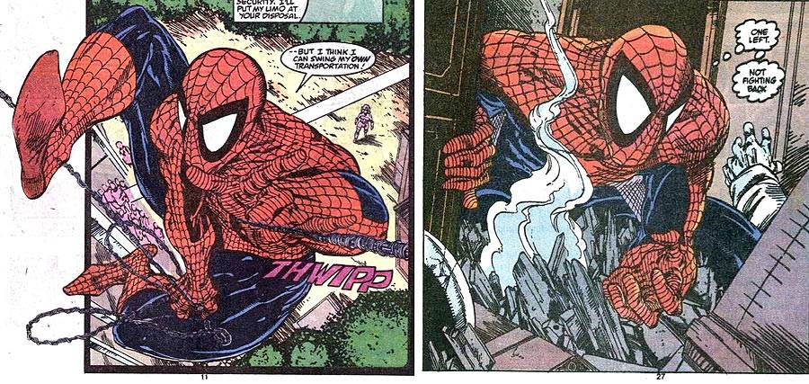
"THE AMAZING SPIDER-MAN" #322: "Ceremony"

Spider-Man fights for the royals' lives in Symkaria, thought not successfully. Mary Jane bluffs her way into an acting role.
Spider-Man is a hired gun now, working for Silver Sable in her homeland of Symkaria, in an attempt to make up for a mistake he made last time. There's chatter of a hit on the royal family, and Spider-Man and Silver Sable won't let that happen. Once the army of terrorists from Ultimatum drop from the sky, though, all bets are off. The end is a tragedy, where the prince's wife is killed in the gunfire. It's a neat out for writer David Michelinie, giving the story weight without killing off the prince, which would cause more seriously immediate political issues.
This is a great summer blockbuster spectacular issue for the time. Comics sold better during the summer, back in the day, and Marvel would release their biggest books twice a month to capitalize. Usually, those six issues in three months would be one big story. That was what an event was in 1989. In 2014, it's called "writing for the trade" and is the norm.
But check this out: You have fighter jets, parachuting soldiers, two competing groups of well-costumed private armies fighting each other, and a big whopper of a tragic ending. This has Michael Bay written all over it. There's political intrigue, an American connection, a big boss in the shadows we haven't seen yet, double-crosses, and gunfire galore. There's even a mutant guest star we'll get back to in a couple more issues.

The bi-weekly strain of producing this book, though, starts to show. While the page layouts and overall designs look like classic Todd McFarlane, the finished line work is uneven throughout. On some pages, there's typical McFarlane noodling on a wall or a familiar shading line with ink. On other whole pages, though, things look like they were suddenly inked with a thick brush that was used past its expiration date. The last few pages, in particular, don't even look like McFarlane inked them. Is that because he was rushing through them to complete the book in half the normal time? Or was there someone else inking the book uncredited to meet deadlines?

It's a shame, because there are opportunities in this issue for McFarlane to draw cool stuff. I'd have loved to see a McFarlane castle. There are a couple in this issue, but they're rough shapes, not detailed architectural drawings. They're thick-lined and simple, the product of being too complicated to do correctly in such a limited amount of time.
The colorist for this issue, by the way, is credited as "Don T. Aske." I'm guessing they used multiple colorists to get the book finished on time.
The Superhero Soap Opera: Mary Jane employs a desperate, though possibly clever, move to land a role on a soap opera, acting as mean in her audition as she believes the character, herself, to be. Then, being Mary Jane, she ponders the need to find a party to recover from how crazy that stunt made her feel. The page gives McFarlane a chance to show a decent enough range of facial expressions for MJ, with one of the better-inked pages, complete with speed lines and crosshatching.

Game of Telephone: In my write-up for the previous issue, I mentioned McFarlane's proclivities towards illustrating phone conversations in interesting ways. In that issue, he had a spider icon standing between Peter and Aunt May. With this issue, the telephone cable -- kids, ask your parents about those -- wraps around the panels and links the two.

Felix Watch: This was a tough one, but Felix appears on a bottle in the limo Spider-Man and Silver Sable are driving through Symkaria in.
Next Issue: While Solo lives, terror dies! And Captain America, too!
Twitter || E-mail || Tumblr || Instagram || Pipeline Message Board || VariousandSundry.com || AugieShoots.com || Original Art Collection || Google+