Cyclops has been with the X-Men from the very beginning when Stan Lee & Jack Kirby's X-Men 1 hit newsstands in 1963. Although eclipsed in popularity by Wolverine, Cyclops had been the team's on-and-off leader for decades. Most recently, he has seen a transition from milquetoast rule follower to a potential throupple-having mass murderer. Cyclops has been a part of every major X-Men event, every alternate timeline, every post-apocalyptic nightmare. Along the way, Cyclops has been depicted by the most essential X-Men artists in many different costumes. Some of them have aged like fine wine. Others, not so much.
10 STILL LOOKS GOOD: Don Heck's Classic Costume

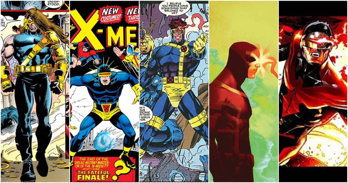
In December 1967, four years after being created by Jack Kirby and Stan Lee, the X-Men were given new costumes by Don Heck in X-Men 39. It retained Jack Kirby's blue and yellow color scheme, the cowl and visor, but ditched the gym class tunic and trunks for a more form-fitting costume to show off the physique. This version of Cyclops's costume would go on to be the foundation of the character's look for the next 30 years. That fact is evidence enough that Don Heck's update to Jack Kirby's work would still look good today.
9 DOESN'T: Age Of Apocalypse

In 1995, the Age of Apocalypse event was planning to show us a world where former Boy Scout and X-Men team leader Cyclops was raised by Mr. Sinister to become a soldier for Apocalypse. A few months later, Fabio was on TV selling us fake butter. Apparently, hunky dudes with beautiful flowing locks were in the zeitgeist. Cyclops's long, lean build was swapped out for something more like The Ultimate Warrior. His quiet stoicism was replaced with a hands-free headset, the only clue we have to infer that in the Age of Apocalypse, Sinister made a teenage Scott get a summer job at a fast-food joint, creating the morally conflicted man before us.
8 STILL LOOKS GOOD: John Cassaday's Astonishing X-Men

John Cassaday's re-design of the X-Men was a return to form following the leathery version of the X-Men we saw on movie screens and in New X-Men. Here, Cyclops's blues and gold uniform returns, but in much more muted tones. Yellow undies, trunks, and gloves are gone and there is only one X on the costume, found on the belt buckle. Instead of Simonson-style typographic boldness, Cassaday went with thin golden piping on the costume to invoke, but not precisely state, the shape of an X. Cassaday's design would become the template from which most other versions of the character going forward, including Cyclops' most recent design.
7 DOESN'T: Phoenix Force

In 2012, Iron Man blew the Phoenix Force apart, causing it to make its new home in Cyclops, Emma Frost, Magik, Colossus, and Namor. Being inhabited by the Phoenix Force gave them all a new look. For Cyclops, the traditional yellow and blue were changed to black and red with an insignia of the Phoenix covering his torso and shoulder, with its wings acting as shoulder pads. Here, though, Cyclops's beak is the culprit. His traditional visor is made more Phoenix-y by giving it the appearance of a beak. For a tall and thin man who wears yellow a lot of the time, this design just makes him look like a bird.
6 STILL LOOKS GOOD: Jim Lee's X-Men

Jim Lee redesigned the X-Men's costumes in preparation for his collaboration with Chris Claremont on the massively successful X-Men 1, which sold an estimated 8,186,500 copies. This was one of the most successful comics of one of the most successful eras. Lee's design was used in the animated series, toys, and more. The classic yellow and blue remained along with Cyclops' visor, but Jim Lee updated his rubber dishwashing gloves to more tactical-looking ones and added many pouches, as was de rigueur. While Don Heck's version of Cyclops's costume may have been used for the longest number of years, it is possible that Jim Lee's version has been seen by most people and in more mediums.
5 DOESN'T: New X-Men

The success of the first X-Men movie taught us that superhero costumes were dumb and could never be convincingly portrayed on the screen. If comics wanted to attract this new potential audience, the costumes had to be ditched for something more practical (read: made of leather). The New X-Men redesign embraces comics' leather phase, giving Cyclops and the rest of the team leather jackets and leather pants with X's all over them. Simonson's bold, stark use of the X is turned on its head. Here, we have an X on each hand, an X on each sleeve, an X on the belt buckle and a huge, puffy X on the torso. It's excessive and turned out to be wrong.
4 STILL LOOKS GOOD: Walter Simonson's X-Factor

When the original X-Men quit the team, they flew the coup from their former professor and went off on their own as X-Factor. In X-Factor 1, Walt Simonson redesigned the team's costumes. Here, Simonson made the letter X the prominent design feature in each costume. He would do a second re-design of the team, but the only change for Cyclops was that his "X" went from yellow to white. The sharp, thin lines of Simonson's pencils, Cyclops''s tall and thin build and a giant X reaching from the shoulders to the knees come together to make Scott Summers a striking figure even now, almost 35 years later.
3 DOESN'T: Age Of X

In the 2011 alternative future Age of X, Cyclops is not Cyclops at all. Scott Summers accidentally killed his parents during a trip to the movies and was experimented on while in prison, becoming Basilisk. A basilisk is a legendary reptilian creature whose gaze could kill. While this costume design is pretty darn mean-looking, it does not hint at any of the costume design elements known to readers from any other version of Cyclops and does not invoke any of the depictions of basilisk throughout history. It seems more like a re-purposed character design than one built from the ground up.
2 STILL LOOKS GOOD: Alex Ross's Earth X

Alex Ross is best known for his hyper-realistic depictions of superheroes, most notably in his collaborations with Mark Waid in Kingdom Come and Marvels, but his work showed us more what heroes would look like if they were real in their world rather than real in ours. Skintight spandex and capes remained, despite their impracticality. Ross's Earth X seems to bridge the gap between those poles. Simonson's giant X remains, but the rest of Cyclops's form is a formless matte black, covered by a long trenchcoat, the closest thing to a cape to be found on any modern street. Here, Cyclops's quiet strength comes into sharp focus.
1 DOESN'T: Jack Kirby's Original Costume

As the saying goes, you come at the King, you best not miss, but it is Jack "King" Kirby who misses here. The X-Men were undoubtedly one of Kirby's greatest creations, but his costume designs would not be nearly as enduring as the characters themselves. Their tunics make them look like they got attacked by Magneto during gym class at Xavier's school. The dishwasher gloves and yellow trunks are no better. There is no question that Kirby's illustrations were revolutionary for their texture and dynamic portrayal of superhero action, but when compared to amazingly complex costume designs like Galactus or beautiful simple ones like Silver Silver, Cyclops's X-Men costume is caught between the two not complex enough to be interesting or simple enough to be striking.