Adapting comic book characters, and their unique looks, onto the silver screen may not always be a simple task, as the early 2000's X-Men movies made clear with their black leather jumpsuits in place of classic comic book blue and yellow tights. Oftentimes, studios will take artistic liberties in order to modernize characters they deem outdated or campy. They may also change a character's look due to CGI and makeup limitations. Many fans are attached to the look of their favorite heroes and villains, and it is important that a studio respect that. What would Spider-Man be without his blue and red suit? Or Iron Man without his gold and red armor? A studio's best hope is that their cinematic characters are a perfect representation of their comic book counterparts, especially when there are several iterations of a character they can draw upon. Though most comic book traditionalist would argue that their penciled heroes are always the best looking representations, there are instances when an on-screen adaptation of a beloved comic book character surpasses the original.
With the MCU now spanning over 20 films, Marvel has had several opportunities to lift its heroes and villains from the pages of their countless comics to the big screen. Though some characters look like they were lifted straight off the page -- like Robert Downey Jr's Tony Stark/Iron Man -- some adaptations have been lacklustre, while a few have been made to look much better than their comic counterparts. Here are 10 Marvel characters that look better in the MCU, and 10 that look worse.
20 BETTER: YONDU

Yondu Udonta was originally depicted as a blue alien with a prominent red fin on his head, wearing a red vest and yellow sash. Clearly a product of the era in which he was introduced, Marvel saw it best to change his look relatively drastically for the MCU. Michael Rooker's Yondu from the Guardians of the Galaxy films resembles a space pirate.
His gold tooth and technological fin -- which starts small in the first instalment before being replaced by a larger one reminiscent of his comic book counterpart in the sequel -- give the leader of the ravagers an intimidating look to offset his heart of gold.
19 WORSE: QUICKSILVER

Quicksilver was the hardest costume design and character design for Marvel Studios to tackle as Fox had done such a great job with the character.
However, the MCU's version of the character lacked any real interesting design, sporting an Under Armour T-shirt in a blue-ish gray with white accents, black pants and running shoes. It all feels very pedestrian and forgettable, perhaps purposely, as the character barely lasts an entire movie before sacrificing himself.
18 BETTER: THOR

Marvel played it safe with Thor throughout his first two standalone films and the first two Avengers films, but quickly realized the character needed to differentiate itself from its comic book counterpart if it wanted to resonate. Ragnarok developed a new tone, but also a new distinct look, as Thor sported a rough, yet modern haircut, gladiatorial armour, and a certain patch, giving him a more grounded and rebellious style.
Though he did resort to a more traditional armour in Infinity War, reminiscent of the Ultimate line of comics, he had already cemented himself as one of the most visually appealing superheroes in the MCU.
17 WORSE: SCARLET WITCH

Much like her brother, Scarlet Witch suffers from a pedestrian and forgettable design in the MCU that does not do this extremely important and powerful character justice.
Her costume has changed with every movie, with her red coat getting progressively more crimson however, despite Marvel continuously trying to improve the design, her look is too bland to compare to her comic book counterpart which may be over the top if directly adapted on-screen, but fits the Marvel comic book universe.
16 BETTER: DRAX THE DESTROYER

Though Drax in the modern comics closely resembles his on-screen adaptation, he was originally introduced with a much different look. Green, wearing purple tights, and a purple cape and hood, Drax donned a golden belt and golden cuffs and a much more refined attitude.
As such, it was no surprise that James Gunn decided to style Dave Bautista's Drax based on Keith Giffen's modern design of the character, complete with tattoos. However, Bautista's makeup is something that stands out when compared to his comic book counterpart, with particular attention paid to the design of his tattoos, they more resemble scars and give the character much needed realism.
15 WORSE: IRON MONGER

The first mimic villain introduced by in the MCU was Obadiah Stane's Iron Monger. Though the character was necessary for the storyline and for Tony Stark's arc, and Jeff Bridges did a great job portraying Stane, his actual Iron Monger costume left a lot to be desired, particularly when Tony had already developed his armor to the classic red and gold.
Unlike most mimic villains in the MCU, Iron Monger seemed outdated, clunky, and slow. His armor made him one of the most forgettable Marvel villains. His comic book counterpart had a blueish tint to it that would have contrasted Iron Man's colors, much like Killmonger's design did with Black Panther.
14 BETTER: BLACK PANTHER

Now, don't get us wrong, Black Panther still looks amazing in the comics. However, his subtle technological details on his costume -- the purple hue, retractable claws, futuristic material -- all add to this already beautiful character design. The MCU has hit a home run with his costume and the overall look of T'challa, even when he does not don the Panther outfit.
From his first introduction to the Marvel Cinematic Universe in Captain America: Civil War, his character design immediately stood out. Since then, Marvel handed the reigns to Ryan Coogler, who was able to imbue the Black Panther costume with both real African heritage, as it is in the comics, and the fictitious aspects of Wakandan heritage.
13 WORSE: HAWKEYE

Poor Hawkeye, ignored in Infinity War and given a lackluster costume design that does not do the character justice throughout all his MCU appearances. Granted, Hawkeye's comic book costume is perhaps the hardest to translate onto the silver screen, we feel that his boring, toned down, costumes worn in every on-screen appearance could have been improved and given a detail unique to the character.
In the end, Jeremy Renner's look is most memorable for when he was out of the costume: hiding the Avengers at his home and acting as a dad in civilian clothes.
12 BETTER: ROCKET RACCOON

The first, and only, fully CGI character to feature on this list, Rocket is a testament to the attention to detail in the MCU. When Marvel announced they would feature a talking CGI raccoon, general audiences scoffed.
However, with their realistic design, detailed fur, expressive face, and clever outfits, Rocket has become a visual masterpiece. As opposed to his comic book counterpart, the cinematic version of the character conveys a real life grittiness through his design, complete with subtle scars that hint to the character's past.
11 WORSE: ULTRON

Avengers: Age of Ultron may have been the weakest in terms of introducing new character designs. However, despite both of those characters being victims of from bland designs, Ultron suffered from a design that was too complex when compared to his comic book iteration.
As a villain, Ultron is an extremely scary concept, but his MCU counterpart is anything but, with his dull facial expression undercutting his power. Perhaps the most negative aspect of the character is his mouth. As a mechanical being, his fluid-moving mouth served to remove audiences from the experience.
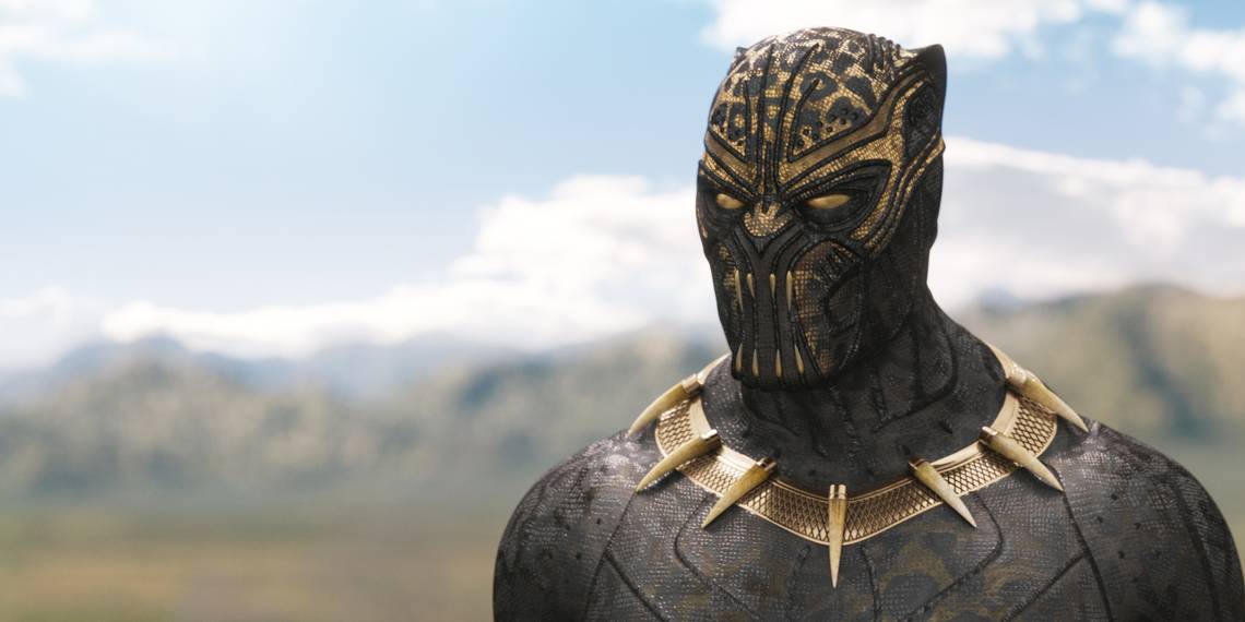
10 BETTER: KILLMONGER

Perhaps the second most complete villain in the MCU, Erik Killmonger has one of the most intriguing character designs, both in his version of the Black Panther costume and his general look, that brings together his desire for a Wakandan heritage he did not experience and his upbringing in Oakland.
And though he falls victim to the MCU's mimic villain costume design, his design works, as it shows a similarity between himself and his cousin T'challa, while indicating a strong difference in views with the contrasting yellow hue.
9 WORSE: VISION

Perhaps one of the biggest gambles Marvel took was adapting Vision to the big screen. The android has a very iconic look in the comics, and one that may not have translated well on film, with a red face and green and yellow cape and tights, and strictly all-white for a look later on in the comics.
However, Marvel attempted to add some realism to the character, utilizing an Infinity Stone to give him a more human-like appearance. However, his subdued shade of colors, along with his futuristic cape design and outfit design is a far cry from the iconic hero from the comic books.
8 BETTER: GRANDMASTER

What more is there to say, any character design that includes Jeff Goldblum is incomparable. In the comics, the Grandmaster's design is rather bland, as he is a blue-skinned alien in long yellow garb, sporting white hair and nothing else that really stands out.
Benefitting from the great design that Taika Waititi was able to create in Thor: Ragnarok, his golden tunic, with blue and red accents, as well as his eyeliner, and blue makeup streaking down from his bottom lip to his chin, give the character an eccentric look that is memorable in a movie filled with interesting characters.
7 WORSE: ABOMINATION

Another mimic villain, Abomination had perhaps the weakest CGI and design, and was unfortunately in a film that had those same issues throughout the course of its runtime. Perhaps it was a sign of the times but regardless of when it was made, Abomination still didn't look all that great.
In the comics, Abomination has a certain dragon-like appearance that represents his beastliness. However, in The Incredible Hulk, he appears as a generic yellowish creature with no unique details. This is definitely a waste, as Tim Roth, the actor who played him, has a very unique look that could have been translated to Abomination's appearance as well.
6 BETTER: HEIMDALL

Heimdall is perhaps the most intriguing supporting character from the Thor trilogy, surpassing the disappointing Warriors Three, who met their untimely end during Ragnarok. Much of this is down to the character's design, which is much more detailed and unique than his comic book counterpart.
In the comics, Heimdall is a relatively generic viking, clad in brown fur and armour and a horned helmet. In the MCU, Idris Elba sports golden armor, automatically setting him apart from other Asgardians. What truly elevates Heimdall apart from his other iterations is his eyes, as this attention to detail from Marvel Studios demonstrates his all-seeing ability.
5 WORSE: MALEKITH

Perhaps one of Thor's most intriguing villains, both in story and in design, Malakith the Accursed is the ruler of the Dark Elves of Svartalfheim. As such, his comic book design is usually extremely frightening, powerful and eccentrically dressed, with blue skin and white long hair.
However, his MCU counterpart has the unfortunate honor of being perhaps the most toned down MCU character when compared to the comics. Clad in boring, dulled taupe armor, with light pink skin and a burn scar, the film version of Malekith resembles a forgettable Power Rangers monster rather than a dark ruler of one of the Seven Realms.
4 BETTER: THE COLLECTOR

In the same vein as the Grandmaster, the Collector benefits from the MCU's general cosmic design and the actor's incredible performance to improve on the character from the source material. The Collector's comic book iteration is also somewhat generic, with his white hair being his only truly distinctive feature.
Still donning white hair and white eyebrows, Del Toro uses subtle makeup -- eyeliner, a line on this bottom lip, black nail polish -- to convey his character's bizarre and unconventional demeanor. His outfit is also more detailed, with fur on his cape and crimson accents on his costume, further enhancing the character's personality.
3 WORSE: THE MANDARIN

Despite the controversial story of the Mandarin in Iron Man 3, we'll focus on the design and look of Sir Ben Kingsley's portrayal. The Mandarin in the comics is Asian, hinted at by his name, and his character design is often inspired by Asian culture, appearing in flamboyant sorcerer robes with jewels and armored shoulders most of the time.
Kingsley's Mandarin has a much different backstory, and though find his beard and bun are spot-on, a theatre actor -- which his character is in the film -- would opt for more eccentric robes if he was playing a role like the Mandarin.
2 BETTER: NEBULA

Nebula's original comic design was a blue skinned female alien with long hair. However, the MCU version of the character is based off her design that first appeared in Silver Surfer #72. In that story, she was turned into a cyborg by Doctor Mandibus and donned a bald look that is much more familiar to moviegoers.
Though both designs a similar, the MCU's version of the character has a much more renegade look to it. MCU's Nebula looks as though she has been put together with different parts. Furthermore, her mohawk-looking metal piece atop her head adds to her rebel demeanor and meaner attitude.
1 WORSE: RONAN THE ACCUSER

Another character that suffered from the MCU's occasional fear of having eccentric villains is the first Guardians of the Galaxy villain, Ronan the Accuser. The popular Kree villain is clad in green armor in the comics and looks like true alien royalty on the page, something that should have been easy to replicate on the big screen.
However, his black armour in Guardians of the Galaxy feels as though it does not fit in the MCU cosmic landscape, especially when placed next to the Guardians themselves, or the Nova Corps. Hopefully his look will grow on us when he appears in Captain Marvel in 2019.