Over the many decades of Marvel, whether it be comics, movies, TV shows, or video games, whenever new creators get involved, it usually results in new and inventive stories and designs for characters. This has resulted in some iconic depictions of classic characters like Iron Man, The Hulk, and Captain America.
However, they had a strange period of seemingly not knowing what to do with characters in the 1990s which resulted in strange stories and even stranger character redesigns. This wasn't always the case as there were also plenty of redesigns that impressed Marvel fans around the world: so which are the worst and best?
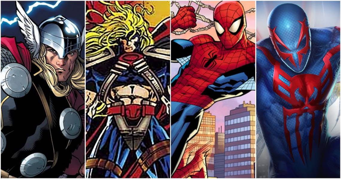
10 Best: Todd McFarlane's Spider-Man

Right at the beginning of the decade, Todd McFarlane who created the likes of Spawn and Venom put his own unique spin on Peter Parker's iconic suit. A majority of the details that made the suit iconic in the first place are still present, but Todd adds enough of his own flair to make it unique.
The lenses over Spider-Man's eyes are much larger and angular, similar to how he would draw Spawn's mask. Todd was also the one to reinvent how Spider-Man's web-lines would be drawn, something that other artists would use for the foreseeable future of the character.
9 Worst: Hawkeye From United They Stand

Marvel had some great animated shows in the 90s like Spider-Man and The Incredible Hulk but towards the end of the decade, they decided to bring Earth's Mightiest Heroes to the small screen. This resulted in The Avengers: United They Stand which most have forgotten and for good reason.
Often deemed as the worst Marvel cartoon to ever exist, most of the character designs are worthy of this part of the list, but the worst redesign from the thankfully short-lived animated series was definitely Hawkeye. The colors clash horribly, the suit itself looks like a poor man's Gambit cosplay, and the bow is overdone. It's just an ugly design.
8 Best: Punisher War Zone

Much like with Todd McFarlane's Spider-Man, this new version of Frank Castle doesn't change things too drastically but it changes enough to be an improvement: instead of looking like he's wearing tights and go-go boots, Frank's suit looks more like a long sleeve shirt and tight pants with white gloves.
There's more detail put into his belt and tactical gear, the trenchcoat is a great touch that would be translated into both the Thomas Jane and Jon Bernthal incarnations of the Punisher. The Punisher: War Zone design also just added more grit and wear to the character's design to fit the dark nature of the character.
7 Worst: Fabulous Thor

One could have sworn that Thor was a Norse God of Thunder from the realm of Asgard: so whose idea was it to transform the character into a reject from a 90s hair band? The hair is so ridiculous that even DC's Starfire would say it's too much to look at. Additionally, the suit looks nothing like anything Thor would be wearing.
This design looks like it was meant for a completely different character that got scrapped so Marvel decided to just throw it onto some iconic character in hopes it would catch on. Most fans can agree that, no, it did not catch on; it just made Thor look like a Fabio-wannabe.
6 Best: Spider-Man 2099

Though this is technically a design for what was a brand new character at the time, it still counts as a new design for Spider-Man. This is the first suit of Miguel O'Hara's Spider-Man from the year 2099 which first debuted in 1992 and quickly became one of the most famous incarnations of Spider-Man ever created.
The suit itself was a refreshing change with a heavy emphasis on a dark shade of blue with vibrant red accents and a scary skull-like spider insignia on his chest. The lack of lenses replaced by spider-like rims around the eyes makes him one of the more intimidating versions of Spider-Man as well. It's a design that has made appearances in multiple games, shows, and even a cameo in Spider-Man: Into The Spider-Verse.
5 Worst: Captain America (1990)

Before Chris Evans came along and became the perfect live-action version of Steve Rogers, there was another Captain America movie twenty years prior. This was Captain America (1990) and it is often labeled as one of the worst comic book movies of all time due to horrible acting, horrible choreography, and most of all, horrible costumes.
Though not nearly as bad as the Red Skull's design, Captain America's suit looks like a piece of plastic that was vacuum sealed onto the actor's body: it looks awkward, doesn't fit properly, and the shield just looks like a giant frisbee painted red, white, and blue. There's nothing redeemable about the costume.
4 Best: Storm

Ororo Munroe AKA Storm has had quite the variety of designs over the years. Some have worked, while others haven't, but many fans enjoyed her new uniform in the 1990s, trading the jet black for a snow-white uniform that conveys majesty and grace but also can look very intimidating when she goes all out with her powers.
This white uniform that matches with her hair so perfectly was also brought into the beloved X-Men animated series from 1992. Later on, Storm would revert to her classic black uniform which has stuck around ever since.
3 Worst: Robo-Captain America

The RoboCop movies were still pretty popular in the 90s so many characters and companies tried to borrow from those films in some way. In some cases it worked but when it came to this new armor for Captain America? It most certainly did not.
Everything about this suit is an assault to the eyes. An armored suit could have worked, but this is just way overdone with way too many plates and details clashing at once. Even the wings look ridiculous.
2 Best: Danny Ketch's Ghost Rider

When Danny Ketch took over as the Ghost Rider after Johnny Blaze, not only did he get a different biker outfit but he sported a brand new motorcycle. This has led to some fans debating who had the superior look as Ghost Rider: Johnny or Danny which shows how much of an impact this new version had.
Danny's Ghost Rider featured new armored pads upon his shoulders, more spikes across his suit, and his new motorcycle was much different than Johnny's. The high-tech armored motorcycle from the future combined with the hellfire upon transforming, added to Danny's Ghost Rider becoming iconic.
1 Worst: The Invisible Woman's Pervert Suit

This one should come as no surprise to anyone. This was a design that only lasted briefly because it turned one of the most dignified and respectable women in the Marvel universe into a sex object. It was designed to show off as much of Susan Storm's skin as possible which is completely disrespectful to her as a character.
Even without the obvious objectifying of Sue Storm, this design looks less like a superhero suit and more akin to something one would see in a strip club if they were having a Marvel night. It's not just the worst redesign of the 1990s, it is one of the worst redesigns of all time.