Knowledge Waits is a feature where I just share some bit of comic book history that interests me.
The late Marie Severin is probably best known today for her long association with Marvel Comics, where she worked from the late 1950s until the mid-1990s. She was a popular penciler, drawing the first five issues of Incredible Hulk's return to his own ongoing series in 1968. She was also Marvel's chief colorist in the late 1960s.
Color is how Severin broke into the comic book industry. Her older brother, the late, great John Severin, was working as a comic book artist for EC Comics, a comic book company run by William Gaines, son of the company's founder, Max Gaines (the elder Gaines was one of the great pioneers in comic book history). Bill Gaines took his father's company, which was built around a comic book that adapted Bible stories and turned it into the premier comic book company of the era for horror, crime and science fiction comic books stories.
When Severin needed someone to color one of his stories, he asked his sister to do it. She agreed and soon, she was working for EC Comics as their main colorist (she would do other aspects of production, as well).
In 2004, Severin drew a piece showing the cast of creators from this period...

What made Severin stand out so much at the time was how much her coloring intermixed with the pencilers. They were truly a team in the way that modern pencilers and color artists are today and that was a lot more unusual then than it is now. Plus, Severin's color palettes helped define EC Comics' look in the early 1950s. It was Harvey Kurtzman who first brought Severin on board on a regular basis, having her color all of EC's war comics and slowly but surely she began to color almost all of their stories, except for those artists who wanted to color their own work. Kurtzman specifically credited Severin as bringing a whole new level of sophistication to the look of EC Comics.
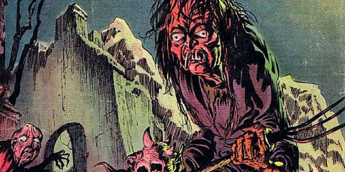
Look how rich and lush she makes these brilliant Graham Ingels and Wallace Wood covers look with her colors...


In an excellent interview with Sequential Tart (really, just read the whole thing), Severin talked about working with the artists...
ST: You've talked about how pencillers and inkers had to rely on your colors to help carry the story.
MS: Some. This could happen some time when the writer would insist on 50 things going on in a panel description. For example, you have to show where the guy is on a circus grounds or something, but he's also being followed by somebody in the shadows or something who's holding a knife, and the moon is out, and that's important for something that happens in the next panel. So sometimes it's not going to be artistically a beautiful thing — he [the artist] has got all of the things, so you try to color it to match the mood and tell the story. The shadow where the person is with the knife, and the bright lights of the circus stuff in the background, where the character is, but you have to do all this — the design you're stuck with is the artwork, and the artist might have been stuck with what he had to put in one panel because of the writer.
Some of Severin's color theory was misunderstood, especially her use of colors where she colored things all one color. I'll explain by showing her coloring in one of the most famous EC stories of all time...
Page 2: [valnet-url-page page=2 paginated=0 text='Shading%20the%20Horror%20of%20Foul%20Play!']
This is something I covered in an old Comic Book Legends Revealed, so I'm basically just posting what I wrote then.
In his 1972 bio of Bill Gaines, Frank Jacobs wrote "There was Marie Severin, Gaines's colorist, and a very moral Catholic, who made her feelings known by coloring dark blue any panel she thought was in bad taste."
Dewey Cassell asked Severin about it in Cassell's book, Marie Severin: The Mirthful Mistress of Comics....
Cassell: The story has it that, on occasion, if you were coloring a book and felt like maybe a particular scene was a little too gory, maybe it might get colored a little more darkly than normal.
Severin: Well, people have said that. I would never assume an editorial position. What I would do very often is, if somebody was being dismembered, I would rather color it in yellow because it’s garish, and also you could see what was going on. Or red, for the blood element, but not to subdue the artwork. If it was too complicated with these gory scenes, I’d rather put one color on it because, number one, you can see more, and if you start coloring every detail of the knife throwing, the blood flowing, the shirt being ripped, all of a sudden, if it’s off-register, you get a mucky panel. It’s all messed up. Well, the whole page would be messed up. Frankly, I’d rather color with solids for, like, a murder scene, and yellow so you can see everything. I wasn’t trying to hide it. I mean, the main reason these people were buying these books was to see somebody’s head cut off, y’know? Lose fingers and everything.
Here's Severin's coloring on one of the most notoriously grisly EC Comics story, "Foul Play," by writer Al Feldstein and artist Jack Davis in 1953's Haunt of Fear #19. ...


Here's how Severin colored the infamous story, "In Each And Every Package," from 1954's Crime SuspenStories #22 (written by Feldstein and drawn by Reed Crandall). This is the one that goes with the Johnny Craig decapitated head cover...

Clearly, she was using color to HIGHLIGHT the gore, not hide it. She was just a brilliant colorist and she helped make EC Comics in the 1950s the legendary comic book company that it was.
Here's one of her hand-drawn color guides from the early 1950s...

Sadly, the Comics Code Authority would lead to the end of EC Comics color comic book line, but luckily, Severin would eventually bounce back with her long career at Marvel.