Several of my cartooning graduates in the last few years have gone on to do 'zines of their own.
I'm always happy to consult on these efforts if they want me to, and I usually hear from one or another of them whenever they run into some kind of a snag.
This year Aja, now a junior in high school, is working on one. A few days ago I got this e-mail--
I have a question about my comic-zine ...
How do you make the panels look more varied but keep a flow to it? My problem is that it's confusing to the reader. I really want my panels to have the reader curious to turn the next page. I was wondering if you could help me out with that???
Thanks Mr. Hatcher!
Here is what I told her, and I got so carried away talking about great art pages and layout, I decided I might as well share it with you all, as well.
*
Hi Aja.
I know it's hard to get over old habits but it's really okay for you to call me "Greg" now.
Anyway. You are asking about the single hardest part of page layout there is. It has to do with how you want to pace your story. The important thing to remember is that people in this country read from left to right, and from top to bottom. So your design will be strongest if you are guiding their eye in a sort of swooping zigzag from the upper left to the lower right.
You don't need a standard grid to do that. Sometimes it works better if you don't use a grid at all. I've attached page scans from some of the guys who are widely acknowledged as being among the greatest comics artists who ever lived when it came to guiding a reader's eye and pacing a story.
One each from Gil Kane and Alex Toth, who are both sadly no longer with us, and a couple more from Howard Chaykin and Walt Simonson, both of whom are still doing great work today, and four from Neal Adams, who's still working but doesn't do comics that much any more.
All of these are pretty old samples. But to me they've stood the test of time, and to be honest, the reason I thought of these layouts in particular is because all of them, especially the Chaykin and Simonson stuff, are from books I used to look at and swipe riffs from when I was learning to draw, back when I was your age. It's exactly the same thing as the way you girls used to swipe manga riffs in my classroom.... and the Adams is probably my personal favorite sequence of his that he ever drew, although there are many other stories he worked on that are more famous. Most of what I know about page layout and composition comes from looking at work like this.
Let me walk you through them and try to break down what's going on there for you. We'll start with the Adams.
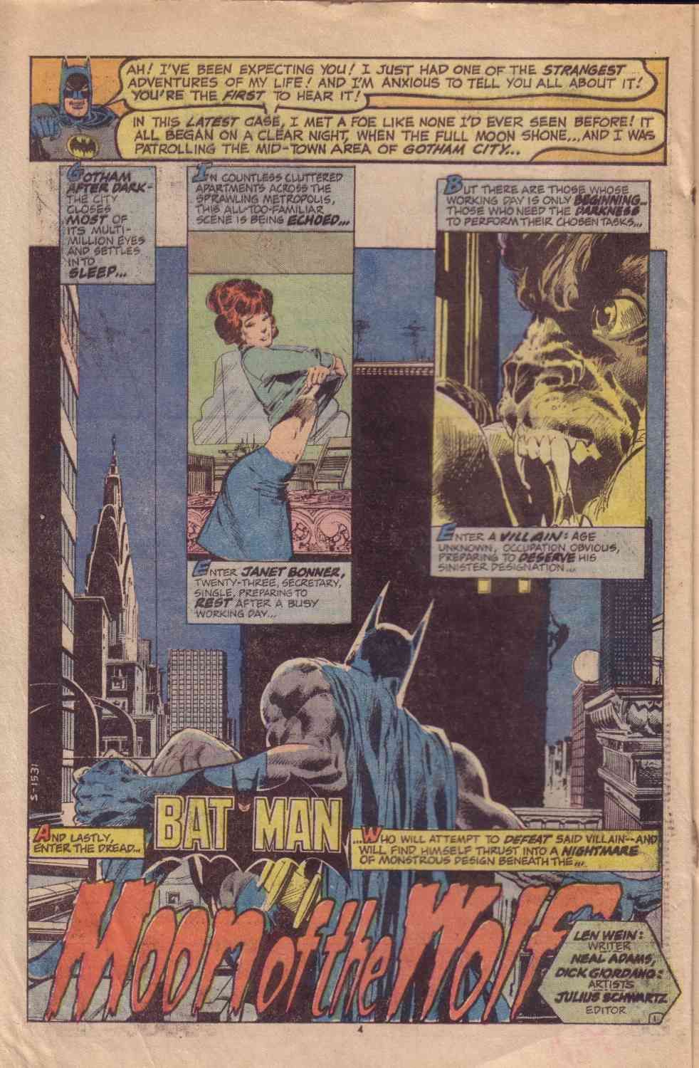
Here's the splash page. This is all from "Moon of the Wolf," which appeared way back in Batman #255, when I was about thirteen.
I think this is just an amazing piece of design work. (Except for that introductory word balloon thing added in at the top, but forget that, it was added afterward with a piece of pasted-in clip art. That's just something they did back then.) But look at the way everything is positioned on the page itself, the way the inset panel boxes start out long and thin and get shorter and wider, so that they are leading your eye in an arc up from left to right. So you naturally land on the tiny little shadow of the creature going up the side of the building, and the way Batman's whole body is aimed at that little figure as well, if your eye is first caught by the title and his figure, you still end up at that same place. And the way Adams has drawn everything, the buildings, the girl getting undressed, the creature's snarling face lit from inside -- you don't need any words on the page at all, to be honest. It's all right there in the artwork. You still know exactly what the situation is and that it's about to get really exciting.
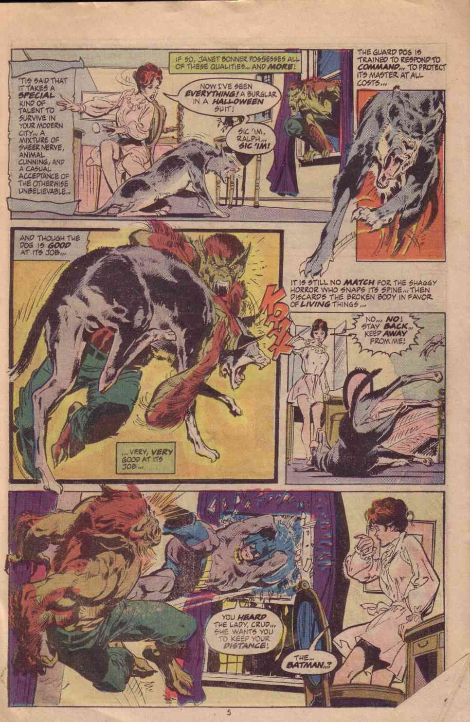
And sure enough, here's things escalating on page two.
Now, you'll notice there are a lot of words on the page -- almost too many. I think part of that has to do with the way the business worked then -- an editor would commission a script and then go find someone to draw it. I'm not sure if this was one of those times but it kind of has that feeling to it, it reads like the writer was trying to make the words on the page enough to carry the load if the art wasn't clear.
The words are a design element too, though, and you can't ever forget that. It's not just something you put in after you're done drawing. Note how the caption and word balloon placement is another visual element, it's part of the art. That's an easy thing to forget but that's actually one of your most powerful tools. Where you put the words controls where the reader looks, almost more than anything else.... remember that it's still about reading. Bad page layouts happen when your eye is confused about where to go next and that almost always comes from getting carried away drawing a pretty picture without thinking about where the words on the page are going to go.
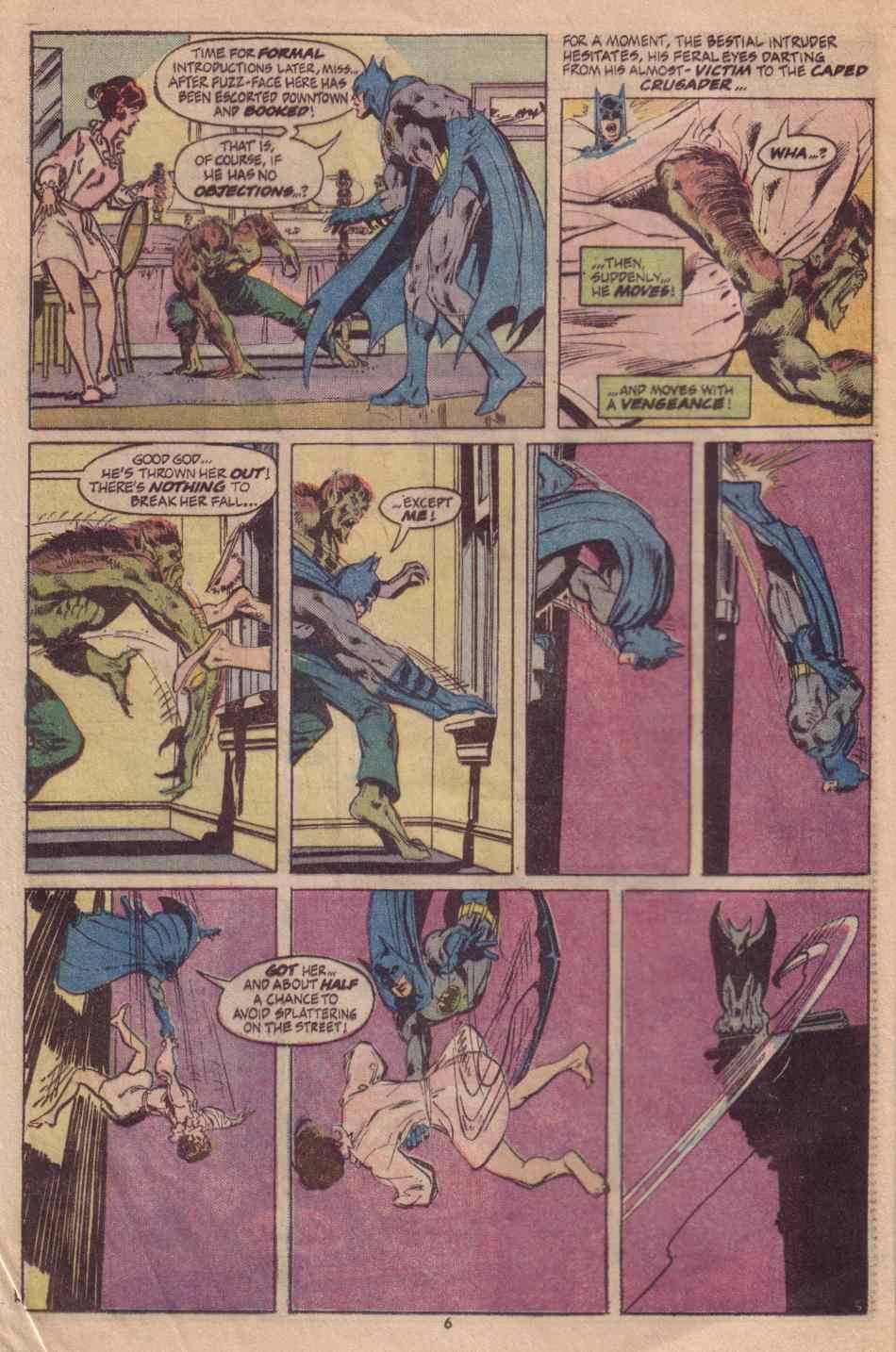
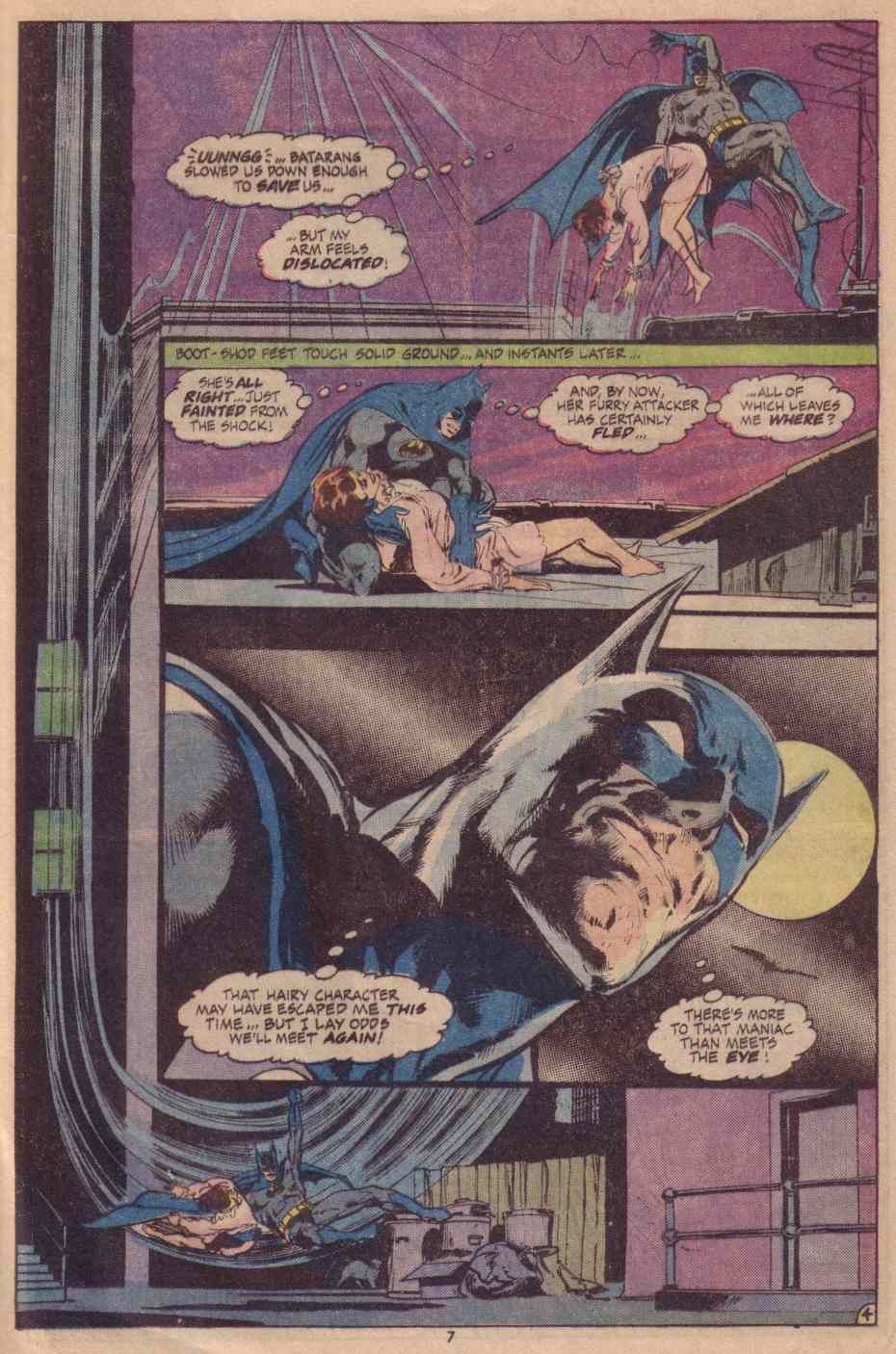
These next two pages are the reason this stayed with me for thirty-five years, though.
Look at what Adams does with the way the whole sequence of panels is built around that leap out the window.
The action on the page is about a long fall out of a window and then swinging up to land on a roof, and Adams designed this so you are supposed to read it the same way, going straight down the left side of the page and then swooping back up to land on the roof. I love that. Even though it gets screwed up a little bit by Batman's thought balloon in the upper right, you tend to get pulled up there too soon because it's the next thing you are supposed to read and it takes away from the swoop. But that's not the artist's fault, and it's not as though the reader is confused. (Nevertheless, that's a textbook case of the words and the art not quite working together. You want to be careful about that.) But I still love the idea of doing a page layout designed to move your eyes along with the same action that's actually in the story.
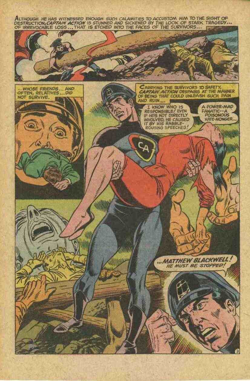
I thought of these next ones because you were asking about using the panel layout in an unconventional way to make pages interesting. Here's a page from Gil Kane. This is from an old issue of Captain Action.
Again, some of the figure execution is a little off -- I think that might be the inking, this was inked by a different guy than Kane himself and it looks like he flattened things out a little too much, probably because he was hurrying. Deadline pressures were harsher in the old days. But this page I wanted to show you because even though it's really only two little panels and one big one, it looks like a lot more, it's like a montage scene in a movie. The images of the suffering people sort of randomly scattered around the main character of the Captain have the effect of giving you his point of view, it's really a clever visual device. And again, your eye is always on track, you're led naturally down to the bottom corner as you read this.
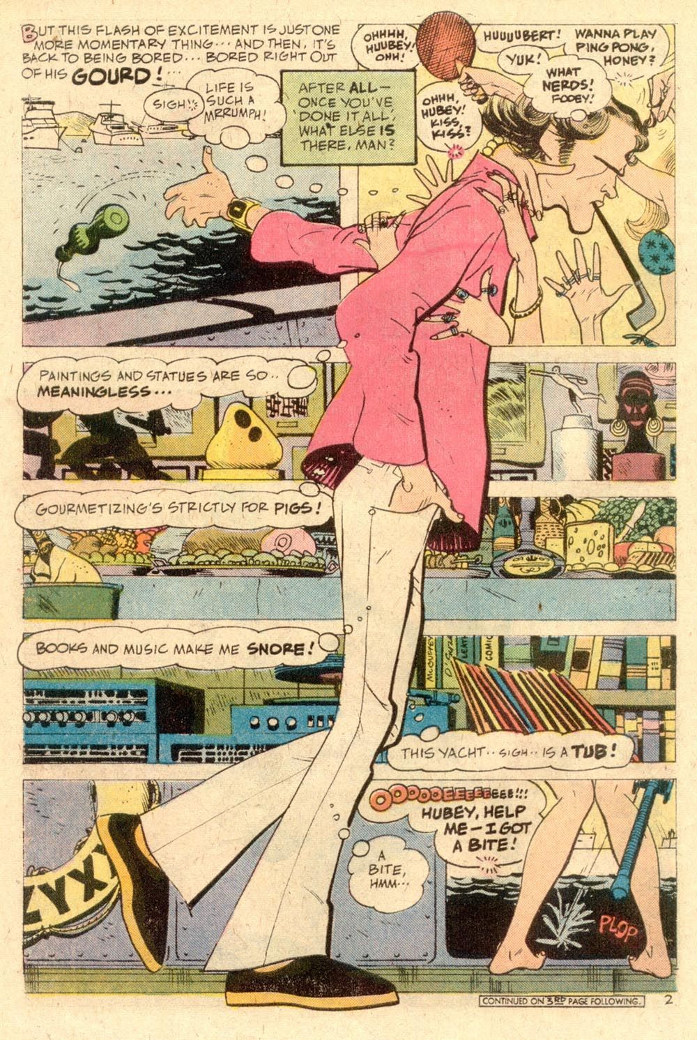
Here's another kind of montage scene built around a single figure. This one is by Alex Toth, from a comic called Plop! It was a humor comic from DC, back when you could still sell humor comics on the stands.
This isn't a montage, exactly, but look at the way Toth has placed Hubert's figure in that walking, leaning-forward posture so it creates the illusion that he really is walking past all these things as he's running down the list. That's a great example of how you can -- and you should -- use everything as a storytelling tool. Even something as simple as leaning the guy forward a little instead of having him be drawn straighter.
And look at that last panel, where we only can see the girl's feet. That is a neat visual trick. If Toth had drawn her from a viewpoint that is higher up, like her face for example, it wouldn't be nearly as effective. He deliberately puts her figure at the same size and level as Hubert. In fact he designed it so the bottom panel is essentially the panel Hubert's actually standing in, it puts her in context with him. So of course we can only see her feet. Again, just a little touch, but little things matter.
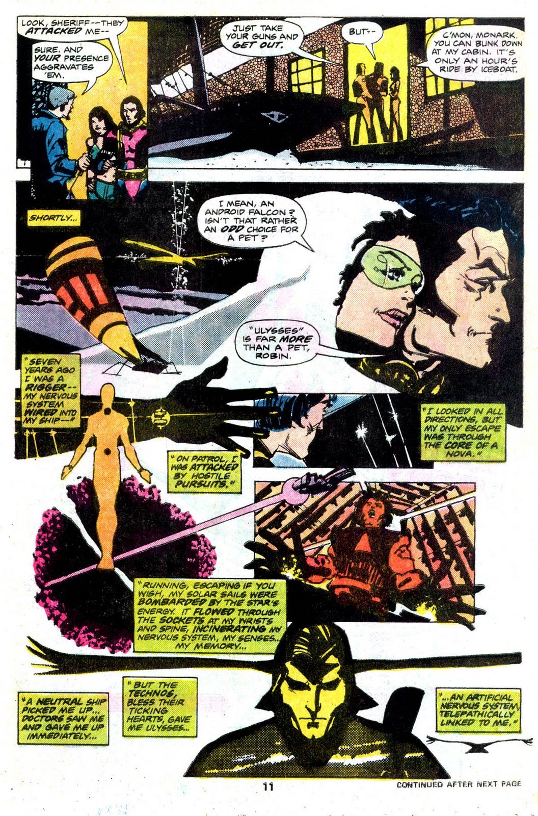
Here's one more montage. This is one of my favorite pages of comics art ever, from Howard Chaykin. This is from a one-off story he did for Marvel called Monark Starstalker.
Chaykin wrote this story, drew it, and inked it, and though he didn't letter it I have to assume that he had very strict instructions for the letterer about where the words needed to go, because everything on this page is absolutely perfect as far as the design is concerned. This is the great advantage of being a one-man band-- Chaykin the artist knows exactly what Chaykin the writer has in mind, so the words and the pictures are always in perfect sync.
Notice the huge amounts of information he's giving you here and yet nothing feels crowded or cramped. We're shown the attitude of the townspeople, including the law; setting up a friendship/romance between Monark and Robin; background on Monark that also gives you a little snapshot of the society and technology of this future world; and finally, we find out about Ulysses the falcon and why he's important. Chaykin does all this without cramming a lot of separate panels on the page, but rather using a sort of poster design with the captions leading you visually down through it.
This one page carries all of that storytelling freight -- and background and exposition is hard enough to get into a story without stopping the action dead while you explain stuff -- but this does all of that without sacrificing forward motion, and still looks really cool just as an art piece, it's visually very striking. Chaykin was one of the first guys that brought that commercial-art, album-cover, movie-poster look to comics, he showed everyone that you didn't have to have a panel grid to do a comics page.
It's also a good example of compressed pacing. Part of the trouble you are having with your layouts is probably coming from the fact that your visual vocabulary -- what you think of when you think of 'comics' -- is mostly from manga. I don't mean the drawing style itself, understand. There are lots of style differences, sure, but that's just style. A figure in a panel is still a figure in a panel, whether it's a muscled teeth-gritting superhero figure or a childlike chibi-style one.
I think your issue is the pacing, meaning the amount of page space you spend on each action in your story. Manga is paced differently from Western comics, they take many more pages and panels to get from point A to point B. The reason is because they're published as thicker books in Japan, so manga artists got habituated to having the extra room. Here in the States, the longest story you see in a standard comic book is 22 pages or so, and for many years it was thirteen, eight, or even six. Traditionally, comics are more compressed over here.
So you take a manga approach to a 'zine and you will find you are running out of pages before you get anywhere. Especially when you are doing it all yourself. Doing a self-published 'zine means you have to think really hard about making every page absolutely necessary, because costs mount up fast. You have to make each page carry more of a load, every panel should have at least two or three jobs to do -- tell us something about the character, set the mood, and move the plot forward. No wasted space.
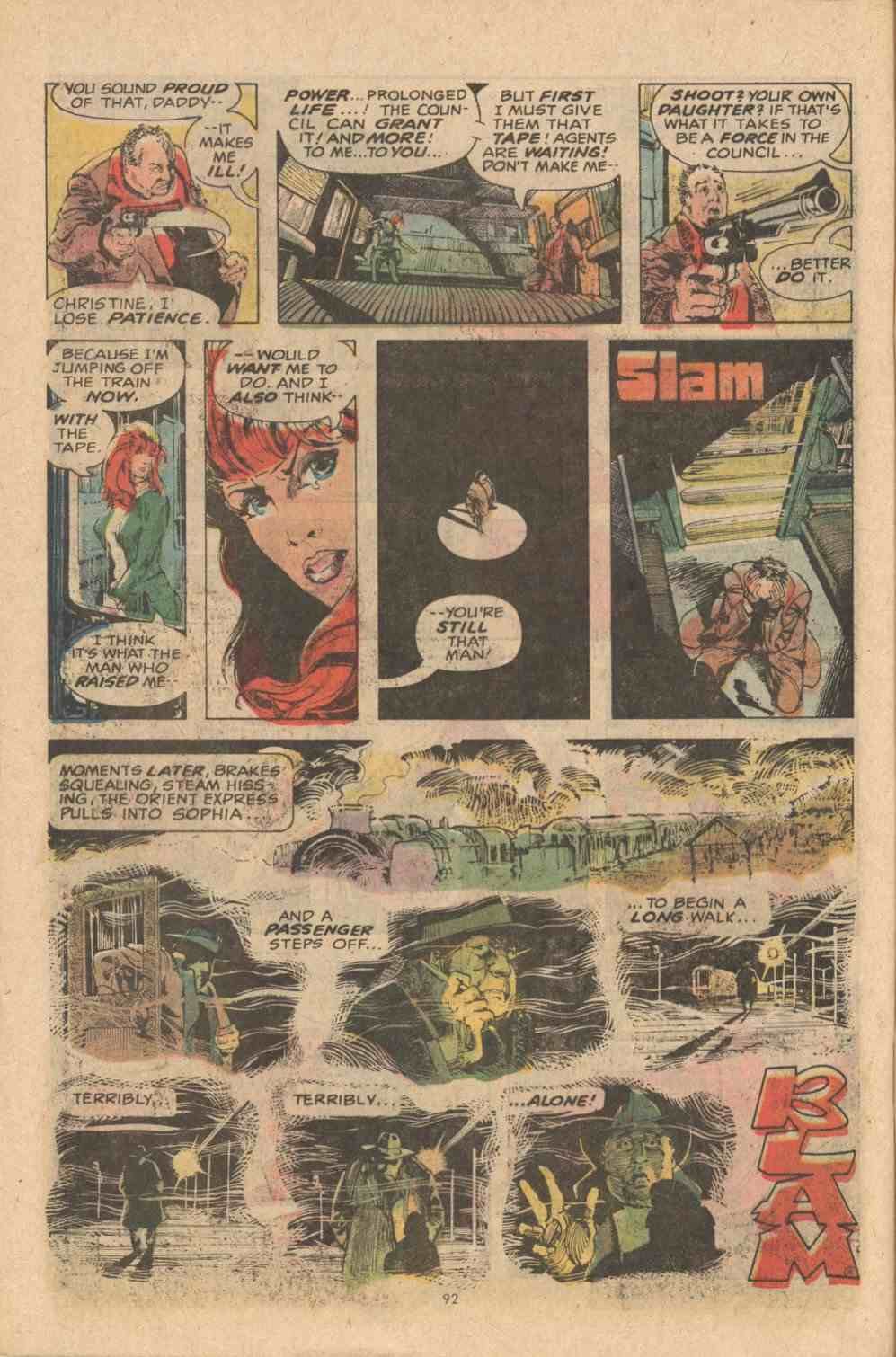
One of the best jobs of story compression ever is also from one of my favorite comic strips ever, Manhunter by Archie Goodwin and Walt Simonson. It was a seven-part serial that ran in eight-page chapters so it had to be ultra-compressed. Take a look at this page here.
What I love about this page is, first of all, it's got fourteen tiny panels on it and still Simonson draws it so that what we see is that Christine's dad is continually left standing isolated, in huge empty spaces. In fact, Simonson is screwing with the space perspective in all sorts of ways, considering that the conversation takes place in a train compartment. But it really works, you don't suddenly stop and say Wait a minute, in a train compartment they'd be almost nose-to-nose. (In fact it only occurred to me just now, writing this. I hadn't noticed it for thirty-five years.)
We also find out all kinds of things about Christine's relationship with her dad, we get a look at how conflicted he is, we get a better picture of the way the evil Council organization does business... and all while moving along the main plot of Christine's race to escape from the Council's operatives and get the tape evidence to Manhunter in time to save him.
Which is not to say that Simonson couldn't do great action sequences too.
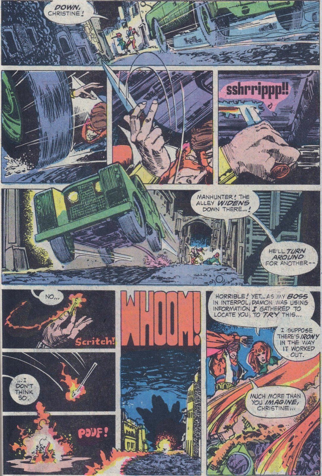
This Manhunter page isn't as chock-full of story as the last one, but the sense of motion here is wonderful... look at the way all the objects and figures are positioned to perfectly fit with the direction of the motion they're supposed to be making, everything here is aimed in exactly the right way. Likewise, the lettering on the sound effects is one of the best matches of the visual style of the letters (I mean the actual font) to the sound they are spelling that I can think of. In fact, it was when I was looking at Manhunter years ago that it finally dawned on me how much you could do with lettering and typestyles on a comics page, how you could incorporate the font itself into the storytelling function. All that and the last panel ends with a nice little turn-the-page hook, too.
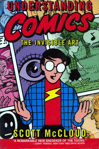
So that's what I have as advice, off the top of my head. For some of the best theoretical instruction and information about this subject -- and lots of other stuff too -- you really should get hold of Scott McCloud's Understanding Comics.
Best book ever on the mechanics of the comics page, period. The library should have one, and if not, you can get it from most bookstores.
Hope this helps. Beyond that I'd really have to see what you are doing, but I am happy to consult anytime you want me to look at something.
Best,
Greg.
****
And there you have it. I had so much fun geeking out over my favorite pages, and talking about why they're favorites, I thought I'd put it all up here. Feel free to chime in with thoughts and suggestions of your own in the comments below.
And Aja will be with us again at this year's Emerald City Convention, so stop by and say hello if you happen to get up there this year. I don't know if she'll have her book done and ready to roll out by then but I daresay she'll have some work to look at, if you are curious to see what she did with the suggestions here. Maybe some day in the future I'll be able to put some of her pages up here in this space.
And in the meantime, I'll see you next week.

