It's better late than never, so before we take a look at Image's DECEMBER titles next week, let's make some prejudgments at their NOVEMBER covers today!
Enjoy!
__________________________________________
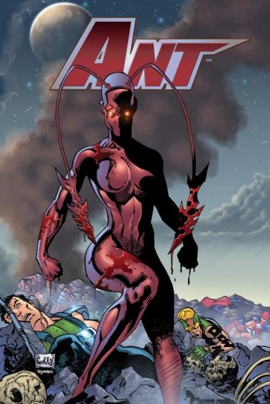
I'm not a fan of this cover, or Mario Gully's art style in general (as I think it has a lot of the excesses associated with "90's artwork"), but let me tell you one thing...
Gully is clearly putting his all into this title. I admire that devotion.
He's picked his niche (90's-esque superhero) and he attacks it with abandon. I think there is something quite admirable about that.
__________________________________________
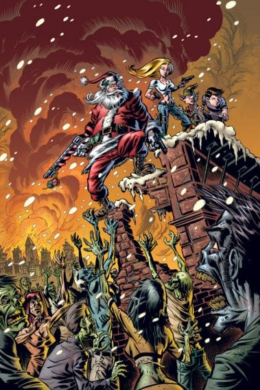
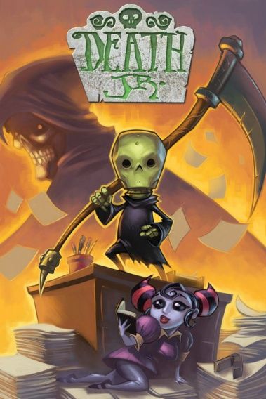
This is probably the best Battle Pope cover that I have seen yet.
Tony Moore is a good artist.
__________________________________________
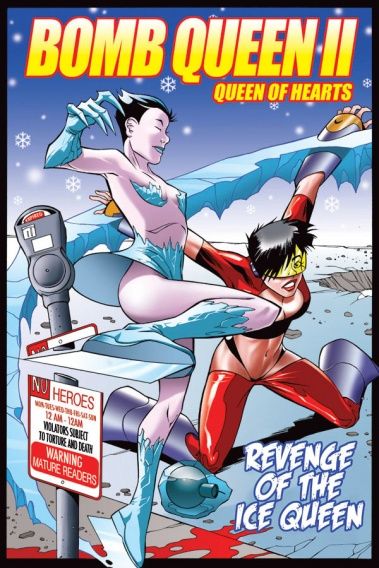
Jimmie Robinson is another one who knows what he is trying to achieve, and whether one likes that or not (I lean towards not), he certainly achieves what he is trying to achieve - and that, in its own, is a sort of success, no?
Please note that one could easily play this as a Cousin Larry trick, in the whole "I was TRYING for a bad cover!" thing, but I'm only saying that it counts for something to achieve what you mean to do - it doesn't necessarily count for a LOT.
And it only applies to artists like Gully and Robinson, who I am familiar enough with that I know, for sure, that this IS what they are going for - if I'm unfamiliar with an artist, I can't tell if they've met their own personal goal or not, so I can't even give them that little "I sort of admire them" reaction.
__________________________________________
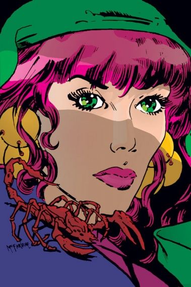
Remember when Todd McFarlane was this restrained of an artist? I liked Coyote - nice to see it being re-released.
__________________________________________
SILVESTRI STREAK!
Let's grade them out of Marcs (4 being the most)!
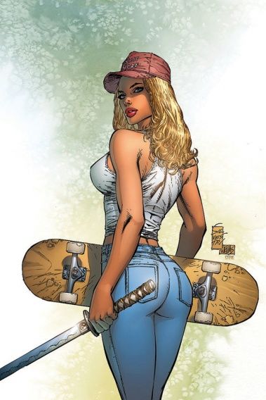
This Innocents Graphic Novel cover...so stiff and bland, and the idea for the cover is not so bad. Only 1 Marc!!
__________________________________________
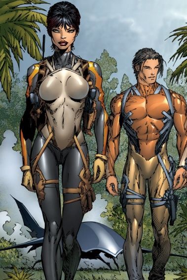
This Hunter/Killer cover is credited to Kenneth Rocafort and Silvestri, but it looks more like Silvestri than Rocafort.
And for a cover, it's...GASP...stiff and bland!!
Only 1 Marc!!!
__________________________________________
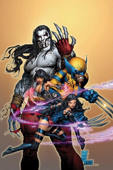
Compared to the other two, this Cyberforce/X-Men looks like a Pop Art Classic!
Three and a half Marcs (granted, when the scale is just 'The best Silvestri can do'....)!!!
__________________________________________
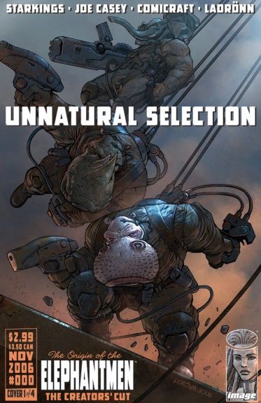
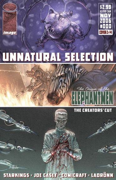
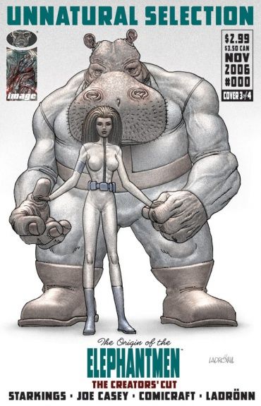
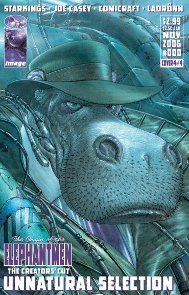
LADRONN TIMES FOUR!!
Sadly, by doing four different Elephantmen covers, Ladonn appears to have quartered his creativity. The drawings are all well-drawn enough, but they appear more bland than Ladronn usually deals out.
Although, this shot of the guys back in their soldier days is pretty decent.
__________________________________________
And how can I resist that baby shot?!
Maybe I was unfair with the bland comment!
I am sorry, Ladronn!
I still love you!!
__________________________________________
Wait, no, the bland comment stands!
They're just standing there - all blah-ish.
I like the Kirby look for the woman, though.
__________________________________________
Here's the best example. Ladronn has done other "face" covers before, but he usually charges them with highly developed emotions in the facial features.
Here?
It's just an empty drawing.
__________________________________________
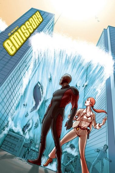
That is a sorry drawing of a tidal wave by Juan Ferreyra for this Emissary cover.
Especially the crowd shots. What is it, affecting, like, three people? Put some more detail into it!!
__________________________________________
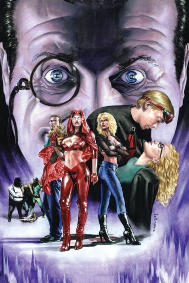
Rodolfo Migliari is always an interesting case, seeing as how essentially, he is Alex Ross - just not as good.
And this Freshmen cover?
Looks like Alex Ross - just not as good.
__________________________________________
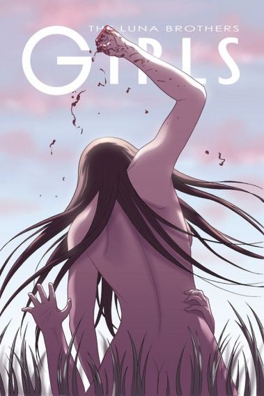
This is a strong visual for this Girls cover by the Luna Brothers.
It also symbolizes the reading experience of the title.
__________________________________________
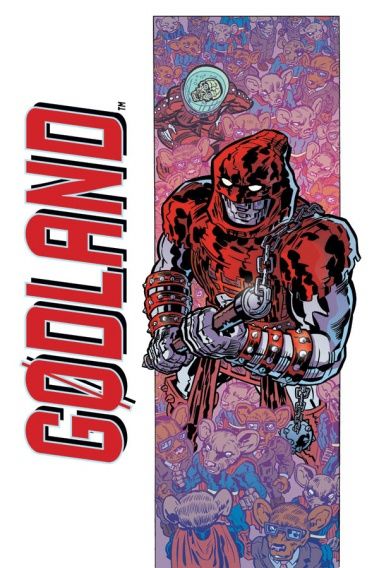
Surprisingly lackluster Godland cover.
__________________________________________
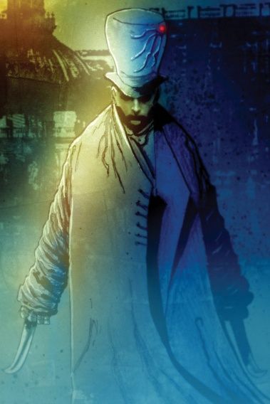
Great Ben Templesmith drawing for this Hatter M cover, but I do not know if it sticks out enough as a cover.
__________________________________________
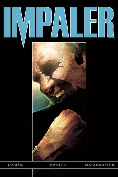
Nick Postic has a nice cover design idea for this Impaler cover, but it really needed a stronger visual for the small box in the middle. A stronger visual and that cover would have REALLY popped.
__________________________________________
I like the angle Ryan Ottley uses for the cover. Very ominous. Good work.
__________________________________________
An homage to the Marvel Handbook covers?
That is....wow.
You know what that's like?
It's like doing a cover of Was Not Was' "Everybody Walk the Dinosaur."
__________________________________________
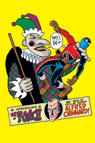
Mr. Punch looks awesome, but I think Paul Grist could have come up with a better cover layout to use him in.
__________________________________________
This cover perfectly symbolizes volume sixes in collections.
The only way you'd be interested in this cover is if you were already interested in Kane.
Just like how most volume sixes go - you're only picking up volume six of a collection usually if you're interested in the series already.
__________________________________________
Very nice Kieron Dwyer cover to the Last Christmas trade paperback.
This should be a real nice seller come Christmas time.
__________________________________________
I love Sean Galloway, but his art on this Low Orbit cover is just too all over the place.
__________________________________________
I think Dominic Bugatto is just working a few levels over my head with this Negative Burn cover.
So much so that I'm willing to give it a "hey, maybe it IS awesome and I'm just too slow to pick up on it."
__________________________________________
I like Khary Randolph normally, but this Noble Causes tradepaperback cover is just hideous.
A total eyesore.
__________________________________________
Not a GREAT Goran Sudzuka cover for this Outlaw Nation trade, but it does the job of telling you what to expect inside, which is helpful.
__________________________________________
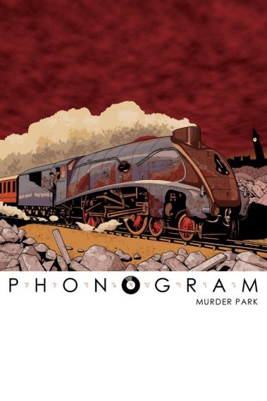
Good Jamie McElvie cover for Phonogram, but a definite step down from the previous issues' covers.
__________________________________________
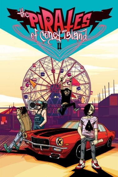
That is a wild Vasilus Lolos cover for Pirates of Coney Island.
A little more connectivity and this would have been a Top Five pick easily.
__________________________________________
Good Galen Showman cover for the Renfield trade. Definitely a nice horror look.
__________________________________________
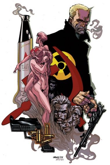
Solid Russsian Sunset cover by Bart Sears.
__________________________________________
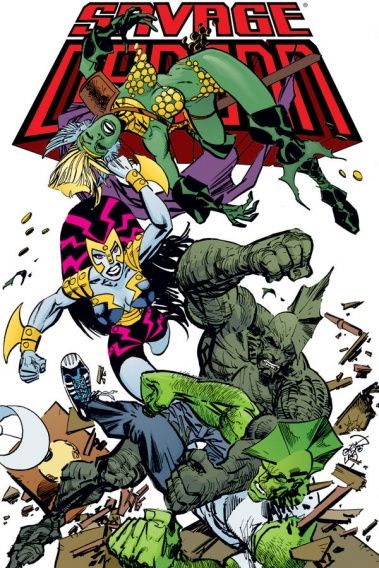
A wild Savage Dragon cover by Larsen. I love the dueling Dragons - very clever art there.
__________________________________________
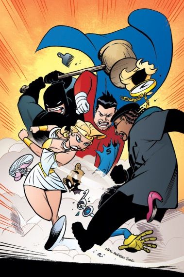
Well designed Sidekick cover by Chris Moreno.
__________________________________________
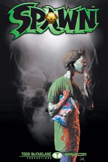
It'd be great if Spawn went by the old DC "write the story after the cover" method.
"Here's my cover!"
"Okay...something involving potato chips and a killer kid....."
__________________________________________
Interesting Micah Farritor cover for Strange Girl.
__________________________________________
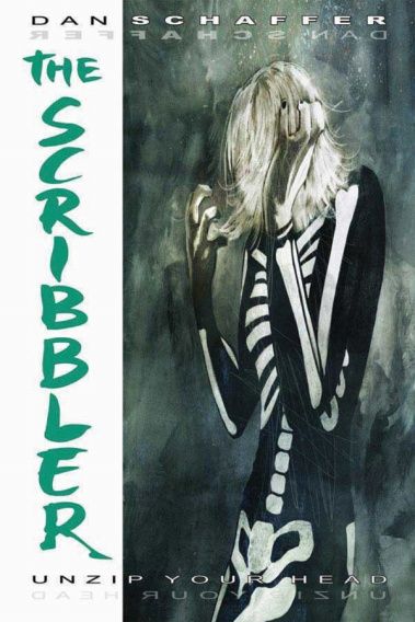
"Unzip your head".
Well, Dan Schaffer at least has an awesome sounding catchphrase for The Scribbler cover!
__________________________________________
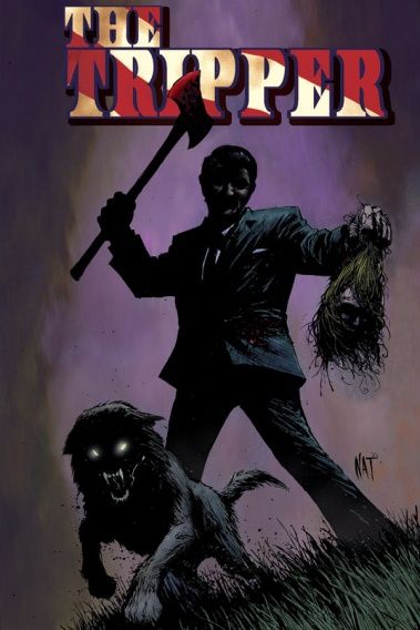
This Nat Jones cover for The Tripper could be a bit more animated.
__________________________________________
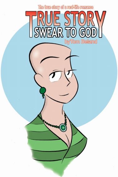
Very striking True Story Swear to God cover by Tom Beland.
__________________________________________
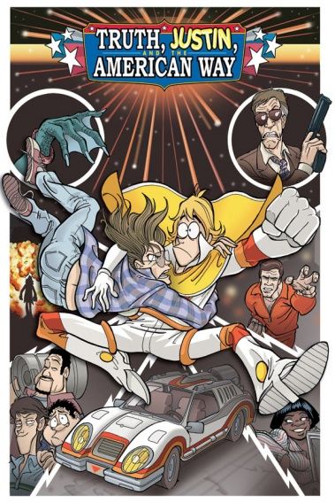
I like how they packed a lot of info into this Truth, Justin and the American Way trade cover, but I think Giuseppe Ferrario should have tried a more dynamic layout.
__________________________________________
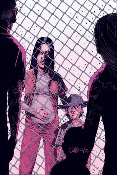
Not a fan of this Adlard/Rathburn Walking Dead cover. No action, but it also seems to lack suspense, as well.
__________________________________________
HONORABLE MENTION
__________________________________________
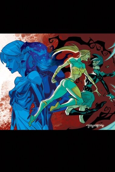
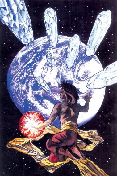
This Coleen Doran cover is striking, but I dunno...this may not be a great reason, but the perspective just threw me off on some level of perception.
It is still a nice cover, but the crystals were just too distracting to me.
__________________________________________
I like this Cross Bronx cover by Mike Oeming, but I think it's a little too close to the last issue's cover to make Top Five.
__________________________________________
Nice cover layout for Drain #1 by Sana Yanada, but I'm not a big fan of the character work.
__________________________________________
TOP FIVE!!
__________________________________________
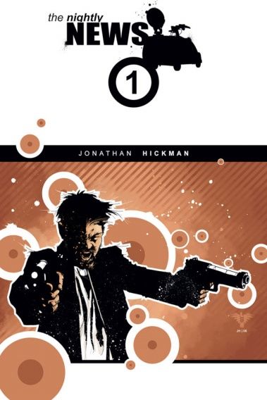
5. Not the most amazing cover, but I think Jonathan Hickman both drew a cool-looking drawing for this The Nightly News cover, while managing to combine it with a neat cover design to create a nice attitude to the cover.
__________________________________________
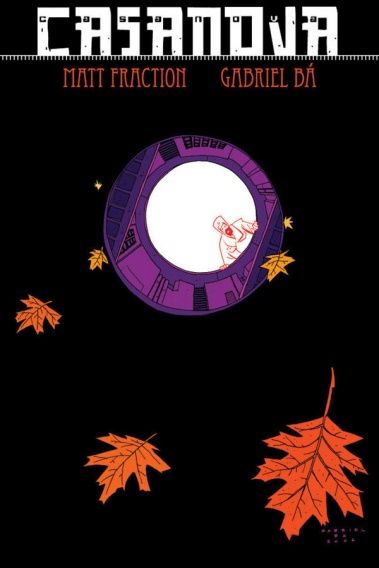
4. I love the way Gabriel Bá demonstrated depth on this cover, as well as his lovely use of black (Casanova's been brilliant with blacks and whites).
__________________________________________
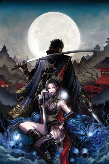
3. Okay, it's kinda creepy to see the little ghost-y girl all trampy...but otherwise, what an awesome Chris Bourassa cover!
__________________________________________
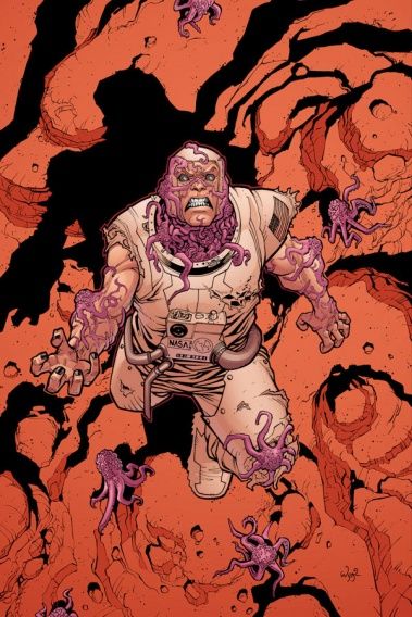
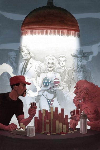
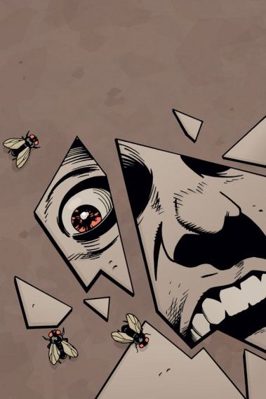
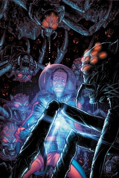
2. Tony Moore does an amazing job of getting across the situation with this striking Fear Agent cover.
__________________________________________
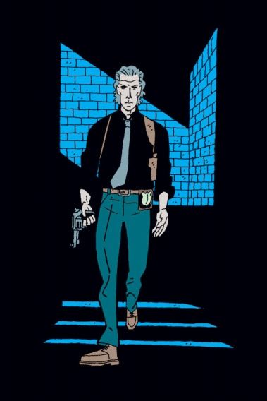
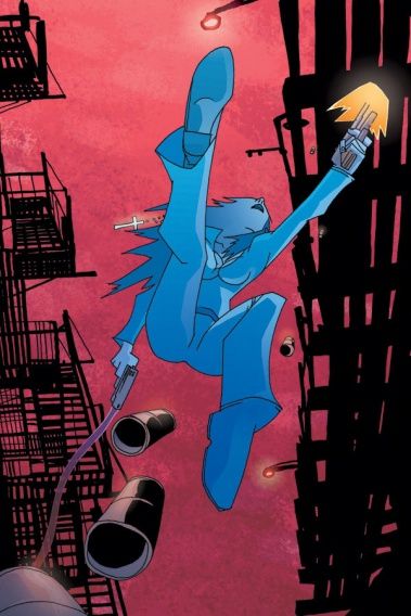
1 . If only Manny Trembley's art could be colored INSIDE the comic.
It's striking the way he can work so well with silhouettes and shadows, yet in the inside, his art is almost completely muddled to the point of it almost looking like black ink on black backgrounds.
Still, a striking cover that oozes cool.
I love it.
__________________________________________
Well, that's it for me!
Feel free to tell me YOUR prejudices (and your top five covers)!!!

