Not a dream, not a lie, I am indeed taking over your monthly looks at the covers the Big Two solicit. Let's begin with DC's July covers.
My format will be slightly different from Brian's. No honourable mentions, only a top five. As well, I'll be listing the name of the book and the artists credited for the cover prior to the image with my comments below. I'm not quite as nice a guy as Brian who always went out of his way to say something positive about each cover. I won't be doing that, preferring to take the term "judge" a little more literally.
(Oh, and there was a snafu earlier where Brian accidentally published an incomplete version of this post. I didn't change my approach as a result of any comments. And, yes, I am harsh. Covers are important and they matter, and they should be nothing short of excellent or they're worthless.)
Blackest Night #1 by Ivan Reis and Oclair Albert

Kind of creepy and gets the broader idea of the book across. Passable.
Green Lantern #43 and 44 by Doug Mahnke and Christian Alamy


These two work well as a pair, showing a sort of "before and after" view of the same spot. But, where's the background in #44? Is there one coming, because the lack of a background really hurts the pairing of the two covers. The design on the Black Lantern Martian Manhunter is nice, but a bit too subtle in its callbacks to his costume. The Black Hand looks suitably creepy, as well.
Green Lantern Corps #38 by Patrick Gleason and Rebecca Buchman

A nice twist on the normal "handing someone a Green Lantern ring" image with a handful of bloody rings. How did they get bloody and how did this Green Lantern get them? I kind of want to know now.
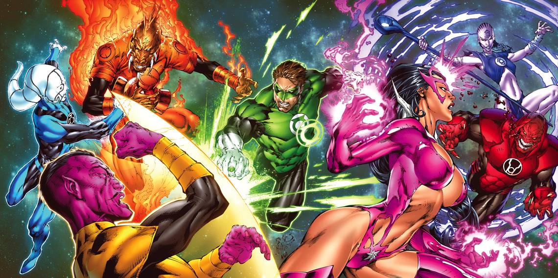
Blackest Night: Tales of the Corps #1-3 by Ed Benes and Rob Hunter (click for larger)

Oh how I hate Ed Benes's art. And oh how I hate Rob Hunter's inking. These covers are even more comical when you look at each on its own, like how issue two will have Star Sapphire's crotch in the lower right corner. Did Benes realise this when he drew the covers? We have to assume that he did... and yet he did it anyway. Odd.
Final Crisis Aftermath: Run #3 by Kako

Static and kind of blah. I like the look on this woman's face if only because it shows that posing in this manner is actually requiring effort on her part.
Final Crisis Aftermath: Escape #3 by Scott Hampton

Not sure how the small "speed" effect for only part of the wheel works, but, otherwise, a lovely composition. Some good pop art.
Final Crisis Aftermath: Dance #3 by Stanley “Artgerm” Lau

I've been digging the painted/computer colouring look of Dance's covers, and this one continues that in fine form. Most Honorable Super-Bat kissing a girl in his costume, which is then displayed on a giant screen in the background? Good stuff.
Final Crisis Aftermath: Ink #3 by Brian Stelfreeze

A snake tattoo... each cover focusing on a different tattoo could be an interesting idea, but it hasn't worked out that way.
Batman and Robin #2 by Frank Quitely

Quitely's covers can be a bit hit or miss, and this is a miss. A boring composition that we've seen a thousand times before. Nothing that new here.
Batman #688 by Tony Daniel and Sandu Florea

Oh, Tony Daniel... it's Batman's head covered with a liquid of some kind. He looks mad. Probably because this cover is very mediocre.
Batman: Streets of Gotham #2 by Dustin Nguyen

Dynamic, and I like the sketchy, washed-out look of the art. It gives what could be a pretty standard action cover a little bit of flare that makes it stand out. Probably not to everyone's taste, but it is to mine.
Gotham City Sirens #2 by Guillem March

Not as exploitive as most artists would make this image. Kind of cool and clever, especially Catwoman coming off as cat-like.
Red Robin #2 by Francis Manapul

Is this a spoiler? If these are the same character, their jawlines could indicate a bit of aging. The colouring makes this image work fully. Much better than the first issue's rather dull cover.
Batman Confidential #31 by Guillem March

Ugh, a great example of foreground and background images put together on a computer in a way where they don't match up at all. Obviously, the creepy batty Batman in the foreground should stand out, but his relationship to the background looks like bad greenscreen work. There are better ways to make foreground figures standout from the background. Very distracting.
The Outsiders #20 by Lee Garbett and Trevor Scott

Boring. A lot of negative space that does nothing with dreary colours. This will blend into the sea of covers on the rack on July 22. There's no pop to it. Next.
Superman #690 by Andrew Robinson

This cover, when compared to Robinson's Superman cover, doesn't work nearly as much for me. The figure work is less competent and it doesn't have quite the same POP to it. Still good, it just suffers by comparison.
Supergirl #43 by Joshua Middleton

I can't look at this cover without thinking that that bird behind Supergirl is totally sneaking a look up her skirt. A very generic cover that's well drawn, but nothing special.
Superman/Batman #62 by Rafael Alburquerque

Very quirky in a creepy, campy sort of way... if that makes sense. I like how the Joker is so over-the-top, as if he's been altered by the overactive imaginations of Robin and Supergirl.
Superman: World of New Krypton #5 by Gary Frank

A good use of light and shadow. A very stark figure that gives a good impression of what's going on inside the comic. Despite not wearing his costume, it's clearly Superman and is engaging enough to make me wonder how and why he's been put in this position.
Booster Gold #22 by Dan Jurgens and Norm Rapmund

Is the side of Deathstroke's face supposed to be that lumpy? It seems to accomodate for the image Jurgens places on his mask, which doesn't quite work. It's a good idea, but that lumpiness bothers me.
The Brave and the Bold #25 by Mario Alberti

Not bad, meant to be very basic and uses a lot of negative space. The shadow works, but I'm not sure what Hardware is doing to Blue Beetle. Is he holding him back or pushing him aside? The snow effect at the bottom is... vague and unclear.
The Flash: Rebirth #4 by Ethan Van Sciver

Dynamic and an interesting twist on this sort of image. I like the altered lightning bolt and that it seemingly takes place on a Flash logo. The juxtaposition of the very muscled Flash and the labcoat wearing Allen is a little disconcerting...
Dead Romeo #4 by Ryan Benjamin

Godawful colouring and computer effects over some godawful drawing. Why is most of this out of focus to demonstrate movement, while some parts aren't? Is the main guy's face not moving at all while the rest of his body is?
Green Arrow & Black Canary #22 by Ladrönn

I'm normally a big Ladrönn fan, but the cleavage on Black Canary here is rather distracting. I love the muted colouring and that it's obvious that the energy being sent out is sound waves. It's effective at getting the message across, but that cleavage... a bit much.
Justice League of America #35 by Eddy Barrows & Ruy Jose

Pretty solid coming from Benes. The ultra muscles and veins on Ace are horrible, but, otherwise, a solid and engaging composition. Though, why are the two women surprised in a frightened manner, while the guys are suprised in a pissed off way? Edit: As pointed out in the comments, the solicits are incorrect to credit Ed Benes since Eddy Barrows & Ruy Jose did this cover. Because I pay attention so much, I totally missed that signature. Apologies.
JSA vs. Kobra: Engines of Faith #2 by Gene Ha

Well drawn, but pretty boring. The JSA rushing off somewhere while Mr. Terrific carries a policeman. So what?
Justice League: Cry for Justice #1 by Mauro Cascioli (click for larger)

It's painted heroes coming at you out of hyperspace! With villains in the background looming overhead! I never quite understood how the Atom, a regular scientist, got so muscular and well-toned. That's weird. Not a horrible cover, but nothing that makes me want to actually pick up this comic.
Justice Society of America #29 by Jesus Merino

Is this meant to be symbolic or does the JSA actually get trapped in Mr. Terrific's black egg in this issue? I kind of want to know. I'm hoping for the latter, honestly. No real complaints or compliments here.
Jonah Hex #45 by Cristiano Cucina

Wow. This is very striking, particularly the casualness of Hex. He's in the rain in a town full of people who have been strung up and he doesn't seem to care that much. Very powerful.
The Last Days of Animal Man #3 by Brian Bolland

Everyone looks very unimpressed with Animal Man. Almost bored. Yet, he's freaking out. Older Superman's hair looks different from how older Superman's hair usually looks when an older Superman shows up. I like it. Nightwing is still Nightwing in the future? That we only see small, minor changes for the most part is really interesting and unexpected. Plus, you know, Brian Bolland draws pretty damn well.
The Mighty #6 by Dave Johnson

The contrast between the crayon-esque colouring of the astronaut and the very solid black of the Mighty is interesting. A striking image.
R.E.B.E.L.S. #6 by Kalman Andrasofzsky

Very dreary colours, but the drawing is good and grabs your attention.
Secret Six #11 by Daniel LuVisi

Not sure what I think of this. It's not bad, not good. The vague background figures are ominous, while the main image combined with the weather and torches has a very "virgin sacrifice" feel. Not sure the look on her face matches the setting... it's neither defiant nor beaten down. It's a bit too sultry.
Solomon Grundy #5 by Scott Kolins

Meant to have a very horror comic feel, obviously, but this is also very cartoony. Those two elements don't quite mix, but there's a certain power to this cover that I can't ignore. The figure is a little stilted, which holds the cover back.
The Spirit #31 by Nick Cardy

The Spirit knocks the second guy back with barely a thought! That's a great little touch! Cardy apparently only drew so much of this cover, but the colouring continues past his art... I wonder if that will get touched up for the final version. A solid piece of art that is better for the odd angles Cardy uses.
Strange Adventures #5 by Jim Starlin and Rob Hunter

A nice concept and the execution isn't bad. Since this cover features a relatively unknown character, not sure it has the drawing power you want. That bottom Weird looks out of his mind. He's my favourite one.
Teen Titans #73 by Joe Bennett and Jack Jadson

The shadow of Wonder Girl's head looks strangely tall and what's with her right (our left) leg? She's seemingly pressed against the wall, but the shadow suggests more room between her and the wall. Those small details jumped out at me, because this image is very boring and something I've seen a thousand times, done better in many instances.
Titans #15 by Angel Unzueta and Wayne Faucher

A comic drawn by Ed Benes but not featuring one of his covers? Weird! And I assume the Titans are in water, but it looks nothing like water. They look like they're in liquid light or something. And Tempest's positioning is awkward and I have no idea what his facial expression is meant to tell us.
Wonder Woman #34 by Aaron Lopresti

Wonder Woman is using a piece of wood she randomly grabbed as a weapon. I like that a lot. Not sure about that top shadowy figure, but, otherwise, a decent cover. Wonder Woman and Black Canary ready to kick some ass. Good stuff.
Vigilante #8 by Walter Simonson

Despite being the middle of some action and by Walt Simonson, this is rather boring and static. Don't look away or you'll forget the image entirely.
Warlord #4 by Mike Grell

You've seen this sort of fantasy image many, many times before, but Mike Grell sure does it nicely, doesn't he?
Billy Batson and the Magic of Shazam! #6 by J. Bone

Simplistic, but effective. A solid pin-up.
Batman: The Brave and the Bold #7 by Scott Jeralds

I can't quite figure out what's going on here. Is Batman stealing Robotman's head? Are people scared of Beast Boy turning into a bat? I have no idea.
Tiny Titans #18 by Art Baltazar

The body language on each character is wonderful here. Everyone is doing their own thing and having Robin sitting up straight and proper is perfect.
Cartoon Network Action Pack #39 by Jay Stephens

I have no idea who these characters are, but the cover gives me a good enough idea. Not very exciting.
Looney Tunes #176 by Scott Gross

The angle used is really good, putting us right in the middle of the action. Bugs looks panicked, while Daffy barely cares that his car is up in the air. Why? I want to know.
Cartoon Network Block Party #59 by Robert Pope

This is the final issue, so having every character on the cover makes sense.
Scooby-Doo #146 by Vincent Deporter

Action, monster, fireworks, exictement... pretty much what you want from a Scooby-Doo cover.
The Authority #12 by Simon Coleby

I had to look at this cover entirely too long to figure it out. At first, I thought Midnighter and his two pals were looking through some sort of portal at a city. Then, I noticed the other part of the city beneath them and the moon in the background. Oh, someone is stealing the city! Except, in the real world, I moved on to another cover around "Then, I noticed..."
Astro City: The Dark Age Book 3 #3 by Alex Ross

Despite not liking Ross's work usually, I almost always like his Astro City covers. The unique, unexpected colours and lack of easily-referenced characters makes this one look really good and eye-catching. What an odd collection of characters.
Stormwatch PHD #22 by Leonardo Fernandez and Francisco Paronzini

Winter. Standing there. Looking grim. YAWN!
Wildcats #13 by Ryan Sook

I like it, but is it just me or do Grifter's eye look very feminine? Has Grifter become a woman? Nothing else indicates that, but I'm curious. The foreground/background discontinuity bothers me less here, because the background isn't the literal background.
North 40 #1 by Fiona Staples

Kind of static, but does showcase a bunch of characters I presume show up in this issue. For a first issue, though, I generally want (and so should everyone else) something that screams "YOU MUST BUY THIS COMIC!" and this cover doesn't do that.
Freddy vs. Jason vs. Ash: The Nightmare Warriors #2 by Shane Davis

I like nothing about this cover. The art is ugly, the pose anything by engaging or dynamic. Ugh.
Gears of War #9 by Jim Lee and Scott Williams

Very similar to the Power Girl cover, but Lee doesn't pull it off quite as well as Conner. It's close, though. I'm actually amazed at how much I like this cover since I'm not a fan of Lee's art. At all.
Killapalooza #3 by Trevor Hairsine

I could do without any more crosshairs covers for at least five years, but, putting that aside, Hairsine captures a lot of energy of a rock show. I like it.
Prototype #4 by Darick Robertson and Matt Jacobs

Kind of boring. I like Robertson's art and this gives a general sense of the story, but, really, boring.
Starcraft #3 by Federico Dallocchio

I like the actual art, but the image is very static and dull. Another bothersome foreground/background disconnect. But, yeah, the actual drawing is rather good.
World of Warcraft #21 by Mike Bowden and Tony Washington

A two-headed monster shouting "By the power of Greyskull"? This reminds me of a splash page that would work within the context of a story, but, as a cover, is just wrong.
Greek Street #1 by Kako

A little too busy. I like the roughness of the character in the foreground and the use of pink. Dropping out a lot of the background stuff and simply focusing on the woman would have been stronger.
Fables #86 by Joao Ruas

Haunting, creepy, very well done.
Jack of Fables #36 by Brian Bolland

Very fun. The glee on Jack's face combined with the shock and outrage on the apes' faces... fantastic.
Air #11 by M.K. Perker

The white background could be boring, but the bird shadows, shaded appropriately sketchy make it work. The foreground figure is very interesting and draws the eye well. A striking image.
DMZ #43 by John Paul Leon

A central image with a bunch of small images, almost like photographs piled atop the main image. Most of the figures in the main image are wearing gas masks for some reason, while one isn't. Another cover that I find myself looking at for a long time, but not to figure anything out.
Bang! Tango #6 by Howard Chaykin

Well designed and composed. A striking image with a background that tells you a bit about the book. Chaykin is quite good at covers and drawing readers in through the single image.
House of Mystery #15 by Esao Andrews

Interesting image. The house is prominent, which I like -- it's the title "character" after all. The outside force unleashing ghosts on the inhabitants is well executed.
Madame Xanadu #13 by Michael Wm. Kaluta

Interesting composition. I'm not familiar with the book, but the doubling of these two characters intrigues me with the similar looks, eyes, and objects... wait, does the background figure have three hands?
Northlanders #19 by Massimo Carnevale

Violent, dynamic, fluid... very good.
The Unwritten #3 by Yuku Shimizu

What the hell is going on? Not in a "I don't understand" way, but in "I want to know how these events have come about" way. What the hell is with that guy in the front? Very interesting and makes me want to pick up this book to find out what's going on.
Scalped #31 by Jock

Very lovely design and a good use of negative space to emphasise specific elements. The focus is really drawn to Dash and his obvious problem with needles and guns.
Unknown Soldier #10 by Dave Johnson

Wow. This is a beautiful cover and, again, great use of negative space to draw the viewer's attention. The various versions of the title character are interesting as he grows with different objects -- each less deadly in an immediate sense (the camera not deadly at all usually).
Young Liars #17 by David Lapham

Striking popart image with the Benday dots and the guitar/gun Young Liars symbol on Sadie's sunglasses. Part of how this works as a cover is in the final product with the colour scheme and text.
And, now, for the top five!
5. Super Friends #17 by J. Bone

I like it. Very basic, but Bone gives each superhero their own little quirk. The Flash looking like he accidentally swallowed a bunch of sand is priceless. More comics need stuff like that on their covers. How about a month of "I think I just swallowed a bug" variants? Anyone?
4. Power Girl #3 by Amanda Conner

Gotta love the look on Power Girl's face. Sort of tired, sort of "screw you," sort of... I don't know, but it's really good. Amanda Conner draws faces that's almost on the same level as Kevin Maguire. The disconnect between the foreground and background here is problematic, though (it's a pet peeve of mine apparently -- I wasn't aware of it until this post).
3. Action Comics #879 by Andrew Robinson

I really like this cover's art. The absent-minded, distant look in Nightwing's eyes is engaging. Why is his fist raised that way while he looks bored? There's a lovely Sienkiewicz quality to Robinson's Nightwing here.
2. Hellblazer #257 by Simon Bisley

Is that John Constantine looking oh so scuzzy and horrid? I feel dirty just viewing this cover. Everything about the image screams seedy and horrible. I love it.
1. Detective Comics #855 by JH Williams III

How good is JH Williams III? This is a trippy, complex piece of art. I don't know where to look first and find myself coming back to it again and again.
That does it. Agree, disagree, let me know.