First off, thanks for all of the great comments last month -- and the surprising lack of "Bring back Brian" e-mails. Now, let's get to judging DC's August covers by terribly unfair and harsh standards.
As always, the format:
- Title, issue number, artist
- Cover image
- Comments
- Covers are in the order they are solicited, for the most part
- My top five are at the end of the post
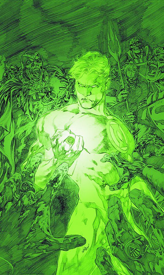
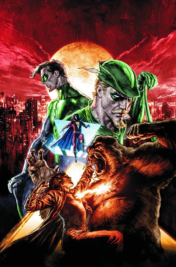
Blackest Night #2 by Ivan Reis and Oclair Albert
This is a very, very good cover. The use of green and the pencils is just wonderful. Part of me thinks this isn't the finished cover and I hope I'm wrong there, because this is just lovely.
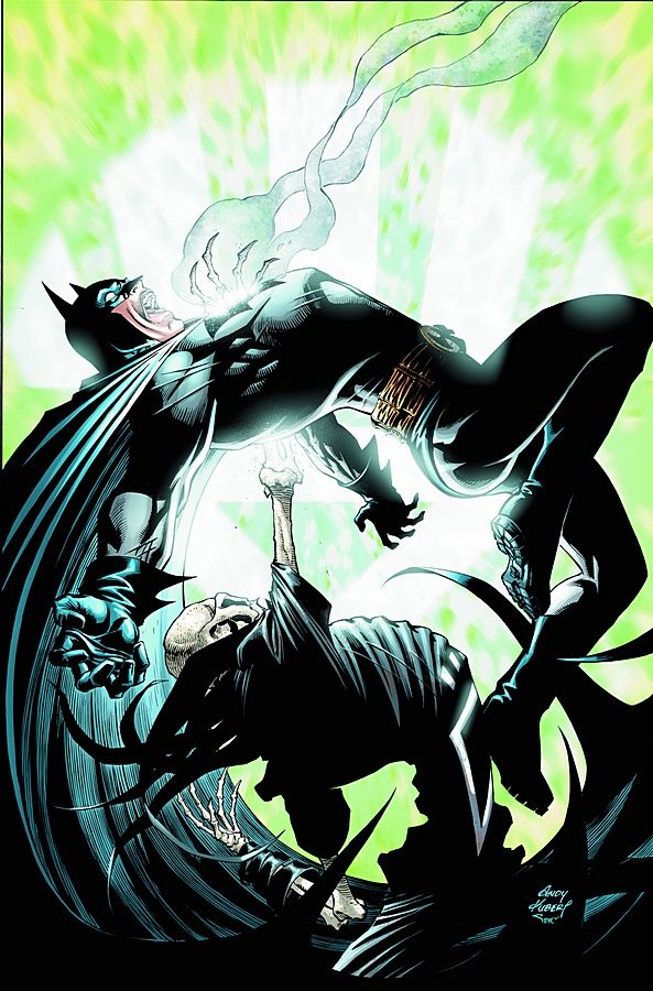
Blacket Night: Batman #1 by Andy Kubert
I like it. Nice action shot that could have been drawn from a number of POVs, but this one works.
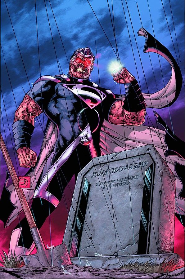
Blackest Night: Superman #1 by Eddy Barrows and Ruy Jose
Striking and intriguing image that presents the reader with a great idea of what's inside.
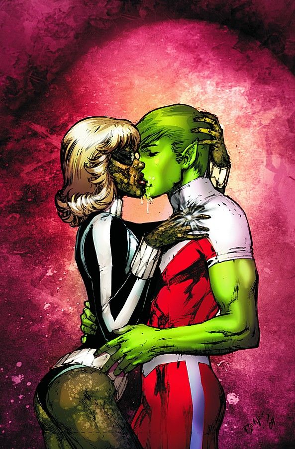
Blackest Night: Titans #1 by Ed Benes and Rob Hunter
I like the concept and the rougher linework is good on Black Lantern Terra, but not so much on Beast Boy. Then again, I'm not a fan of Ed Benes's pencils or Rob Hunter's inks, so what do you expect?
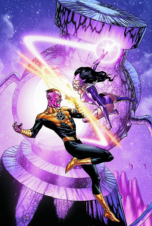
Green Lantern #45 by Doug Mahnke and Christian Alamy
Sinestro's skin colour works to the advantage of this image, making his yellow uniform stand out very well in a sea of violet/purple/pink. It gives the cover some much needed pop since it's a boring, standard, two characters fighting image.
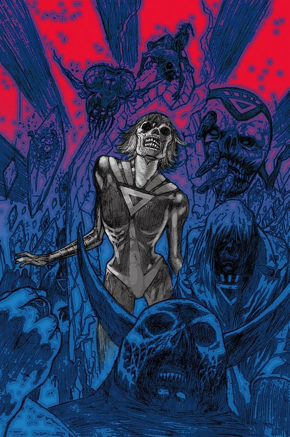
Green Lantern Corps #39 by Patrick Gleason and Rebecca Buchman
Like the cover to Blackest Night #2, I love the rough pencils and colouring. The image here is much more scary/creepy than the other cover, though. It's also a bit more dynamic.
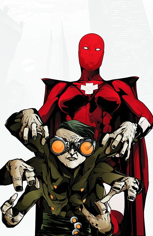
Final Crisis Aftermath: Run! #4 by KAKO
I like the two characters, very clean linework and colours that jump off the page, but it's very static and boring at the same time. I'm usually a fan of the use of negative space to draw attention to an image, but in cases like this, simply having the background drop away for two characters standing around itself what I'm talking about.
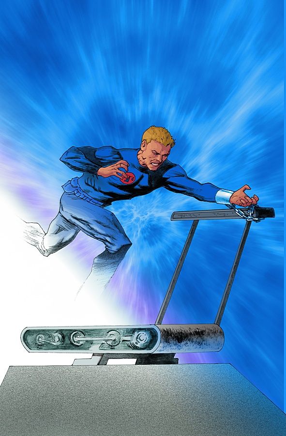
Final Crisis Aftermath: Escape #4 by Scott Hampton
This series has had some great covers. This isn't one of them. I understand the use of computer images given the central image -- but, the focus of the background being the centre while the character runs towards something else... it just doesn't make sense to me.
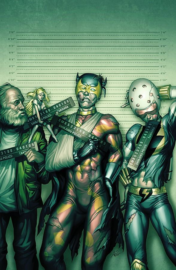
Final Crisis Aftermath: Dance #4 by Stanley "Artgerm" Lau
Not terribly original, but well executed. The way Lau draws their injuries is really well done. And why is the police ID bar in Well-Spoken Sonic Lightning Flash's mouth?
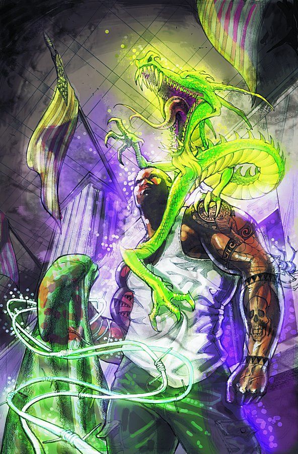
Final Crisis Aftermath: Ink #4 by Brian Stelfreeze
After last month's mundane tattoo-centric cover, this is a welcome change. Bolder and demonstrates the Tattoo Man's powers more explicitly. EDIT (May 28): This is actually the second page of Final Crisis Aftermath: Ink #1, not the cover to issue four. Still, it would make a decent enough cover, don't you think?
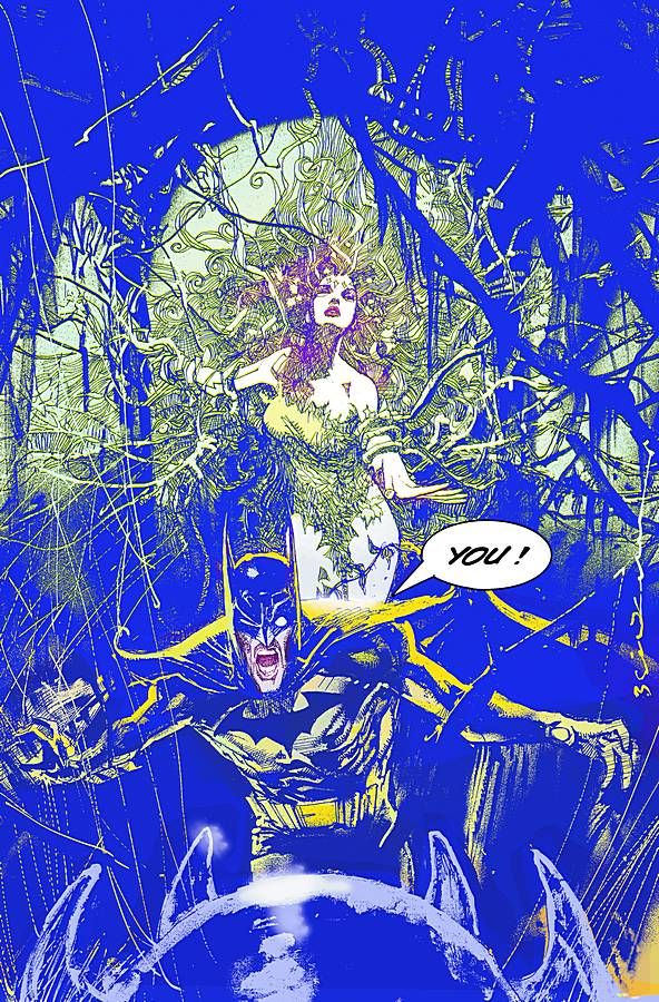
Batman: Widening Gyre #1 by Bill Sienkiewicz
Restrained work by Sienkiewicz, but also very engaging and detailed. The sketchier, more "out there" style is saved for Batman, which sets him apart. Very nice.
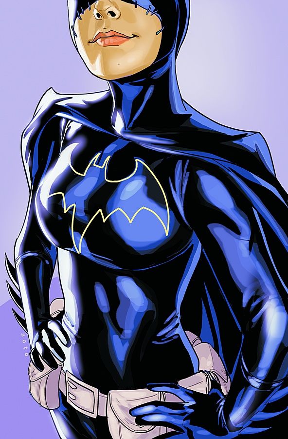
Batgirl #1 by Phil Noto
A cover we've all seen for quite some time and not bad. It works as a teaser image online or as an ad, causing buzz surrounding the identity of Batgirl, but as a cover... I'm not sure.
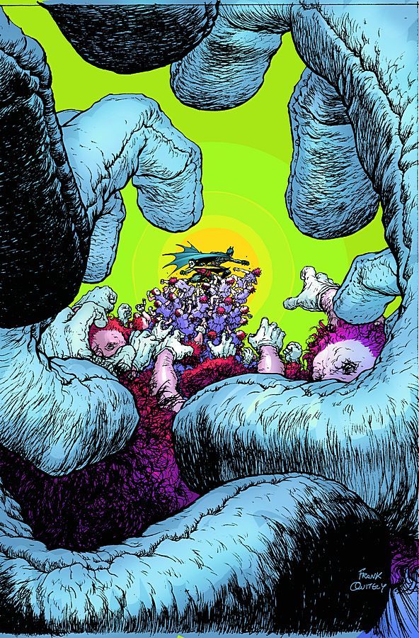
Batman and Robin #3 by Frank Quitely
Great angle that leads the eye to the centre where Batman and Robin fight this swarm of identical men. Quitely is an expert on this sort of POV.
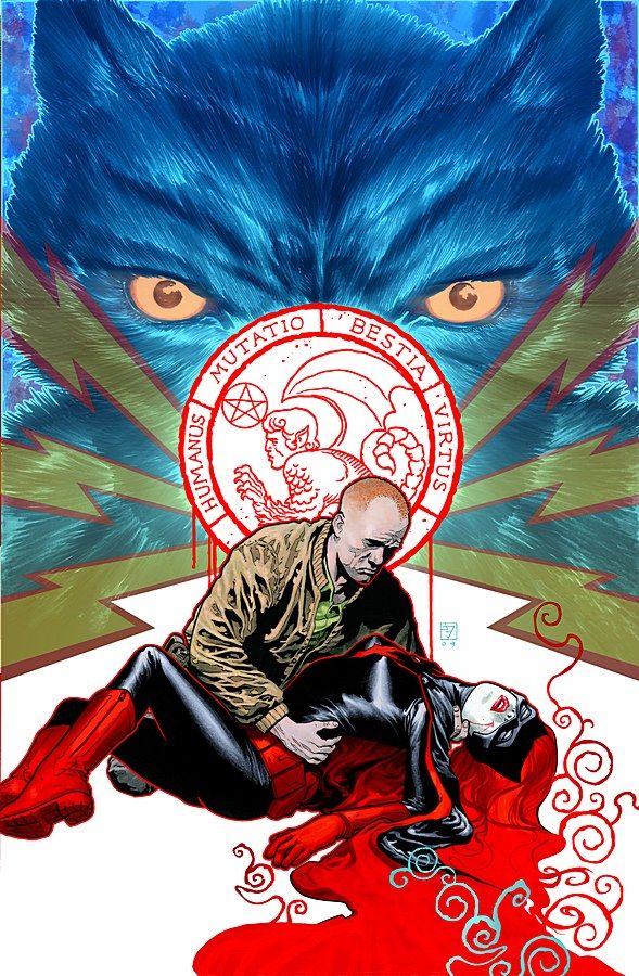
Detective Comics #856 by JH Williams III
The fur on the animal in the background makes the foreground image that much clearer and emphasises it superbly. Another winner by Williams.
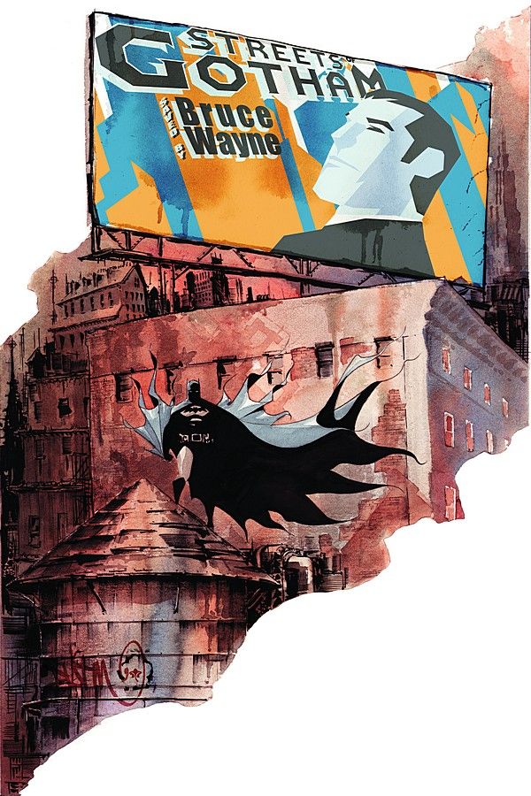
Batman: Streets of Gotham #3 by Dustin Nguyen
The billboard is a nice touch to an otherwise boring cover. Very well drawn and the odd border for the picture is nice, but it doesn't really draw me in.
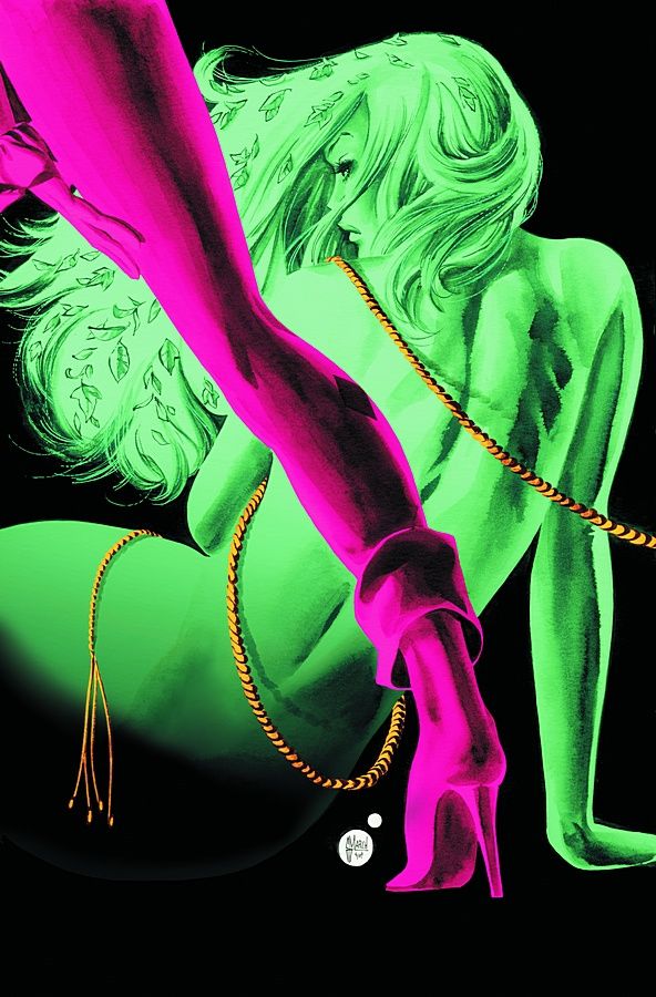
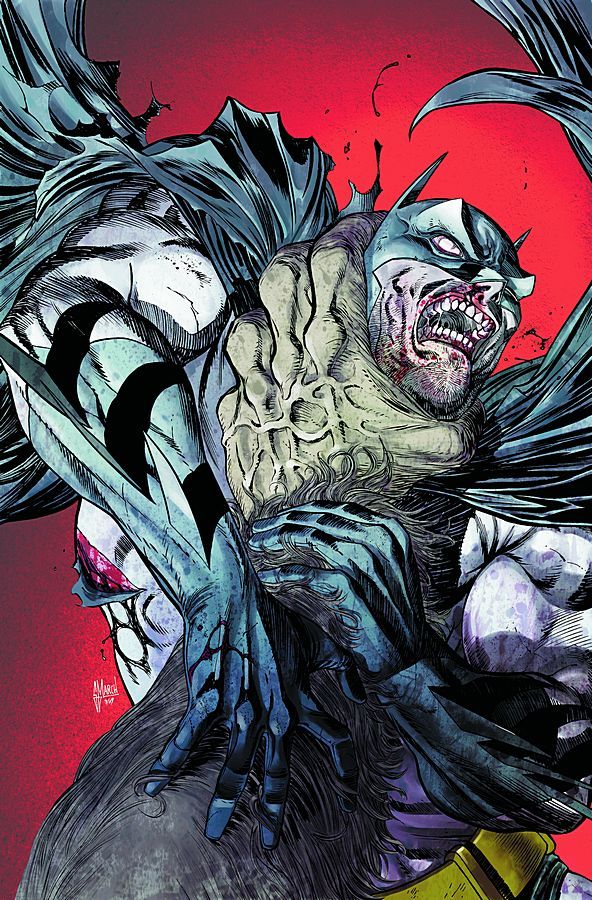
Gotham City Sirens #3 by Guillem March
A sexy tease cover that maintains some standard of decorum, going for a more suggestive look than explicit. Reminds me of an old pulp image more than anything.
Batman Confidential #32 by Guillem March
Not nearly as good as his Gotham City Sirens cover, but decent enough. I do like how March can vary his style so much and this is a solid action pic.
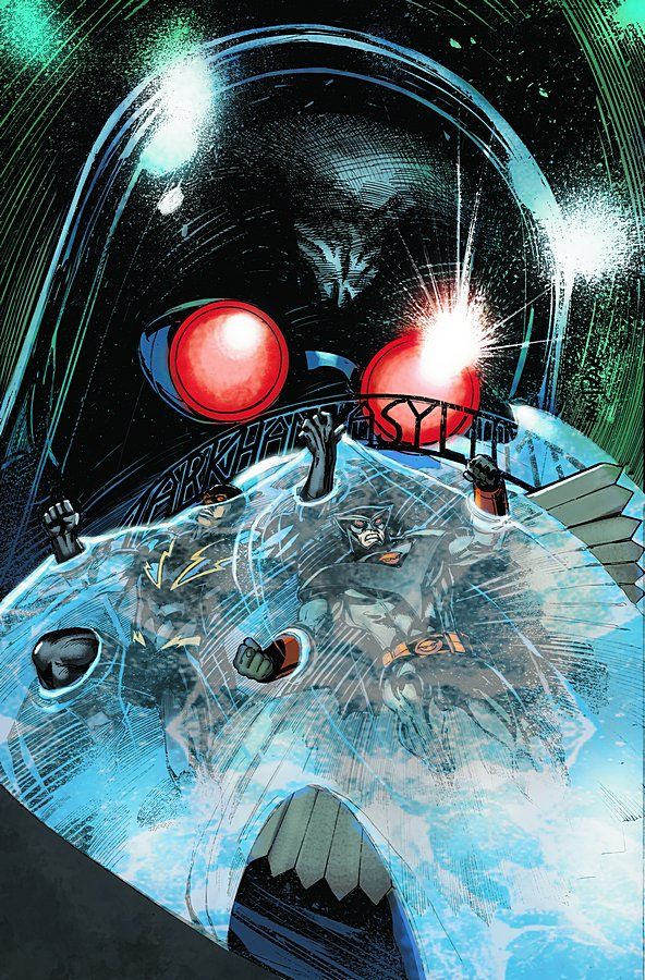
Outsiders #21 by Tom Mandrake
A clever image, but a little too busy and vague in execution. The ice, as well, looks more like water than ice.
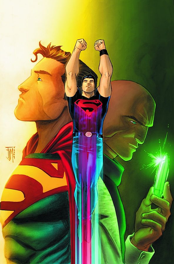
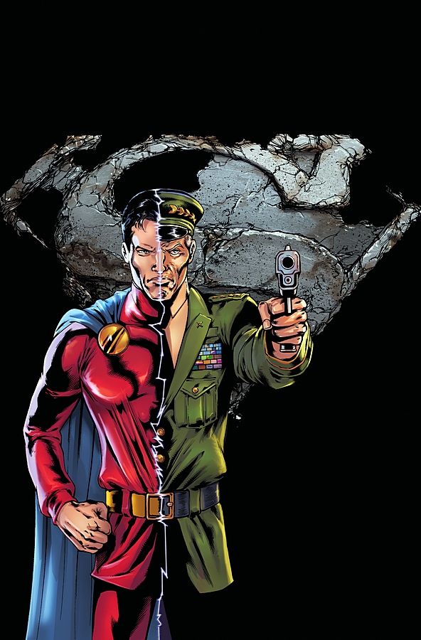
Adventure Comics #1 by Francis Manapul
A solid concept, showing the two sides of Superboy and spotlighting his return. I will say that this cover does make me want to go on my "So what if Lex Luthor's genetic material was part of Superboy's make-up?" rant.
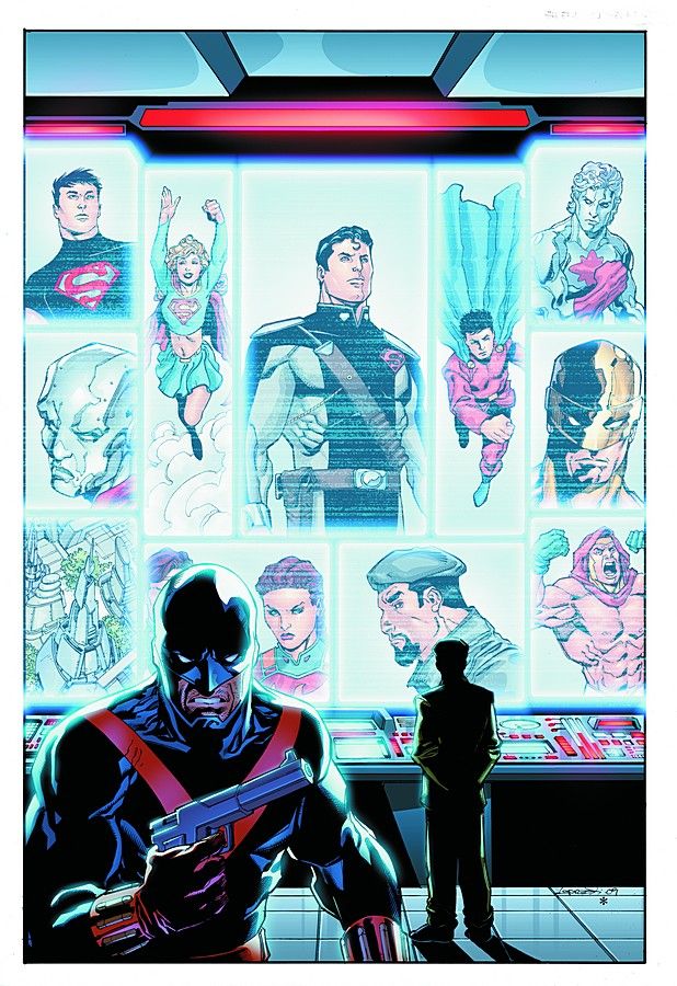
Superman Secret Files 2009 #1 by Aaron Lopresti
A nice concept that ties into the "Secret Files" nature of the comic.
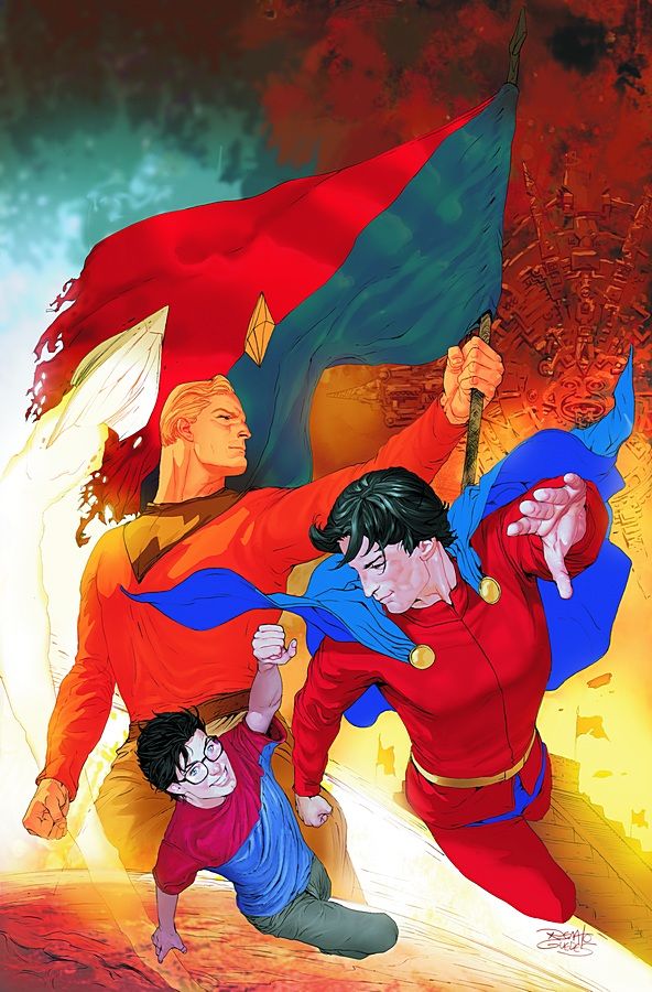
Superman Annual #14 by Renato Guedes
A montage image that doesn't really work for me. It's a bit too busy and confusing. The actual artwork is nice, but the composition is a mess (and, for me, the composition of a cover is as important as the art itself).
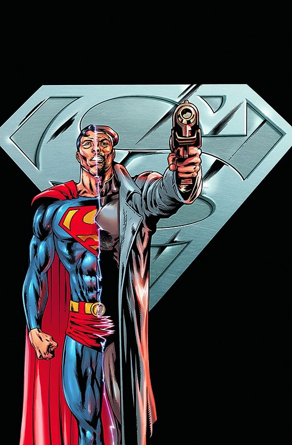
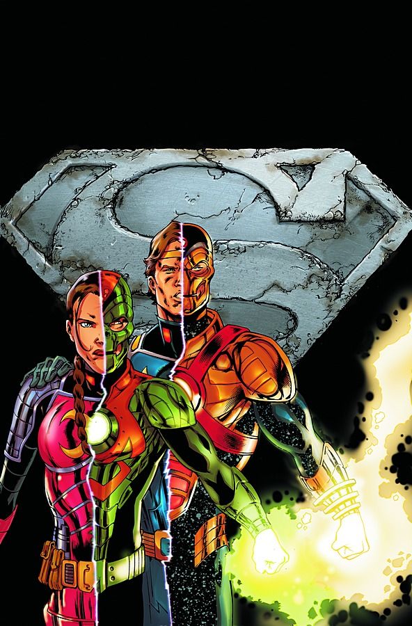
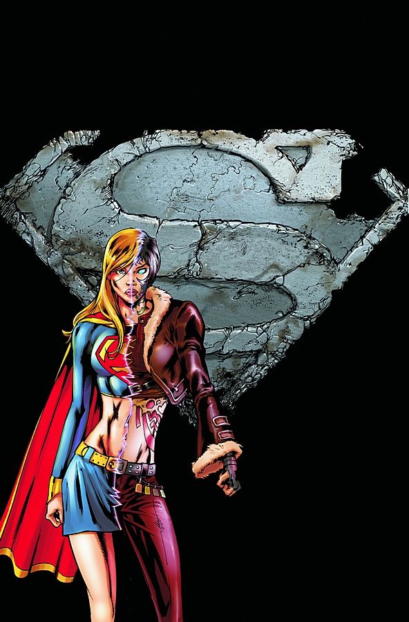
Superman: World of New Krypton #6, Action Comics #880, Supergirl #44, and Superman #691 by Fernando Dagnino and Raúl Fernandez
A nice concept and a great way to spotlight that these four issues are part of the same story. It also sets up the two sides of the conflict. I like them.
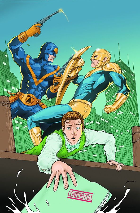
Superman's Pal, Jimmy Olsen Special #2 by Pere Pérez
Jimmy Olsen in trouble cover #8576. It still works, though.
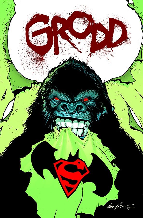
Superman/Batman #63 by Rafael Albuquerque
HA! Funny, engaging image. The "GRODD" at the top adds well, particularly the lettering.
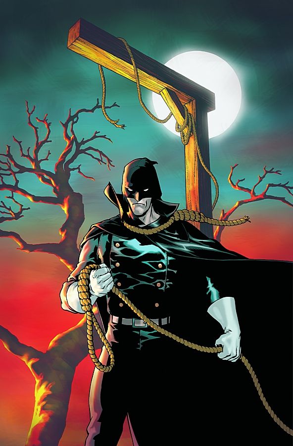
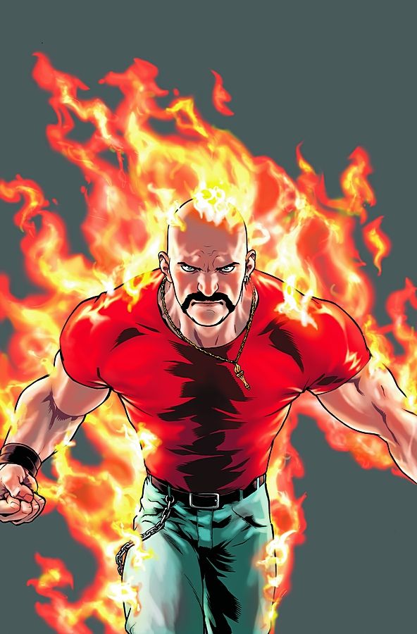
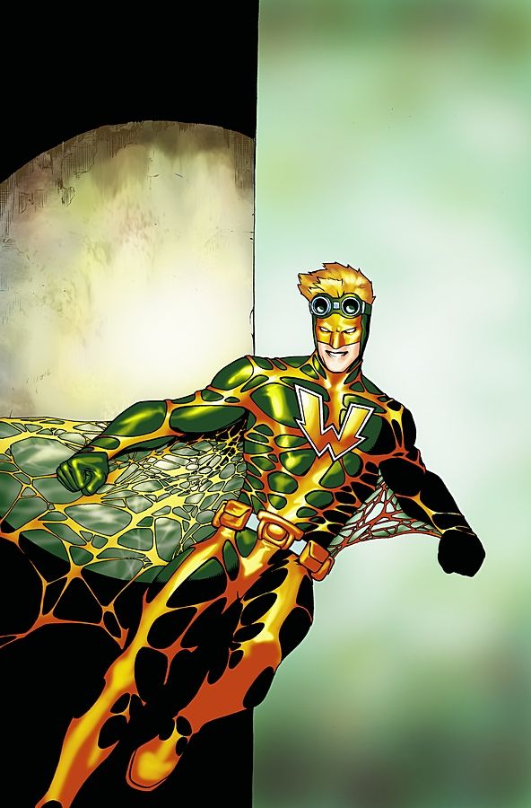
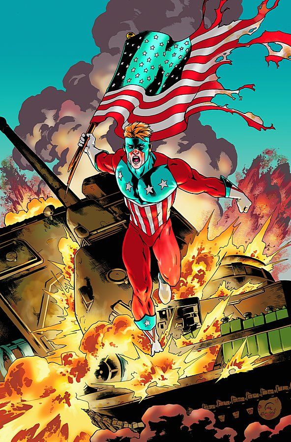
The Red Circle: The Hangman #1, The Red Circle: Inferno #1, The Red Circle: The Web #1, and The Red Circle: The Shield #1 by Jesus Saiz
Getting one artist to do all four covers is a smart idea -- I would have liked a bit more of a unified visual theme, though. None of the images are that engaging or striking. If I were to rank them: Hangman, Web, Shield, Inferno.
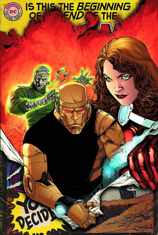
Doom Patrol #1 by Matthew Clarke
Fantastic concept, mediocre execution. More of the original cover, a better sense of the trio of characters breaking through -- both would have made the cover stronger. It's kind of blah right now.
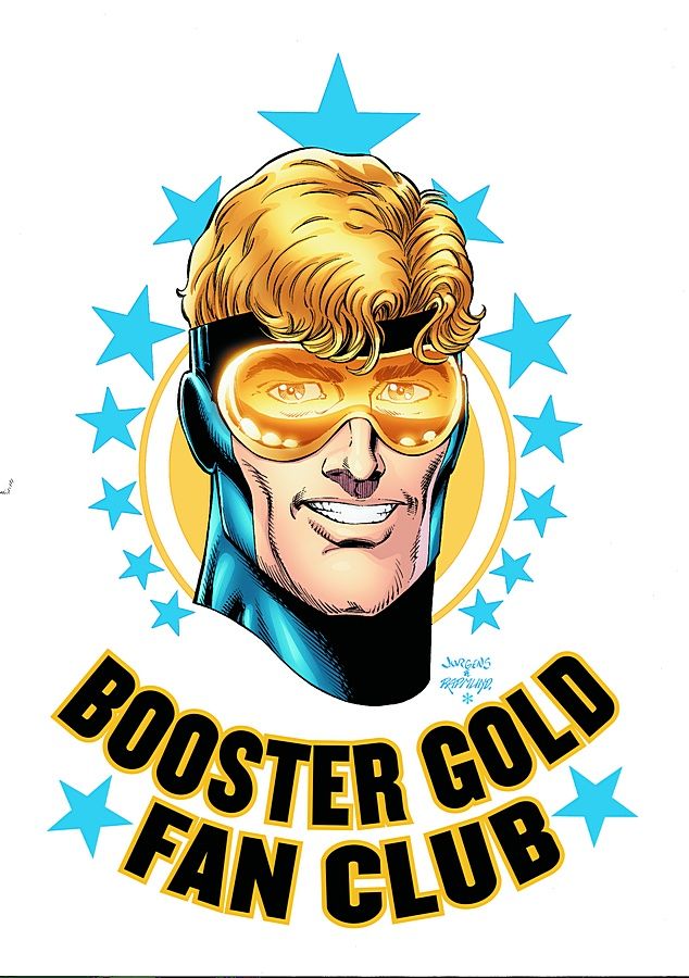
Booster Gold #23 by Dan Jurgens and Norm Rapmund
This should work, but... it just reminds me of a shirt design I'd expect to see in Previews that I would never buy. Or wear if given to me.
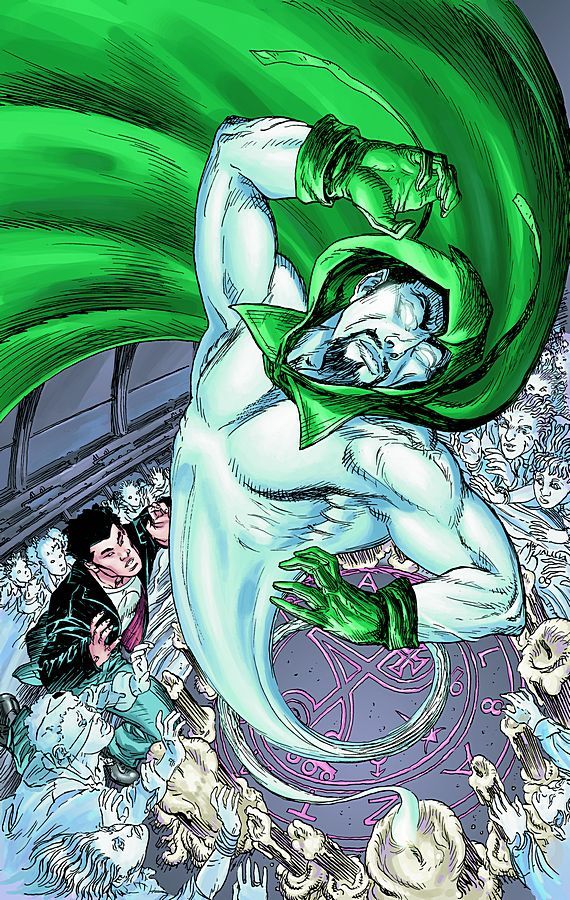
The Brave and the Bold #26 by Michael Wm. Kaluta
The art on the Spectre is great, but the rest of the figures look rushed and incomplete. A strong design, though.
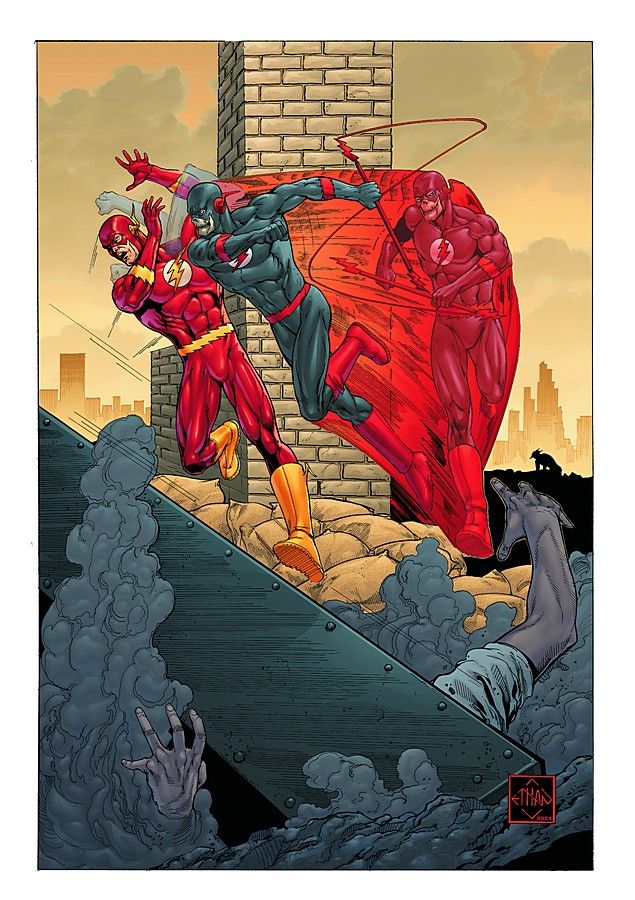
The Flash: Rebirth #5 by Ethan van Sciver
An homage/allusion cover that works well, because it takes the basic design/story idea of The Flash #123, but distorts it to tell a new story with its image.
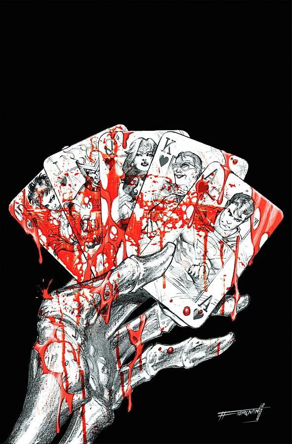
Justice League of America #36 by Fabrizio Fiorentino
Great concept and the execution is pretty good, for the most part. Another pencil-heavy cover -- is this a new trend at DC or are they falling behind? If it's a new trend, I approve, because it's been done a very effective manner so far.
Justice League: Cry for Justice #2 by Mauro Cascioli
The foreground image is great, but the rest leave me cold.
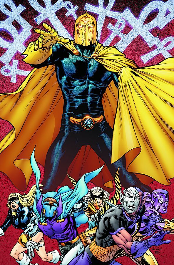
Justice Society of America #30 by Jesus Merino
The speckled colouring effect on Dr. Fate and the background is cool. Fate himself is an imposing/intriguing figure. The villains at the bottom seem like an afterthought, though.
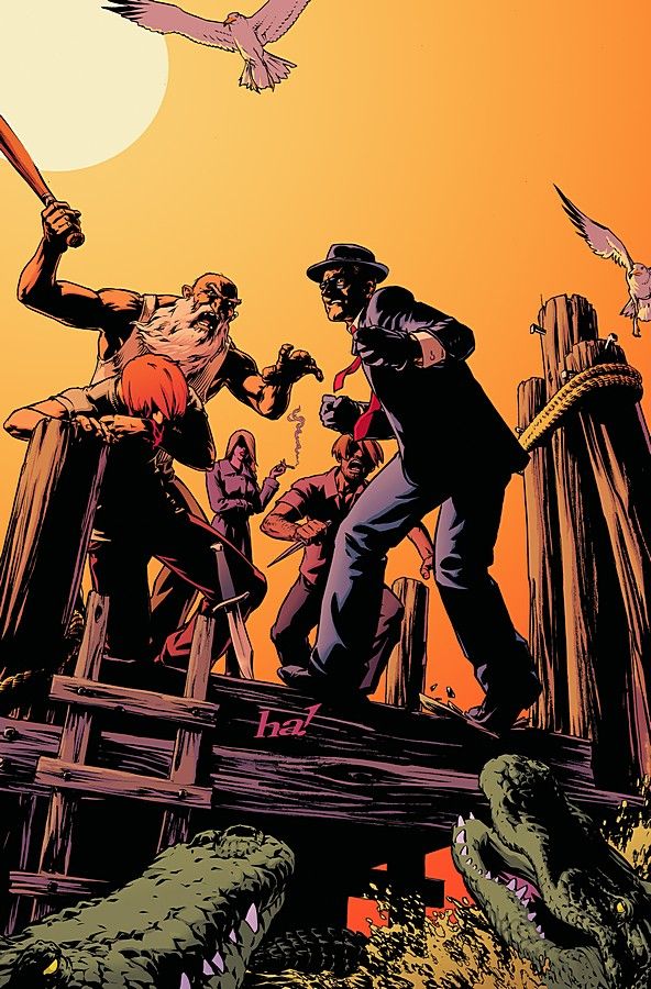
JSA vs. Kobra: Engines of Faith #3 by Gene Ha
I'm not sure what to make of this. The art is great and the cover draws me in. The sky has a water effect that you wouldn't expect. Huh.
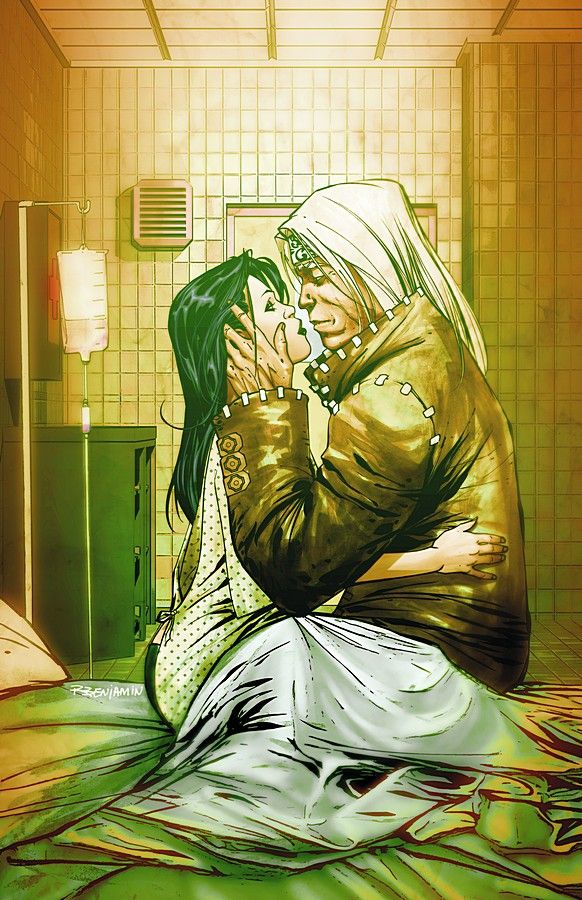
Dead Romeo #5 by Ryan Benjamin
A touching cover, nicely done. It doesn't make me want to buy the comic, though.
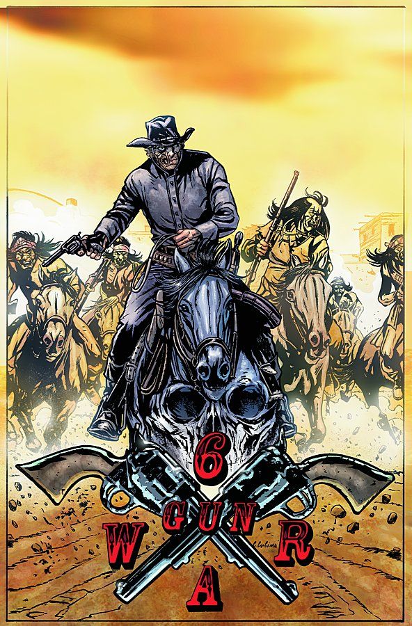
Jonah Hex #46 Cristiano Cucina
A decent image. Nothing special really, but competently done.
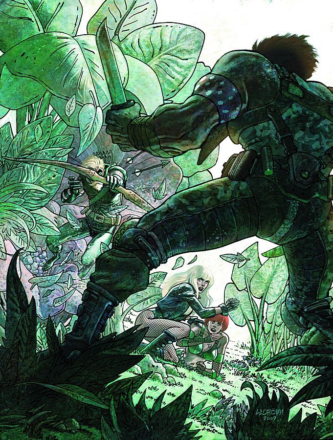
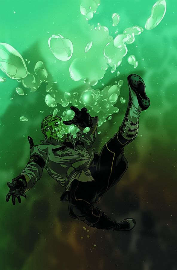
Green Arrow & Black Canary #23 by Ladrönn
What is up with the women's hair? The colouring just doesn't gel. Their poses is also a bit bothersome since they're both capable women who are cowering while Ollie does the job. Odd.
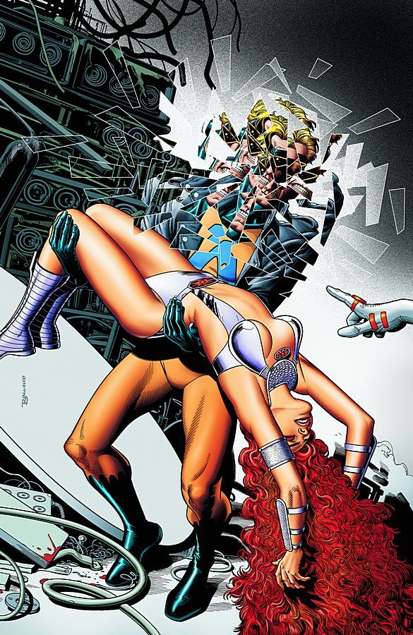
The Last Days of Animal Man #4 by Brian Bolland
Okay, this is just gorgeous work. There is something so unsettling about the manner in which Bolland does the shattering/fragmenting effect. The rest of the image is pretty standard, but that effect really elevates this cover.
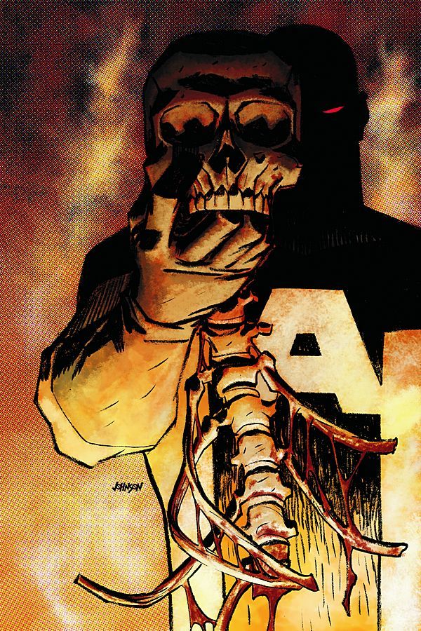
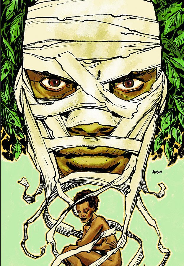
The Mighty #7 by Dave Johnson
The colouring on this cover is disturbing, which works with the image. Very striking.
R.E.B.E.L.S. #7 by Kalman Andrasofzsky
Good combination of computer effects and regular pencilwork. The drawing is very well done.
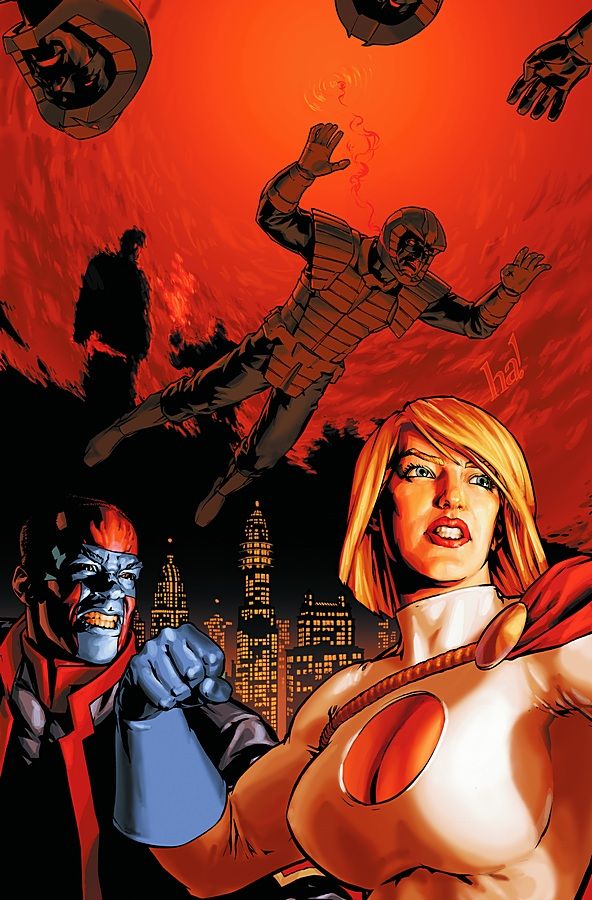
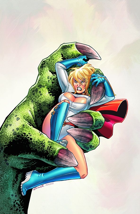
Power Girl #4 by Amanda Conner
She is pissed off. Conner's facial expressions are unmatched. The lack of any sort of background hurts this for me.
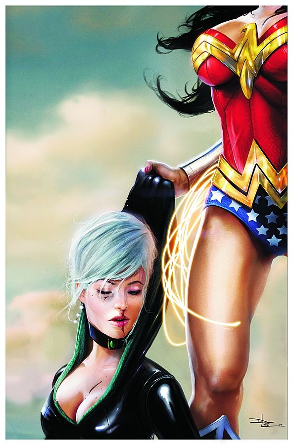
Secret Six #12 by Daniel Lu Visi
Gotta love a composition that makes sure there's just enough room for both sets of breasts on the cover, eh?
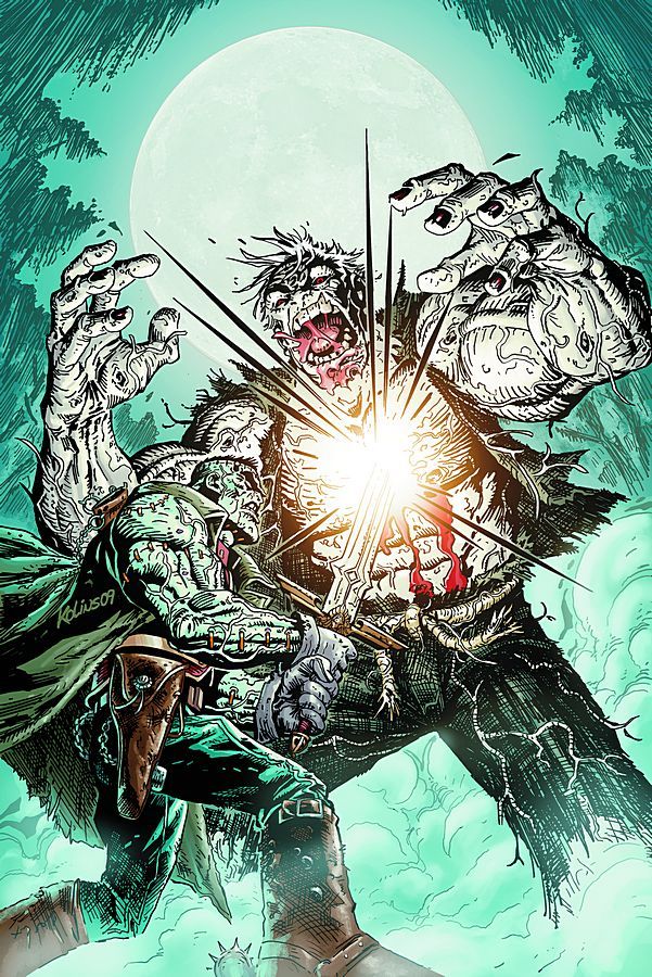
Solomon Grundy #6 by Scott Kollins
Kollins's rougher, cruder linework is very appropriate for these undead characters and this is a great action shot.
The Spirit #32 by Gene Ha
Uh oh! The Spirit is in some capital T Trouble! Something very basic about this that's also very effective.
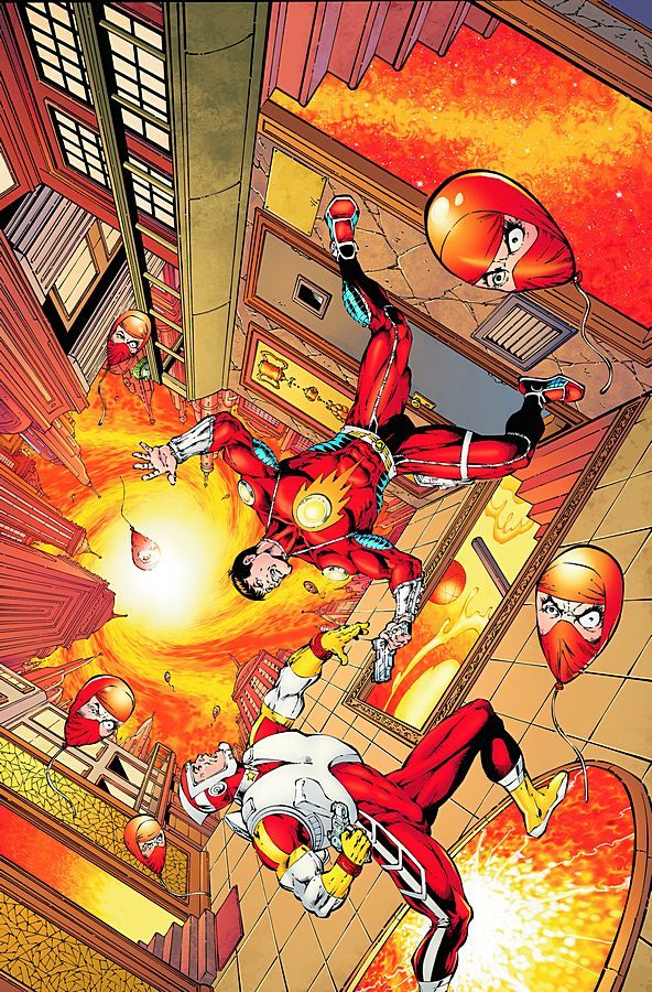
Strange Adventures #6 by Jim Starlin and Rob Hunter
This adventure sure looks strange, so this cover lives up to the title. An offbeat composition and image with some Weird balloons. Pretty good.
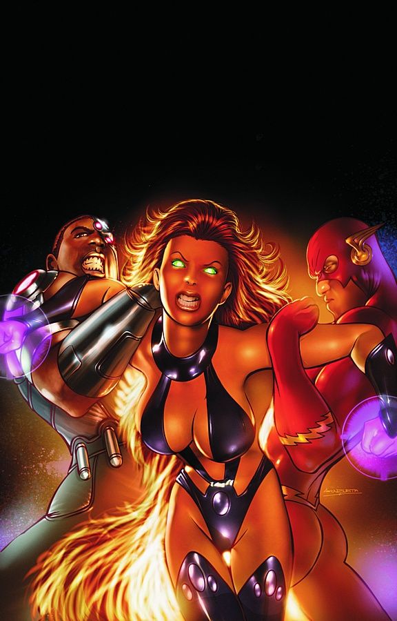
Titans #16 by Angel Unzueta
WHERE IS THE BACKGROUND?!? WHERE, DAMMIT! (And why does the Flash look like he's concentrating on looking cool?)
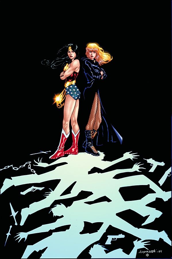
Wonder Woman #35 by Aaron Lopresti
A cool-looking design. No background, but it doesn't require one.
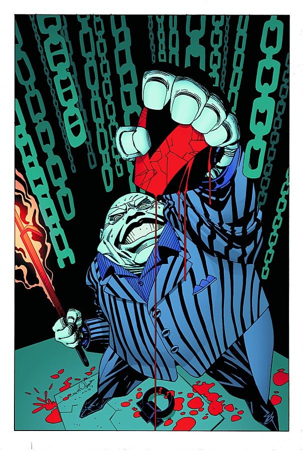
Vigilante #9 by Walter Simonson
SIMONSON!!!!!!!! Great design, engaging image, I like it.
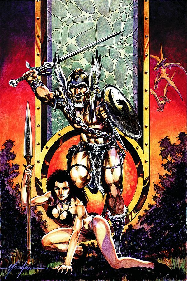
Warlord #5 by Mike Grell
A classic fantasy cover. Well executed and well designed.
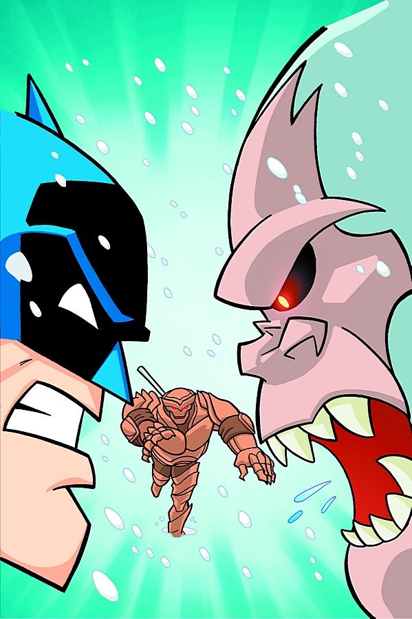
Batman: The Brave and the Bold #8 by Scott Jeralds
Batman versus Yeti! YAY!
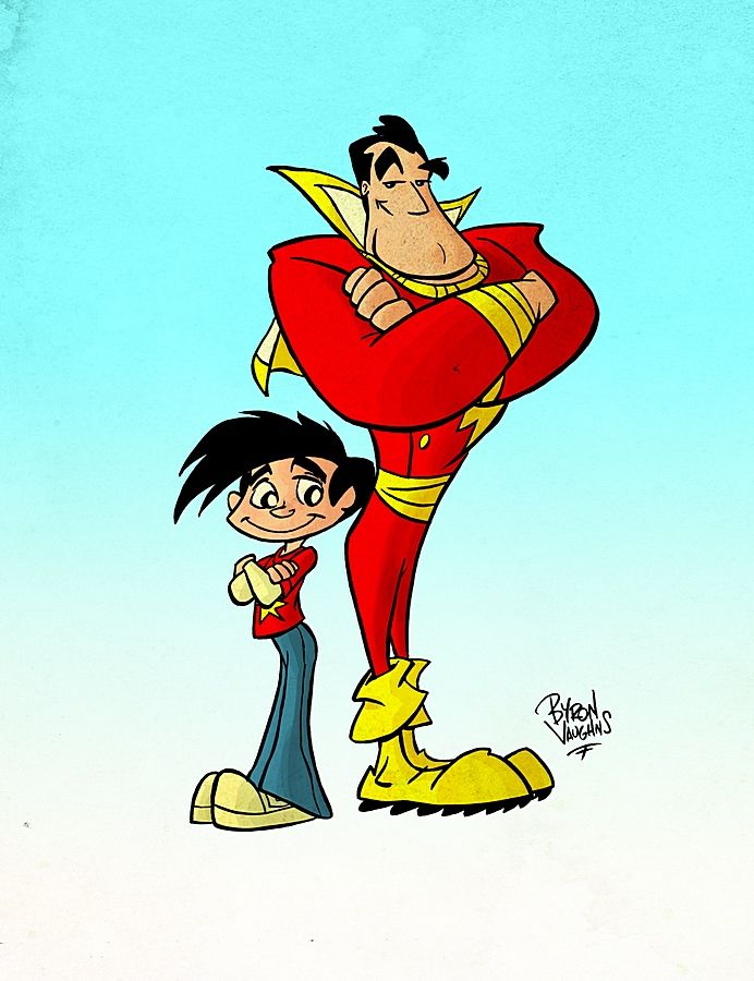
Billy Batson and the Magic of Shazam! #7 by Byron Vaughns and Ken Branch
This gets the basic concept of the book across, but not much else.
Tiny Titans #19 by Art Baltazar
Very cute cover that makes me feel all mushy deep down inside where I'm soft like a woman.
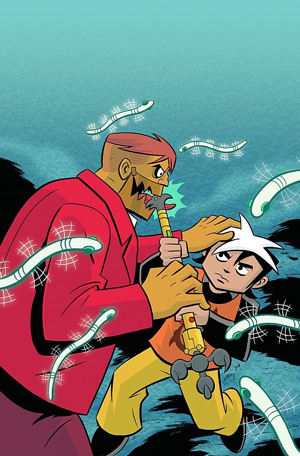
Cartoon Network Action Pack #40 by Jay Stephens
Flying glowing worms? Cool! Nice cover.
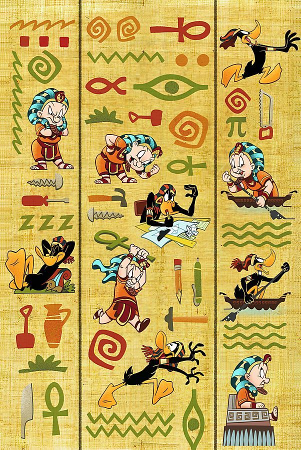
Looney Tunes #177 by Scott Gross
It's like a complete story in one cover. Great design, great execution.
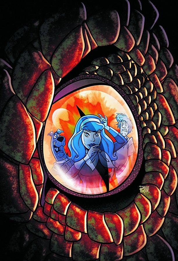
Scooby-Doo #147 by Vincent Deporter
The contrast between art styles for the dragon and the gang is very striking and nice.
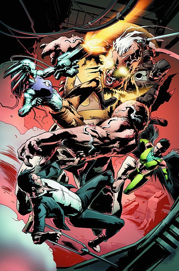
The Authority #13 by Simon Coleby and Cliff Rathburn
A decent fight scene. I do love Coleby's style.
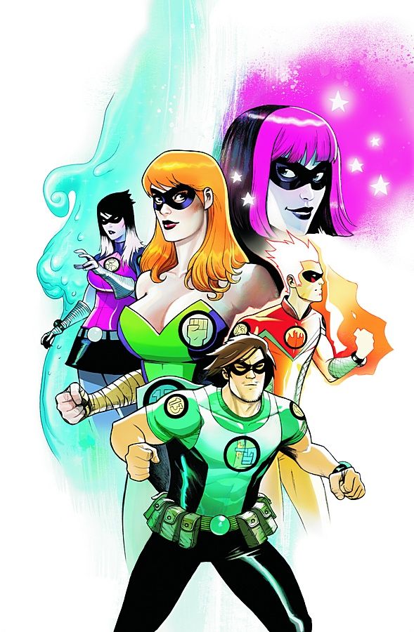
Gen13 #31 by Mike Huddleston
Kind of cute and boring. Plus, this really doesn't match up with the solicit text at all. Not even close.
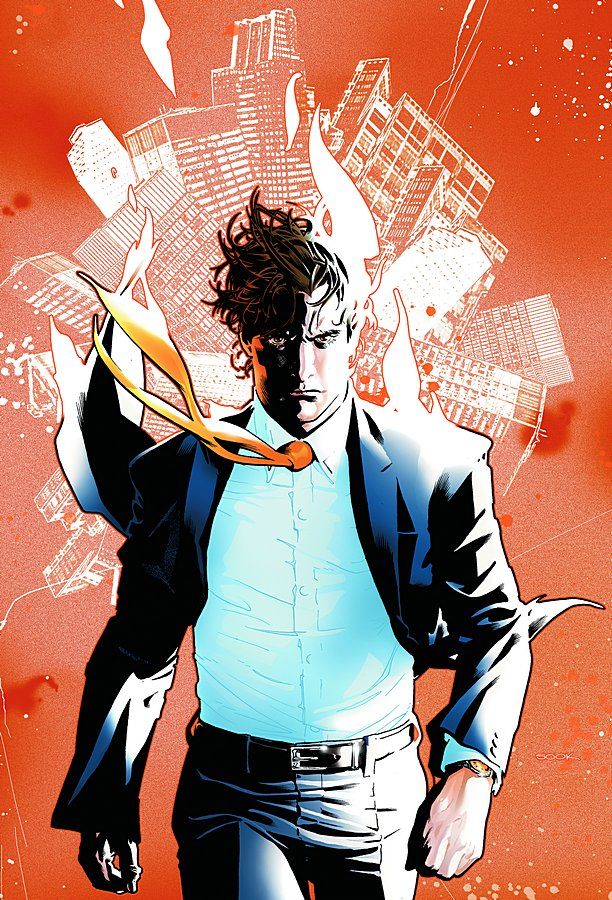
Wildcats #14 by Ryan Sook
Well drawn, nice execution -- the background image seemingly coming out of Tao's head is a cool touch.
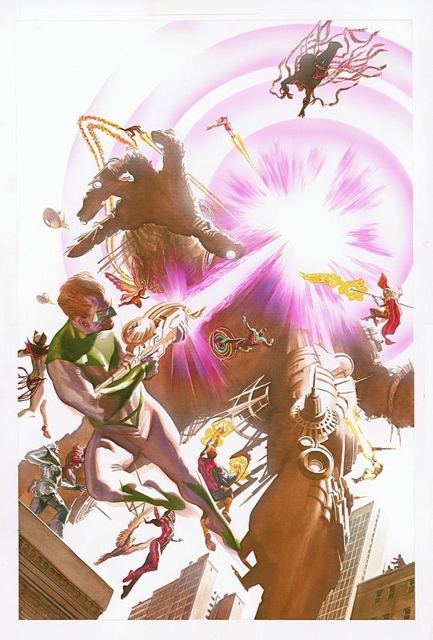
Astro City: The Dark Age Book 3 #4 by Alex Ross
A little too washed out for my tastes. I know that's a purposeful effect, but it doesn't work. The image itself has a very classic feel.
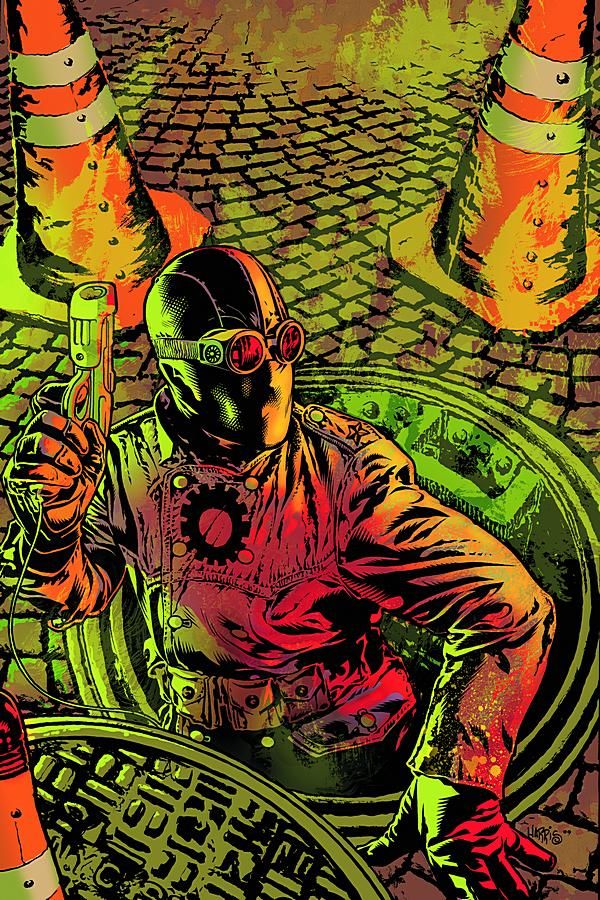
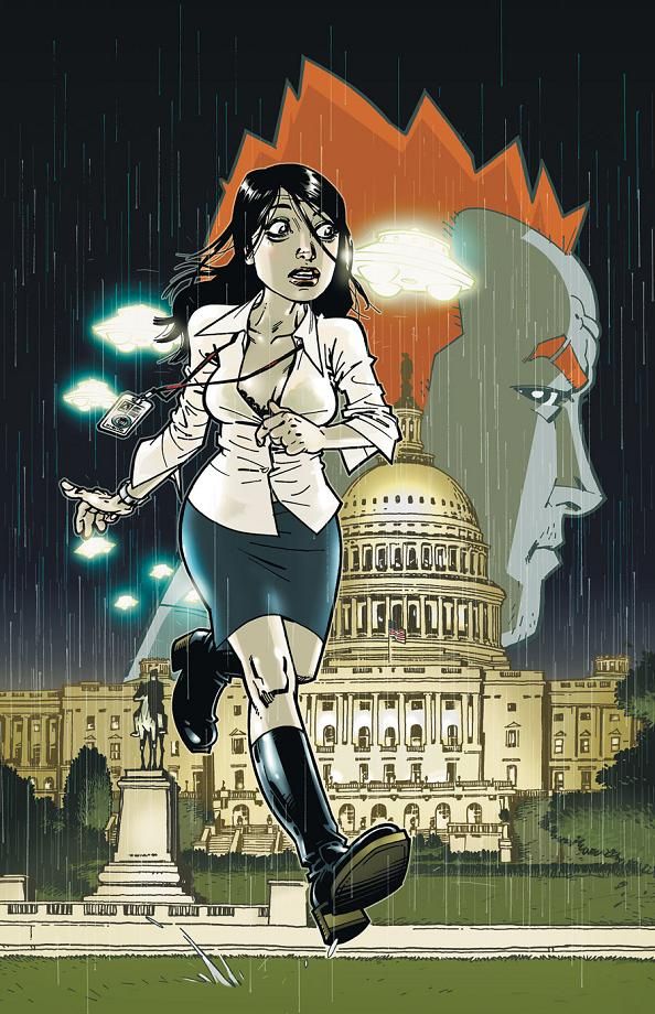
Ex Machina #44 by Tony Harris
A pulpy sort of cover. Solid image.
Red Herring #1 by Philip Bond
Not as engaging as I like to see in a first issue's cover, but a nice enough concept -- plus, it's Philip Bond! BOND!
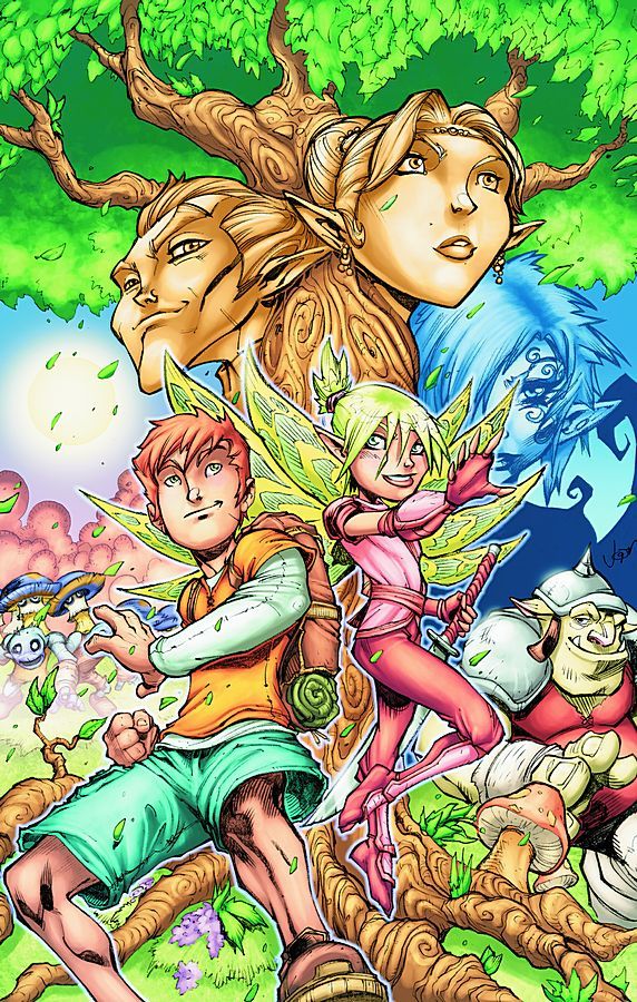
Free Realms #1 by Jon Buran
Totally not to my tastes, but seems appropriate for the book and its content.
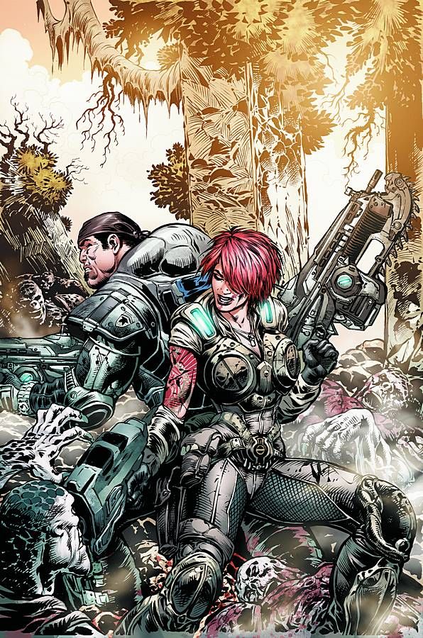
Gears of War #10 by Liam Sharp
Decent composition, nicely drawn.
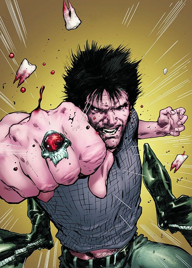
Killapalooza #4 by Trevor Hairsine
Great action cover, well executed. I like the perspective a lot.
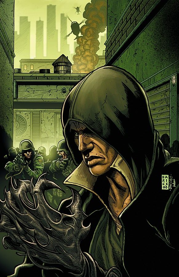
Prototype #5 by Darick Robertson and Matt Jacobs
I love Robertson's art, but this cover is just so damn boring and dull.
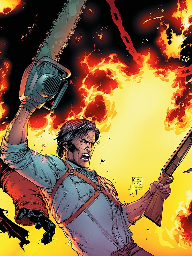
Freddy vs. Jason vs. Ash: Nightmare Warriors #3 by Shane Davis and Sandra Hope
Oh, so these covers connect! That... doesn't help at all. Hated last month's cover, hate this month's.
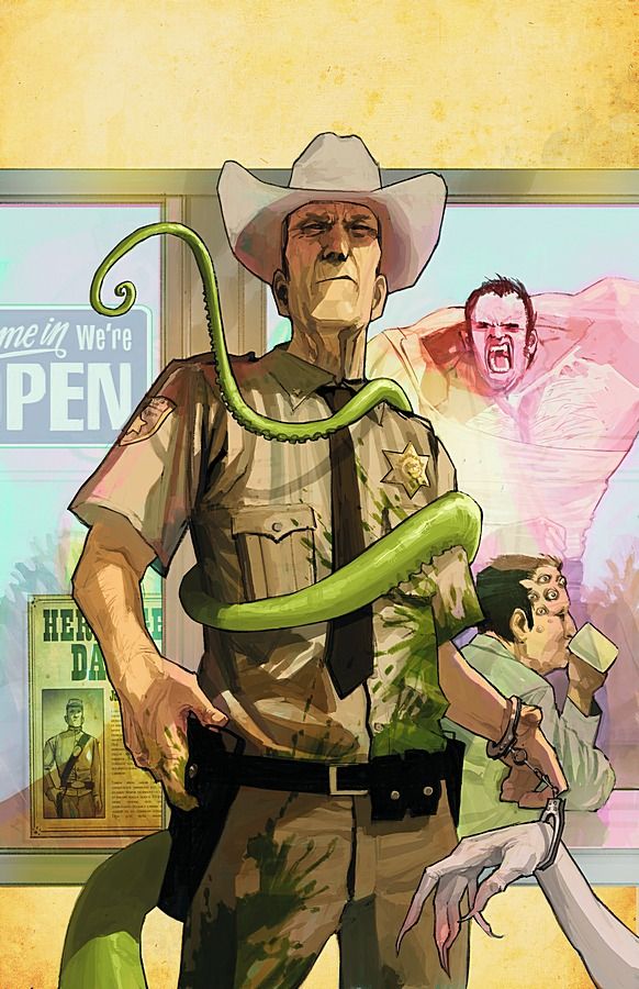
North 40 #2 by Fiona Staples
There's a lot going on here and I'm liking all of it. Strong image with lots of small, interesting elements.
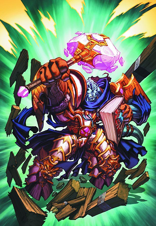
World of Warcraft #22 by Mike Bowden and Tony Washington
Where does this take place? Why is there a wooden support beam? Bad cover!
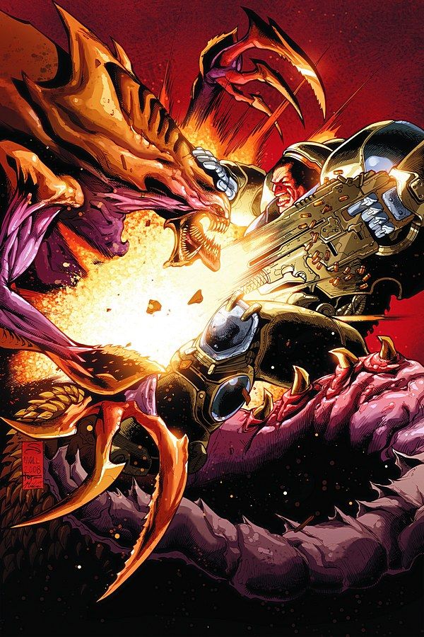
Starcraft #4 by Federico Dallocchio
Fight scene! No background! Pass!
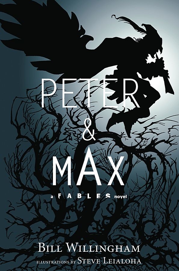
Peter & Max: A Fables Novel by Steve Leialoha
While very appropriate and well designed for a novel cover, it also would make a great comics cover. Striking and simple in its design.
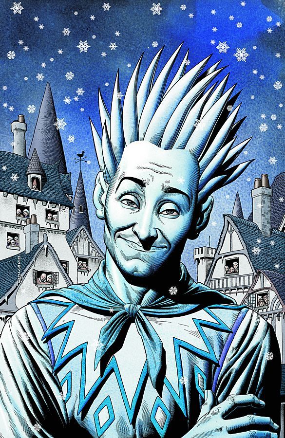
Jack of Fables #37 by Brian Bolland
Nice looking cover. A bit boring, but very well drawn.
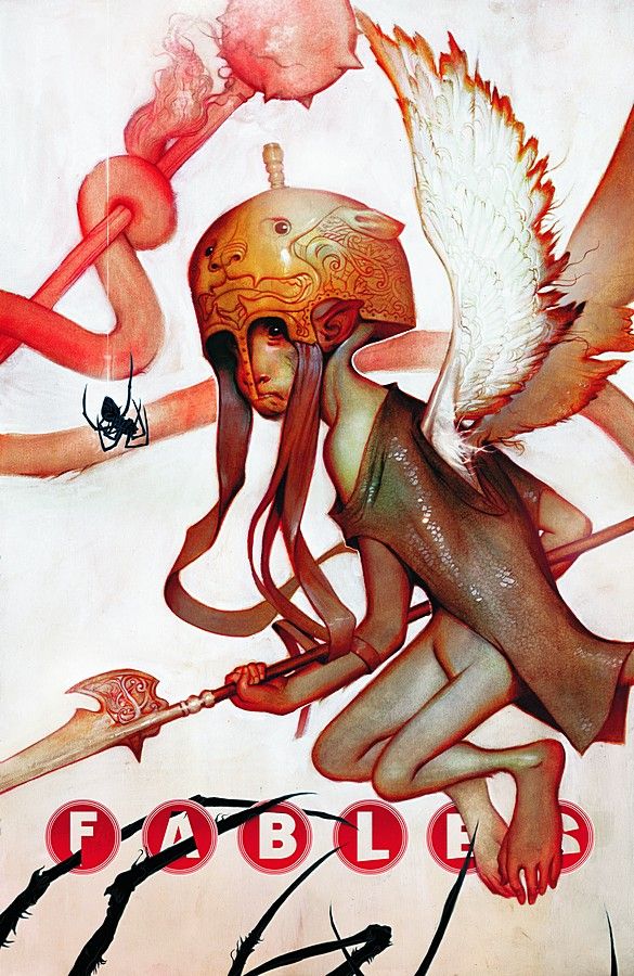
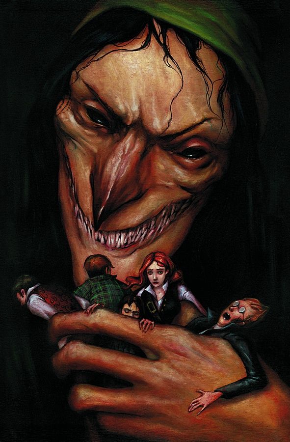
Fables #87 by Joao Ruas
Strangely unsettling. Very nice.
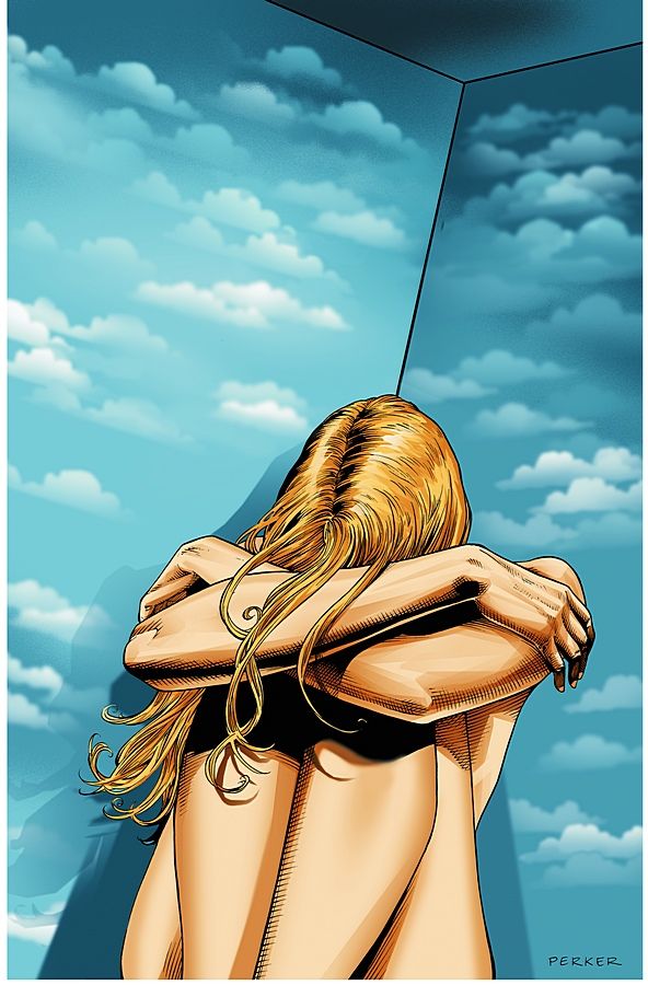
Air #12 by MK Perker
Nicely symbolic and composed. Very close to making the top five.
House of Mystery #16 by Esao Andrews
Creepy, simple and strong.
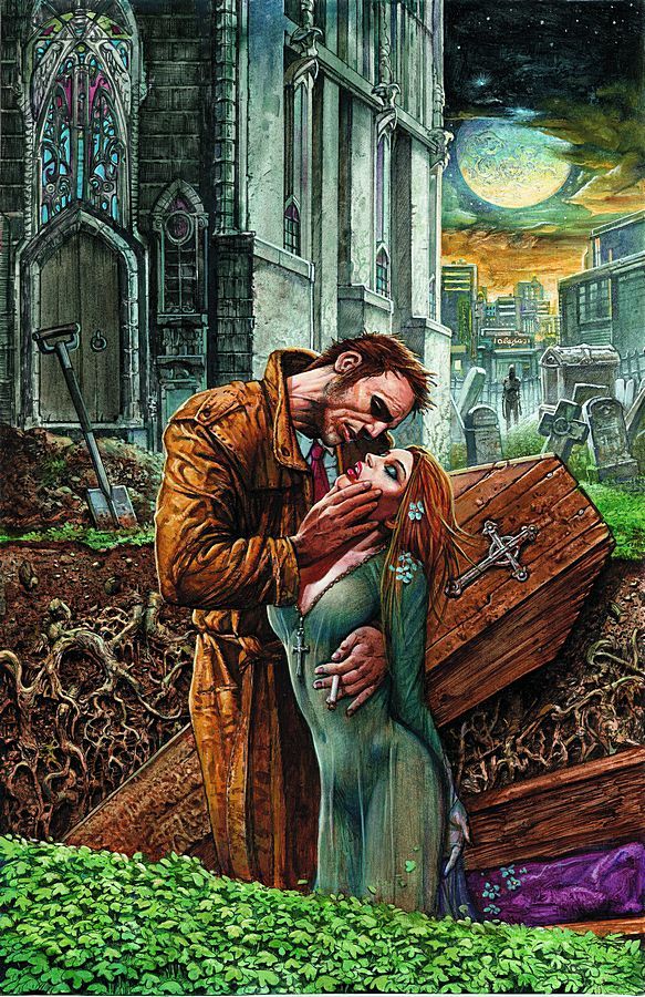
Hellblazer #258 by Simon Bisley
Great painted cover. Bisley can really draw his ass off when he wants to.
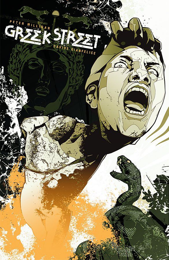
Greek Street #2 by KAKO
Very busy and messy. Too busy and messy.
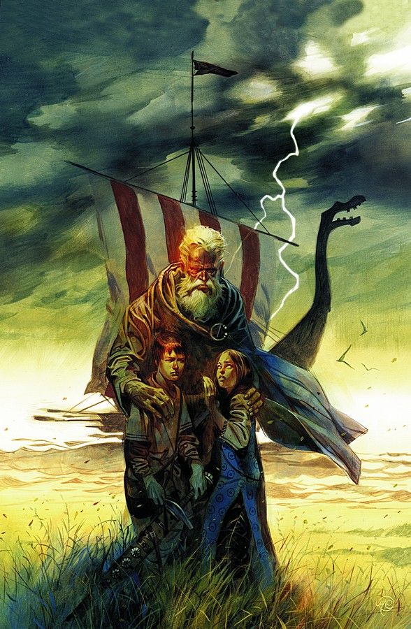
Northlanders #20 by Massimo Carnevale
Strong, central image that catches the eye. Very nice job.
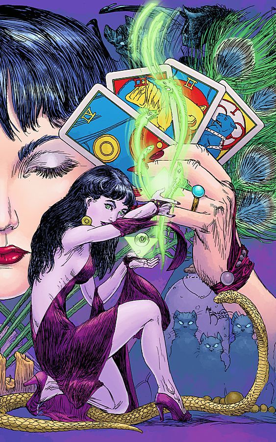
Madame Xanadu #14 by Michael Wm. Kaluta
Kaluta's linework is very impressive, but the image is a little bland.
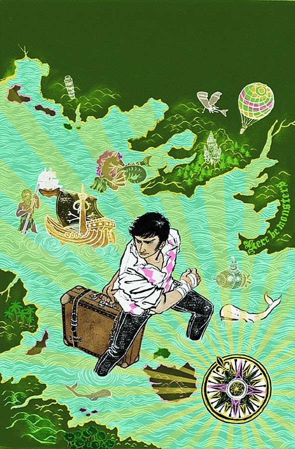
The Unwritten #4 by Yuko Shimizu
I like it. Tom in the middle of the fictional sea. Great concept and nice looking cover.
Unknown Soldier #11 by Dave Johnson
Dave Johnson's style recently seems rougher than I remember. Not the most exciting of images.
Top Five!
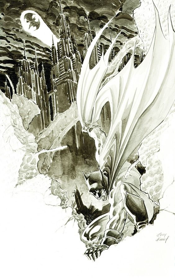
5. Batman #689 by Andy Kubert
Another seemingly incomplete cover that I hope remains this way. The black and white water colours look is beautiful. The image itself draws focus in a clever manner. One Kubert's best covers.
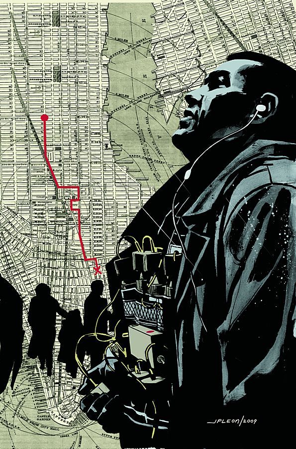
4. DMZ #44 by John Paul Leon
Fantastic concept, composition, and execution. Haunting and engaging.
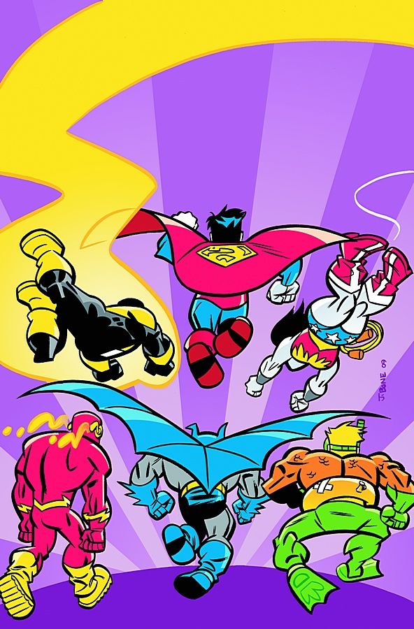
3. Super Friends #18 by J. Bone
HAHAHAHAHA! Bizarro JLA run other way! I love it!
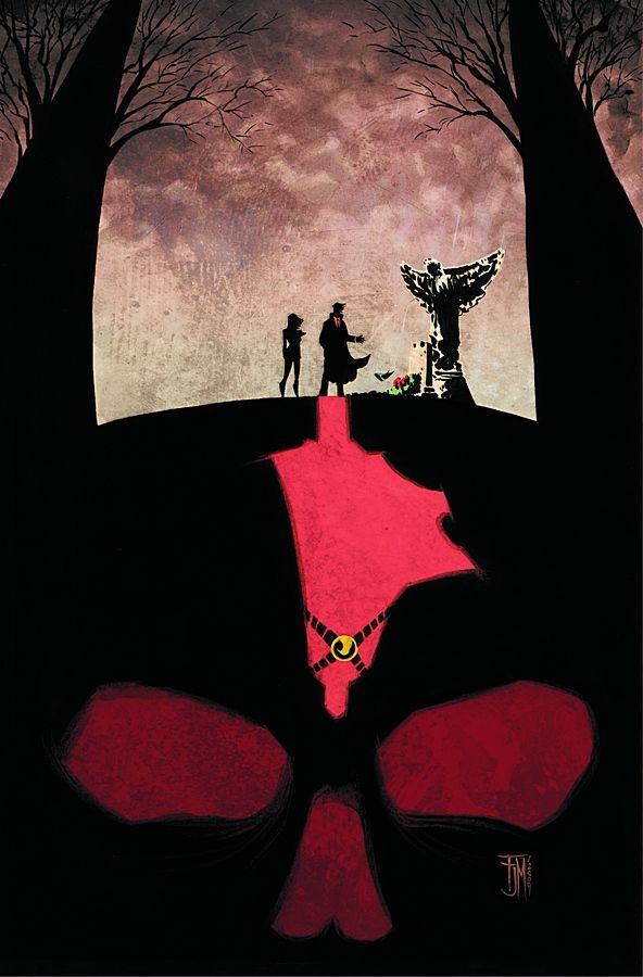
2. Red Robin #3 by Francis Manapul
I love this cover. A lot of elements are combined here that could have clashed, but Manapul integrates them all nicely. Not only that, but the central image is very well drawn. A step up from his previous work and I hope he keeps this up.
1. Young Liars #18 by David Lapham
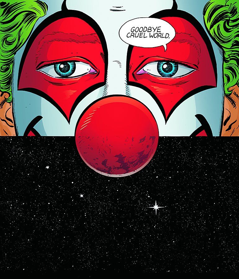
Perfect cover. I'm sad already. Goodbye, Young Liars.

