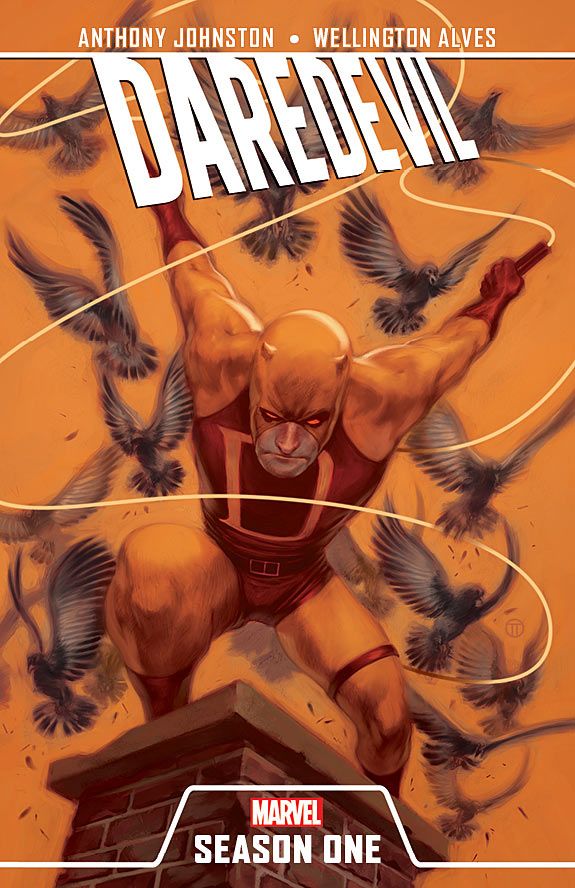
Marvel released the trade dress for their new line of graphic novels yesterday, and I have to say, as someone who seldom reads superhero comics, they tempt me in a way that DC's New 52 line does not. The covers are simple and show off the characters without a lot of clutter, explosions, or excessive detail. I feel like these are books that someone who has never read comics before could pick up and read without having to look stuff up on Wikipedia.
I went back and looked at the New 52 first-issue covers to figure out what was turning me off about them. Some, like the Flash, Batwing, and Voodoo covers, do a nice job of showing what the comic is about, but others read as an impenetrable mass of lines and colors. I know this is largely a matter of taste, but as someone who reads a lot of manga and indie graphic novels, I find the art in many superhero comics difficult to "read" visually, because of the huge amount of detail and the lack of differentiation between subject and background.
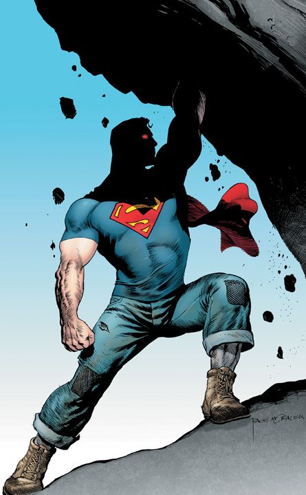
The two images above crystallized my feelings on the topic. The one on the left, the original design for Action Comics #1, conveys who Superman is in a direct, uncluttered way. A visitor from Mars could understand what it's about. There are two things in the image, Superman (with his rippling muscles) and some big thing that he's pushing on. It's a picture of struggle and of strength; nothing else matters. Detail is confined to the important areas of the image; everything else is vague—this mimics the way the eye actually sees. (Alas, this cover has since been replaced with a much busier image.)
Superman #1, on the left, is just the opposite. The image is swimming in detail. Superman is so awkwardly drawn that it's hard to see if he is carrying the Daily Planet globe or just pushing it in a really uncomfortable way—there is no sense of weight to it and no sense of struggle, either—he looks like he's floating in front of it. Both covers use basically the same material, a single image of Superman using his strength on some big heavy thing, but one of these covers gets its point across at a glance, the other does not.
For a longtime reader that richness of detail may be a selling point, and I'm sure a lot of these covers contain allusions that I'm not getting. If DC hadn't made a big deal about trying to bring in new readers with this reboot, I wouldn't be writing about it at all. But if they are trying to bring in new readers, it's useful to keep in mind that "confusion" is seldom a selling point.


