DON'T JUDGE A BOOK BY ITS COVER; JUDGE IT BY ITS COLORS
One of my pet peeves in modern comics is coloring that makes the art difficult to read. Part of this is a personal preference. I like brighter books with lighter colors that let the linework of the art shine through. There are colorists who can do dark and gritty well while still making the art legible, but those are far fewer in number than those whose attempts to be "realistic" often come at the cost of being unreadable.
There are also work which dies on the pages, but likely sings on the screen. As an industry, we've become used to seeing things on screens. Many have forgotten that the final product is (mostly) still the page, where the paper will suck up color and make everything look muddier. Some paper stocks can minimize the impact, but it's always there. Everyone needs to be aware of that.
I was thinking of that today when Jamal Igle passed on the latest preview pages from Action Labs Entertainment's upcoming books. Along with the email came small embedded sample pages. Some sang on my screen. Others made me squint my eyes to make out what was going on. It wasn't just the size of the art. While, yes, larger art would be easier to see, I think there's a test to be had here.
If a book is too dark and illegible when it's shrunk down, I think it'll be too dark at full size.
Let's test that theory this week, starting with the books from Action Labs Entertainment:

"Fracture" has a bit of an anime or "Invincible" style to it, but it's very easy to read at small size, whether or not the book, itself, is interesting. If I flipped through the pages at the store, I'd see the artwork very easily and recognize it as something readable. (It's a book about people who sleep in their underwear...)

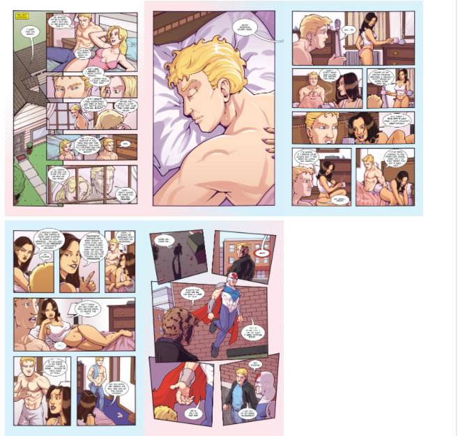
"Skyward" is a bright-looking book. Even at this small size, I can make out the figure work and the backgrounds. There's a real attempt to differentiate the two without hiding anything in the colors. The coloring shows off the art instead of fighting with it.
Is that an anthropomorphic rabbit with a sword? Awesome!

With "Princeless" #3, things get slightly murkier. It's easy to see the art and some bold colors, but I'm worried that there's not quite enough differentiation between the foreground and background. Are the backgrounds too saturated, maybe? Some of those blue backgrounds don't let the earth-toned foreground characters pop out as much. The orange/red hair of the lead character in the pages is nicely offset by the blue, at least. The lighter tones on the first two pages work better than the darker tones on the latter two.

"Jack Hammer" #1 is where things go south in a hurry. This is a mess. I see six pages with about three panels that won't require effort to read. It's too monochromatic. It's too dark. There's not enough contrast to these pages.
They might work better at full size, but the preview has put me off the book. I opened a couple of the pages up to give it a second chance, but it didn't help. Yellow backgrounds behind red/pink/purple characters in shadowy darkness don't make for an attractive read to me.
Now, to be fair, most of the books I just mentioned have a fairly open style of artwork. It's not so much that they're all cartoony, but that the artist draws with open space for the colorist to come in and do his or her work. There's not too much noodling in the inks to fill in all the blank spaces. Could this test work in a densely-packed comic book? Would a superhero comic with lots of noodling, exaggerated artwork, and no space left blank ever look good shrunk down like this? Let's find out:

"Justice League" #27 is a mixed bag. The splash page is clear enough. The last page works with one big image and two larger panels before that. Everything else drowns itself out. The art is just too small here to be clear. There's too much on the page. A larger page size will be required to determine how readable it is.
Special credit to the lettering layout on the first story page. From this distance, you can see where the letterer is leading your eye around the page with the trail of balloons.

On the other hand, "Batman" #27 is pretty easy to follow. Greg Capullo draws dark and Gothic while keeping plenty of open areas for his colorist to work their magic. These pages are overwhelmed with a neon green light, but it looks nice. That first pair of pages, in particular, look beautiful even at postage stamp size. (Kids: Ask your parents. Before e-mail, you see, you needed to send your letters in an envelope and you paid for it with -- ah, nevermind.)

It is not surprising in the least that Phil Noto's pages would look beautiful in color at this size with "Black Widow" #2.. I love the palette used here. The all-black costume with the shocking red hair topping it off pops off a page that's colored with desaturated tones and knocked out line work. You can see it clearly a mile away.

"The Hacktivist" looks like it might be questionable, but I can make out the art very easily here. Things are obviously drawn with some detail on this page, but the coloring is keeping blocks of art separated. The oranges that dominate the pages work well, and while I'm not a fan of that sickly green color on the last page, it sets off those panels from the others in the story for what I assume is a very good reason. That's the sickly green usually reserved for a glow from a computer monitor or the poor lighting in an interrogation room.

And here's where things fall apart for me. This is "Velvet" #3, which looks not so great at this size. These pages are monochromatic and inky. It looks like thin strips of dark color are scattered inside black rectangles. But, at the same time, I've already read this issue. It's beautiful. Betty Breitweiser's colors fit the noir tone of the tale. It's a book that's drawn to be monochromatic, and where the storytelling from Steve Epting is strong enough to handle that. The isolated panels where the oranges and reds come in to the backgrounds stand out appropriately for the moments in the story. Things are realistic and, yes, gritty, without being hidden or overpowered. The layout in the storytelling is strong enough to make up for the lack of cues you might seem from a more colorful coloring job. It helps give the book its signature look, though.
Having gone through this exercise, I'm not entirely sure what to think. The truth is that I can pre-judge a comic by what I see of it, no matter how small or briefly. There are certain styles of coloring I'm more inclined to like than others. There are some that are perfectly valid, but aren't my kind of thing. Then there are the pages where things just don't work for me, at a level that I can explain with some minor technical detail.
Some of the problems, no doubt, also have to do with an artist's style. I tried to separate that out for the point of this column, but art with stronger negative space works better at smaller sizes. I can see from what I just wrote that I've favoring those artists over the ones who draw lots of detail on the page. That all said, you can't find too many blank spaces on pages by Francois Schuiten or Sergio Aragones or Albert Uderzo, and yet it's still easy to read at smaller sizes.
This bears further investigation. Maybe someone with a better coloring vocabulary can run with this, too. If you do, drop me a line. I'd like to hear/see what you think.
MIRACLE-YAWN
After what seems like a quarter of a century of build-up, "Miracleman" #1 saw a reprint through its new owners at Marvel Comics last week. I didn't jump to buy it. I always assumed when the day would come, I would. But, no, I just didn't care enough. I can't possibly justify the $6 price tag on this one that's packed full of material nobody wanted the first time Marvel tried to sell it a couple years back.
As much as I appreciate a good history of comics, all I want to read is The Original Writer's storyline. I understand wanting to make an "event" book out of this, but doubling the cover price with this kind of padding leaves a bad taste in my mouth.
Amazon has the first hardcover edition reprinting the first four issues in May at a $30 cover price. That's still too high for 152 pages, but at some point you have to be willing to pay for the quality of the content and not just the number of pages. As someone who enjoys European reprints, that's a pain I feel far too often. At least I can keep from paying it twice by picking up the individual issues, too.
BUY THE BOARD BY THE BULK
Do you read this Tumblr entry from Rob Liefeld and not just picture him in some sort of comics-themed CostCo store? Maybe he threw in the 144 count #2 pencils while he was at it? A couple gallon containers of India Ink?
PIPELINES PAST
Last week, five years ago in Pipeline:
Still, "Asterix" without Goscinny or Uderzo? Many would argue that the series lost much of its luster after Goscinny's death. While I'm not as harsh on the series as many die-hard fans, there's definitely a spark missing from the last dozen volumes that Goscinny might have provided. They're still better comics than 90% of the books out there, but there's something missing. The plots are a bit weaker. The gags are a bit more obvious. The subtleties are gone.
But it's still "Asterix" and we're all allowed to love it.
Should it carry on after Uderzo? I think it's inevitable that it would. Will it reclaim the old glory? Of course not. Whoever takes the reigns of the series after Uderzo will have one of the scariest jobs in the world. Those books are idolized; I wouldn't want to replace the guy who had drawn it solo for the last fifty-plus years. Talk about performance anxiety!
I read the new "Asterix and the Picts" volume this week. I'll have a full review next week, but let me spoil myself here: I'm very happy with it. It fits right in with the series on all counts.
Ten years and a week ago this week, I listed some of the comics blogs I was reading at the time. Today, the only ones still going are Peter David's and Mark Evanier's. When the blog is part of your professional life, I suppose it's easier to keep it running for a long time than when it's a personal project, subject to the whims of the day job and personal interests.
Ten years ago, to the week,, I took a second look at the Top Ten books I had named from the year before. 2002. CrossGen was just starting to fall over. Keith Giffen's "Suicide Squad" was canceled before it had even made my year-ender list. "Lone Wolf and Cub" had just finished for the first time from Dark Horse.
The books I listed for consideration of 2003's best titles included "The Walking Dead," "Uncle Scrooge," "Sleeper," and "League of Extraordinary Gentlemen."
One last thought from that column:
One thing I know I can say about 2003: Pipeline's Man of the Year would be Robert Kirkman. Coming from a small self-published title (BATTLE POPE) he became a one-man industry in 2003, producing entertaining stories for multiple companies every month. Just look at a list of the titles he wrote over the course of the year: INVINCIBLE, TECH JACKET, HE-MAN (or a spin-off thereof), CAPES, TALES OF THE REALM, THE WALKING DEAD, BRIT, CLOUDFALL. It's an increasingly diverse list of titles that are all enjoyable to read and very entertaining. He's a classic example of a creator with a do-it-yourself attitude: create new books, use new talent, letter it yourself, self-publish, and then use all those skills to publish through Image, CrossGen, Epic, and the like.
And he's still with us, bigger than ever. I can't picture him picking up a "He-Man" comic to write these days, though.
Twitter || E-mail || Pipeline Message Board || VariousandSundry.com || AugieShoots.com || Original Art Collection || Google+ ||eBay Auctions