Jesse Hamm has been working as a professional artist for many years now, with his first mainstream work being as artist on the recent Good As Lily graphic novel, with writer Derek Kirk Kim, for DC Comics' Minx line of books. You can find out more about Jesse and his work at his website, www.jessehamm.com.
8 THINGS I'D LIKE TO SEE MORE OF IN COMICS
by Jesse Hamm
Comics should indeed be good. As a comics reader, I couldn't agree more. But as a critic, when I call for better comics, I'm often tempted to prescribe solutions that are lofty and vague.
"Write believable characters!" comes to mind.
"Draw credible backgrounds!"
"Master anatomy!"
"Be clear!"
All noble goals; all lousy advice. Lousy because it substitutes destinations for directions. Might as well direct someone to the Fortress of Solitude by telling her to go to Superman's hideout. The shortest route to better comics is, instead, concrete advice that any creator can put to use right now.
That said, here are 8 things I'd like to see more of in comics. These are suggestions that I think any creator can try out immediately; adjustments that don't require new skills to implement. They aren't all about quality; some are just intended to foster variety. But in every case I think they would add extra oomph to today's comics -- both alternative and mainstream.
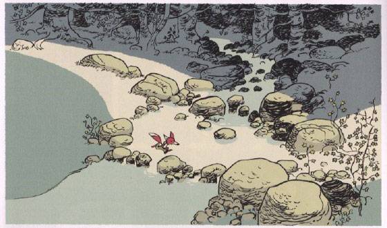
1.) EXPANSIVE BACKGROUNDS
Most cartoonists are aware that well-drawn backgrounds add character and verisimilitude to a scene. But they often overlook one of the easiest ways to strengthen a background: grant it more space in the panel. Back your "camera" away from the figures, and include more of their surroundings. This doesn't require a better-drawn environment -- just a willingness to show the reader more of it, foregoing some of those juicy close-ups.
European cartoonists lack our kenophobia. They often include spaces which may be irrelevant to the action, but which enrich the world their characters occupy:

American cartoonists should be similarly willing to push their characters farther back, or off to the side, to increase readers' immersion in their imagined world.
2.) COLOR INDICATING DEPTH OF FIELD
The late, great Alex Toth's favorite complaint about his colorists was that they failed to establish planes of depth in his drawings. He was partially colorblind himself, and therefore wasn't the best person to ask whether colors matched, but one thing he did know about color is that light and dark colors can be used to indicate distances between objects. Simply put: coloring the foreground dark and the background light, or vice versa, will cause the foreground to pop forward and the background to recede.
Unfortunately, this simple, three-dimensional effect seldom appears in comics. For all the effort colorists spend on shading forms and balancing hues, there's often a flat uniformity to their light & dark values. A uniformity which could easily be remedied with stronger contrasts between planes -- such as in this panel, which Toth once praised for bailing out his murky drawing:

3.) NARROW VERTICAL GUTTERS
When the gutters between panels are all of uniform width, it's tempting for readers to skip down to the next tier of panels, ahead of the narrative. A simple way to discourage this, focusing readers on the proper tier, is to make the vertical gutters much narrower than the horizontal gutters:

This approach is standard in manga, but I rarely see it in domestic comics. I think the Japanese have the right idea.
4.) FIXED POINT OF VIEW
It's common wisdom that frequent changes of p.o.v. in a scene add variety and drama. But that approach is used so often lately that most comics read more like photo albums than fluid chains of events. By contrast, look at the fluidity of comics by cartoonists with an animation background, like Graham Annable or Jeff Smith. They know well that a static p.o.v. ties moments together, and casts the action in sharper relief. You don't need a course in animation to follow their example; it's a simple matter of leaving the background the same while the characters do their thing:

5.) CAREFULLY DRAWN EYES
It's easy for artists who draw for hours at a stretch to default to rendering every line with equal care. This approach makes sense most of the time, since an even pace aids productivity, and because shifting gears mid-drawing can result in stylistic inconsistencies. We've all chuckled at artists who lavish attention on the breasts while neglecting the feet, for example.
But the handling of pupils and eyelids is much more exacting and less forgiving than the handling of other parts. In fact, no mark in a drawing has more to do with its success than the marks which delineate the characters' eyes. We rely heavily on those few, tiny marks to show us crucial story info, such as what the character is feeling, and where her attention lies. What compounds their importance at the drawing stage is that such small marks are easy to botch. A millimeter off, and the character becomes cross-eyed, or wall-eyed, or she looks too tired, or too surprised. Worse, characters may look past each other when they're meant to address each other, making them appear vacuous, distracted, or incapable of intimacy.
I see such "eye" problems often in comics -- more often than the artists' skills should warrant. Simply taking more care with the eyes would make a world of difference. Note the significance of this tiny adjustment in Good As Lily, where I had to fix a character's pupil placement:

Perfecting every line in a comic wouldn't be worth the time, but a few extra minutes spent perfecting the eyes on each page could determine whether or not your characters resonate with readers.
6.) RURAL & SUBURBAN LIFE
Most cartoonists, both mainstream and alternative, have imprisoned their characters in cities -- a setting which represents only a tiny fraction of the world.
I can accept that Spider-Man and Batman work best in New York and Gotham. I can accept that Harvey Pekar and Seth happen to live in Cleveland and Toronto. But I can't accept that nearly EVERY comic book character HAS to occupy an urban environment. There's a great big world out there to chronicle, folks. Send your characters on some field trips! Give your skills -- and your readers -- a broader field to graze in.
7.) THOUGHT BALLOONS
Thought balloons have come under fire in recent years. Some complain that thought balloons are cheating: that they explain what should instead be demonstrated through characters' behavior. Others believe the intermittence of thought balloons is arbitrary: if we can read one thought, why not all of them?
I think both complaints prove too much. If we shouldn't depict characters' thoughts, why even use dialogue? Why not adopt the silence of sculpture and pantomime? And if displaying only relevant thoughts is arbitrary, how come displaying only relevant images is OK?
Thought balloons needn't be more didactic or arbitrary than any other creative choice. And since they're unique to our medium, we should allow them to give it distinction.
8.) CREATIVE DEPICTIONS OF VIRTUE
A common complaint is that comics have become too negative, and that virtue should be more celebrated. A common rejoinder is that villainy is more interesting to read about.
The truth is that creativity is interesting to read about, whether it's villainous or not. The virtuous exploits of Golden Age heroes like Captain Marvel, Plastic Man and Powerhouse Pepper are fun to read not because those characters are virtuous, but because they're virtuous in creative ways. Similarly, villains written by Moore, Miller, or Morrison are interesting not because they are villainous, but because they are creatively villainous. In the shadow of those writers' success, many writers work overtime inventing creative ways to be villainous, while neglecting to invent creative ways to be virtuous. No wonder virtue appears boring! In JLA: Earth 2, I loved Morrison's "good Luthor" granting bad Luthor's surprised secretary an $80,000 bonus -- out of bad Luthor's ill-gotten funds. More of that, please.
This applies to alternative comics as well. Characters' flaws and neuroses have been explored so well and so long in the undergrounds that alt'toonists have begun to mistake lowness for depth. Let's see more characters who are creatively virtuous -- more Oskar Shindlers, for example. They needn't be perfect; just creatively virtuous. They don't even have to operate on a grand scale. I know a guy who convinced the Cartoon Art Museum to hang a cartoon he drew of himself proposing to his unsuspecting girlfriend -- whom he then brought on a tour of the museum, letting his drawn self pop the question. More of that too, please.
This approach wouldn't require extra skill; only that we use our skills more optimistically.
So: eight simple ways to improve what's on the shelves. Here's hoping more creators will give these a try.
>>>>>>>>>>>>
Image info, in above order of appearance:
Thierry Martin's art from "Le Roman de Renart" c. 2007 Guy Delcourt Productions
Alex Toth's art from "White Devil...Yellow Devil" c. 1990 DC Comics
Tatsuya Egawa's art from "Tokyo University Story" c. 1997 Tatsuya Egawa
Jeff Smith's art from "Bone" c. 1994 Jeff Smith
Jesse Hamm's art from "Good As Lily" c. 2007 Derek Kirk Kim and DC Comics