When Netherrealm and DC worked together to create the Injustice franchise, there were a lot of creative liberties taken with the costumes. While each character clearly resembles their comic book counterparts, there are plenty of nuances and additions that make them stand out from versions in the past. Love them or hate them, they're a big part of the series. Everyone from Batman to Solomon Grundy got costume updates to make them fit within the universe. However, most people don't realize that it took a lot of attempts at the drawing board before the designs were approved. Many different ideas were tossed around and completely drawn before the versions we know were thrust into the game.
Now that both Injustice: Gods Among Us and Injustice 2 have come out and released all of their DLC characters, concept art has been released that details what these characters could've looked like had other teams been given their visions. On top of that, the concept art also reveals characters that were considered for the games, but scrapped during development. Art like that makes us wonder how different the games could've been with the addition of different designs and new fighters from the DC Universe. With that out of the way, we're digging through the development history of the Injustice franchise as we look at 20 pieces of concept art that show us what could've been. Keep in mind that this list will include art from both Injustice: Gods Among Us and Injustice 2. We're solely focusing on the games too, so no comic book concept art.
20 INJUSTICE 2 - BATMAN
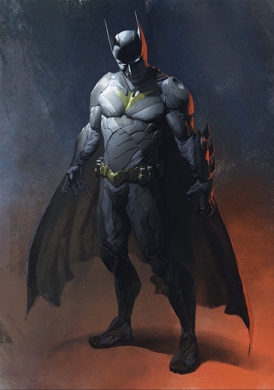
Batman's costume in Injustice: Gods Among Us wasn't a fan favorite, so it makes sense that he'd get a re-design for Injustice 2. The version that made it into the game was bulkier and focused on the special tech he added to it to help in his fight against Superman. However, this concept art reveals that the Dark Knight was originally intended to have a slimmer design with a yellow batman logo on his chest.
Not only is this look reminiscent of his costume in Batman Rebirth mixed with Christopher Nolan's Dark Knight Trilogy, but it keeps his standard appearance intact without changing too much that it becomes distracting.
19 GODS AMONG US - ARES
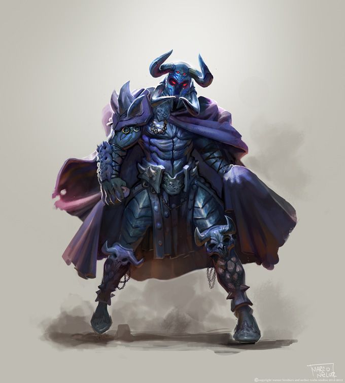
Ares was changed significantly from his comic appearances for Injustice: Gods Among Us. Not only did his helmet no longer hide his face, but he was given dark gray skin with red eyes to boot. While the helmet and color scheme clued players in that it was still Ares, it was quite different. Some early concept art for the character revealed that they were originally going to have him look more like he did in the comics.
Keeping his darkened facial features on top of an overly exaggerated cape with spikes, this is exactly the kind of character that Netherrealm would use in their games. Honestly, we like this design better than the final version.
18 INJUSTICE 2 - RED HOOD
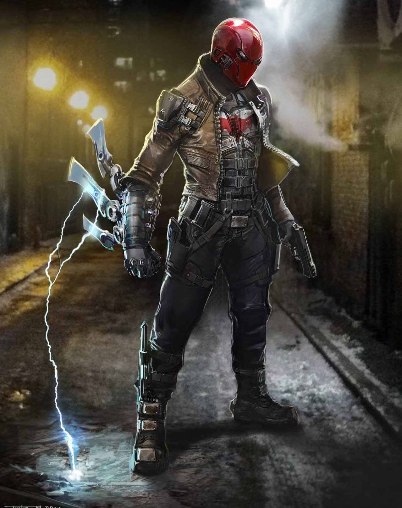
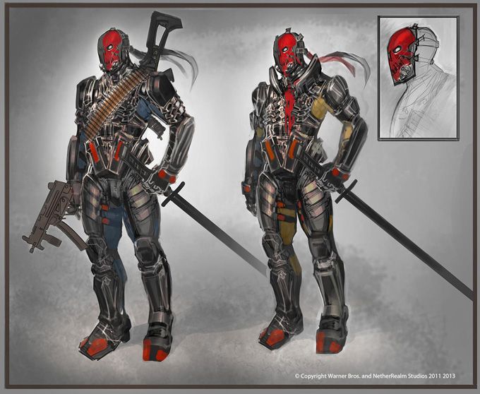
Jason Todd was finally given his chance to fight in Injustice 2. While he didn't launch with the game, he was one of the first DLC characters to be introduced. His final design was quite familiar to fans of the character. While the eyes might've been a bit too narrow for some, it was classic Red Hood.
This concept art suggests that there was initially another piece of equipment to add to his repertoire. The electric arm blades likely would've been used for other attacks and helped the character stand out more against the rest of the cast. On top of that, he is given the red bat logo, which is absent in the final game.
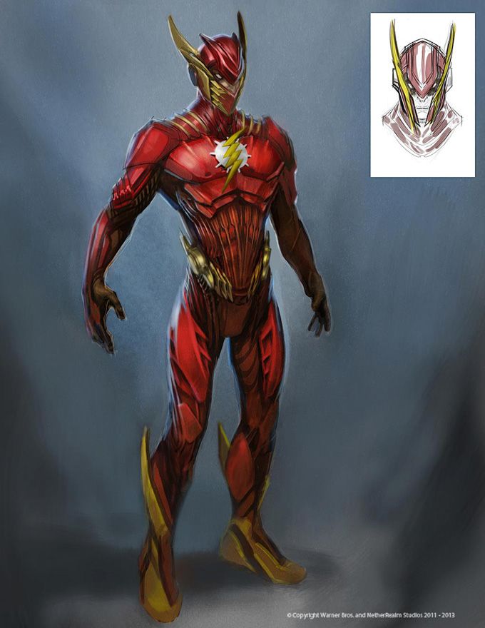
17 GODS AMONG US - THE FLASH
The Flash received a notable change when brought to Injustice: Gods Among Us. The new details on his suit rubbed some the wrong way, but it was clear that the artists experimented a lot with the character. Before the concept art got closer to the final version, this one stood out from the rest of the bunch.
This version of the Flash is unlike anything we've seen before, with a suit that covers his entire face as well as his body. The bright red and yellow are on point, but its the details on the lower torso and head that make a huge difference. We have to admit, this would've been cool as a DLC costume.
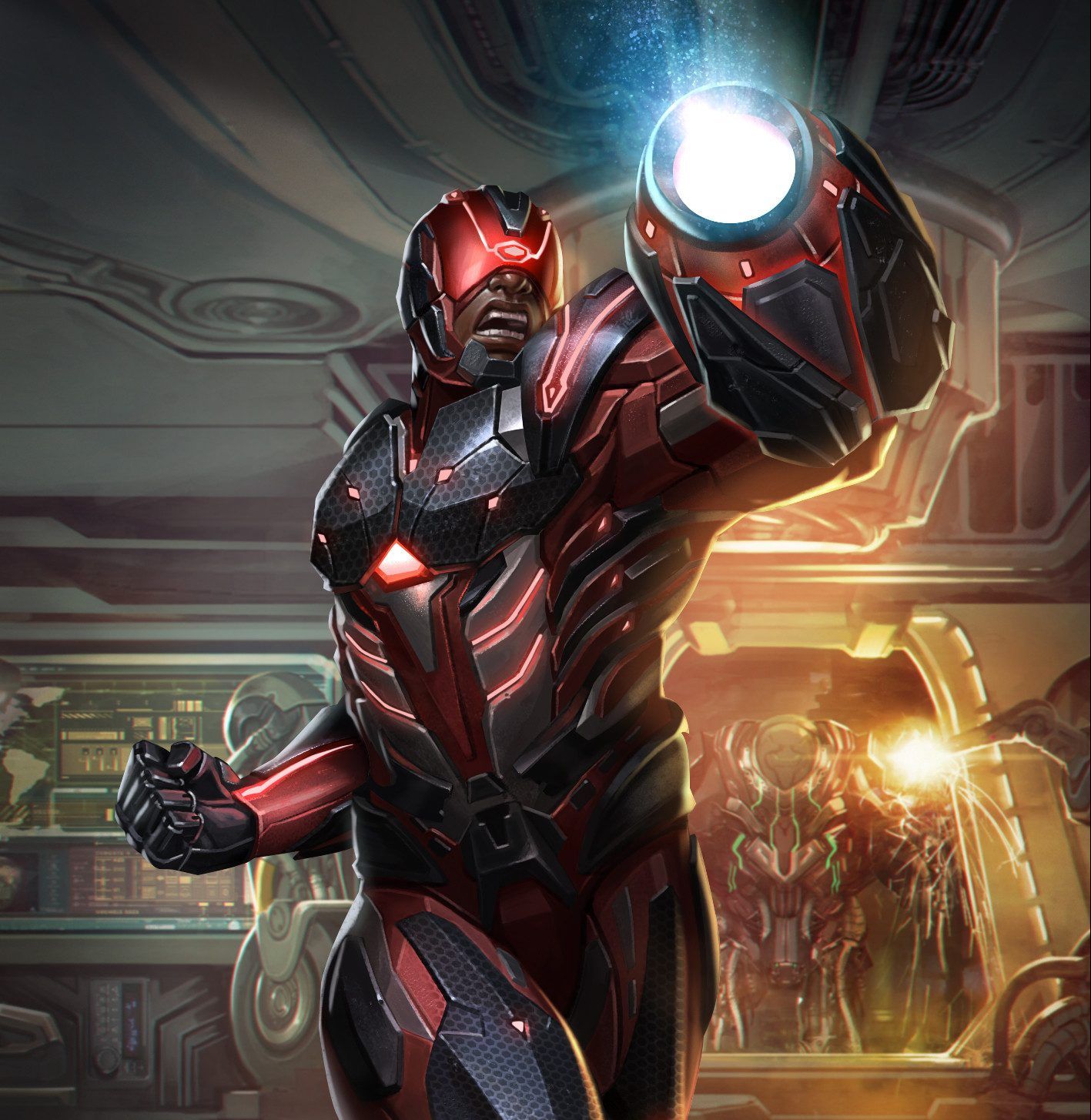
16 INJUSTICE 2 - CYBORG
Cyborg returned in Injustice 2, with a similar design to his first outing. Instead of trying to keep his appearance intact, there are some pieces of concept art that suggest he was going to get a massive change to his look. This art gives Cyborg an entirely new color scheme.
While the look is focused, it throws away just about everything that makes the character recognizable. On top of that, it looks more like a version of Judge Dredd than the popular character who became a member of the Justice League and the Teen Titans. That red visor throws off the look quite a bit too.
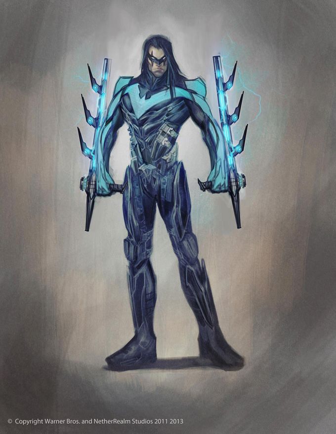
15 GODS AMONG US - NIGHTWING
Instead of throwing Robin into Injustice: Gods Among Us, Netherrealm decided that Nightwing would be a better fit for the game. His final design in the game was sleek, black, and had blue accents over his torso -- it was a simple yet effective look for the character.
That said, he almost had a much more noticeable costume. This concept art shows off one vision for Nightwing. Not only does he sport more blue across the board, but his trademark batons are replaced with massive, bladed taser batons. While they certainly look cool, the batons and the entire costume for that matter look like they belong in the '80s.
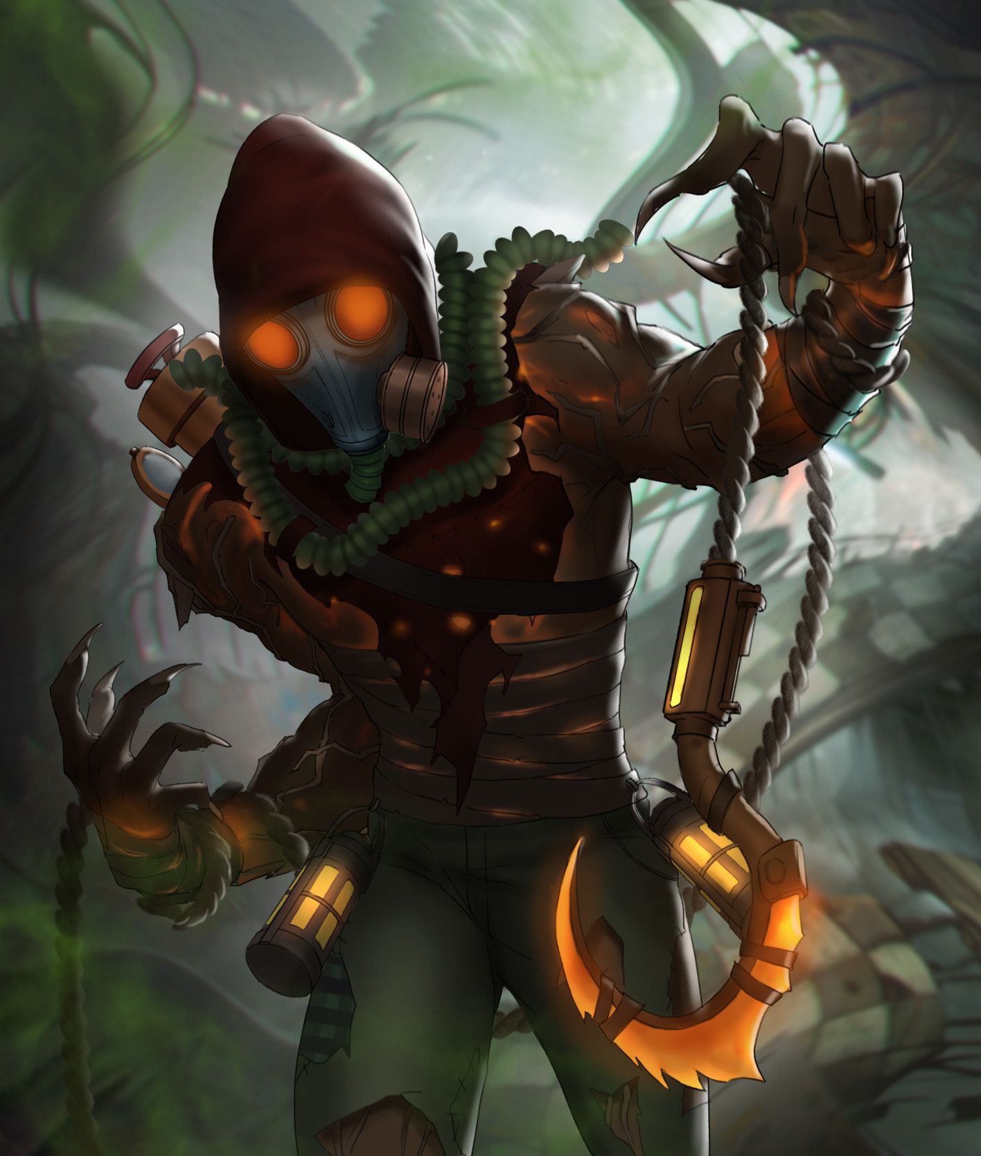
14 INJUSTICE 2 - SCARECROW
Scarecrow was (obviously) made to be one of the scariest characters in Injustice 2. With the enhancement of the fear toxin, he appears as a horrifying monster straight out of our nightmares. Before that design was approved, though, there were many looks that were closer to what we would expect.
This piece of concept art has Scarecrow in a tattered costume and a light-up gas mask, which is different from any of his prior appearances. One thing that remains the same is the hook that he is wielding. This hook would become his primary weapon in the final game, and adds a lot to the fear factor of the character.
13 GODS AMONG US - BANE
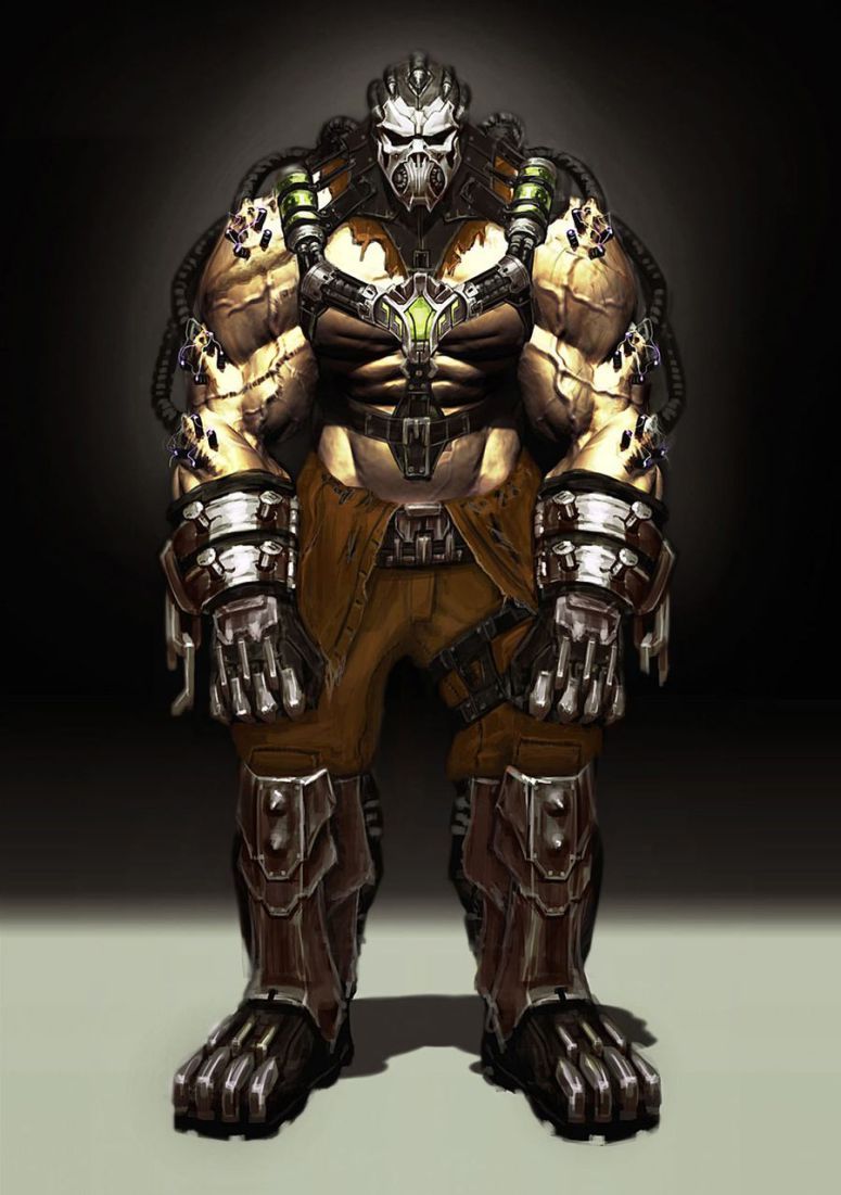
There were a lot of Batman characters brought into Injustice: Gods Among Us, and Bane was one of those. Being a villain injected with Venom, he was a heavy fighter who would use a lot of close-range attacks to get the job done. Considering that he has the potential for a lot of different designs, he has had a lot of variations over the years.
The final design in the game was much more reminiscent of his comic look. This concept art suggested that Bane was going to have a more over-the-top costume that made him look more sadistic and dangerous.
12 INJUSTICE 2 - CAPTAIN COLD
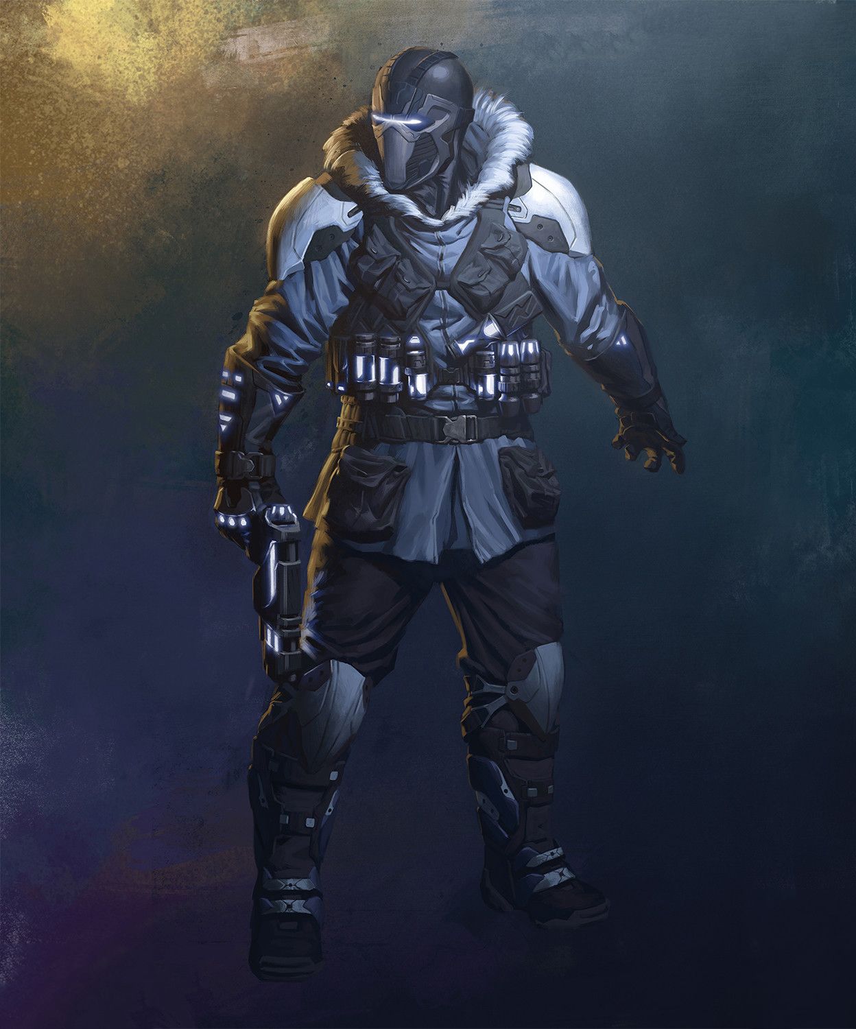
With Killer Frost on the outs, there was a need for an ice-based character in Injustice 2, which ended up being Captain Cold. His final design made his human features more noticeable, but some earlier concept art imagines him as someone more enhanced by machinery. Instead of having his face exposed, this version of Captain Cold has a full helmet with a visor.
Apart from that, it isn't far off from the final version, giving the character a winter coat, some white armor to boot, and modern equipment attached for good measure. It's also worth noting that the cold gun ended up being larger than this concept art's version.
11 GODS AMONG US - SOLOMON GRUNDY
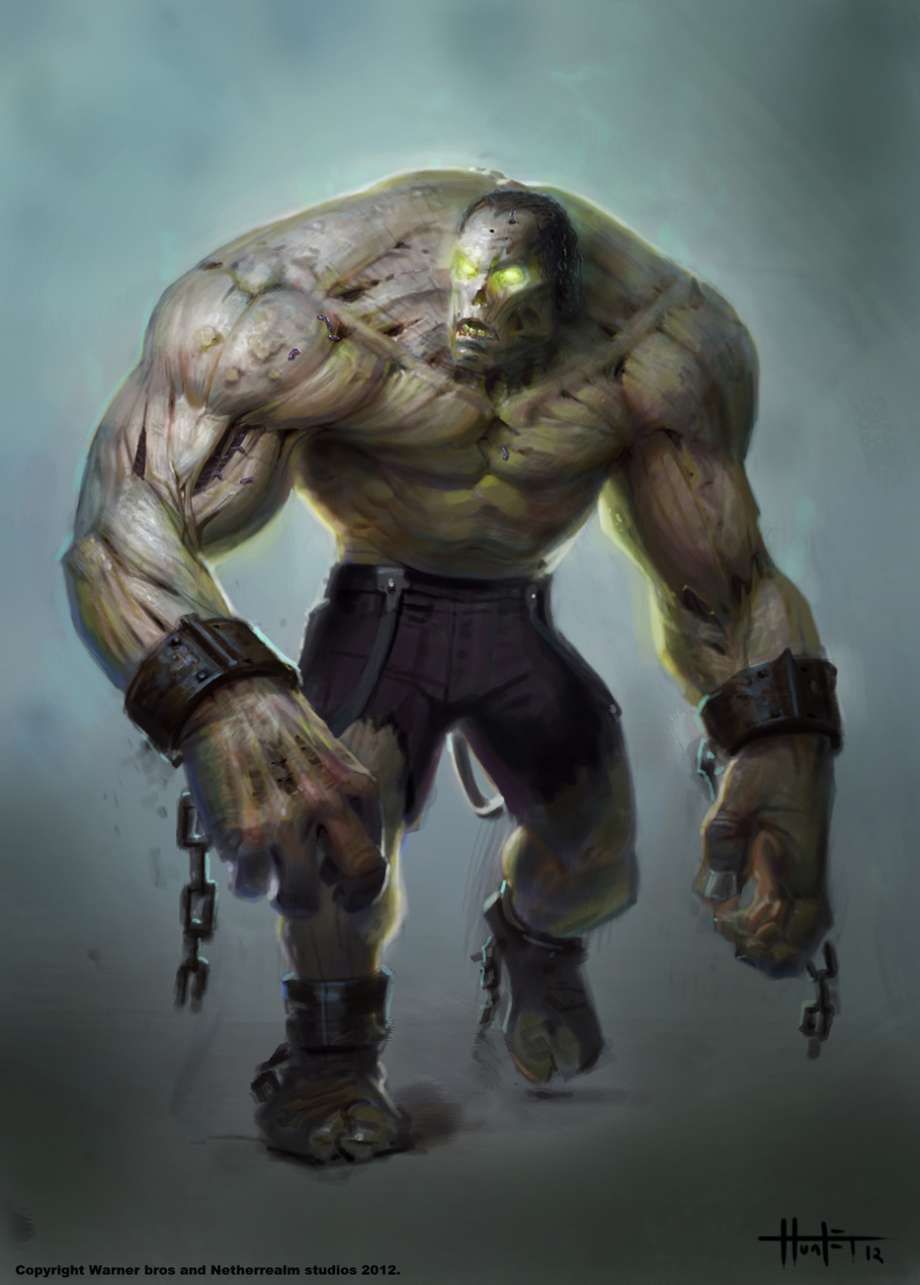
Solomon Grundy is the undead beast that has tormented Batman and other DC characters for years. Typically portrayed with square features, gray skin, and a tattered suit, it's surprising to learn that concept art for Injustice: Gods Among Us reveals that he was once planned to look more like a mindless zombie.
Having flesh-colored skin with various cuts and holes were his blood would be exposed, this version of Solomon Grundy was much more grotesque than the final version. The most striking part of this design is the mindless, bright eyes -- it makes him look more like a deadly monster.
10 INJUSTICE 2 - SUPERMAN
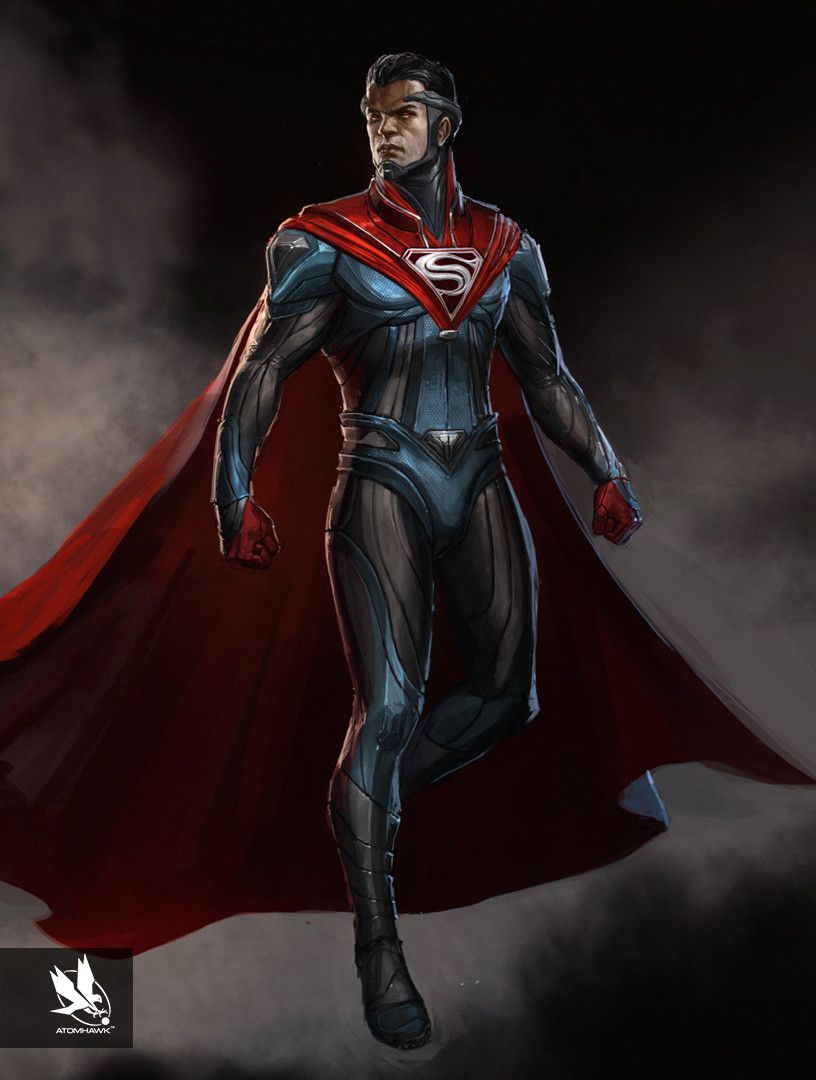
Superman received a design change for the Injustice series, mostly due to him being the main antagonist rather than one of the greatest heroes. For Injustice 2, he was given yet another re-design that would hint at his morally ambiguous ways while still paying respect to the cultural icon that he is.
As such, this concept art isn't too different from the final version. A lot of the details on the suit are carried over into the final game, the biggest difference being the silver "S" on the end of his cape rather than the red "S." This version is also slimmer than the final version, but that was changed likely due to the developers wanting him to look stronger.
9 GODS AMONG US - DEATHSTROKE
Deathstroke, one of the greatest assassins in the DC Universe, was a playable character in Injustice: Gods Among Us. Believe it or not, his final design, while given some more details, is quite similar to his look in the comics, complete with the trademark black and white mask. It's clear from this concept art that he was originally going to look much different.
While he would still have the blue and orange color scheme with the split mask, it's the armor around it that sets it off. On top of that, this version of the mask is given markings to represent a skull. All in all, we're glad Netherrealm toned it down for the final release.
8 INJUSTICE 2 - THE FLASH
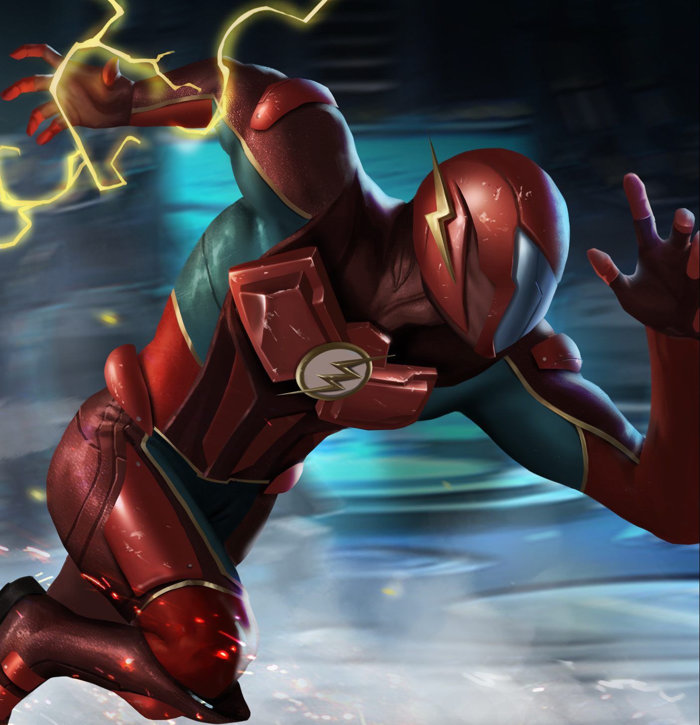
The Flash went through a big arc in the Injustice series. After originally working with Superman's Regime, he switched sides at the end to fight under Batman's Insurgency. With this change, he was also due for a costume upgrade, considering the first one looked a bit awkward. The final costume was more reminiscent of the comic Flash, but some concept art suggests that he was, at one time, going to get a serious overhaul.
This version still has the red and yellow color scheme, but with blue accents under his arms. The Flash logo is kept the same, but he is given a full mask and visor that covers his whole head.
7 GODS AMONG US - SHAZAM
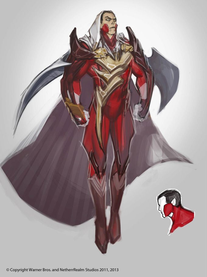
Shazam is a character blessed with the power of multiple gods, and it's clear that Netherrealm had some concept art that wanted to lean into that more. This design for Shazam's appearance in Injustice: Gods Among Us simply has too much going on.
Not only is the cape going in several directions, but there is so much added to the logo that it's almost unrecognizable at this point. The guard on his neck also extends up to his face, which looks awkward. With all that said, we're glad that the final version of the game had a much safer look for the character.
6 INJUSTICE 2 - PROFESSOR ZOOM
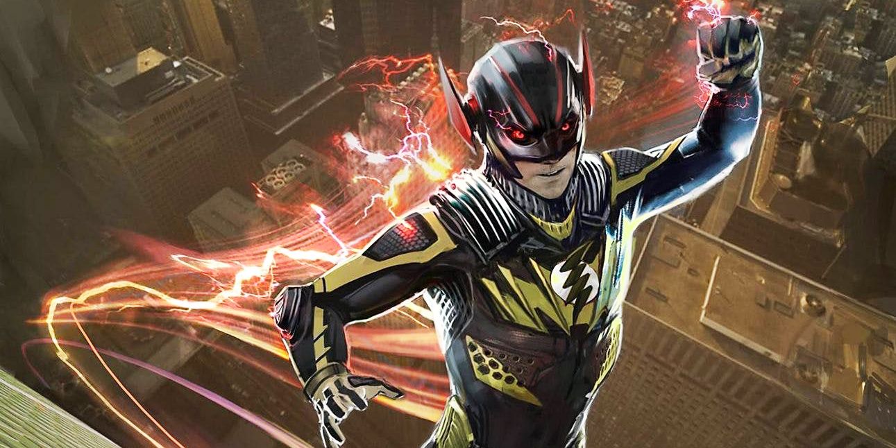
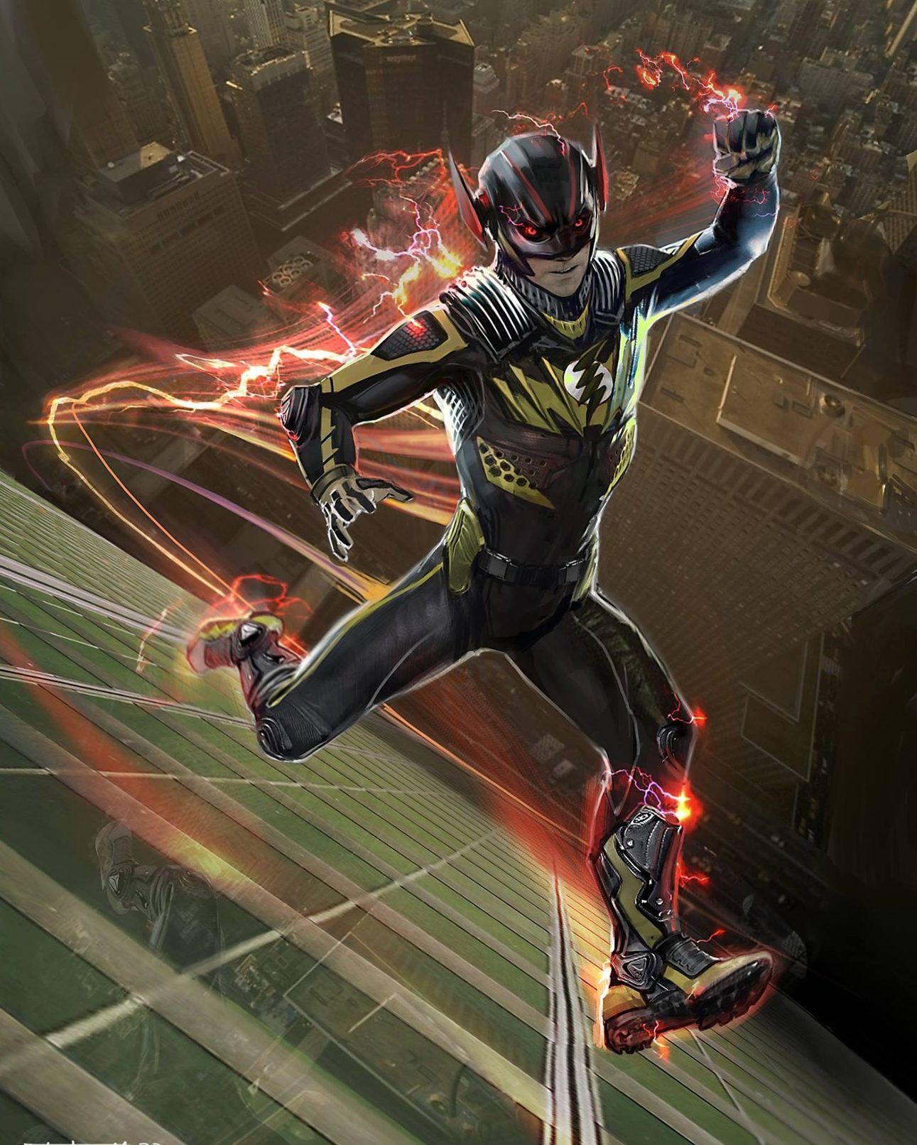
While putting multiple speedsters in the same fighting game would risk characters being too similar, there was a time when Professor Zoom was being considered for Injustice 2 as more than just an alternate costume for the Flash. Instead of going with his standard yellow design, there were a lot of creative liberties taken with his proposed look.
Having a primarily black design with yellow accents, this is a look for the villain unlike anything we've seen before. However, the character was scrapped and not put into the final game as a separate character. Reverse-Flash was made a premier skin for the Flash, but he looks nothing like this piece of concept art would suggest.
5 GODS AMONG US - AQUAMAN
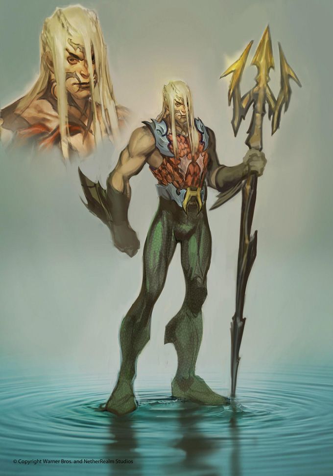
Aquaman has been the red-headed stepchild of the DC Universe for a long time. When being put into a big game like Injustice: Gods Among Us, it was important that he looked cool to avoid the mockery of gamers everywhere. The final design did a good job of taking the best from multiple versions of the character without overdoing it.
Thankfully, this version of Aquaman wasn't in the game. While the various tattoos and more aquatic limbs sound like a good idea on paper, they just look awkward in this design. The long hair also makes him look like he belongs in the band Nirvana rather than a superhero fighting game.
4 INJUSTICE 2 - BLACK MANTA
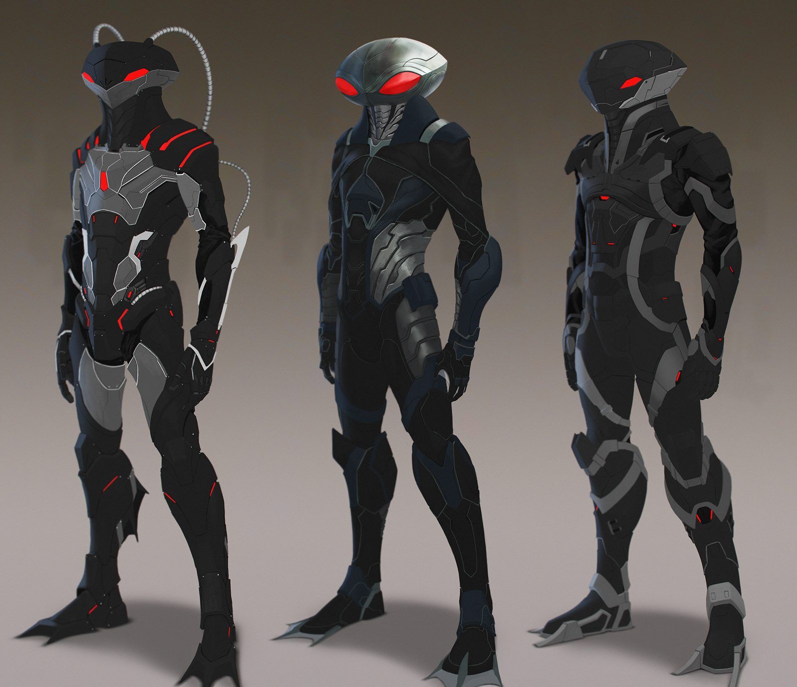
Black Manta can be a ridiculous-looking character, but his connection to Aquaman as well as his popularity in the comics made him a prime candidate for Injustice 2's DLC. When bringing him over, the final look was very simple, giving him the iconic helmet but not adding much to the design outside of that. This concept art shows a few different versions of what he could've worn.
The design on the far left plays into the technological angle and resembles his Young Justice design (the design on the right is similar to it but without the tubing and gray accents). The middle design is closest to the final version, with the large eyes on the helmet.
3 GODS AMONG US - RAVEN
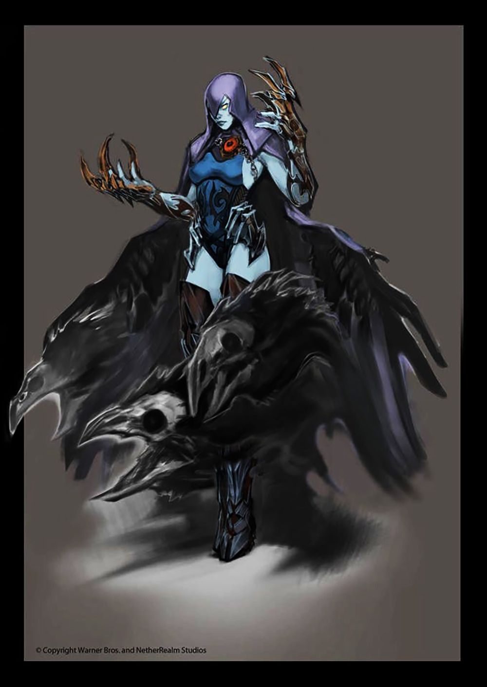
Raven is the daughter of a demon and has access to all sorts of crazy abilities. In Injustice: Gods Among Us, she ends up working with Superman and has fully embraced her heritage. It makes sense, then, that Netherrealm played around with making her look a bit scarier than the version in Teen Titans.
This concept art vies her monstrous talons over her hands, as well as a cape that transforms into demonic ravens at the bottom. While the final design isn't as memorable, it makes sense that a more subtle costume would've been chosen for the game's release. Wouldn't want to scare younger players away.
2 INJUSTICE 2 - STATIC
Static is a fan-favorite character, and one who was highly requested to be in the roster of Injustice 2. While he never made it in the game, whether in the form of during the initial release or DLC, there were plans to put him in. This official concept art shows what he would've looked like if he had made it into the roster.
Looking more hip that his past incarnations, this version of Static would fit right at home among the other characters in Injustice 2. He is still sporting the yellow lightning bolt on his chest and has all the right colors. It's a shame that he was never put in the game.
1 GODS AMONG US - GREEN ARROW
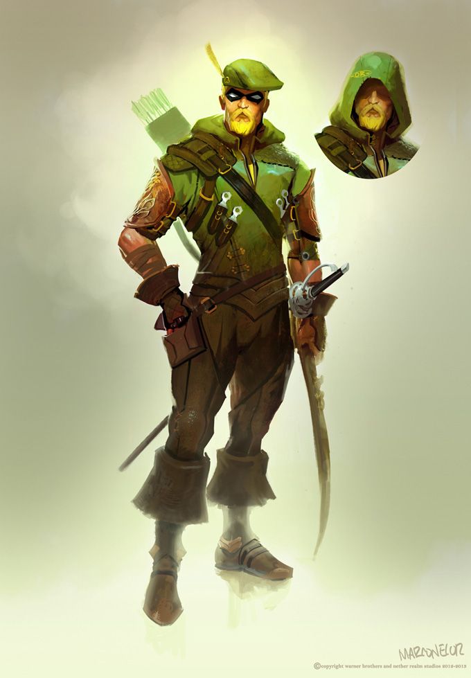
Green Arrow's design in Injustice: Gods Among Us wasn't far off from some versions in the comics. However, it took more inspiration from the modern designs as opposed to his classic Robin Hood-esque look. Some concept art was released, though, that suggests Netherrealm was going to pull from his first appearances as the basis for his design in the game.
This design for Green Arrow brings in his iconic hat and father from the old days. On top of that, he is given some more medieval-looking garb to make him feel more like a classic archer. The most interesting addition has to be the longsword attached to his hip. What sorts of attacks were they planning with that?

