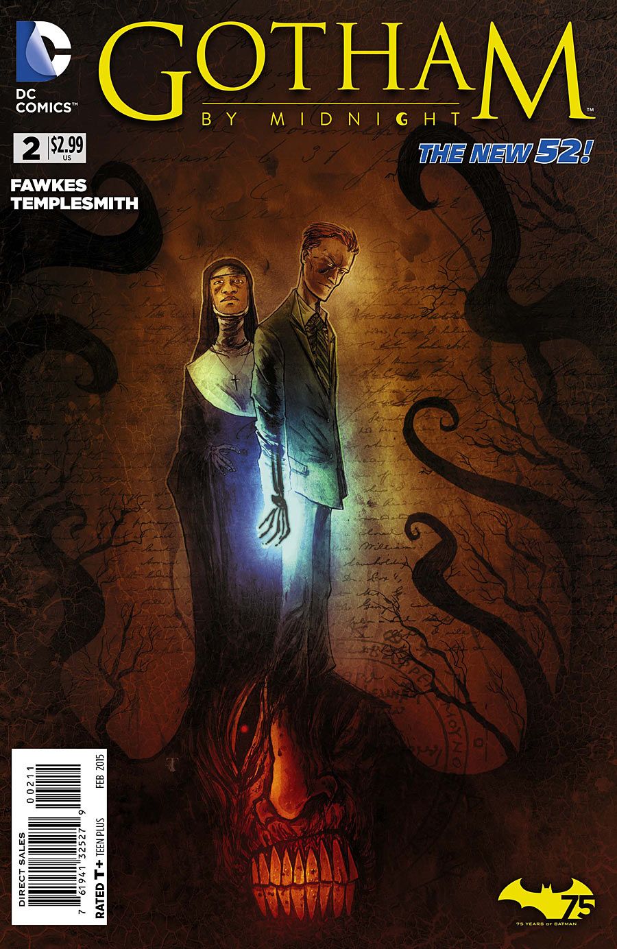
Building smoothly on its predecessor, "Gotham by Midnight" #2 reveals more about its cast and (presumably) central villain. The conclusion of the Gotham Heights abductions isn't particularly thrilling, but the story as a whole is well-paced, smartly structured and moodily drawn. Ben Templesmith's signature style creates a creepy, horror-heavy mood that just screams supernatural procedural, and Ray Fawkes writes a nicely balanced team. Altogether, "Gotham by Midnight" is shaping up as a perfect addition to the Batverse.
Fawkes structures this issue around two uses of the Spectre's power: one in the past, and one in the present. The two scenes parallel and contrast with one another, reminding the reader how Corrigan's ability works without any heavy-handed exposition. Fawkes also uses the flashback to flesh out one of his new characters, Sister Justine, and her backstory dovetails neatly with the overarching conflict. Though the overlap might feel convenient, Fawkes gets a great deal of information into the issue without slowing the story down. With a team to establish and a villain to build, he needs to be efficient with his pages, and he certainly is here.
Though the structure is quite tidy, Fawkes' dialogue can be too obvious. He overemphasizes Corrigan's tough-cop bravado at times. Corrigan gives a lot of ultimatums that are meant to establish his authority in these matters, but often sound like overcompensating. It's something that I'm sure Fawkes will smooth out in the months to come, but it's still just a touch clunky in this issue. (The title page, which may be Fawkes' or may be the editor's, is also far too dramatic.)
As many people have noticed, Ben Templesmith is an ideal fit for a supernatural procedural. His warped, ugly creatures and moody, mottled coloring create a menacing atmosphere. He colors entire panels in shades of a single color, and the effect fits supernatural stories as well as it does noir. It's a very distinctive style, and it certainly won't appeal to every reader, but it gives "Gotham by Midnight" so much of its mood. Not many artists could have made the black flowers near the end look so ominous and sickly.
That said, Templesmith's eye for the horrific still feels somewhat underused. The monster designs haven't been as inventive as those in some of his other titles, and even the concluding splash page feels underwhelming. That said, it's still early days, and I'm delighted to see some real artistic diversity in DC's titles. I've no doubt that Templesmith will deliver with the Big Bad.
As in the last issue, letterer Dezi Sienty is refreshingly subtle in his treatment for the possessed-child dialogue. He uses just the lightest yellow shading on the interior of the word bubble to differentiate their ancient language from everyone else's. This delicacy gives the possession an edge of sadness, rather than simply horror, that fits with the tentative way they're always asking questions.
"Gotham by Midnight" is a welcome addition to the Bat-verse, and its eerie horror is an ideal fit for the city. Though it doesn't deviate from Gotham's usual dark, serious tone, it is an artistic breath of fresh air.

