Spider-Man has an expansive and iconic rogue’s gallery whose popularity is only challenged by Batman’s. From the unhinged intelligence of Green Goblin to the calculating ego of Doctor Octopus to the psychopathic fervor of Carnage, every villain poses a unique challenge to your friendly neighborhood wall-crawler. When Spider-Man took the mantle of Marvel’s flagship character, it became inevitable that he and his rogue’s gallery would be adapted in numerous on-screen iterations. The Sam Raimi Spider-Man movies, the Amazing Spider-Man series, Spider-Man: Homecoming, Spectacular Spider-Man, and Spider-Man: Unlimited are some examples of on-screen media that has portrayed the wallcrawler. And, in many of these, his villains got their shine.
Unfortunately, though, these villains not immune to the sometimes questionable wills of the comic book artists. In some instances, these characters are drawn to look quite silly because they were made in a different time for a different audience. But the same can also be true of on-screen versions of these villains. Whether it’s due to budgetary constraints, artistic changes that didn’t quite pan out, or good old bad decision making, sometimes the on-screen versions look worse than the comics. To compare these two instances, here are 8 Spider-Man Villains That Look Better On-Screen (And 7 That Look Much Worse).
15 BETTER: VENOM

As most fans already know, Spider-Man: Unlimited was Spider-Man’s experimental phase. It’s an odd show made with a unique style of animation for the time. And this animation worked well for Venom, who was one of the show’s three main villains.
The animation style gave Venom an interesting sheen that the comic book version lacked. In addition to this shine, he was also a hulking figure.
His arms were the size of fully grown redwoods and he had the build of the Incredible Hulk. Venom in the comic books has an iconic look and there’s nothing wrong with the portrayal. But Spider-Man: Unlimited’s unique style helped to actually improve on the original design and make him appear even more threatening.
14 WORSE: ELECTRO

There was a lot wrong with The Amazing Spider-Man 2. Most of the problems had to do with the studio interfering after dollar signs clouded their vision following the success of the MCU. There were, however, other problems with the movie and one was the portrayal of Electro, the movie’s primary villain.
This version of Electro seems to be based more on Electro from the Ultimate Universe, which is actually much easier to pull off than classic Electro. Ultimate Electro is simply a being of pure blue electricity. Just don’t mess up the CGI and you’re golden. Unfortunately, however, they did manage to mess up the CGI, leaving Jamie Foxx looking more like a smurf than an entity made of electricity. Then to cap it all off they put him in a black bodysuit for some odd reason. The Amazing Spider-Man 2 was a warning about doing too much.
13 BETTER: DR. OCTOPUS

The only villain in Spider-Man’s rogue gallery who can challenge the Green Goblin as Spider-Man’s greatest foe is Doctor Octopus. However, his appearance isn’t the most threatening. While Doc Ock’s intelligence and four mechanical limbs make him a dangerous adversary, his bright green spandex suit and exaggerated rotund figure makes him an eyesore.
In Spider-Man 2, Octavious isn’t a short, overweight man in an ill-advised green suit. All of that is toned down some. Sure Alfred Molina is no Chris Hemsworth, but he isn’t as rotund or short as Dr.Octopus is in the comics. And he’s dressed like a normal person, which is a refreshing change of pace. Not only does the man look better, but the tentacles look much better as well. In Spider-Man 2, these tentacles have a lot more detail on their bodies and the fingers actually look like they are capable of flinging around Spider-Man.
12 WORSE: GREEN GOBLIN (NORMAN OSBORN)

People love Spider-Man. Sam Raimi’s original entry into the Spider-Man trilogy was an enjoyable affair that embraced campiness and heart in order to present a true comic book story. One thing that made this movie so great was the cast. The best performance, besides J.K Simmons as J. Jonah Jameson, came from the talented Willem Dafoe who portrayed Norman Osborn. He brought a deranged, over-the-top performance to the movie’s main villain that fit in well with the established tone. While Dafoe’s performance was loved by fans, his costume wasn’t.
The costume made him look like a robot on an old Japanese tv show instead of a threat to Spider-Man.
To add to the overall horrible look of the costume, the mask was distracting. Unlike its comic book counterpart, the face didn’t move, but you could see Dafoe’s mouth moving underneath the mask.
11 BETTER: KRAVEN THE HUNTER

Kraven the Hunter is an intriguing villain to Spider-Man, but there’s no escaping the fact that he looks like he is the fifth member of Kiss. From the leather jacket that’s always open to the giant fur hood to the capri-like pants that he wears, he looks eccentric bordering on plain goofy. His history as a world class hunter makes his choice of wardrobe even more confusing.
Spectacular Spider-Man fixed this by turning him into a freaking lion. Spectacular Spider-Man was known to change the characterizations and backstories of classic heroes and villains to fit its narrative. Kraven was one such character. When he couldn’t best Spider-Man in a fight on his own, he decided to have his DNA spliced with that of a lion and it resulted in a massive lion-human hybrid that looked interesting and was a true challenge for Spidey.
10 WORSE: JACKAL

There isn’t much at all to like about the new Spider-Man series on Disney XD, as it seemed to be made with the sole intent of cashing in on the character’s renewed popularity from Spider-Man: Homecoming. The characters are grating, the story is paper-thin, and the animation is laughable. The character designs don’t get a pass either, especially Jackal. In this abomination, the Jackal looks like a character from Gargoyles, just animated more poorly and wearing frayed jean shorts.
In the comics, Jackal’s look is nothing short of creepy. Once he went full Jackal, he developed an extremely lifelike costume that resembles some sort of ghoulish creature. In addition, his unnatural lankiness and menacing grin of the costume combines to present some truly nightmarish imagery that probably could find its way into anybody’s nightmares.
9 BETTER: ELECTRO (SPECTACULAR SPIDER-MAN)

Spectacular Spider-Man is considered by many to be one of the best Spider-Man cartoons of all time. It has great animation, tells compelling story arcs, and centers a lot of its focus on Peter’s high school exploits which opens up all new storytelling avenues. It’s also known for changing up the backstories of well known characters, like Electro.
In Spectacular Spider-Man, Max Dillon is an electrician working in Dr. Curt Connors' lab when he becomes Electro. He’s put in a containment suit that is far more interesting than his costume in comics. In the comics, he only wears a spandex green and yellow suit with an flamboyant mask designed to look like electricity. But in Spectacular Spider-Man, his suit is a darker green with pipes filled with electricity running along it. They even invoke the feeling of the mask by having actual electricity consume his face when he’s fighting.
8 WORSE: CARNAGE

Spider-Man Unlimited was the most experimental out of the Spider-Man cartoons. It took place on Counter-Earth, a duplicate Earth on the other side of the sun populated with genetically created animal hybrids called Beastials -- yeah, it was a little weird. Most of the classic villains were reimagined as Beastials for this show, but two that remained the same were Venom and Carnage who came to Counter-Earth from the regular Earth. Venom actually looked slightly better than his comic book counterpart, while Carnage...didn’t.
Carnage looked like a cross between a Xenomorph and a Godzilla villain.
The look was likely to make him seem threatening beside Venom’s hulking figure, but Carnage is threatening because he’s unhinged and unpredictable, not because he looks like a lanky bone monster. His look in this show not only failed on numerous levels, but distorted children's perception of Carnage.
7 BETTER: TASKMASTER

You could say that 2012’s Ultimate Spider-Man has had a divisive run. While people do seem to enjoy the animation and action, they criticized the rapid-fire jokes the series seemed to embrace. One thing the show did right, however, was Taskmaster. Taskmaster has always been an interesting villain that never really got much attention outside of the comic books. He’s a mercenary with the ability to learn anyone’s fighting style simply by observing them in a fight once, making him nearly impossible to beat for some people as he has hundreds of fighting styles to draw on.
In Ultimate Spider-Man, Taskmaster’s wardrobe is far more indicative of a mercenary than in the comic books. The skull mask and hood remain, but he now sports a much more tactical sort of armor rather than the orange spandex with underwear on the outside that the character wears in the comics.
6 WORSE: SHOCKER

Shocker was one villain that would benefit from not being put on the big screen in his comic book form. Shocker is one of the more ridiculous-looking villains Spider-Man faces off against. He wears a yellow and brown quilted suit with gauntlets of various designs. The gauntlets are actually pretty cool, but the suit itself is fairly silly and comes from a time when silly sold comics.
Shocker has been done once on the big screen and that portrayal came in Spider-Man: Homecoming with Bokeem Woodbine and Logan Marshall-Green playing two different versions of the character. These two versions largely ignored the comic book costume, instead sporting a single gauntlet with a yellow quilted glove they had to wear inside of the gauntlet that offered their arms protection from recoil. The decision to remove the costume was understandable, but it ultimately didn’t look any better than the comic book version.
5 BETTER: GREEN GOBLIN (HARRY OSBORN)

In the comics, Harry Osborn has had a long, winding history due to being the son of a deranged, power hungry Green Goblin and the best friend of his mortal enemy, Spider-Man. There have been several times that he has taken the mantle of Green Goblin whether it was to get revenge for his father’s death or to save the day. Generally, when he donned the mask, he looked similar to his father.
In Spider-Man 3, Harry took a different approach. While he did seek revenge following his father’s death, he became the New Goblin instead of the Green Goblin. Because of this, he updated the look, choosing a glider that was more like a skateboard and a costume that was far more tactical than theatrical. His suit was black instead of bright green and he wore a half mask and goggles combo before the Winter Soldier made it cool.
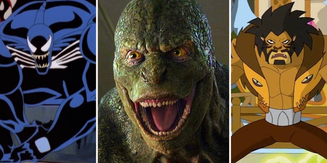
4 WORSE: LIZARD

The Amazing Spider-Man was dragged down by its sequel, but it was not as bad as people make it out to be. It offered a different take on Peter Parker and a more charismatic Spider-Man than the original Sam Raimi movies. In addition, Emma Stone as Gwen Stacy is easily the best female lead in any Spider-Man movie and Dr. Curt Connors was a sympathetic villain with a slow descent into madness who eventually redeemed himself.
The Lizard in this movie looked more like a Ninja Turtle than the terrifying crocodile-like monster he is in the comics.
The decision to not include a snout really hurt the character’s design and made him appear less threatening. So while the portrayal of the Dr. Curt Connors was done well, his scaly alter ego was not realized to its full potential.
3 BETTER: TOMBSTONE

It’s amazing how one feature can change a character’s appearance for the worse. Tombstone is a gangster born with enhanced strength and albino skin. He’s faced off against numerous heroes including Spider-Man and Daredevil. But there’s something about the way the artists draw his nose that makes it hard to take him seriously as a threat. Well, that and his flat top and penchant for leather jackets.
Spectacular Spider-Man remedies this, however. It puts Tombstone, or the Big Man as he was known for much of the show, in a suave business suit that works well with his cool demeanor and businessman-like threats. In addition to the costume change, they draw his nose normally which no longer distracts the eye and allows you to focus on his words and actually perceive him as a credible threat instead of someone with a perpetually broken nose.
2 WORSE: VENOM (SPIDER-MAN 3)

We really shouldn’t have to say much about this. Not only was Topher Grace thoroughly unthreatening in the role, nothing about this character looked the way it was supposed to. The version of Eddie Brock we got in Spider-Man 3 was the sniveling skinny kid that Topher Grace was in That '70s Show. And when he became Venom, he remained the same size, invoking a style similar to Carnage with none of the menace.
In the comics, Eddie Brock could easily have gotten a career in bodybuilding if the whole Venom thing didn’t work. And he’s even more hulking once the symbiote does come on. He looks truly insurmountable when Spider-Man fights him; a massive being with all of Spider-Man’s powers that’s much faster than he looks. That’s what everybody was looking for in Spider-Man 3.
1 BETTER: VULTURE

The Vulture in the comics is far different from the version we got in Spider-Man: Homecoming. In the comics, Vulture is a geriatric foe who developed a harness that allowed him to fly and gave him super strength. However, for some reason, this harness was bright green, skin-tight, and covered in feathers.
Vulture’s design may be a radical departure from the source material, but it’s a necessary one that fits with the aesthetic of the universe while providing insight into the character.
Adrian Toomes, like Peter, is a junker in the MCU. He’s a working class criminal that uses technology discarded from the exploits of upper class people like Tony Stark to create his flight suit. And beyond the symbolism, this suit looks far cooler, deadlier, and more practical than the version from the comics.