In this column, Mark Ginocchio (from Chasing Amazing) takes a look at the gimmick covers from the 1990s and gives his take on whether the comic in question was just a gimmick or whether the comic within the gimmick cover was good. Hence "Gimmick or Good?" Here is an archive of all the comics featured so far. We continue with 1992's dual-cover (with trading cards!) for Youngblood #1...

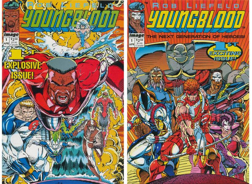
Youngblood #1 (published April 1992) – story by Rob Liefeld and Hank Kanalz, art by Liefeld
It would be irresponsible for me to write a column about gimmicky comic books from the 1990s without spending some time looking back on the dawn of the “Image Age.” The founding of Image Comics in 1992 was a watershed moment for the comic book industry as it brought major artistic talent together (like Todd McFarlane, Jim Lee and Liefeld) and advocated a new business model for creators, who could now publish material about new characters without giving up their copyrights for their creations. Image was enormously successful out of the gate and the popularity of many of the publishing house’s #1 issues helped fuel the comic book collecting speculator boom of the early 1990s.
Youngblood #1 was Image’s flagship title, built around Liefeld, a controversial artist for Marvel who helped create some of the modern era’s most popular characters such as Deadpool and Cable, and the new mutant team X-Force. As for a marketing gimmick, the comic sported two covers (I referred to this format in my He Said She Said comics article a few weeks ago as a “flip book” and was corrected by some of you, but I still haven’t found a better description of the two covers/two stories set-up). Youngblood #1 also had special trading cards inside each of the two covers.
But what about inside the comic (beyond trading cards, of course)?
I could probably generate about a dozen columns worth of material about Liefeld, his impact on comics, and all of his personality faults that have turned him into an industry pariah ever since he burst onto the scene more than 20 years ago, but I’m sure that’s a bit of “been there, done that” for the bulk of you out there. Needless to say, Youngblood #1 is not a very good comic book, but rather than just sit back and make fun of Liefeld’s inability to draw feet or some of his sloppy illustrations, let me attempt to scratch a bit deeper beneath the surface and explain why this issue is an industry punchline two decades later.
Looking at the comic from a sheer production perspective, the flip book/two cover format is incredibly confusing as it gives no indication if there’s a designated “A” story or “B” story. I understand that Liefeld has broken up the two stories so they spotlight two separate teams of heroes, the Youngblood “home” team and an “away” team (which was a clear rip-off of X-Men’s “red” and “blue” teams) but when I pick up a comic, I want some clarity as to how I should go about attacking it. For instance, in the Joey Buttafuoco/Amy Fisher comic I reviewed, the two cover format works because I can pick whose story I want to read firsta; Buttafuoco or Fisher’s. With Captain America #400, the new story was clearly marked with one cover, and the reprint of Avengers #4 was on the other side. With Youngblood I started with the Shaft story (the guy who looks like a red-suited version of Hawkeye) and wondered if I read out of sequence since there was no real introduction of the Youngblood concept. When I flipped it to the other side, I realized that the “away” team story didn’t have much of an origin either and I was pretty much S.O.L. if I was looking for an actual set-up for this brand new comic book series.
Meanwhile, the dialogue, which was reportedly scripted by Kanalz, features such literary gems as “You nail ‘em, and we jail ‘em!” and “No I.D. No pulse. No answers.”

In fact, this comic is littered with clumsy and awkward dialogue. There isn’t a single spread where I didn’t have to re-read a panel or two to try and decipher this gobbley-gook. Did a character really just say “Y’know, this doesn’t become such a mighty man as yourself. Stop your groveling!”? I read that sentence at least three times before I made sense of it. That’s just poor use of syntax. Additionally, people don’t speak like that.
The characters as a whole are completely unoriginal and uninteresting. Oddly enough, Youngblood was originally conceived as a New Teen Titans title by Liefeld, but I found myself counting all the Marvel rip-offs. Without trying too hard I came up with Thing (Bedrock), Deadpool (Diehard), Pyro (Psi-Fire) and Wolverine (Cougar).

One thing I did find interesting about the Youngblood concept is the idea that these superheroes exist in a society where they are treated like rock stars and other major celebrities. That’s certainly a departure from the DC model where the heroes are revered more as Gods, and the Marvel model of outcasts and misfits. But similar to my complaint about the lack of any origin, the text of the comic doesn’t provide me with any of this information. Instead, I have to cull from the Vogue character’s trading card that because of her celebrity, she was able to launch a successful cosmetics empire.
And given that this is an early 1990s Liefeld comic, I have to take a couple of potshots at the art. In this specific comic, Liefeld works best in tight quarters. His opening montage of Shaft getting attacked in the mall actually has some style to it. The action is mostly tightly plotted, there are no embarrassingly large bazooka guns used, and the Shaft character is not some grotesquely large, disproportionate meathead.

But the art is also inconsistent and is downright embarrassing in some of the group shots. In one panel, Bedrock looks like just your average, muscle bound rock-man, and then in this one group shot, he’s about as wide as a football field. Unless he’s taking some kind of Hany Pym/Giant Man serum without it being mentioned (which wouldn’t surprise me given some of the other details left out of this comic) I don’t understand where this transformation takes place.

If I could spotlight the Youngblood #1’s biggest overall flaw I would say that the comic desperately needed an editor who would have sat down with Liefeld and asked him some straightforward questions: what is this comic about? Who are these people? What is the story you’re trying to tell? Then he would circle all of the rushed/phoned-in art with red ink and told him to do it again and do it right this time. Say what you will about how the “Big Two” treated their creators, especially artists, but even the bad DC and Marvel comics had an air or professionalism about them. Youngblood #1 lacks plot, cohesion and consistency, and from a quality standpoint, it’s embarrassing how Image used this as its flagship title.
Verdict: Gimmick