In this column, Mark Ginocchio (from Chasing Amazing) takes a look at the gimmick covers from the 1990s and gives his take on whether the comic in question was just a gimmick or whether the comic within the gimmick cover was good. Hence "Gimmick or Good?" Here is an archive of all the comics featured so far. We continue with 1991's multiple-cover and gatefold cover X-Men #1...

X-Men #1 (published October 1991) – script by Jim Lee and Chris Claremont, pencils by Lee, inks by Scott Williams
The calendar may read 2013, but the gimmick cover is alive and well. Throughout the month of April, DC comic, as part of its “WTF” promotion, is releasing a number of comic books with special “gatefold” covers. In acknowledgement of how the comic book industry hasn’t evolved as far past the 1990s as it often cares to admit, during April, Gimmick or Good will focus on some comics from the past that also sported these special fold-out covers.
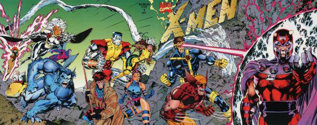
What better place to start a gimmick cover theme month than with arguably the most famous comic book of the 1990s and the greatest selling single issue of all-time, Marvel’s X-Men #1. By the early 1990s, X-Men had become Marvel’s most popular property. In an effort to draw even more attention to its newest “X” title, Marvel released the first issue of this series with four different variant covers that interlocked to create a larger scene. Marvel then released a gatefold cover edition of the comic (known by retailers/collectors as X-Men #1E) that featured the entire scene.
The marketing gimmick was historically successful, as X-Men #1 went on to (reportedly) sell more than 8 million copies – a record that will probably never be broken in any of our lifetimes. On the negative side, the comic’s runaway success set the standard so incredibly high for future #1 issues of different series, that the higher-ups at Marvel were inevitably disappointed when something like Silver Sable #1 only moved a few hundred thousand units upon its release – numbers publishers would kill for in today’s marketplace.
But what about inside the comic?
Not to reveal too much about my process here at “Gimmick or Good,” but before I give a 20+ year-old comic book a fresh read (or in some cases, a first read), I generally have some idea whether or not I’m going to give it a positive or negative review based on my initial memories/impressions of the issue from back in the day. In the month and change rhr I’ve been contributing to Comics Should Be Good, X-Men #1 is the first instance where a fresh read revealed a completely different opinion about a comic from the first impression I had of it 20 years ago.
As a kid who grew up reading comic books in the late 80s/early 90s, X-Men #1 is the definitive version of the mutant team and associated cast of adversaries. These are the characters that starred in the video games, cartoons, action figures and movies I consumed and enjoyed throughout my childhood and teenage years: Wolverine, Storm, Colusses, Gambit, Beast, Rogue, Jean Grey, Cyclops, Psylocke, Professor X, etc. versus the idealistic but deluded Magneto and his team of villainous followers. Reading this comic again in 2013 was just going to bring on the wave of rose-colored nostalgia, right?
And yet, I labored through nearly every page of this comic. At 48 pages, it’s a behemoth, and the bulk of it is exposition, clearly laying down the foundation for future stories. And yet, entire sections feel superfluous. Does a reader really need 15 pages worth of a training sequence at Xavier’s School for Gifted Youngsters?

I understand that the scene essentially mirrors the events of the very first issue of Uncanny X-Men in the 1960s, all the way down to the confrontation with Magneto later on. But those pages really don’t serve any purpose beyond giving some of the key characters their obligatory “moments” (Wolverine and Cyclops don’t like each other, Beast is chock full of one-liners, Gambit talks like James Carville).
Lee’s artwork places all of the X-Men in stunning action-figure poses (and if I wasn’t cynical enough, the back page of this comic book is an advertisement for a new line of X-Men action figures) and Lee/Claremont’s (both get script credit) dialogue goes to such lengths to explain everyone’s individual powers that it almost reads like a text book – incredibly rigid without any natural flow. Isn’t one of these guys the author who wrote some of the greatest comic book stories of all time? There has to be a happy medium here between trying to introduce hypothetical new readers to the X-Men universe without boring those of us who already know that Wolverine is a loner who has adamantium claws and likes to say “bub.”
Meanwhile, the issue as a whole suffers from a clunky, cluttered layout filled with large striking poses mixed with large swaths of texts and speeches that ultimately don’t jive with each other. The very last spread shows Magneto confronting the X-Men in one panel across two pages.

Lee has posed Magneto with arms dramatically outstretched as Lee/Claremont plots a Shakespeare-sized soliloquy. And all I’m thinking is even as a mutant who can control magnetic forces, this guy’s arms must be getting tired standing there in full Jesus pose while he gets out all those words. I know this makes me a hypocrite for mocking Todd McFarlane’s splash page bonanza in Spider-Man #1 a few weeks ago, but again, there has to be a happy medium between working in the obligatory number of marketable art panels with the required amount of text to advance the story at an appropriate pace.
There are smaller criticisms, like a couple of rough transitions that were poorly edited. For example, in the issue’s third act, Rogue confronts Magneto when a nuclear blast occurs.

The reader sees Rogue plummeting from the sky while the X-Men’s jet is in pursuit. Flip to the next page, and both Magneto and Rogue are back in their respective corners being attended to. Maybe my reading comprehension skills are just slow-witted, but I feel like there are a couple of panels missing between these two scenes that explain how everything got back to the status quo.
Just to be sure I wasn’t being some irrational cynic, I went back and re-read parts of Giant Size X-Men #1 – a true introduction to a brand new cast of characters – and the older comic does a much more admirable job of quickly working through the exposition and moving immediately to the conflict and its resolution. Obviously, with Giant Size X-Men, Marvel had one of its last chances to make the X-Men franchise work, while with X-Men #1, the demand and desire to purchase these comics was already there. The end result is a comic book that for lack of a better description is without any real joy or fun. It shouldn’t be this much work to get through a comic. In this case, my first impression was not my lasting impression.
Verdict: Gimmick