In this column, Mark Ginocchio (from Chasing Amazing) takes a look at the gimmick covers from the 1990s and gives his take on whether the comic in question was just a gimmick or whether the comic within the gimmick cover was good. Hence "Gimmick or Good?" Here is an archive of all the comics featured so far. We continue with 1992's foil cover Spider-Man 2099 #1...

Spider-Man 2099 #1 (published November 1992) – script by Peter David, pencils by Rick Leonardi and inks by Al Williamson
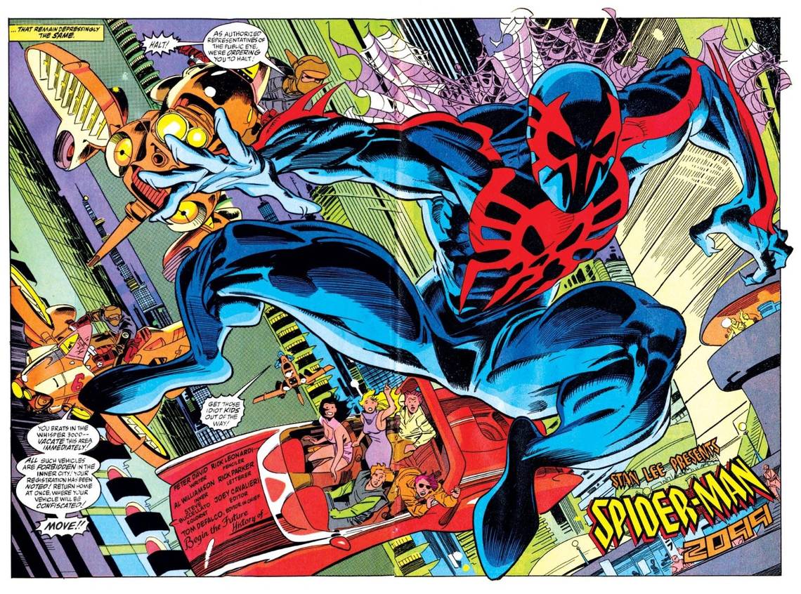
In 1992, Marvel launched a major initiative known as its 2099 line. A number of its most popular characters were to be re-imagined more than 100 years into the future, with new alter egos and supporting casts. Spider-Man 2099, which featured writer Peter David and introduced the world to Miguel O’Hara, the first Latino Spider-Man, was the most popular series in the line until cost-cutting measures by Marvel led to the termination of the 2099 universe in 1996. For its first issue, Spider-Man 2099 #1 sported a red foil banner – a somewhat traditional embellishment for this era of comics.
But what about inside the comic?
Spider-Man 2099 and Miguel are front and center again thanks to the recent Superior Spider-Man storyline being written by Dan Slott. Slott is doing a fine job getting fans who may be unfamiliar with Miguel up to speed, but regardless I thought the timing was right for “Gimmick or Good” to time warp back to 1992 and analyze the contents of this first issue.

I don’t remember this comic leaving much of an impression on me when I was younger, but more than 20 years later, I actually think David and Leonardi do a great job creating a universe that’s both an homage to the Spider-Man of yesteryear, while also setting out to traverse new themes and ideas. Miguel is a brilliant geneticist with a snarky wit and a bit of fascination with the “old” Spider-Man, but that’s really where the bulk of the parallels end. For the most part, Miguel features his own look, his own power/abilities set, and an interesting supporting cast of characters that are darker and grittier than Stan Lee/Steve Ditko’s Aunt May and Flash Thompson.
Leonardi’s character design remains my favorite element of this comic. In terms of aesthetics, Spider-Man 2099 may be as perfect of a re-imagining as it gets. The character looks futuristic but there’s also a classic vibe and in a few panels I swear Leonardi is referencing the iconic John Romita Sr.

Miguel’s costume is sleek and simple and the color scheme is terrific. The splashes of red add a touch of flair. The webbing “cape” Miguel wears is a nice callback to Peter Parker, but again, the creative team doesn’t come across as being overly burdened in trying to make every component of this character connected to the more “familiar” Spidey.
David creates a whole new vernacular for his 2099 universe with the phrase “what the shock,” being used in place of your expletive of choice. Miguel meanwhile is portrayed as a “good” guy but not necessarily a nice guy. While an argument can be made that the Lee/Ditko Peter wasn’t the saint a lot of contemporary writers have made him out to be, Miguel is unquestionably more hardened and arrogant. He has issues listening to authority, which is partly due to his personal moral code, but can also be chalked up to just plain hubris.

Like Peter, Miguel’s life as Spider-Man is set into motion through trying to use his power responsibly. During a genetic test, the subject is transformed into a hideous creature and attacks Miguel. Miguel then goes to Tyler Stone, the CEO of the company he works for, Alchemax, and resigns because he no longer wants to be a party to such a level of human experimentation. Of course, Miguel’s resignation goes horribly wrong. Stone slips him a highly addicting drug called “the rapture,” which bonds to a person’s DNA. The cure for the drug is proprietary to Alchemax employees. But rather than submit to Stone’s game, Miguel self-experiments, giving him the abilities of a human spider (and fangs and claws to boot).
My biggest issue with the comic is something I’m sure some of you will find to be innocuous and inconsequential. I found some of the futuristic details of the 2099 universe – the flying cars and holograms – to be a little trite. Granted, this was written in 1992 when some of these ideas for “the future,” were fresher to readers, but as I sit here writing this article in 2013, I’ve become more convinced that 86 years from now, the world is not going to look like the set from a movie based on a Philip K. Dick novel.

Yet at the same time, there’s something eerily prescient about David’s script here. While the comic was written in the early 90s, a lot of its themes of corporate greed and pharmaceutical industry corruption resonate in 2013. The fact that a legal drug like the rapture exists in this universe was particularly eye-opening. This is a drug that is essentially manufactured to be addictive so that the user needs to take even more drugs to feel better. Keep that in mind the next time you stop and read the list of side effects during an advertisement for whatever the prescription drug of the moment might be.
Reading this comic today made me disappointed with my 11-year-old self for being so unimpressed with Spider-Man 2099 back when it was first released. This is a fun concept that also served as a precursor for other “alternative” Marvel timelines, like the Ultimate universe. The only difference here is that Spider-Man 2099 feels completely untethered to the “traditional” Spider-Man story that it gives the creative team carte blanche to craft a story that was unlike any other Spider-Man story that preceded it.
Verdict: Good