TRANSFORMERS/G.I. JOE: AN ARTISTIC MESS TO LEARN FROM

DreamWave Studios' six-part crossover miniseries from 2003/2004 is set at the beginning of World War II, where Cobra has joined forces with the Decepticons against the world, basically. G.I. Joe is formed as an elite squad to take them out. Thankfully, they luck into awakening some Autobots who give them a hand.
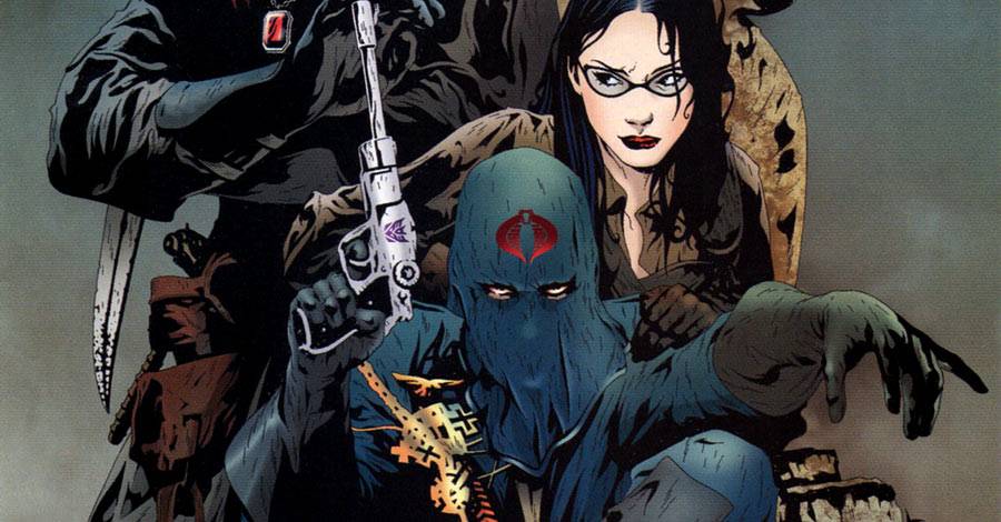
It's G.I. Joe and Transformers. Nobody was expecting high literature. I was, however, expecting some decent storytelling, or at least a hint of story that made sense, where one event led into another and a progression built into an epic climax where the good guys won. Unfortunately, this series is a mess. It's all limited plot for plot's sake, with sub plots that stop and start almost randomly to make a confusing mess, not helped by art that so often obscured characters or was colored so uniformly dark that everyone looked alike. Some color assistance might have separated the characters a little better, particularly when it came to robots in disguise who all look alike from a certain well-shadowed angle. Where does robot end and regular machinery begin? Your guess, often, is as good as mine.
John Ney Rieber's script has plot elements in it that are interesting and potentially uber-dramatic. There's some backstabbing going on with Cobra, as expected, particularly when it comes to the crazy Cobra Commando, Destro, and the Baroness. Throw in Megatron, and who do you trust? (Correct answer: Nobody.) The Joes having to come back from overwhelming odds with the help of a small number of Transformers might make for a good war strategy story, except they're separated most of the time and having their own disconnected adventures. The Autobots then refuse to fight against the Decepticons until the Joes pull a Captain Kirk-level logic bomb on them to spur them into action.

But good luck following all of that, particularly when Snake Eyes and Storm Shadow get the only character-based focus of the series, and in chunks that always feel too short and random. You won't realize until it's too late that this is Snake Eyes' origin story, basically. When his face gets destroyed, you'll be surprised that it wasn't already. There's nothing to tell the reader otherwise in advance. It often feels like Rieber is paying off things he never set up, relying on devoted followers of the franchise to get it naturally.
In the end, the story stops. Suddenly. In the last three pages, the big crescendo hits, and that's that. The consequences are immediate and severe. It comes out of left field and conveniently ends everything. Cobra loses and the Transformers -- both good and bad -- instantly shut themselves down. Life moves on. I'd have preferred some repercussions, somewhere.
That's where the pacing really gets blown. It's bad enough the series feels like a scattered mess leading up to this point, but then the momentum is stopped dead in its tracks before it starts building up. As a reader, it's disappointing.
Jae Lee's art is dark and moody and well-colored in period grungy dramatics by June Chung. The problem is, the combination of Lee's style and Chung's style makes the book a confusing muddle. I can't tell you how many times I couldn't tell where a Transformer ended and some other random piece of machinery or vehicle began. It's frustrating to have to rely on the captions and the expository dialogue to keep track of what's going on, particularly whenever Storm Shadow and Snake Eyes are on the page. At that point, though, you can't even tell who's narrating.
Benjamin Lee's lettering works, but the more creative parts of it look clunky, like when letters burst out of balloons and it looks like an Intro To Illustrator tutorial informed it. Granted, 2003 was relatively early days for computer lettering, but it still looks second rate.

So, yes, a complete mess, though at times pretty. I admire Jae Lee's style and his ability to draw dirty technology, old worn-down buildings, and even the intricate folds of clothing all on the same panel. Some of it feels very Mike Mignola-esque, particularly with those backgrounds. It relies on Chung's coloring, though, to keep each page interesting. The problem there is that her coloring style in this book makes for great individual panels, but too often obscures the story and doesn't do enough to separate layers of each panel. The textures are nice and all, but the storytelling is lost.
In an effort to salvage something from this, let's look at the covers and try to take away some artistic lessons from it all.
Scale and Separation
The covers for issues #4, #5, and #6 have similar compositions. The large Transformers dominate the image in the top half and left sides. The humans are tiny specks along the bottom edge or in the bottom right corner. The scale of the fight is shown nicely that way.
There are no backgrounds in any of these covers. Issue #4 has some clouds painted in to sort of substitute for a background, but the overall effect is almost like silhouettes fighting against each other.

By the sixth issue, though, even that drops out and everything is one pale gray blob. You can't tell where Megatron ends and the background color beings. It's monochrome completely, which flattens the color out completely. But Megatron is clearly walking up to Snake Eyes (I think) in the front of the image. There's some smoky fog between the two to help separate them, but it's not enough. The lack of distinction in the coloring amongst the different planes of the image flattens everything out. Shame.

The cover to issue #4 works out slightly better that way, in that the Transformer and the Cobra agent are basically on the same plane. The bright orange background helps push them forward and gives the characters a strong shape from that difference. They stand out for the reader because, even though there's no background image, per se, the strong contrast between the bright orange clouds and the darker characters helps everything pop.

The cover for #5 is the most confusing. I have no idea what's going on with the Transformer on the top half of the cover. I don't know where the robot ends and the military plans begin. I can make out the arm and a clenched fist in the front, along with the right leg. But where that explosion is, I have no idea what's what. It appears the character has his back turned from the reader, which makes the cover feel weaker, too. I want to see the action happening in front of me, but the Transformer is blocking me from seeing it. Frustrating.
Negative Space
The one nice thing all three covers do is play with negative space to separate the humans and the robots. In issue #4, there's a natural break between the Transformer's gun and the Cobra agent holding up the flag. Even better, the Cobra agent's head is easy to spot, because the white flag behind him perfectly frames his head. I only wish the flag was larger so the Cobra symbol wouldn't be fighting with the soldier's head there.
Issue #5 pulls the neatest white space trick along the bottom edge of the cover. The soldiers in their vehicle -- can't tell if it's a ship, a Jeep, or what -- are silhouetted against a horizontal stripe of white that might be smoke, water waves, or fog. Their silhouettes pop out nicely, even if they are just standing there, looking, when they might better be seen making a decisive action of some kind. Maybe if a soldier was pointing a gun or loading a rocket launcher or something, the extra action would make for a more exciting image.
The sixth issue cover, as I said before, uses that white space between characters to not just separate them on the cover between the corner and the upper half of the page, but also between the foreground character and the middle ground Transformer.

The second issue is a variant of this design, in that the Transformer and the Joe characters are both about the same size. Again, we have some negative space in lieu of a background to help pop out the human character, while the Transformer is blending in with a stack of rubble/machinery/rock. The lighter colored background makes for a much more readable cover, as well. The white of Snake Eyes' sword sticks out in a sea of pale grays.


Snake Eyes is facing off against a robot in disguise carrying only two swords, and yet we all believe he's going to win that battle easily. Spoiler: He does. See the pages above.
Design Shapes

The cover to issue #3 is my favorite of the series. It's the simplest and most static, but it's the easiest to read and has the most people on it. There's a kind of triangular design at work here, with Cobra Commander looking his most flamboyantly evil at the bottom, and Destro the most conniving at the top point. Baroness is caught between the two men, which will play into the plot later in the series.
Between the Baroness' skin tones, Destro's red collar, and Cobra Commander's blue uniform, there's a welcome relief of color to this cover. Even the ornate brick and stone sculpture incorporated into the cover has a couple different colors, and sits back nicely from the foreground characters. A brighter background might have helped out more, but it's still the best of the bunch.

The first issue's cover has a half-circle cover design. The background of Optimus Prime and that rubble feels very much like a half-circle drawn behind the Joes. You could make an argument that it's just another triangle, I suppose, but the arc of the background feels too rounded, like Prime's shoulders are hunched up to protect the Joes.
But does it work as a cover? The first issue's cover was tri-fold, wrapping around with a fold-out panel. Lee doesn't take much advantage of the extra space to do anything more than just create a more epic setting. There's not much on either side of the front cover of interest. There's no element of surprise, nothing that would stand well on its own, and nothing that needed to be there, honestly. Flint is on the back cover, but his entire face is in shadow. (Only the hat tells you who it is.) The inside cover flap is dominated by Optimus Prime's first and a fallen statue's head. But nobody is buying the book for that statue's stone cranium.
The width of the cover helps reinforce a certain movie screen-shaped frame for the overall image that couldn't otherwise be created in a portrait-formatted cover image. But I think a tri-fold comic book cover needs something else besides that.
At least there was no extra charge for it. All issues of the series were $2.95
I'll give the miniseries credit: It tried something new, re-imagining these two franchises in World War II. They went all the way with trying to make it as realistic as possible with the art and coloring.
There's never really a good way for all the characters in the two series to join up that'll make sense, though. The Transformers are, obviously, vastly too powerful. I like the concept, but it was the execution that was fatally flawed. It's a combination of a script that feels too disjointed and an art style that's not clear enough. There are individual panels and pages that I can look back at and enjoy in isolated moments. But put it all together and the sum is far less than all of the combined parts.
And then there are moments like this. Bumblebee is a yellow motorcycle in this comic, since Volkswagen wasn't making Beetles yet. Scarlett is not afraid to make use of this. Thus, we get a rare example of Transformers innuendo.

Transform and roll out, indeed...
Twitter || E-mail || Instagram || Pipeline Message Board || VariousandSundry.com || AugieShoots.com || Original Art Collection || Google+