The heads-up display, or HUD, is information seen on-screen during gameplay. This can be the status bar, map, health, or any other mechanics tied to the game. Many games have a standard use of a HUD with many only having small differences between them.
FPS games in particular have been known to have a limited or entirely crowded HUD with the weapons in the bottom right-hand corner and a mini-map in the opposite corner. The implementation of these user interfaces varies from genre to genre, but several HUDs have been praised for their appearance and clever usage. HUDs don't need to overwhelm the player or crowd the screen. They can be integrated in ways so clever and creative that players might even forget that they are there.
10 Metroid Prime Immerses Players Immediately Seeing Through Samus's Eyes

Nintendo's Metroid Prime trilogy has players see the world as Samus does with the camera perspective being inside her visor within her helmet. All the information needed at any time is displayed on-screen like looking at diagnostics on a real combat suit. Most of everything is on the HUD and there is rarely anything to do outside of just playing the game apart from pausing or looking at the map. Scanning is also a key feature in the games and having the information pop out of everything being scanned adds to the immersion as they read and discover things as Samus discovers things.
The most clever part of the HUD for the games is present in Metroid Prime 2 and 3's Wii versions, as the battery life of the Wii Remote is displayed with a blue, yellow, and red color on-screen to warn players when they'll need to recharge or replace the batteries when playing.
9 Mirror's Edge Shows That Less Is More With Its HUD

The parkour simulation game, Mirror's Edge, has almost no information on screen apart from the rooftops that the player is expected to traverse. The game marks edges and interactable landscapes with a highlighted red hue to give the player a sense of direction as they run through the game. This becomes especially useful indoors as the player has less of an idea of where to go in narrow spaces.
The option for these platforms to be highlighted can also be turned off, leaving players with no direction and careful thinking to know where they can wall jump, climb, and grab onto ledges next. Even the slow-motion ability is only shown to be regained when the screen begins to glow blue after running long enough.
8 Horizon Zero Dawn Uses A Dynamic HUD With A Clever Theme That Fits The Game's Narrative And Setting

Aloy's Focus in Horizon Zero Dawn makes up a fragment of the game's HUD, but its usage is very important to the story and engaging in combat. The first usage of the item has Aloy track the paths of the machines on patrol, using it to stealthily move through the tall grass. The game uses icons well enough to show consumables, ammo, weapons, as well as the waypoint to the quest objective.
The other statuses are the compass, HP, reserve healing, and XP meter. The game uses a dynamic HUD to hide all unnecessary information while traveling to fully experience the world without obscuring the environment with all the information on-screen. Additionally, while using the Focus, the weaknesses of the machines and their weak points are highlighted to add to the post-apocalyptic setting.
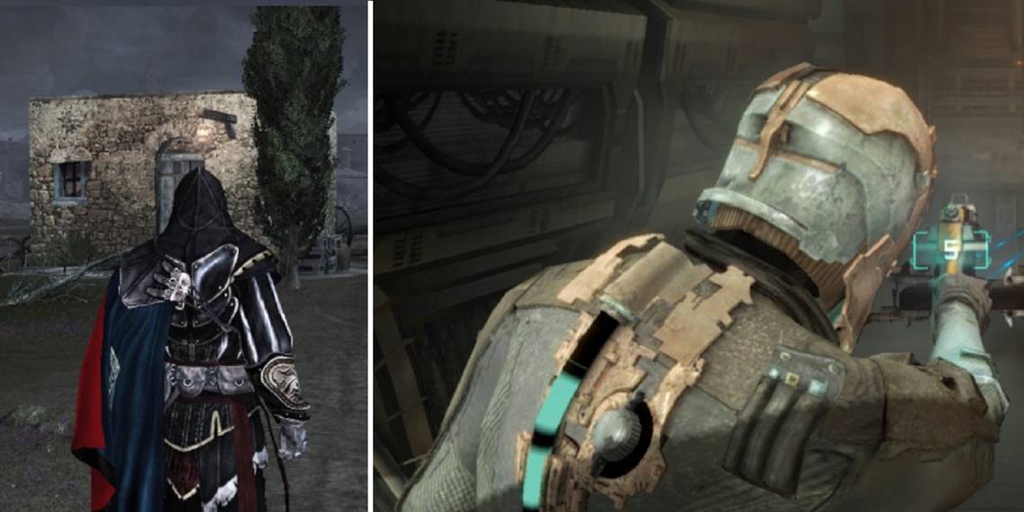
7 Assassin's Creed Uses A Minimal HUD That Contrasts The Historical Setting

Every AC game uses a similar HUD, but the ones used in the original trilogy are themed around the Animus. The Animus is the machine that Desmond uses to live through the memories of his ancestors. While playing as the assassins, the game has the health of the character stylized with the Creed's symbol. The controls are always on screen as well as the weapons equipped.
The mini-map displays interactables rather than the map itself and uncovers more things as the player discovers synchronizing locations. While the newer AC games have a sleek HUD, the early game's theme of the Animus adds to its charm.
6 The Metro Series Uses Artyom's Equipment As A Clever HUD

The HUD in the Metro series changes depending on the difficulty. On every difficulty but Ranger, icons are present to represent ammo in the magazine, weapons in the inventory, and damage markers. The cleverness present in Metro 2033 uses the gun as a visual indicator to see how many bullets are left, how much pressure is left, or the voltage on Ranger difficulty.
Artyom's Watch is one of the best indicators as the information displayed on the watch measures his stealth and the timer for when his oxygen in his gas mask will run out. The watch uses LEDs above it to show how hidden Artyom is and the watch itself uses colored segments to show how much time is left until the next filter is needed.
5 Fallout's Pipboy Is The Most Straightforward HUD For The Wasteland

The Pipboy in the Fallout series tracks nearly everything in the game. In the actual menu, the Pipboy is used to manage inventory, track quests, use the map, and look at the status of the player character. Outside of his meu is the HUD during gameplay and the Pipboy is explained to be displaying this information at all times.
The compass and HP or the XP meter can be written off as being less immersive for the game, but VATS is something strictly unique to the Fallout universe. The HUD is even further improved when inside Power Armor, as everything needed is there on the screen as though the player character was being fed all the information from the suit itself.
4 Call of Cthulhu: Dark Corners Of The Earth Has No HUD To Prevent Any Distraction From The Sanity Mechanics

One of the best Eldritch horror games has one of the best minimalist HUDs in video games. Call of Cthulhu: Dark Corners of The Earth has no HUD when playing the game, however, the inventory does go to a different menu. While playing, the effects of what the player is witnessing start to have effects on reality.
The "sanity" meter is not visible in the game and the only way to deal with it is by going into the inventory and using an item. The same can be down for health as there are many different indications for how low the player is. If the PC's arm is broken, it becomes harder to aim and if the PC's leg is broken, then sounds of pain are heard while the camera bobs while limping.
3 Shadow Of The Colossus Gives Players Ambience And No Guidance With Its Lack Of A HUD

Regardless of the version of the game, Shadow of the Colossus has very little use of its HUD apart from being in combat or using stamina. The meter is a pink circle that indicates the player's stamina and is important when climbing the tall creatures they are tasked with slaying. In the game, the direction of each Colossus is a mystery, however, Wander's sword shines a beacon in the direction of the next one to fight.
The world is vast, and there are few ways to improve stats but aren't explained. The stamina meter is only displayed along with the health bar and weapon when climbing, using a weapon, or taking damage. This, as well as the lack of music in many areas, makes the world feel that much fuller and that much more empty.
2 NieR: Automata's HUD Is Themed Around The Androids Played In The Game

When starting NieR: Automata, players experience a dynamic HUD no matter the style of gameplay. During exploration and combat, the HUD can be as minimal as desired or even entirely disabled. Playing as an android, the player can use chips to upgrade their stats to their preferred playstyle.
With these chips exist a plethora of chips that are attached to the game's audio, HUD, and even the life of the android being played. When playing the game normally with all these installed, the HUD displays the appropriate information and hides it when not necessary. The HUD and menu change when at low HP as well, similar to when damaged in other games, but can be forced to appear this way if the self-destruct sequence is initiated.
1 Dead Space Has Its HUD Built Into The Armor Of Isaac

One of the smartest implementations of a HUD is the health and stasis bars on the back of Isaac's suit. The overall enjoyment of seeing more and more nodules for his health as the suit is upgraded over the course of the game is incomparable. Rather than displaying these important vitals in the corner of the screen, the clever design allows players to control Isaac and pay full attention to the environment.
The frightening Necromorphs fought should be the main focus anyway as looking away could mean certain death. Even when going into space, the oxygen counter is displayed below the stasis meter for the convenience of the player. Accessing the menu is done in real-time and Isaac interacts with everything he sees when using it.