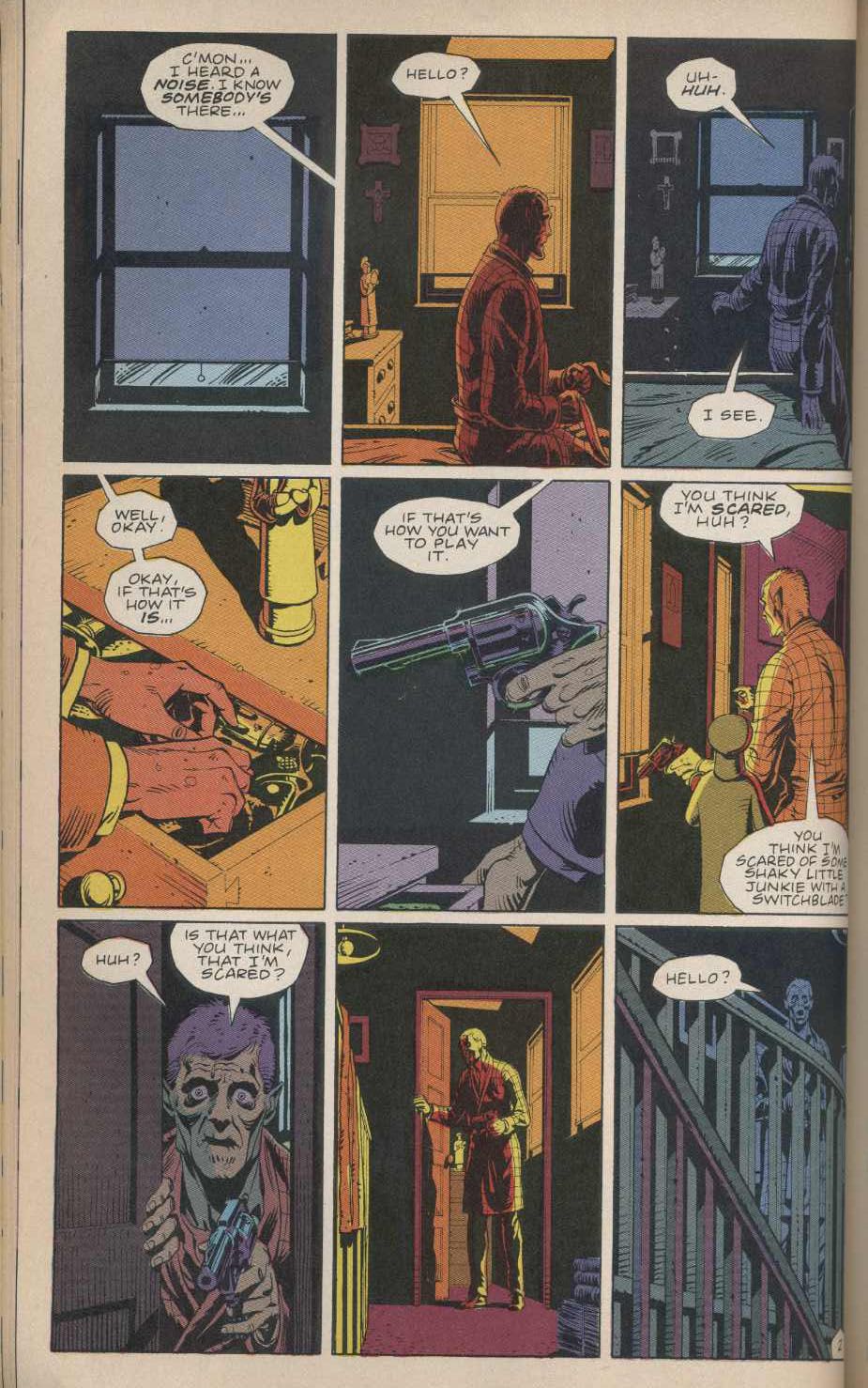
The great cartoonist and critic Frank Santoro is once again tackling grid-pattern panel layouts, and this time he's talking about arguably the most famous nine-panel grids of all: Those used by Alan Moore and Dave Gibbons in their stone-classic superhero dissection Watchmen. Here's a sample that includes an insight about the art in that book that had never occurred to me before:
Let’s look at 9-panel grids in North American comics. When I think of the 9-panel grid I invariably see Steve Ditko’s Spider-Man page layouts in my mind. Then I see Watchmen. Both stuck to 9-panel grids for the most part. And I think the center panel – the panel that doesn’t exist in a 6-panel grid – is where some of the power comes from in these works.
If I flip randomly to a page of Watchmen and let my eyes scan the page, usually I look straight at the center – and often that center panel is representative of the whole page. It’s like an anchor. Also, the artist (Dave Gibbons) never gives up the center of the page when he uses a different layout. Never! He never has a center tier that has a vertical gutter in the direct center of the page. I really think this is part of Watchmen‘s visual power. When I flip through the book, my eyes just go from center of page to center of page and I feel more enveloped by the story and by the world created.
I don't have the book in front of me, but take a look at the page above and the other examples Frank posts, and damn if he isn't right: Whatever panel or image is in the center of the page pretty much tells the story of the entire page. Now I want to scan the whole book and string together a comic solely from the center panels/images and see if you could still "read" it. I kinda think you could!
Anyway, Frank's always worth reading on the craft of comics. Go ye and get edjumacated.


