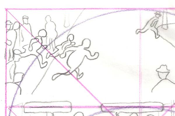

In his latest post at The Comics Journal, Frank Santoro engages in a little bit of compositional analysis, explaining how an artist determines where the eye will fall, and what are the static and dynamic areas of the page, using a page from a Tintin comic, King Otokar's Sceptre, to demonstrate the ideas in action. In this case, the components of the drawn comic line up so neatly with Santoro's diagram that it's hard to believe Herge wasn't doing it deliberately.
I'm usually suspicious of after-the-fact dissections, because it's easy to look at a completed work and see things the artist may not have put in deliberately. But Santoro says that Herge was probably aware of the technique, but that for some artists it just comes naturally, like playing music by ear. And just as the artist may use it unconsciously, the reader probably isn't aware of it, observing only that some pages are more attractive or compelling than others. It's useful to be reminded that such swift impressions are often born of painstaking planning. Sometimes you have to work hard to make it look easy.