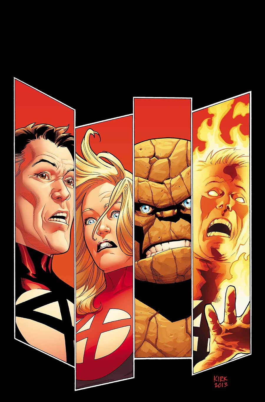
Marvel's first family gets a new lease on life and a new volume of their adventures thanks to the imaginations of James Robinson and Leonard Kirk in "Fantastic Four" #1. Unfortunately, the thrust of this first issue sets it up as the beginning of the end, with a double-page spread devoted to creator credits and announcing "The Fall of the Fantastic Four."
The foursome remains the same: Mister Fantastic, Invisible Woman, Human Torch and the Thing, but much of the presentation of "The World's Greatest Comic Magazine" has changed, from the logo to the color scheme of the team's costumes. While the red uniforms are not initially addressed in "Fantastic Four" #1, the presence of red -- closer to crimson than scarlet -- permeates the issue, perhaps offering clues of the pain and uncertainty ahead for the Fantastic Four. The ominous title of the story and the depressed nature of the narrative, filtered through Susan Storm, indicate an emotional tumble set in the near future for the team. Additional foreshadowing is visible in the circle-four graphic on the "Previously..." page. The icon has some slight cracks at the edge of the circle surrounding the four, indicating the beginnings of some wear. I look forward to seeing this team follow the lead of previous "Fantastic Four" scribe Jonathan Hickman and continue the dilapidation of the icon.
The story itself is mired in gloom and impending doom, but is not without its classic Fantastic Four moments. The quartet charges into battle together, each with a role to play integral to solving the problem. Ben gets a moment to shout out, "It's clobberin' time!" He also has the opportunity to roll his eyes as Reed spouts off about the theories present in battle. Johnny gets a laugh at Ben's expense and Sue has to hold the team together and lead the way. Robinson's use of Sue as the point-of-view character is inspired and showcases Robinson's strengths and comfort with the team nicely. Ben gets a fair turn in the spotlight and Robinson even breaks down Reed's analytical exterior. Robinson provides a nice tour of the Fantastic Four's world and has a remarkably capable accomplice to work with.
Leonard Kirk does not hesitate to use the space to the fullest, frequently making images appear larger than the actual space they occupy, frequently by using vertical shots more effectively than almost any other artist in the industry. That said, he does use a few full pages and there is a double-page spread, but all of the larger images work for the story. After all, a fight with Fin Fang Foom should be huge and unwieldy. That is precisely what Kirk delivers. Foom is as big as the pages allow and the Fantastic Four work against Foom throughout the entire space. Kirk manages to make characters like the Thing and Foom and objects like the Fantasticar feel as real as the city buildings reduced to rubble under Foom's gigantic arms. The artist's mastery of detail is exactly what a book like "Fantastic Four" #1 needs. It needs to be big and loud, detailed and expressive. With the help of Karl Kesel on inks and Jesus Aburtov on colors and magnificent, emotionally evocative lettering from Clayton Cowles, this issue is expressive and detailed, colorfully loud and dynamically big. The visual team transforms Robinson's story into a widescreen epic with powerful character moments.
"Fantastic Four" #1 does exactly what debut issues are supposed to do: appraise the reader of the cast of characters, establish the plot and surrounding subplots and hook the reader for more to come. James Robinson and Leonard Kirk are welcome additions to the expanding Marvel NOW! Universe and "Fantastic Four" is now climbing towards the top of my reading list, hoping to share a spot with other Marvel books like "Daredevil" and "Nova." Like those other titles, I've never been more excited to read "Fantastic Four" than I am right now. Those other titles better beware -- with "Fantastic Four" #1, Robinson, Kirk and company make a strong case for this comic book to return to prominence as "The World's Greatest Comic Magazine."

