Many fans fight about different aspects of DC Comics, and they fight about the usual stuff, ranging from who is writing or drawing which series to whether their favorite hero is stronger than someone else. There is one thing that all the fans can agree on, though: Elseworlds is pretty awesome. If you didn’t know, Elseworlds features some of DC's most entertaining alternate universe stories -- they let us get a glimpse of familiar characters in different times, places, and situations. The Elseworlds line contains some of the absolutely best DC Comics stories, including Kingdom Come and Dark Knight Returns, but just how popular is the Elseworlds idea? It looks to be making the jump to the big screen, with Warner Bros. announcing that the upcoming solo Joker movie would be completely disconnected from its troubled DCEU. In this way, they are kicking off a cinematic Elseworlds line of movies.
Part of why fans love these stories is that their favorite characters get altered appearances and designs. Your favorite hero might be downright unrecognizable in one tale, and he might be a monstrous villain in another. However, it’s an open secret that not all of these new designs were created equally. Some of the looks are so iconic that we wish the mainstream stories would make the look permanent. Other designs are so baffling that it makes you wonder what kind of Kryptonite the creators were holding. So, how can we suss out the good designs from the really bad ones? Find out below.
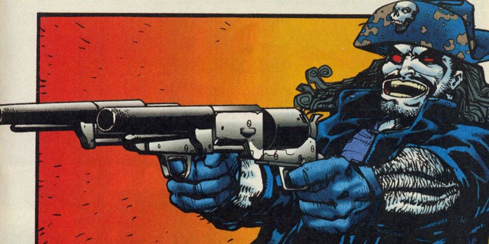
18 BETTER: LOBO
Deciding on a good Elseworlds redesign is actually pretty difficult. After all, the original designs are so iconic: how do you improve on the original? In the case of Lobo, the answer is really simple: just pop a hat onto him!
In an old Lobo Annual, we get a collection of Elseworlds Lobo cowboy parodies under the collected name "A Fistful of Bastiches: Fraggin' Train!" The stories themselves are simply “okay”-- if you like Lobo, you’ll like the stories; otherwise, feel free to skip them, but we can't deny that the Main Main himself looks pretty darn cool when he’s rocking a ten-gallon hat!
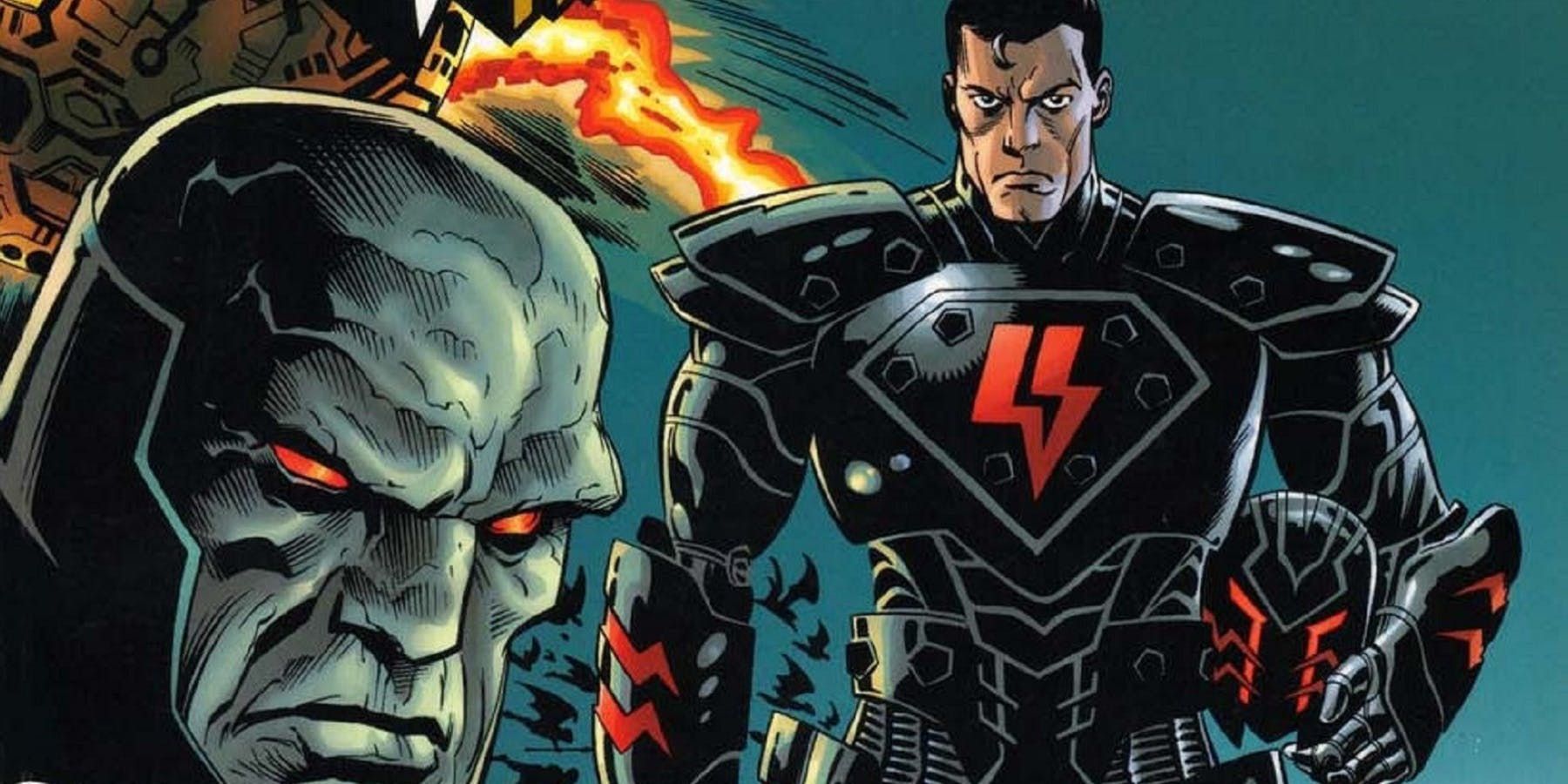
17 WORSE: DARK SIDE SUPERMAN
What if Superman was actually a bad guy? This has been such a potent idea that we have returned to it so, so many times. One example of this was the late '90s tale Superman: The Dark Side, and as the name implies, it imagines a world where young Kal-El was raised by Darkseid instead of Ma and Pa Kent.
If you like both Darkseid and Superman, it’s a pretty cool story, but we can’t get over how bad Superman looks in this story. His “evil” armor makes him look more like a generic medieval bad guy or poorly-painted Warhammer figurine than someone who is supposed to make us quake in our boots. Sorry, evil Supes! Better luck next redesign.
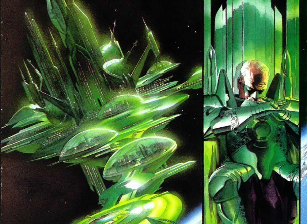
16 BETTER: KINGDOM COME GREEN LANTERN
For our money, it’s tough to improve upon Hal Jordan’s Green Lantern costume. The clean lines, the combo of black and green: it’s a costume that basically screams “power.” However, if we had to pick a redesign that manages to top the original, we’d go with the Kingdom Come version.
For the nitpickers out there, this is technically Alan Scott, though many design elements are inspired by Hal Jordan’s appearance. Here, the simple uniform has been replaced by intimidating emerald armor and a giant sword. This “green knight” looks downright cool intimidating, all at the same time, and remains one of our fave redesigns.
15 WORSE: VAMPIRE BATMAN
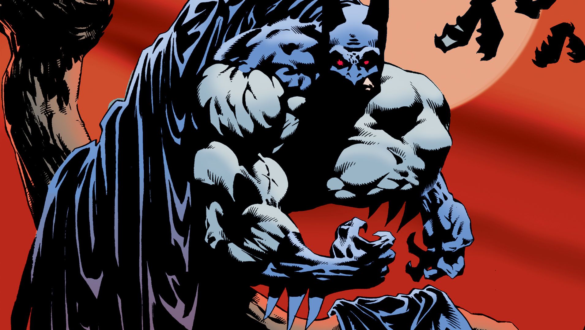
Before the haters come at us, we want to say that bad designs can have good stories, just as good designs can have bad stories. We’re the first to say that the trio of Elseworlds Vampire Batman stories are actually pretty cool, but this is a really, really bad Batman redesign!
Sometimes, the appearance is as simple (and silly) as “Batman with fangs.” And “Batman with wings” often looks downright laughable. Our least favorite is “Batman before the wings come out,” when he simply looks like a really ‘roided out Caped Crusader. Ultimately, this monstrous Batman is scary for all the wrong reasons.
14 BETTER: KINGDOM COME AQUAMAN
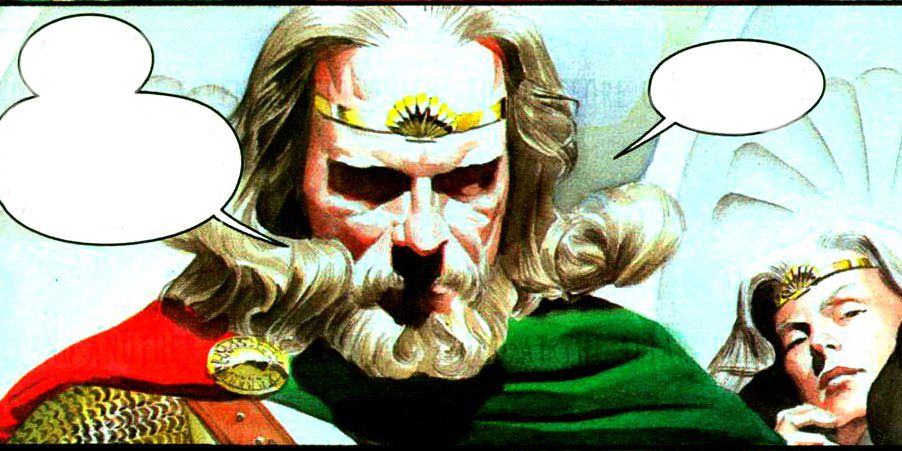
Aquaman has had some good and bad designs over the years. For instance, fans went wild over Jason Momoa’s super-muscled and down-to-Earth version. Part of the joy of an Aquaman redesign is because the original look, bright orange and green, looks bad on just about anyone.
That’s why we enjoyed the Kingdom Come Aquaman redesign so much. Alex Ross makes Aquaman into a royal-like figure, complete with regal beard and royal robes. With these simple changes, Ross manages to convey the kind of royal aristocracy the character has always claimed to have but rarely pulled off (at least in the wardrobe department).
13 WORSE: DARK KNIGHT STRIKES AGAIN FLASH
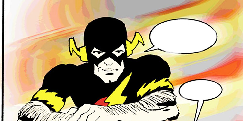
There is no doubt that Frank Miller is an absolutely visionary comics creator. His amazing contributions to things like Sin City, Daredevil, and Dark Knight Returns helped to turn the industry on its head. Here’s a difficult truth, though -- his designs aren’t always very good.
One of the best of the worst examples is Flash in The Dark Knight Strikes Again. The basics of the Flash costume are there, but it’s black instead of red. However, the character now has short sleeves and shorts on (no, really). He looks more like a middle-aged jogger than a superhero who is fighting to save the world.
12 BETTER: NEW WORLD ORDER MR. FREEZE
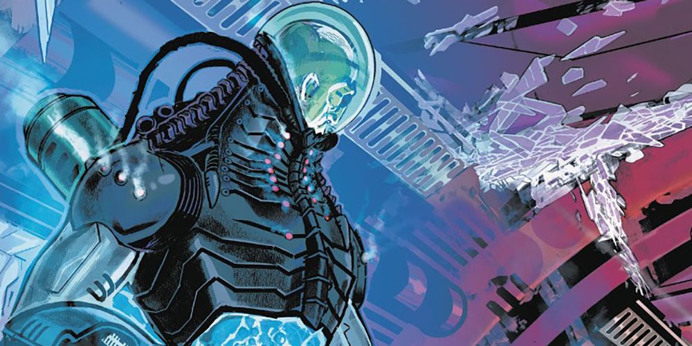
Many of the Elseworlds tales on this list are pretty old school. However, the Elseworlds label is still going strong, as we can see in the recent New World Order series and, among other interesting redesigns, this series brings us a fresh new look to Mr. Freeze.
Despite all the years and all the different appearances, Mr. Freeze has typically kept the same “futuristic as defined by the '50s” aesthetic. In this series, though, Mr. Freeze looks more like an alien being and less of just another villain from Gotham City. This one definitely gives us the chills.
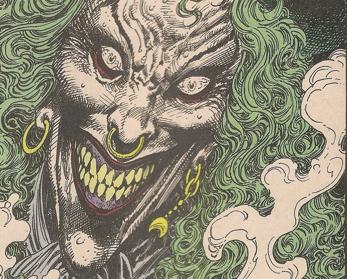
11 WORSE: PIRATE JOKER
In many ways, the Elseworlds stories were the precursors to all those bad Batman toys. These are the ones where they just put increasingly crazy adjectives in front of Batman’s name and it’s thanks to the Elseworlds story Batman: Leatherwing that we got “Pirate Batman.” Unfortunately, he came with a “Pirate Joker.”
There is no doubt that the original Joker design can be scary in the right hands. However, in this series, Joker mostly prances around in an outfit that’s way too colorful. At the end of the day, he looks like a rodeo clown that’s getting paid by the hour at the local renaissance faire.
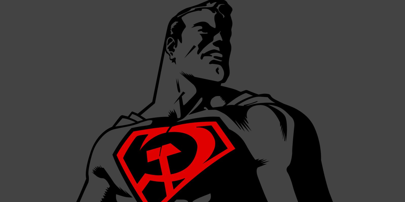
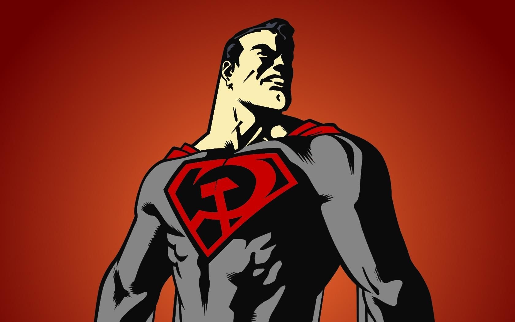
10 BETTER: RED SON SUPERMAN
We can’t say it enough: a really good redesign is about the little touches. You don’t have to (and usually shouldn’t) make wild changes to the essential design elements of the character. Instead, the artist should make small changes that convey major differences, and that’s the case with Red Son Superman.
The basic colors and layout of his costume are very similar. However, the familiar “S” symbol has been transformed into a hammer and sickle, and he eventually gets a high collar with stars on it that makes him seem militaristic and dangerous. With these simple changes, we get a “hero” that is downright scary.
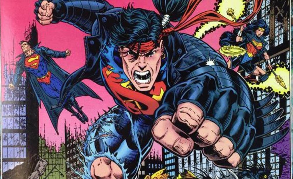
9 WORSE: SUPERBOY
Superboy has always been something of a design challenge. How can you show him as a distinct character that is not just a copy of Superman? While there have been many different designs over the years, this punk-rock flavored Elseworlds design may be the absolute worst.
Basically, this is the kind of design you get when you mix Superboy with every bad '90s fashion and hair statement that you possibly can. Insanely long hair? Check. Big bandana? Check. Leather jacket and jeans? Double check! It’s a bunch of tastes that don’t taste great on their own, and they certainly don’t taste any greater mixed together like this.
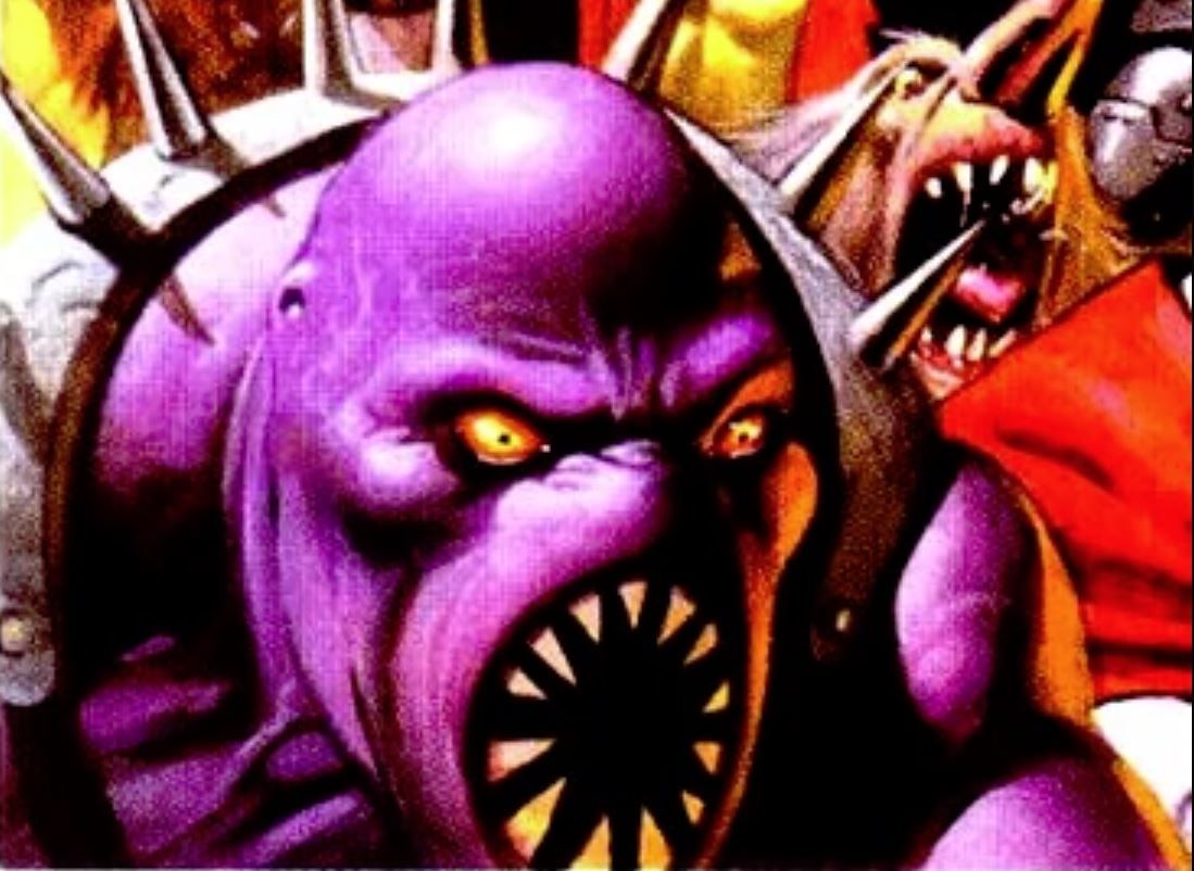
8 BETTER: RIDDLE OF THE BEAST PARASITE
Parasite is another character whose basic design has always been a challenge. Sometimes, he’s basically just a purple guy in weird spandex -- like an alien wrestler who got lost on the way to the match. Fortunately, this “Riddle of the Beast” Elseworlds design gave him a nice upgrade.
As befitting this gothic tale, Parasite’s makeover really emphasized his animalistic nature and the character simply looks dangerous, with spikes ranging from the ones on his back to his spiky teeth. In short, the character looks both hungry and angry, meaning that we get the essence while still enjoying a new design.
7 WORSE: KINGDOM COME ROBIN
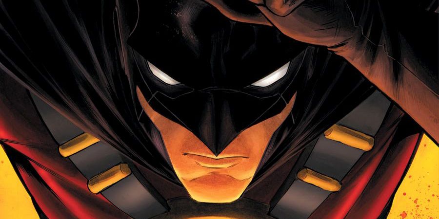
This deep in the list, you can probably tell our secret: we really enjoy most of Alex Ross’s Kingdom Come designs. However, not all of them can be winners, and one of the clear design losers is actually everyone’s favorite former Boy Wonder, Dick Grayson!
His costume mixes the elements of both Robin and Batman, but the final result looks terrible. We get a pretty unremarkable Robin outfit that is topped by a Batman outfit with no ears. Ultimately, it’s not just a bad design, but a forgettable one -- basically, the worst possible design sin! It’s enough to make us long for Robin to don his classic costume once more.
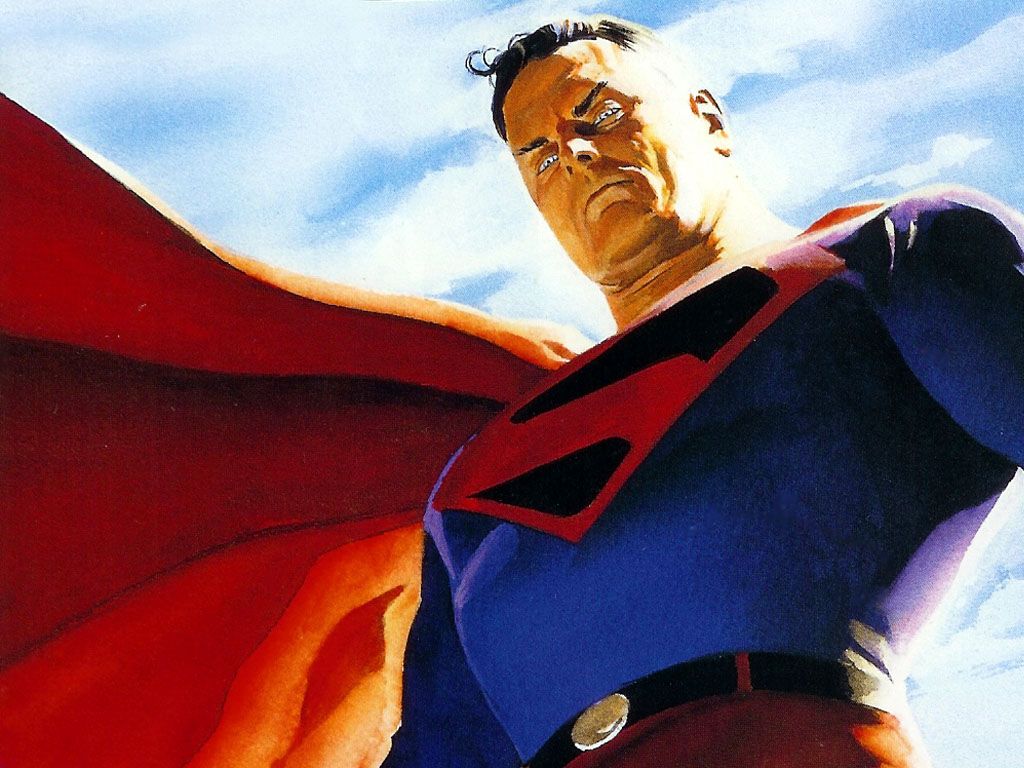
6 BETTER: KINGDOM COME SUPERMAN
The best Elseworlds character designs do more than simply look good. They also reflect the nature and personality of a particular character. It is for this reason that we love the Kingdom Come Superman design so much and, ultimately, only one thing has changed.
No, we’re not talking hair, though Supes is rocking some gray. However, his shield is now rocking an ominous black shade. Not only does this help the red “S” stand out better, but it represents the darker side of humanity and the world that Superman is constantly trying to rise above. We’d love it if the mainstream comics stole this look!
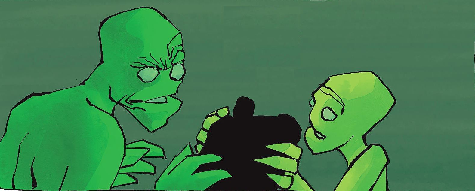
5 WORSE: DARK KNIGHT STRIKES AGAIN GREEN LANTERN
Ever seen a character design that had a good idea but a terrible execution? That’s basically what is happening with Green Lantern in Dark Knight Strikes Again. The conceit of this character design is that Green Lantern has now moved beyond human concerns and Earthly life and has an entire alien family of his own.
Neat idea, right? Unfortunately, the result of this is that our hero looks like a featureless green blob of a man. That’s really it -- Charlie’s Green Man costume form It’s Always Sunny in Philadelphia has more intricate details than this design. Ultimately, this is a big step down from the traditional GL design.
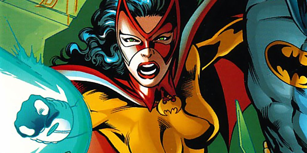
4 BETTER: CATWOMAN FROM THE NAIL
Most of the time, these Elseworlds redesigns feature the same character simply wearing a modified outfit. Every now and then, though, we get a complete transformation and that’s the case with Catwoman from The Nail... or should we say Batwoman?
When she makes her transformation from villain to hero, Catwoman gets an entirely new look and colors. Now, she’s rocking a differently-shaped mask, and she has colors that seem to honor Robin (who has perished at this point in the story). It was a cool and instantly iconic look, and we’d be thrilled to see it come back to mainstream continuity.
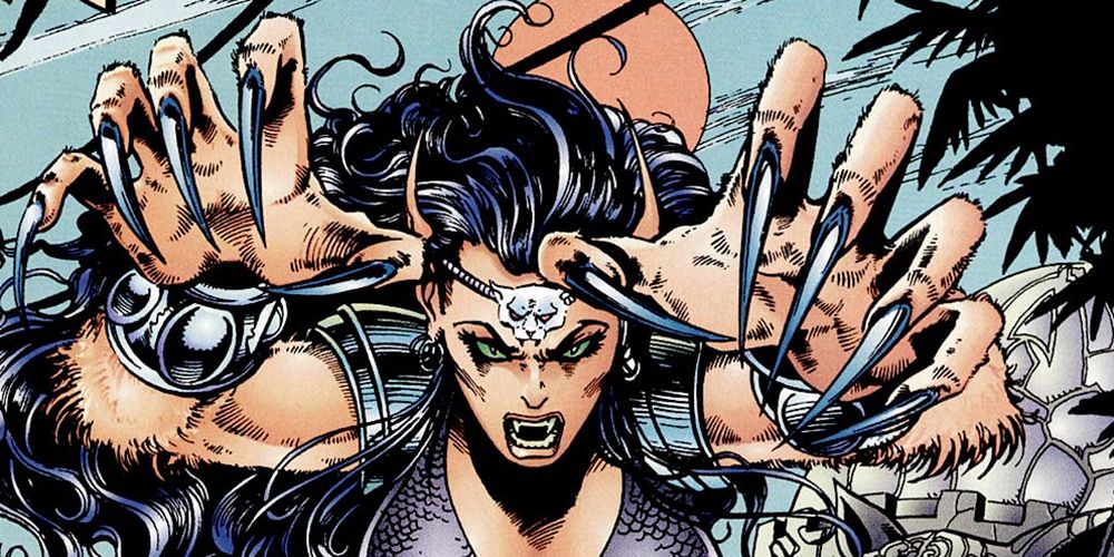
3 WORSE: “CAT” WOMAN
Earlier, we lamented the idea that most Elseworlds versions of characters are not very dramatically different. In the case of the next Catwoman design, she is drastically different from her usual appearance. Unfortunately, this is a downgrade in every way.
In this old Catwoman Elseworlds annual, she becomes a literal “cat woman.” She is a giant orange cat beast with giant claws and who is gifted at hunting her prey. While this is a pretty natural take on the idea of Catwoman, the execution ends up looking like the most generic furry art on the planet. Sorry, Selina -- we appreciate the effort!
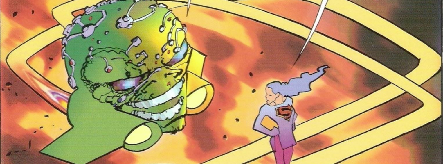
2 BETTER: DARK KNIGHT STRIKES AGAIN BRAINIAC
In our opinion, a good Elseworlds redesign will retain just enough of the original elements. In this way, these iconic characters are still recognizable, but we’re in a good position to appreciate the major and minor changes. Maybe that’s why we like Brainiac from Dark Knight Strikes Again so much.
In his humanoid form, Brainiac is vaguely unsettling -- he is covered with colored circuitry, defying your attempts to see him as a man. Later, we see him as a giant spaceship that looks exactly like his own head. It builds upon classic character designs while still managing to seem fresh, modern, and relevant.
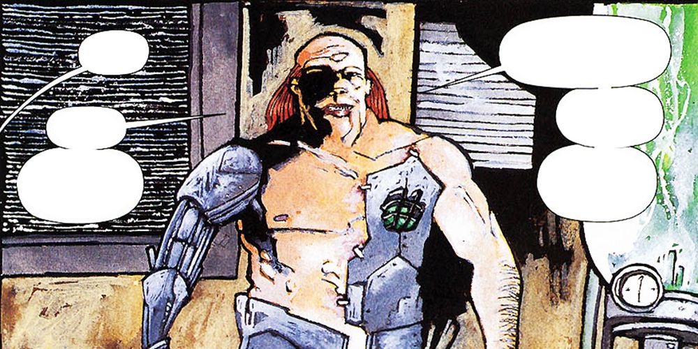
1 WORSE: CYBORG LEX LUTHOR
Sometimes, the essence of a bad redesign is that it’s just a bad mashup and the better the original design was, the worse this redesign is going to look. This is certainly what is going on with Lex Luthor's new look in Superman’s Metropolis.
Lex started out in these comics as a mad scientist, and he eventually became a ruthless businessman. Either way, he always looked cool. In this weird old Elseworlds tale, though, he is just a generic half-man, half-machine. In fact, if we didn’t tell you he was Luthor, he would look right at home as a stock '90s anime villain.

