Think back to when you were a kid and saw Dragon Ball Z on TV for the first time. It's very likely that the crazy visuals were what hooked you in, seeing characters with rather strange, but appealing designs got you to stick around for the epic battles and violence that you couldn't find in the other, normal cartoons that were on TV. And while taking nothing away from the western fare that populated the screens of our collective youth, Akira Toriyama's character designs are some of the best in all pop culture.
Because of this, we decided to gather up some of the most striking, unique, beloved, or otherwise noteworthy designs in the Dragon Ball franchise and rank them from worst to best. This is just our two cents, of course, and we'd love to hear your favorite and least-favorite designs from the groundbreaking series. Another caveat is that we left some characters out, not because we dislike their design, but just because we wanted to include the most interesting ones and still keep our count at 25. With all the logistics, disclaimers and criteria out of the way, please enjoy Comic Book Resources' ranking of the best and worst character designs in Dragon Ball.
25 BOTAMO

This might be a strange one to start out with, but like we said, we're taking some of the most interesting designs in the series, and while Botamo might not be the most beloved character in the franchise, or even in Super for that matter, his look is still rather unique or, at the very least, eye-catching. On top of looking interesting — his design is comedic, yet intimidating — Botamo also represents one of Dragon Ball Super's better traits: unique enemies. This is to say that Super threw a bit of a monkey wrench in the usual fodder of Dragon Ball fights, where it is mostly about power levels.
Instead of being just powerful, Botamo had a unique trait, a superpower of sorts that is specific to his alien body. Because of the sponge-like quality of his body, Botamo can absorb nearly any blow thrown at him, absorbing all potential damage without injury. All that said, Botamo's character design is perhaps the worst out of the 25 we've chosen. Again, this is not because it isn't interesting, but because it looks a bit... off. Let's be real, dude looks like a very strange interpretation of Winnie the Pooh. Botama's design is unique and interesting for sure, but it could have been a bit less derivative.
24 CAULIFLA

This one might ruffle a few feathers, but hear us out. As great as it was that Dragon Ball Super finally gave us the first female Super Saiyan in the franchise's history, Caulifla's design leaves a bit to be desired. Don't get us wrong, there's a lot to like about Caulifla's overall design — the harem pants, the simplicity, the crazy hair — but it feels uncreative compared to other Saiyans in the series. Goku, Vegeta, Raditz; all of these characters have interesting designs that are unique from each other, but Caulifla seems a bit plain in her aesthetic.
It looks a bit like a first pass at what a female Saiyan might be, and we've gotten some great female Saiyan design previously with characters like Fasha and currently with Kale. Plus, Caulifla's slim build, which heavily contrasts the Saiyan physique we have come to know, is a bit disappointing, both because it is so different to male Saiyans (at least in Universe 7) and because her waist seems just a bit too impossible. We like the character's hair, but it too looks like a first pass. If Caulifla shows up in future Dragon Ball media, we'd love to see some updates to her design.
23 HIT

This was a tough choice to make, since there is a lot to love about Hit's design, but when you take a good look at him, it's hard not to notice how Dragon Ball the character looks. That might seem like a counterintuitive statement, but hear us out. Hit looks like an awesome alien assassin wearing an outfit that seems to take inspiration from The Matrix, but with some added anime flair. The way the skin-tight armor-looking top transitions into an overcoat of sorts is really cool, as are the boots, the high collar and the color choices of the overall design.
All of these design elements are wins in our book, but let's take a closer look at some of Hit's most prominent features. Any way you look at it, Hit seems like a mashup of previous Dragon Ball villains, specifically the likes of Frieza and Piccolo. Heck, his face is nearly an exact copy of Golden Frieza, just with a slightly different color scheme, which costs the design a few points in our book. To top it off, there is also the matter of Hit's head shape, which is... well... how to put it delicately, "head"-shaped, if you catch our drift. All that aside, Hit's awesome powers and cool attitude make him one of the coolest characters introduced in Dragon Ball Super.
22 KALE

Where Caulifla looks a bit generic, Kale succeeds in bringing a little more to the table in terms of character design. However, it's a bit of a give and a take with her design. Kale earns a lot of points for having a non-generic spiky Saiyan hairstyle. Her outfit earns points as well since, while just as simple as Caulifla's, it is more fitting to her rather timid demeanor. Kale's outfit is reflective of a warrior race, but also looks like it could be her casual outfit, since it has elements of the armor that Cabba wears and aspects of everyday clothes. We also dig the character's earrings, which are a small, but nice touch, as is the lipstick.
Another way that Kale's design earns points is in her Super Saiyan form. In her regular form, Kale is slim, which works for her character, but also makes her body look identical to Caulifla's, providing very little diversity in body types. However, in her Super Saiyan form, Kale becomes incredibly bulky and muscular, which makes her design a bit more interesting. That said, as great as this body diversity is, the design loses a lot of points for essentially being a carbon copy of Broly, right down to the green-tinted Super Saiyan hair and pupil-less eyes, putting the design as number 21 on our list.
21 ANDROID 17

The fashion sense of the world of Dragon Ball is indisputably '90s, and Androids 17 and 18 are some of the best examples of this notion. Of the two twin cyborgs, Android 17 has perhaps the lesser design of the two. This isn't to say that his design is bad — not in the least, it is one of our favorite designs in the entire bunch — more so that the simplicity of it doesn't quite hold up to the slightly more fashionable look of Android 18. But, comparisons aside, there are a lot of great elements to Android 17's design, especially how youthful it looks.
The teenage-looking outfit that 17 wears makes him all the more frightening, since it makes him look unassuming, like a punk kid that you would not expect to have the power of a demi-god. Plus, what's not to love about a bright orange scarf and blue sneakers? All this said, the reason that 17's design only ranks at number 20 in our opinion is because of how underwhelming it is when compared to the sci-fi-heavy, alien-looking, wild and otherwise out-there designs of other villains featured in the franchise. As Toriyama's editor during the Android saga put it, he just looks like some ordinary kid.
20 JIREN

We're a bit torn on Jiren's design; on the one hand, the simplicity of his design feels somewhat lazy, but on the other, the choice to go with a simplistic idea of alien life as the basis for the design is also kind of cool. Nearly every other alien featured in the Dragon Ball franchise is unique and intricate, taking inspiration from various sources, including uncommon elements not usually seen in alien/creature design. Knowing this, seeing a character based on Grey aliens, the most basic and perhaps oldest human idea of what extraterrestrial life might look like, ends up actually being kind of a fresh take.
Jiren's design is basically a buff alien, which is, for lack of a better term, VERY Dragon Ball-esque. Add those signature Akira Toriyama alien ears and we have ourselves a pretty cool design, one that plays homage to classic alien imagery while adding that classic Dragon Ball flair. All that said, the design could perhaps use a bit more detail, particularly in terms of costume, since Jiren and the rest of the Pride Troopers' outfits are kind of simple.
19 CABBA

What fans have typically come to know as "Saiyan Armor" was first seen being worn in the series by Raditz. From then on, the armor, or some variant of it — which was actually revealed to be a signature of all of Frieza's army, not just the Saiyans — was seen on quite a few other characters, including Vegeta, Nappa every soldier under Frieza's command. Because of this, and the fact that Vegeta continued to wear his battle armor throughout the years, the Saiyan armor has grown somewhat stale. This isn't to say that armor looks bad, just that it was nice to see some variation on the typical Saiyan duds when Cabba, the first Saiyan featured from Universe 6, was introduced.
Cabba's armor feels like a less-advanced version of the Saiyan armor, a roman-gladiator-looking outfit that is brought together well by Cabba's unique appearance. Though there are some variations, a lot of the Saiyans of Universe 7 have roughly the same face and build, so seeing a slim, thin-faced Saiyan was a nice touch of design diversity that the series needed. Cabba's design is simple in a good way, not overly-detailed, but not basic or boring.
18 THE GINYU FORCE

The Ginyu Force was a group of Frieza's most elite soldiers, warriors with great power and tough-to-combat special abilities. The members of the Ginyu Force, led by Captain Ginyu, were as ridiculous and eccentric as they were powerful, tending to add dramatic flair to their battles in the form of team poses like the one shown above. The team's eccentricities and love of dramatic posing was based on tokusatsu heroes, characters and teams like the Super Sentai, who America knows as the Power Rangers. However, we could argue that Toriayama's spin on tokusatsu heroes actually improves on the concept and designs of the live-action TV characters.
Where characters like the Power Rangers would, in most interpretations, have the same costume for every team member, just in different colors, the Ginyu Force manages to give the team a lot of variety in their designs while still maintaining a team aesthetic. Each alien that makes up the team is unique — with only Recoome appearing blandly human — each rocking a different variant of the Frieza Army armor/uniform, which brings them together, along the symbol for the Ginyu force. That said, there are aliens in the series that are much better designed, including the Ginyu Force's commanding officer himself, Frieza.
17 MR. SATAN

This is another one that might be a bit of a controversial ranking at first glance, but if you look closely, Mr. Satan has one of the best character designs in the Dragon Ball franchise. While he might not be the coolest looking character, Mr. Satan has a design that truly reflects the nature of his personality, demeanor and status as a champion. When you look at the character, especially when he wears his theatrical cape, he looks just like a pro wrestler, which is essentially what Mr. Satan is. Think about it, a pro wrestler is typically a great athlete and showman, putting on dramatic theatrics to intensify the fight.
This practically describes Mr. Satan to a T. While he might have won his first few championships fair and square, Mr. Satan is quick to use theatrics and the like to cover up his own weakness when compared to the likes of the Z-fighters. He is brash, he is loud and he has a flair for the dramatic, which is why his design is so perfect; the big handlebar mustache and afro that screams '80s wrestling, the half-open gi of a kung-fu movie martial artist and a giant gaudy championship belt. All of it comes together for a surprisingly great character design for a rather disliked character.
16 THE GREAT SAIYAMAN

There is a fan theory that says that Gohan's experience with the Ginyu force is what lead to his ridiculous Great Saiyaman persona. The theory implies that Gohan has PTSD from being on Namek and he uses the Great Saiyaman as a coping mechanism, taking the ridiculous persona and poses of his attackers to repurpose their eccentricities for good. The theory might be a bit of a stretch but it kind of checks out. Regardless, Gohan's personality as the Great Saiyaman is nowhere near as ridiculous as his outfit, which is actually a pretty great superhero design.
There's a lot going on with the design, since it brings in elements from a bunch of different outfits from the franchise. He has Vegeta's boots and gloves, a gi top like his father, a champion belt like Mr. Satan and a cape like Piccolo. The costume takes these elements and blends them with both American superheroes and Tokusatsu heroes, seen in the red of the cape, the spandex and the hyper-detailed helmet. The Great Saiyaman is a great pastiche of all the influences and elements of Dragon Ball all coming together perfectly for one of the franchise's best character designs.
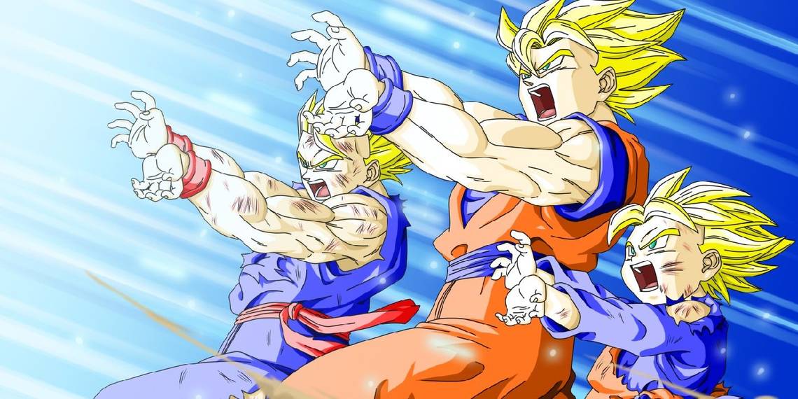
15 GOTENKS

The two canon, main timeline fusions featured in the Dragon Ball series are Vegito and Gotenks. Vegito resulted from Goku and Vegeta fusing with the Potara earrings, and Gotenks was the series' first successful fusion dance. Since we've already got Goku and Vegeta later on in this list, we're going to take a look at Goten and Trunks' combined form for an analysis of fusion character design. To start, the outfit that result from a successful fusion, believed to be the clothes worn by the Metamorans, the aliens who created the fusion dance, is classic Toriyama gold. The martial arts influence, the puffy pants, the unique design of the vest, it's all great stuff.
As for Gotenks himself, there are a lot of great details to his design that make it one of the series' best. The way that Goten and Trunks' traits are combined are great, particularly the dual colored hair! We also love how Trunks' father's traits peak through in this fusion, since Gotenks has the widow's peak, signature scowl and overall hair shape of Vegeta. The colors are also fantastic on this design, bringing the entire thing together. All that said, Gotenks' design loses a few points for giving us a somewhat disturbingly buff child who looks even stranger when he goes Super Saiyan 3.
14 RADITZ

The character that introduced us to the Saiyan armor is probably one of the best designs featuring it. One of the biggest reasons that we love Radtiz's design has to do with its context. While the franchise had seen alien life before Raditz showed up, it was key that his design communicate a few important details of the Saiyan race. Think about it, Raditz not only served as the first antagonist of Dragon Ball Z, he also brought with him the exposition that would lay the ground work for the next two sagas of the series, i.e. Goku's origins as a Saiyan.
Raditz design works well as a foil to Goku's and when you compare the two, the brilliance of the design shines through. Raditz and Goku are brothers, and Radtiz looks similar enough to Goku — similar faces and crazy spiky hair — but Raditz' armor, which implies a savage warrior background through the use of Earth tones and exposed arms and legs, creates an alien look, like he and Goku are similar but different at the same time. On top of these great contextual details, there are small splashes of color in the form of Raditz's scouter and arm/leg bands. Plus, Raditz was the first Saiyan to be shown with his tail around his waist, which is easily one of Akira Toriyama's best design choices.
13 TEEN GOHAN

Goku might be Gohan's father, but he wasn't his first teacher. No, that honor belongs to Piccolo, who somewhat reluctantly took Gohan under his wing after Goku died fighting Radtiz. Seeing the potential in Gohan, he thought it best to train the boy so that Earth could stand a chance against the Saiyans, or perhaps so that Gohan could protect himself. Either way, the two formed a bond during Gohan's training, one that would make Piccolo like a surrogate father to Gohan. This close relationship continued throughout Dragon Ball Z and Super, as Piccolo helped Gohan gain back his power before the Tournament of power and acted as a babysitter to Pan.
Perhaps one of the most touching gestures that Gohan did to honor his surrogate father was to don a similar outfit. This is not uncommon to Dragon Ball as Goku has worn gi with the symbols of his martial arts masters ever since he first trained under Master Roshi. Gohan wanted to wear Piccolo's outfit to honor his first teacher, and it was a fitting design choice for the character, especially since his Super Saiyan blonde hair contrasts the outfit's design and colors incredibly well. And speaking of his hair, it was a nice touch to give Gohan Super Saiyan hair that was different from the usual "straight up" look. While the whole getup works best for Piccolo, this look was one of Gohan's best, and one of the best designs in the series.
12 ANDROID 18

Akira Toriyama had a bit of trouble when it came to the Android and Cells sagas of the Dragon Ball manga; every time he created a main villain for the story arc, his editor had notes. When he presented Androids 19 and 20 as the protagonists, his editor said they were just some old man and a fat guy. So, Toriyama presented Androids 17 and 18, but yet again his editor rejected them, saying something like “What, this time it’s just some brats?” While we can agree that their human appearance might be a bit stale compared to previous villains in the series, there is still a ton of merit in the costume design of the twin androids, especially with Android 18.
Android 17's outfit is cool and very fashionable-hipster-looking, but Android 18's look is much more stylish and appealing. The color balance of the denim skirt and vest and the striped shirt all come together really well with the character's blonde hair and striking blue eyes. The character's other various outfits are great as well, but her first look is one of the series' most stylish character designs.
11 ANDROID 16

As much as we love Android 18, of the three androids chosen for this list (excluding Cell), Android 16 comes out on top in terms of character design. There is so much to unpack with this character, whose design is also one that becomes even cooler when you look at the context of their origin. Android 16 was created by Dr. Gero in the image of his son, who died as a member of the Red Ribbon Army. Grief stricken, Gero created 16, and since he couldn't stand to watch his son die again, he programmed the android to have a gentle, non-combative nature so he wouldn't purposely put himself in a dangerous situation and lose his life.
This is a tragic tale that humanizes both Dr. Gero and Android 16, who, unlike 17 and 18, is fully artificial. Furthermore, knowing this backstory is what makes Android 16's design so brilliant. While his mohawk and angry, scowling glare might be that of a villainous Red Ribbon soldier, the rest of his design appears, for lack of a better term, soft. The character sports armor, the only Android to do so, which looks heavily padded and protective, perhaps even overprotective, especially for a virtually indestructible android. It's like Dr. Gero gave 16 extra, unnecessary padding to prevent a second death of his son.
10 BUU

When it comes to the designs of the main villains of Dragon Ball Z, it is hard to beat Frieza and Cell, but Buu still makes it into our top ten character designs of the franchise. The character has a lot of forms, each with great designs, so let's look at them one by one. The first form we were introduced to was Majin Buu, otherwise known as Fat Buu or Good Buu. Majin Buu's design served well to disarm the Z-fighters and the audience when he first awoke. He doesn't look as intimidating or powerful as he actually is, his childlike face and outfit exaggerating this.
The next version we saw was Evil Buu, which is really just a pale, gray, skinny version of Majin Buu, but the design works to contrast against Good Buu. Super Buu had quite a few forms, and one of the best design choices of the character was to make him seem more human with each person he absorbed. He gains more fingers, a nose, more of a jaw, etc. Another nice touch was how his antenna got longer and more prominent as he got stronger. The final form we were introduced to was Kid Buu, whose designs succeeds in being raw and frightening, like an all-powerful tantrum incarnate. While the differences between these designs are minute, they are also incredibly effective.
9 BEERUS

It might be a bit bold to say that Beerus is a better design than Buu, or any of the other fan-favorite characters we've ranked up until this point, but we think this is some of Toryama's best work. Based on his Cornish Rex cat, Beerus takes the appearance of an Egyptian deity, complete with a pharaoh-like outfit that brings the whole design together. It's nice to see a character who doesn't quite have a human face, one that veers from the previous Dragon Ball villain designs and leans more heavily into Toriyama's creature-designing talents.
There really is a lot to love about this design, especially with the outfit. Toiryama is great at designing gods that break the concepts of what most people might assume a deity looks like, and Beerus' design reflects this. Beerus also display's Toriyama's skill in designing a character that can be as intimidating as he is comedic. Lastly all the colors come together perfectly and the small hints of gold with his god-like jewelry really make the design pop. Beerus is truly one of Toriyama's best villain designs, and one of his best character designs over all, which is why we put him in our top ten.
8 WHIS

Another thing that Toriyama loves to do with deities is give them attendants, something we saw previously with Supreme Kai Shin's attendant, Kibito, and something most recently seen in the Gods of Destruction and their assigned Angels. Among the Angels, Whis is easily one of the best character designs to come out of the new era of Dragon Ball media, even better than Beerus, whom he shares some design patterns with as a means of showing his connection to the destroyer. Toriyama's interpretation of Angels is really out there in the best kind of way, taking small elements of what most known an angel to be and adding some Dragon Ball flair.
Whis is like a cosmic deity, like if David Bowie turned out to be the god of the stars. Whis is eccentric and colorful and regal, sporting bits of traditional angel imagery — the use of white, the halo, flowing robe-like clothes — with a lot of interesting elements added in; like the sangria clothes, the elements of Beerus' costume, the shoes that look like they were made for tap-dancing. It all comes together for a brilliant design. Whis' character design perfectly creates this image of a godly alien with a lot of subtle, but strong elements.
7 FRIEZA

The Frieza saga was incredibly important to the Dragon Ball franchise. It featured the first Super Saiyan transformation in Dragon Ball Z, which essentially changed the course of the series. It also featured one of the series' greatest villains, both in terms of character and in terms of design. Frieza was as frightening as he was interesting, an intergalactic tyrant who conquered planets and only feared one thing: a challenge to his power. The designs for all of Frieza's forms are brilliant, both on their own, and in the context of the character.
Akira Toriyama seems to like playing against type when it comes to character designs, something that can be seen in Goku's design in early Dragon Ball — a small child who turns out to be super strong — and Frieza is another excellent example of designing to misdirect. Frieza's first form is small and, even with the horns and sharp tail, it's rather unassuming. Yet, people fear him -- it is a contrast that makes sense when you see Frieza's second form, a hulking version of his first. His third form gets even more frightening and his final form is sleek and streamlined, like it is the most efficient version of himself.
6 PICCOLO

We ranked Teen Gohan at number 13, saying that his outfit during the Cell saga, a tribute to his first teacher, was one of the best design choices of the series. That said, you can't beat the original, and Piccolo wears the getup way better, acting as one of the series' best character designs. Just barely missing our top five, Piccolo's entire design is one of the coolest that Akira Toriyama has done. While the look of a Namekian originated with King Piccolo, Piccolo Jr. is a HUGE improvement on the design.
The basic anatomy and design of the Namekian form stays the same from King Piccolo to his son, but the outfit that Piccolo wears is much cooler than his father's. King Piccolo's outfit was rather generic, not really standing out amongst other, greater designs in the series. But Piccolo Jr? He's got one of the coolest designs ever. The turban-like hat, the use of purple to contrast his green skin, the shoulder-pad armor wrapped in a cloak that flows out into a cape, the shoes — everything just fits together so well, and the design still works when he sheds his weighted training gear, which is an accomplishment in design all on its own.