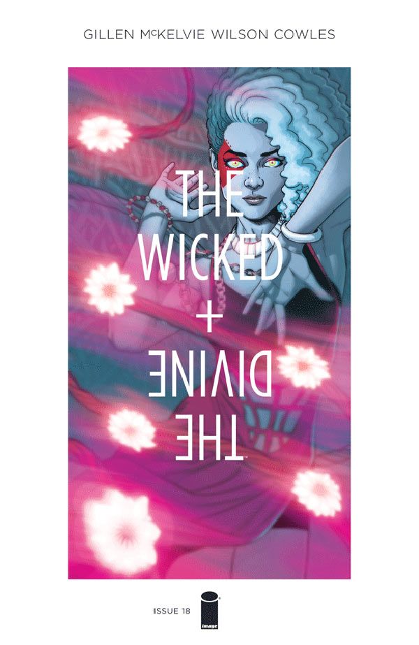
After taking a break to wrap the third volume of "Phonogram," artist Jamie McKelvie and colorist Matthew Wilson have returned to "The Wicked + The Divine," rejoining writer Kieron Gillen and letterer Clayton Cowles.
With last week's issue #18, they kick off what's billed as "the most rock-and-roll, everything explodes" arc of the Image Comics series, which centers on 12 gods who return to Earth every 90 years as young people who are adored, or hated, by the world. The one caveat: Their power runs out in two years -- and then they die.
The new chapter follows a handful of issues notable not only for debauchery, murder, mind orgies and the occasional patricide, but also for contributions by such guest artists as Kate Brown, Tula Lotay and Leila Del Duca.
Now back together on "WicDiv," McKelvie and Wilson spoke with CBR News about their long-running collaboration, and their work process.
CBR News: After completing a six-issue run on the third "Phonogram" miniseries, you've now come back to "The Wicked + The Divine." How does working on the two books compare? Do you find there's a shift in approach for you?
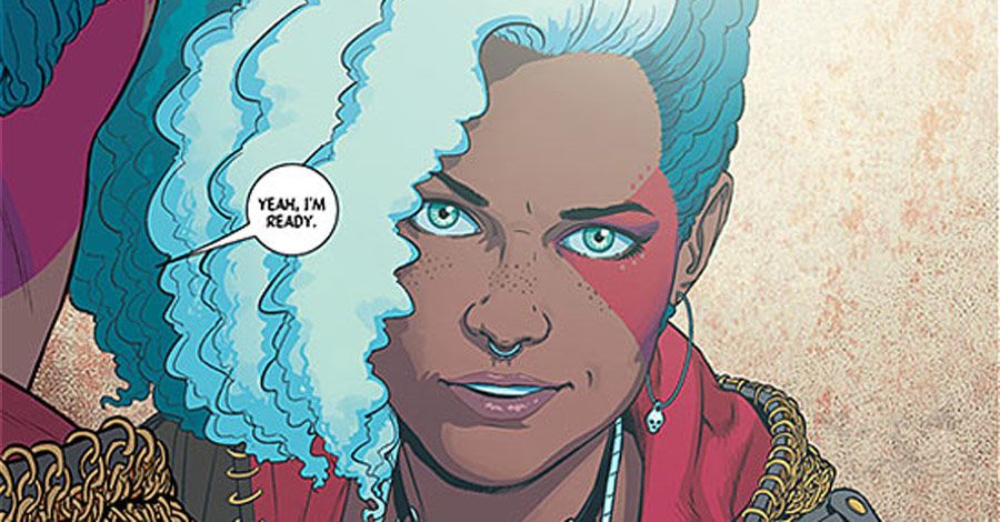
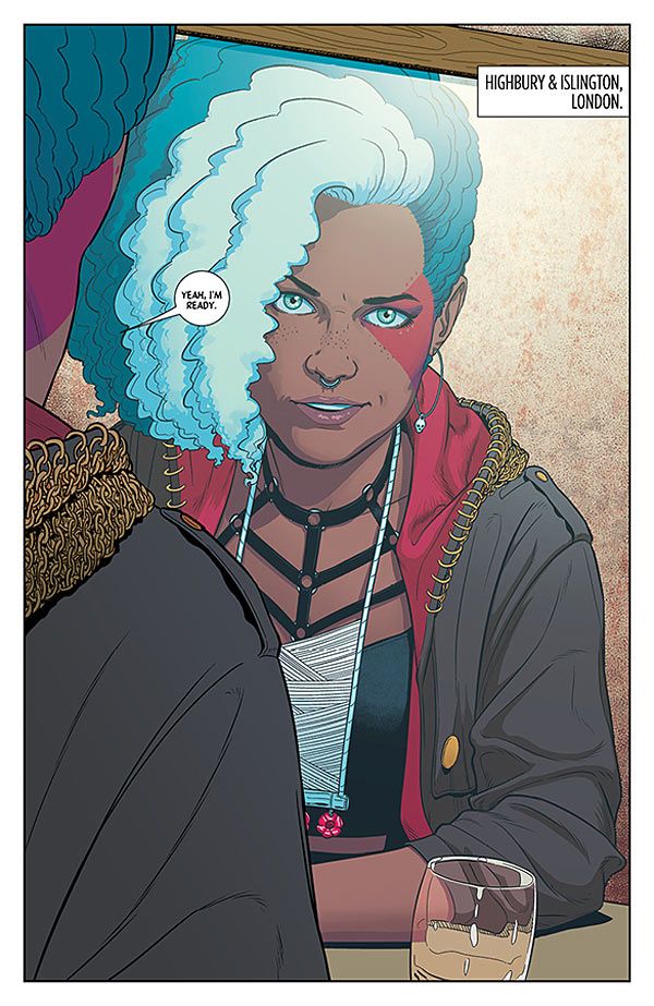
Jamie McKelvie: Yes, definitely. Both books come from similar places, but they manifest in very different ways. "Phonogram" is written very strictly to a grid, for example. There are occasional places where it breaks away, but it largely maintains a specific rhythm. "WicDiv" moves all over the place. There's also a lot more action in "WicDiv," bigger and more explosive set pieces. And while generally in "Phonogram" I stick to the design and clothes of an indie crowd, in "WicDiv" I get to pull in a lot more fashion and music influences.
Matthew Wilson: You know, when I first sat down with "Phonogram" Vol. 3 pages, I didn't expect it to feel different -- just kind of like, "Last month I colored Gillen/McKelvie Book B, and this month I'm coloring Gillen/McKelvie Book A." Same-same, right? Nope! The two books felt quite different.
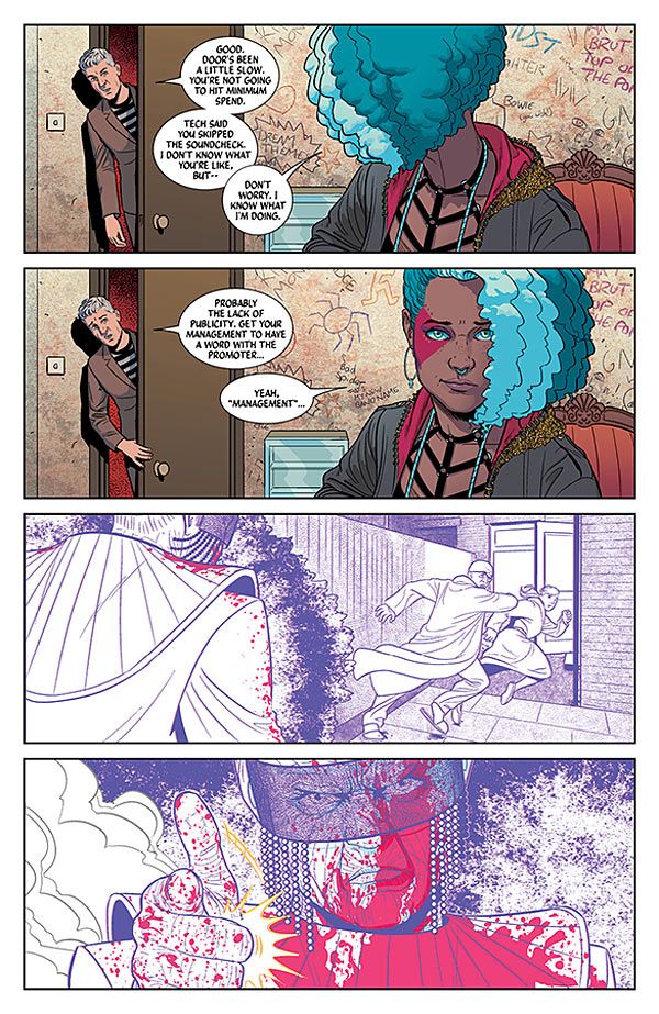
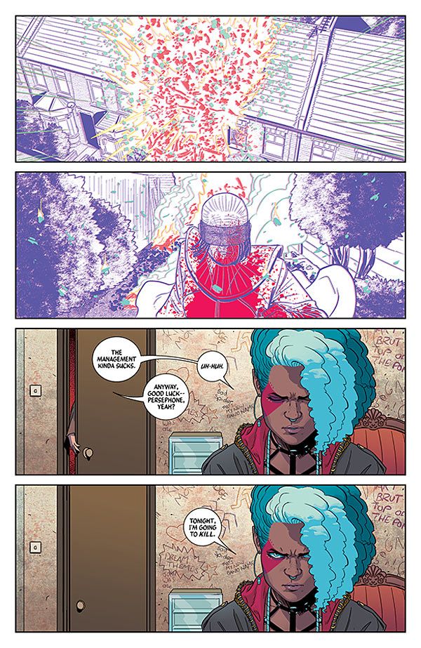
I think the biggest difference is the scale. While the events in "Phonogram" must seem huge to the characters that are living them, they're pretty small in comparison to what's taking place in "WicDiv." In terms of that translating to color, I spend a lot more time in quieter, darker little corners of the world in "Phonogram." While "WicDiv" does have all sorts of real world locations, it also has some pretty unexpected settings like Valhalla, or some purely conceptual places, like the tunnel of faces the characters fall through when transforming in to gods.
It's probably best summed up with a "Spinal Tap" reference: If I have the "color dial" max out to 6 or 7 for "Phonogram," I often crank it all the way to 11 for "WicDiv."
Was it a conscious choice that you'd not work on any of the other issues as the colorist, Matt? You could have worked over Leila's artwork, for example, but instead you took a break alongside Jamie.
Wilson: Well, almost everyone we used normally colors their own artwork, for one thing. On top of that, if we were really going to make this departure in the art for almost the whole arc, then it made sense for us to go all the way with it -- you know, to really get a different vision for each issue. Plus, the way each of the guest artists color their art is such an integral part to each of their styles, and what their each known for, I think adding me into the mix would've homogenized the look of the arc a bit too much.
Although you work digitally, you use a lot of reference notes and fill your room with concept, storyboards, design and layout. Do you find you work best with reference you can quickly check back on, to keep the sequencing natural and make the book feel more grounded?
Wilson: Ha. Lots, actually, and for both realistic things and the more abstract elements like the gods' powers. Jamie sends me a lot of Google Street View stuff for the various London locations. We also send fashion photography, music videos and other things like that to inspire the gods' performances or fights.
McKelvie: I think most comic book artists surround themselves with reference. Working digitally makes it very easy to bring up any particular past page, though, so I don't have to go hunting through piles of board to find it.
"WicDiv" requires a lot of specific design and lighting choices. Matt, do you find you have a lot of free rein to play around and try unexpected things within each page, rework material?
Wilson: Oh, yeah, for sure. The guys want me to experiment and be creative with my coloring decisions, especially when it comes to the gods and their powers or performances. Basically I'm told to go crazy, and often I don't go crazy enough, and I'm pushed to go further. But both Jamie and Kieron have a great amount of respect for what colors bring to the storytelling, so they're very open to my ideas and contributions.
What decided the palette for "WicDiv," which is a big change from, say, the more subversive feel of "Phonogram"?
Wilson: Slick is the word I seem to come back to when thinking of "WicDiv's" look. I want things to be very pretty, mostly very clean, and appropriately poppy. Like most of my work, I tend to just rely on instinct when choosing palettes and colors. So I don't have a set of firm rules that dictate what I do with the colors. It's more based on feel. I read the issue, or know the general theme of the arc, and try my best to convey those things in the colors.
Jamie, you've been an advocate for the idea that comics don't have an "author" and an "artist." How do you view your creative process with Kieron? How do you go from concept to script to page?
McKelvie: How do I view our process? Through tears, largely.
The core of the story, the plot and the characters, is always Kieron's. We talk about the concepts, characters and events of the story, and he'll often come to me and say, "What do you think of this bit? Is it OK? Should we do it like this?" He does the same with Chrissy Williams, our series editor. Kieron's scripts are very dense, but they always come with the proviso that if I can see a better way of putting across the idea of the page or panel, I should go with that. Action pages are always written Marvel-style, with no panel breakdowns and little dialogue.
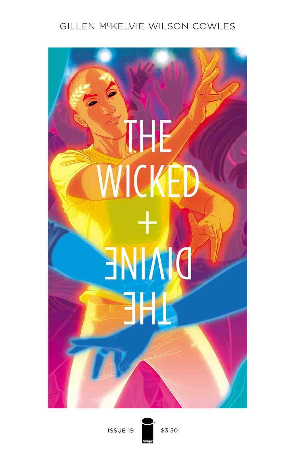
Sometimes there will be too much or too little to fit on the page, but he's good at explaining what the point of an action sequence is (and action sequences should always have a point for the story), so I can take that core and turn it into a page that works. I send over pencils and we talk them through before I ink them. The look of the characters is almost always me, taken from the concept of the character as described by Kieron. There aren't many characters in the book who had an outfit prescribed by Kieron in the scripts. I think maybe Luci, he wanted her to always be in a white suit, and Dionysus' T-shirt and jeans with head tattoo was his idea.
When we conceived the series, Persephone's style was going to be vaguely inspired by a couple of existing musicians, but it wasn't quite grabbing me. Then, after we'd started working on the book, FKA Twigs started making waves, and it clicked for me immediately that she was the strongest influence on Persephone's look.
Once the pencils are done and I'm inking, Kieron will starting doing a lettering draft of the issue. I always want to know the internal life of the characters; I don't want a script direction that says "X looks sad." I want to know why they look sad, so I can get into their head and get the right expression or movement for them. I tend to think of it as a victory when Kieron's removed dialogue because we don't need it, as the art says what the lettering would have.
There are some challenging page layouts at times, which must require a lot of back and forth with letterer Clayton Cowles. How important has his work been to the book?
McKelvie: Hugely. Clayton deals with a lot from us. (Sorry, Clayton!) I'm not sure how much it compares to other books he works on, but it does feel like we have a lot of discussion amongst all of us, and tweaking lines to get things just right, and so on. He comes up with the great lettering styles we see with some of the different gods, such as Dionysus and the Norns. He pretty much always gets where to place the lettering, though, with very little direction needed from me.
I'm particularly interested in your partnership with Matt, as you've been working together since "Suburban Glamour" in 2008. How did you first come to meet, and start collaborating?
McKelvie: The first colorist of that book had to pull out, and I needed a replacement very quickly. Ivan Brandon recommended Matt to me, and our work clicked immediately. With "SG" he was kind of stuck imitating the style set by his predecessor, but from "Phonogram: The Singles Club" onwards, he's been able to do his own thing on my pages.
Wilson: Yeah, our mutual friend Ivan introduced us. I was coloring for a coloring studio at the time. So while I had plenty of coloring experience under my belt, I only had one coloring credit to my name for a short story in an anthology (written by Ivan). Ivan knew Jamie needed a colorist to finish "SG," and he knew I wanted to get my name out there, so he put us together. There was basically a zero-dollar budget to get that book made, but I made enough money at my day job coloring for the studio, so I didn't mind working for no pay. It was a perfect match!
And then, yeah, Jamie and I worked well together. After that, Jamie and Kieron asked me to color the second volume of "Phonogram," which got us a lot of attention and allowed us all to start working together at places like Marvel.
Jamie and Kieron have a close working relationship, and their scripts reflect that. How do you adapt to working with them on a book like "WicDiv"? Do you find it different to, say, working with someone like Cliff Chiang?
Wilson: The broad strokes are pretty much the same. Emailing back and forth, sharing notes, inspiration and reference images. The differences come in the details of the coloring that are used to enhance each story or artist's work. Sometimes the coloring can have a theme that permeates every scene or palette in the book. That's the case on "Paper Girls" with Cliff's art. I'm focusing on specific values (keeping the colors very light in value) and working with color temperatures for my contrast across the entire book. I'm free to base my palettes in different hues, but they're always going to be lighter valued, and often less saturated versions of whatever hue I use for a scene.
That's much more of a "big picture" concern that I keep in mind when coloring "Paper Girls." But in "WicDiv" I don't have a theme that dictates something across the entire book. Instead, my focus is to enhance the gods' fights or performances, or anything they do, so that you understand these beings are more than human. We want the reader to understand that what's being shown on the page would absolutely blow their minds and melt their eyes if they were to witness these events in real life. So in the case of "WicDiv," I'm often focused on smaller, more scene- or character-specific aspects of the color, which usually don't carry over to surrounding scenes.
What do you think you offer each other, as a creative partnership?
Wilson: Specifically? Jamie offers a lot of room to play around. His open style means that I get to make a lot of decisions, which can be nice.
McKelvie: A million things! The first is that Matt is extremely good at adapting the way he works to the style of artist he's working with -- that's a lot rarer than you might think. The second is he is always coloring for the story. He's able to color for mood, to focus the eye, for time and place, anything that serves the telling of the story. Thirdly, he can think about color conceptually. You can see that in Issue 8, with the club scenes, or the remix issue, or any of the fight scenes.
The fights are our equivalent of gigs, and Matt can bring the colors and effects to make that clearer. With the remix issue, his concept was that, like in a song remix, you can hear parts of the original song, so all of the panels feature bits of the original coloring leaking through.
"WicDiv" requires a lot of specific design and lighting choices, in particular. What degree of specificity do you place in your notes? Do you give Matt relatively free reign to experiment, himself?
McKelvie: A lot of it comes from Matt following vague directions. Sometimes he'll come up with a couple of different ways of taking things that he'll send to us, but he's usually got a great concept for it that just works (though he probably spent hours figuring out how it would do so). So each character has their own color set associated with their powers, and certain effects; notice how Woden's creations tend to have a touch of pixelation to them. I try to make things easier for him by separating out lines and layers that need different colors or effects. Working digitally makes that a lot easier.
It very much feels like "WicDiv" has seen you reflect the diversity of Britain, with characters of various body types and facial structures. Moving from the first "Phonogram," which because of its nature was mainly about white Britpoppers, how do you feel you've progressed in terms of creating and designing realistic character designs which reflect a greater diversity?
McKelvie: As you say, we're very keen to try to reflect the reality around us, especially here in London, where Kieron and I live -- as much as "WicDiv" is also a fantasy about a group of people with the powers of pop-star gods. I think I'm getting better at it, but like with anything in art it's always a work in progress. And it's very easy to fall into drawing the same things over and over again so you should always try to push yourself in that respect. But really a large part of it is just trying to pay attention to the world around you.
"The Wicked + The Divine" #18 is on sale now. Issue 19 arrives May 4.

