Different Artists, Same Page, Different Results
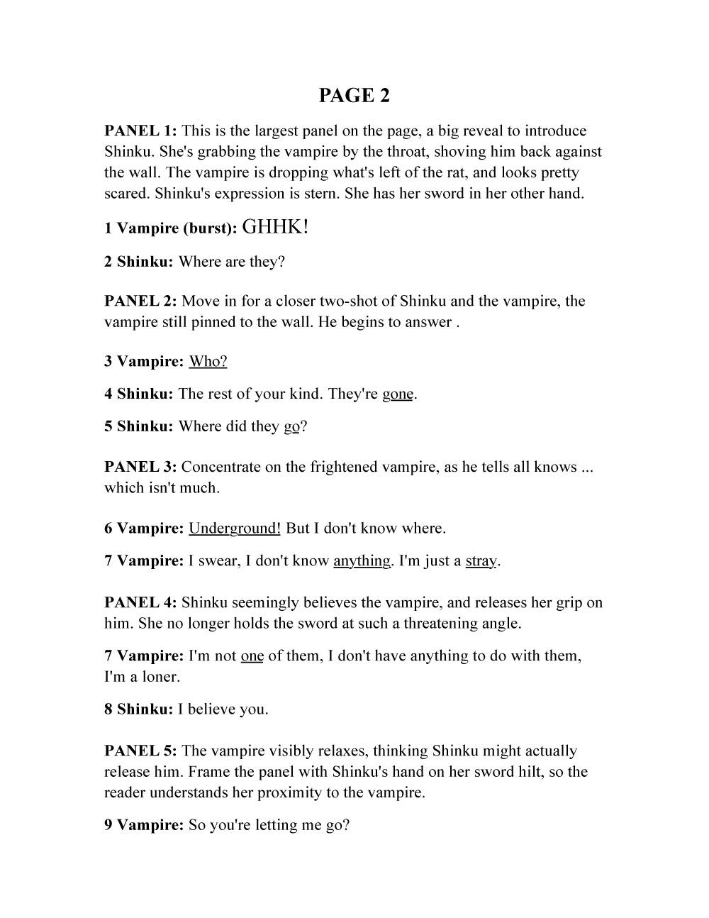
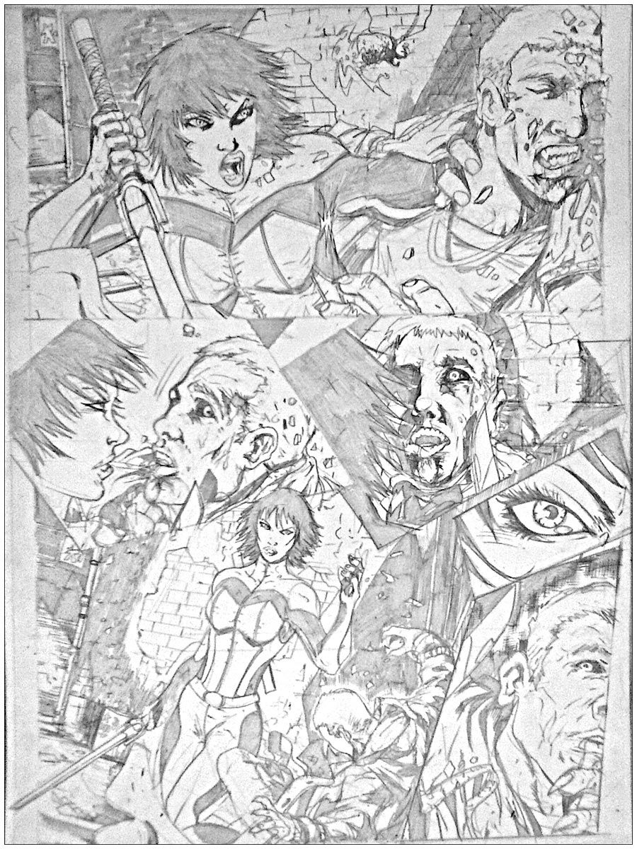
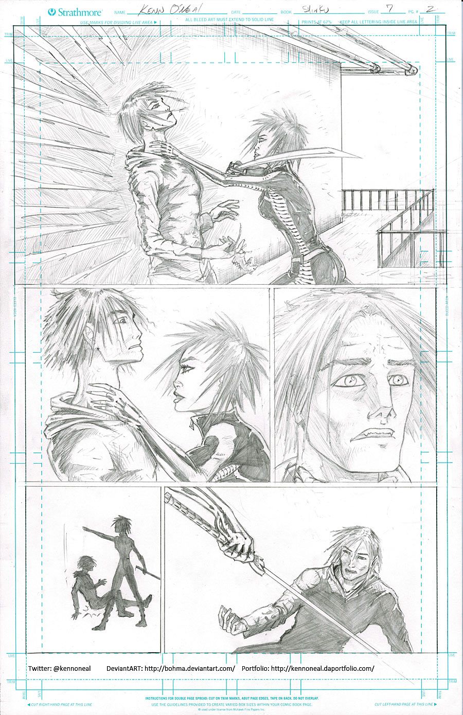
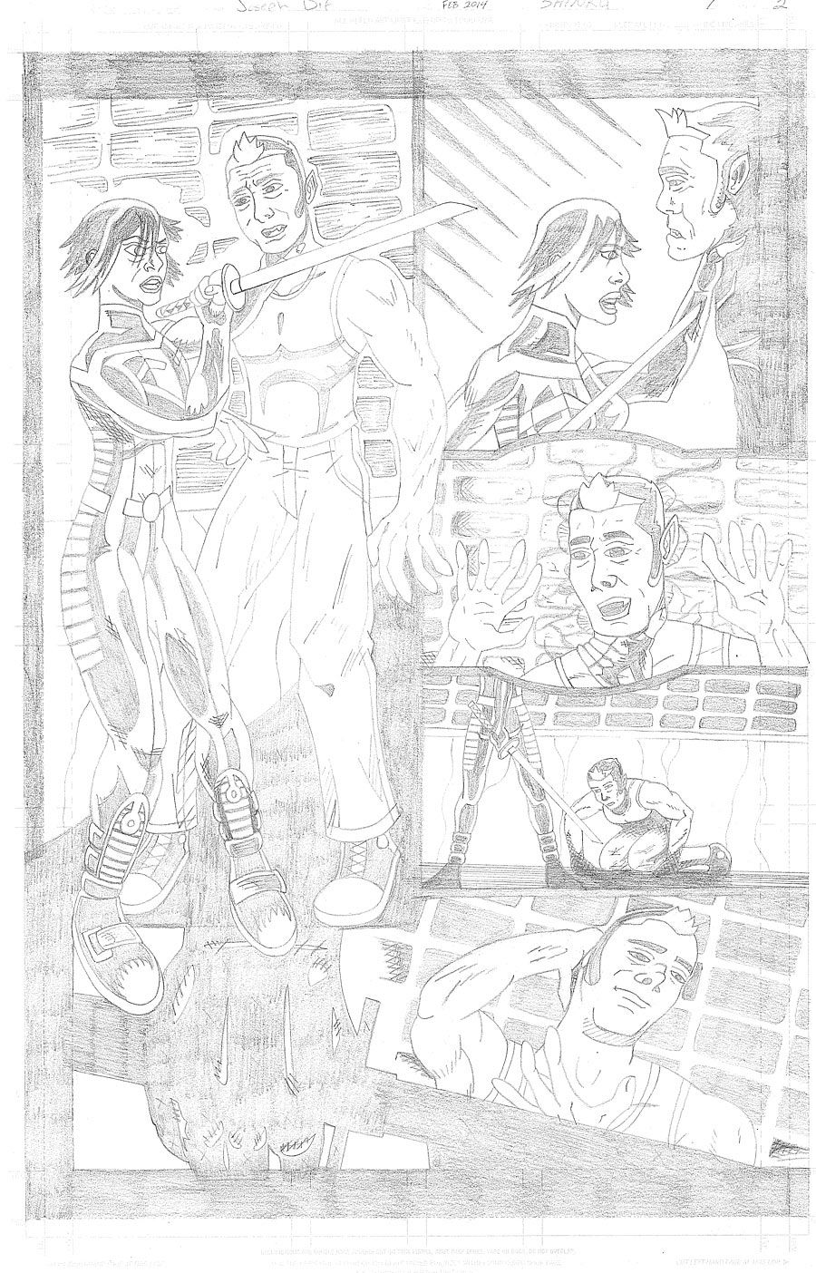
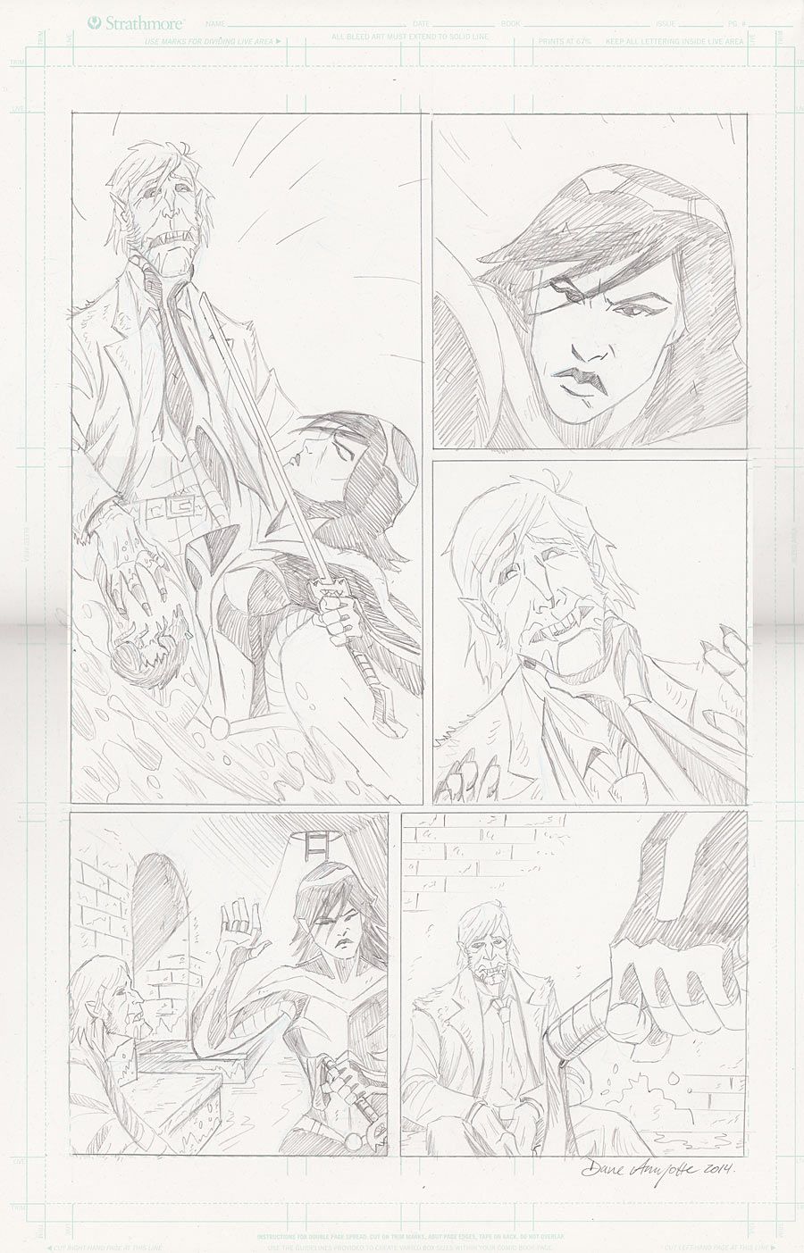
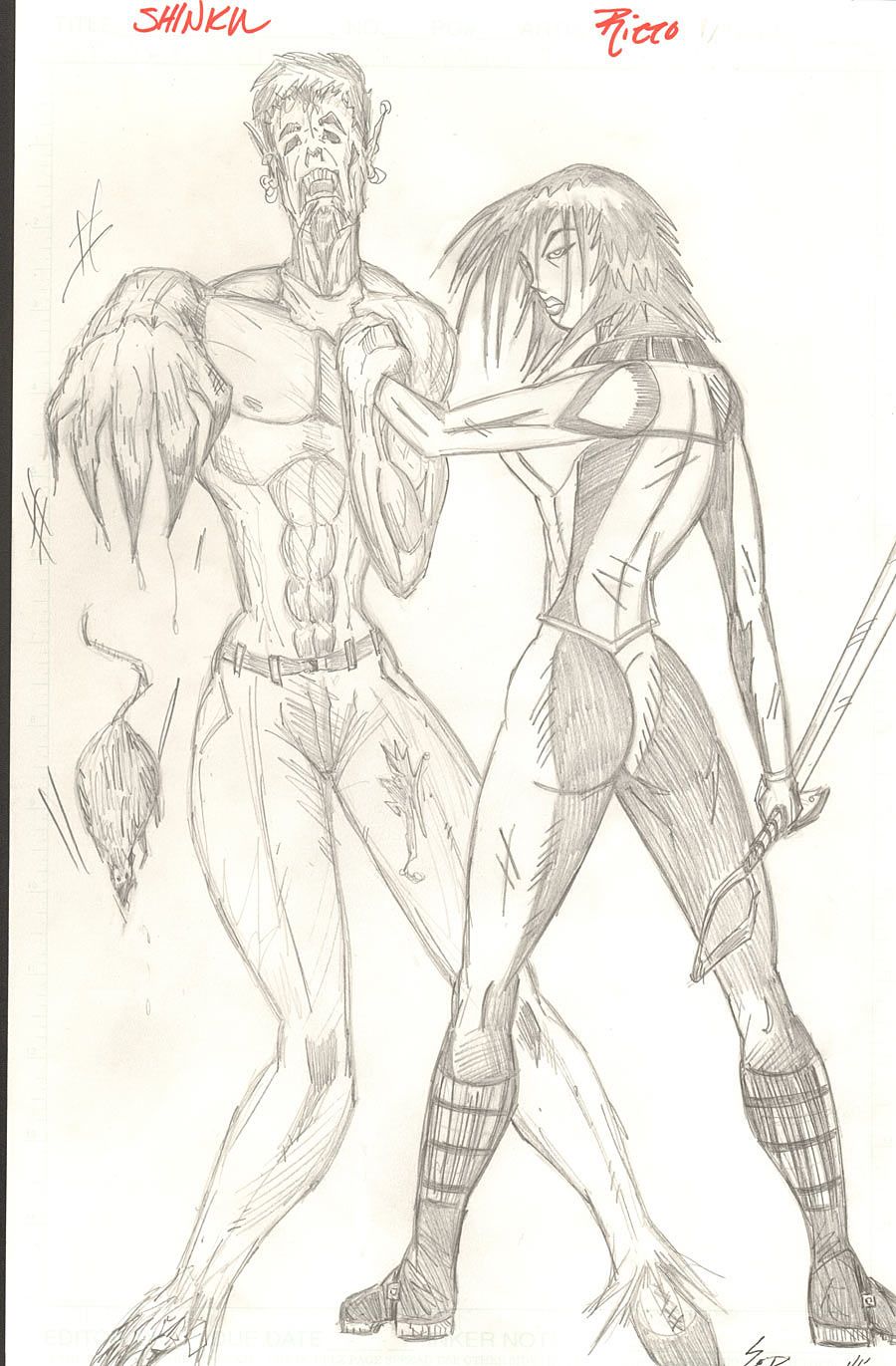
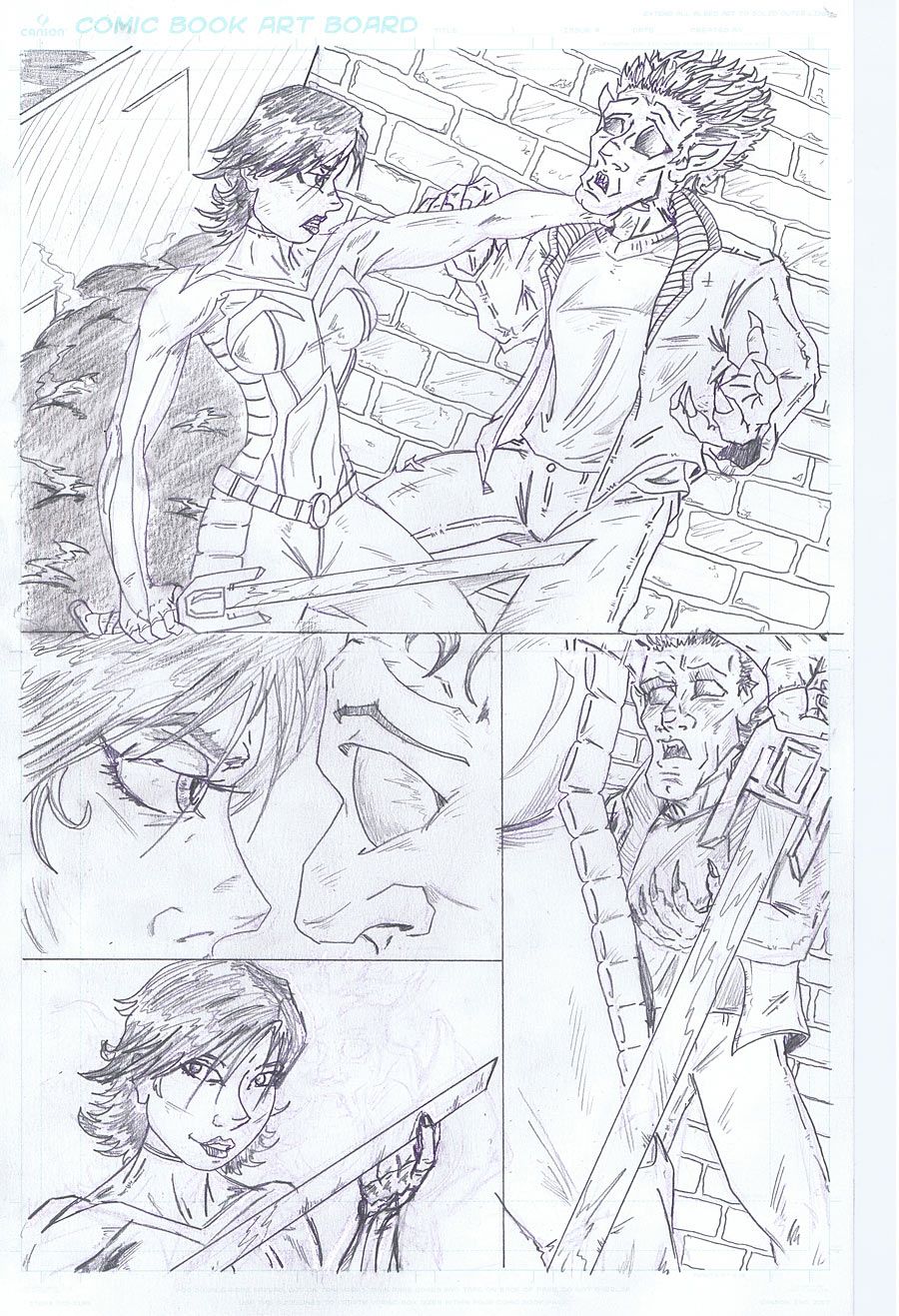
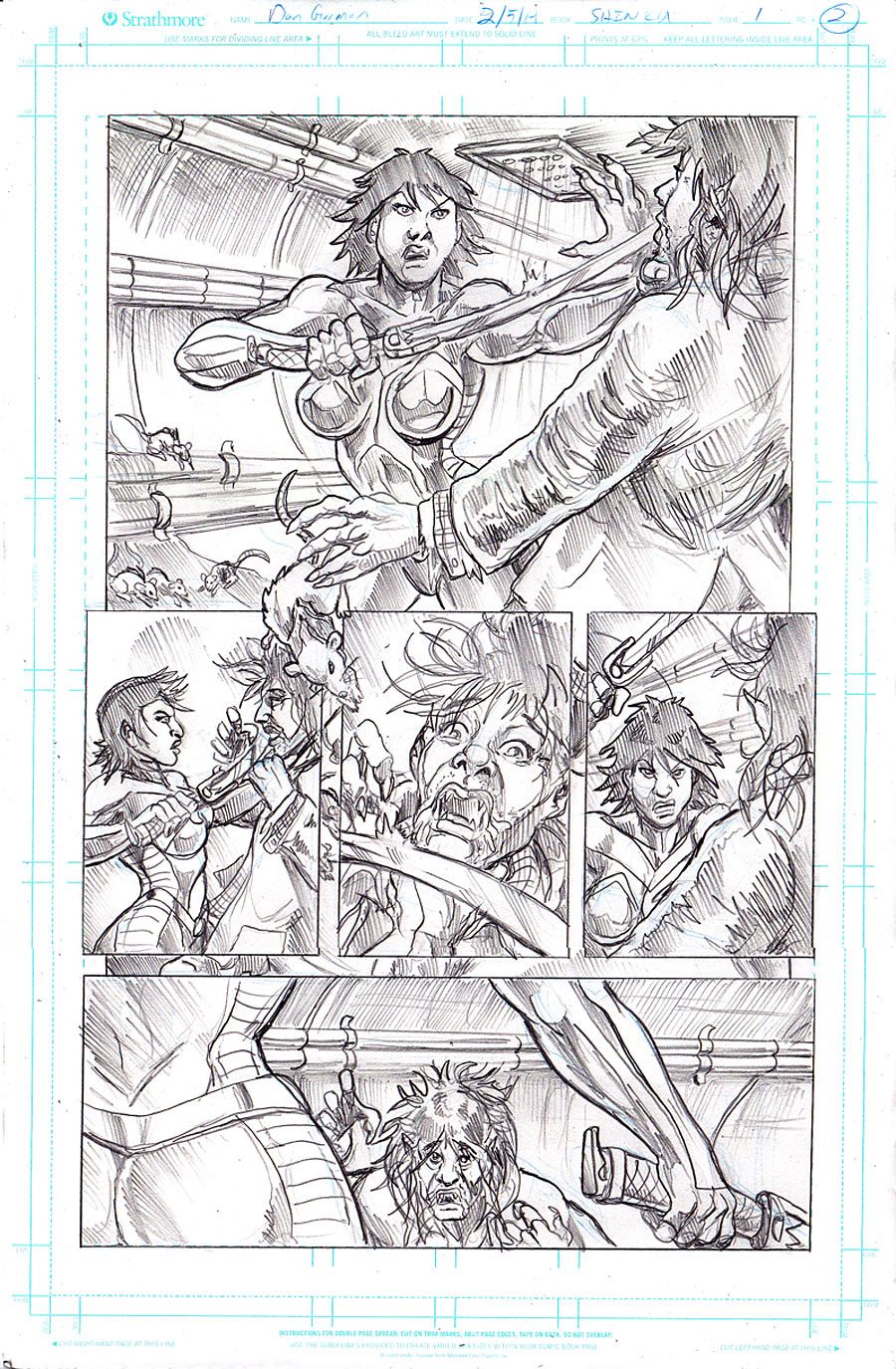
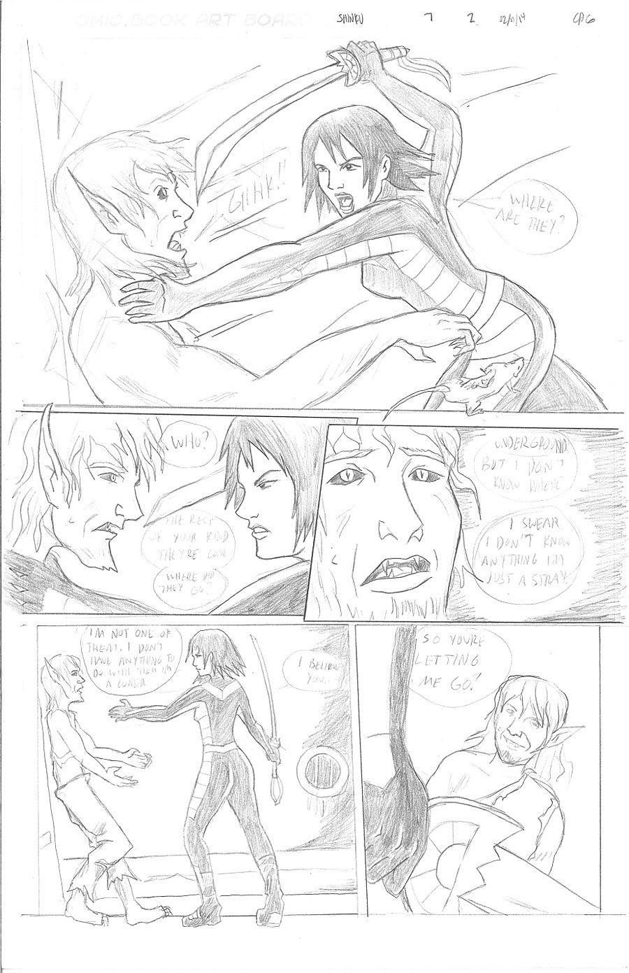
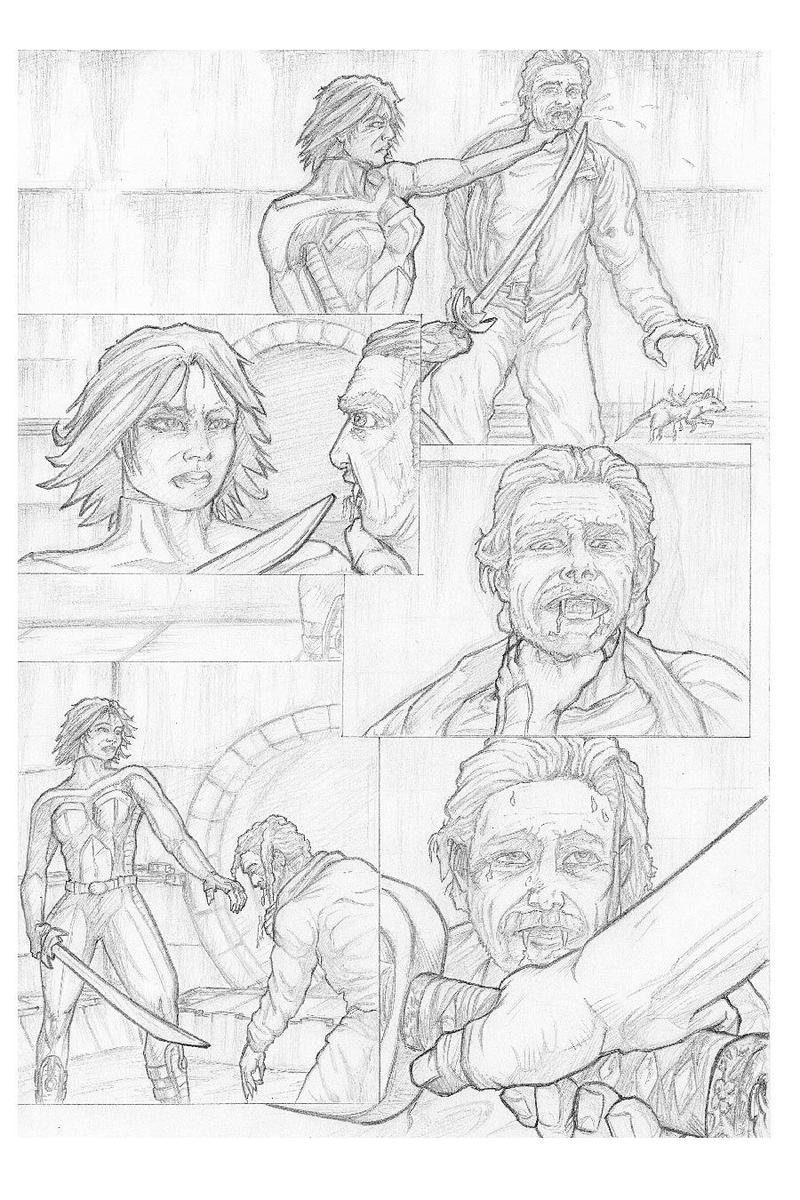
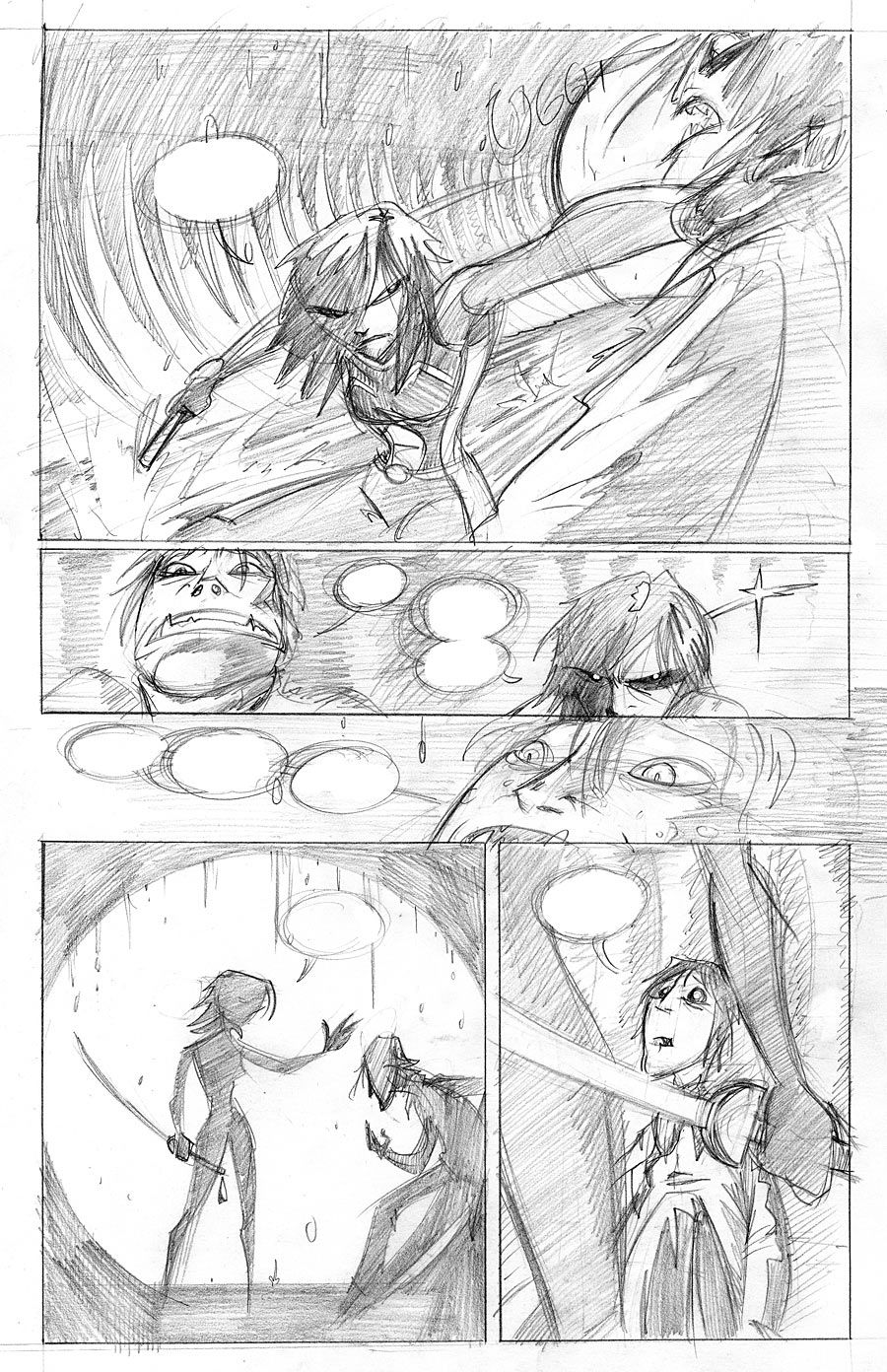
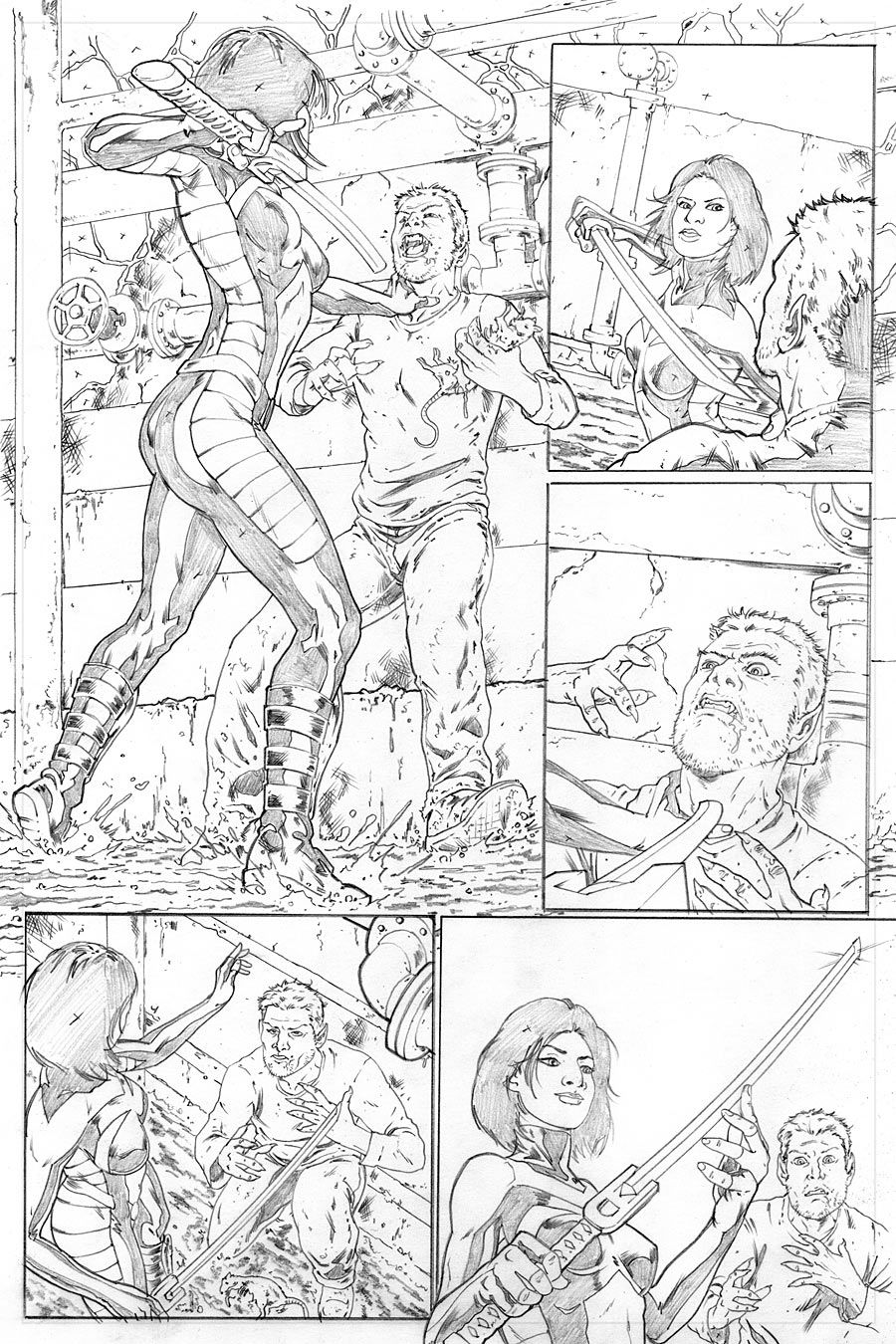
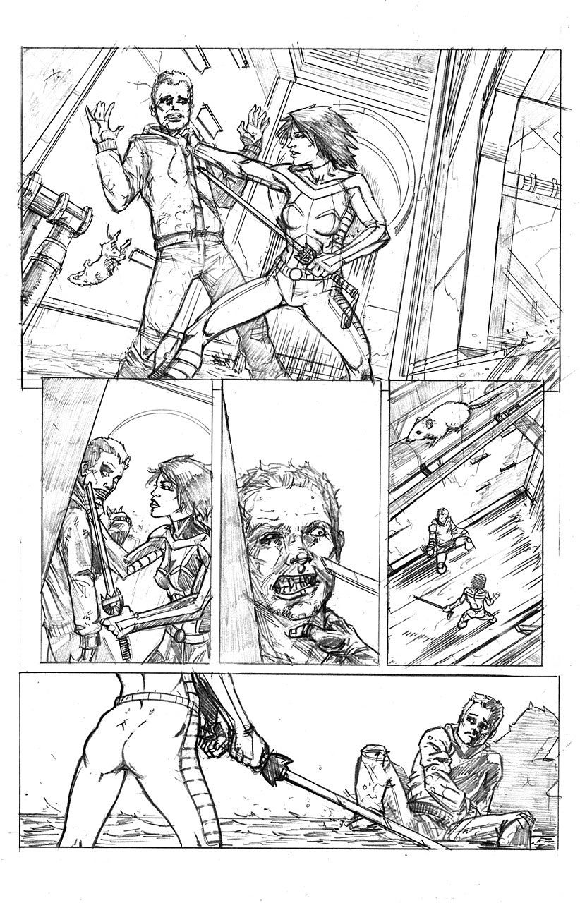
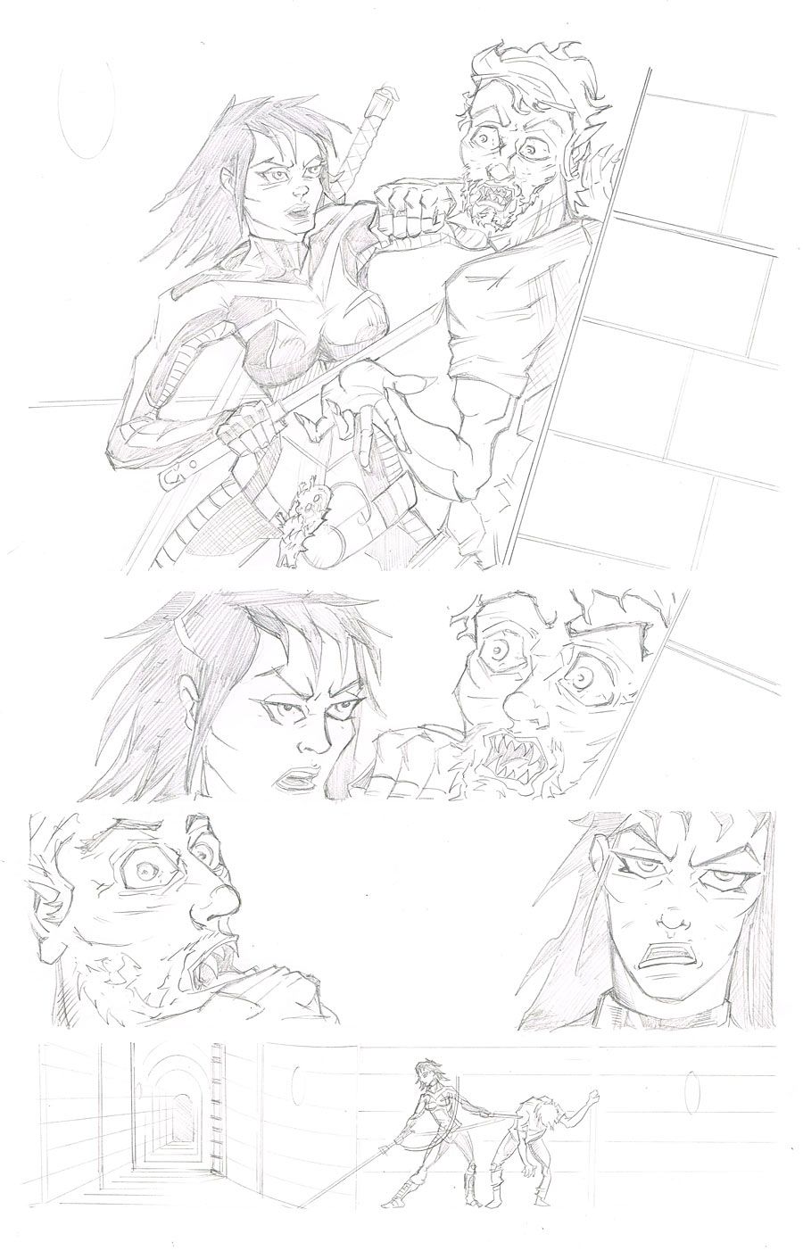
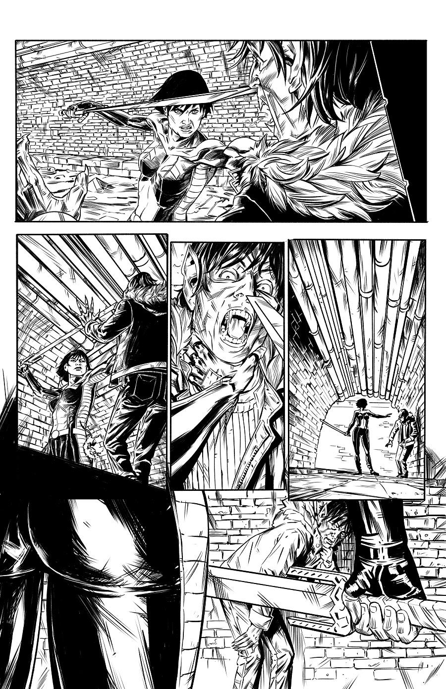
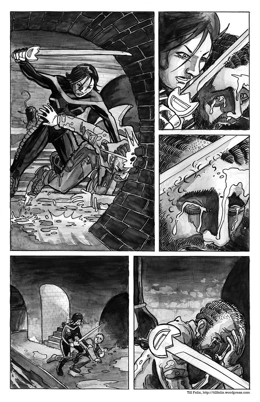
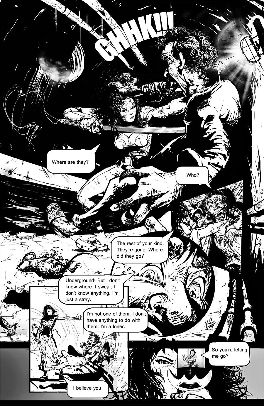
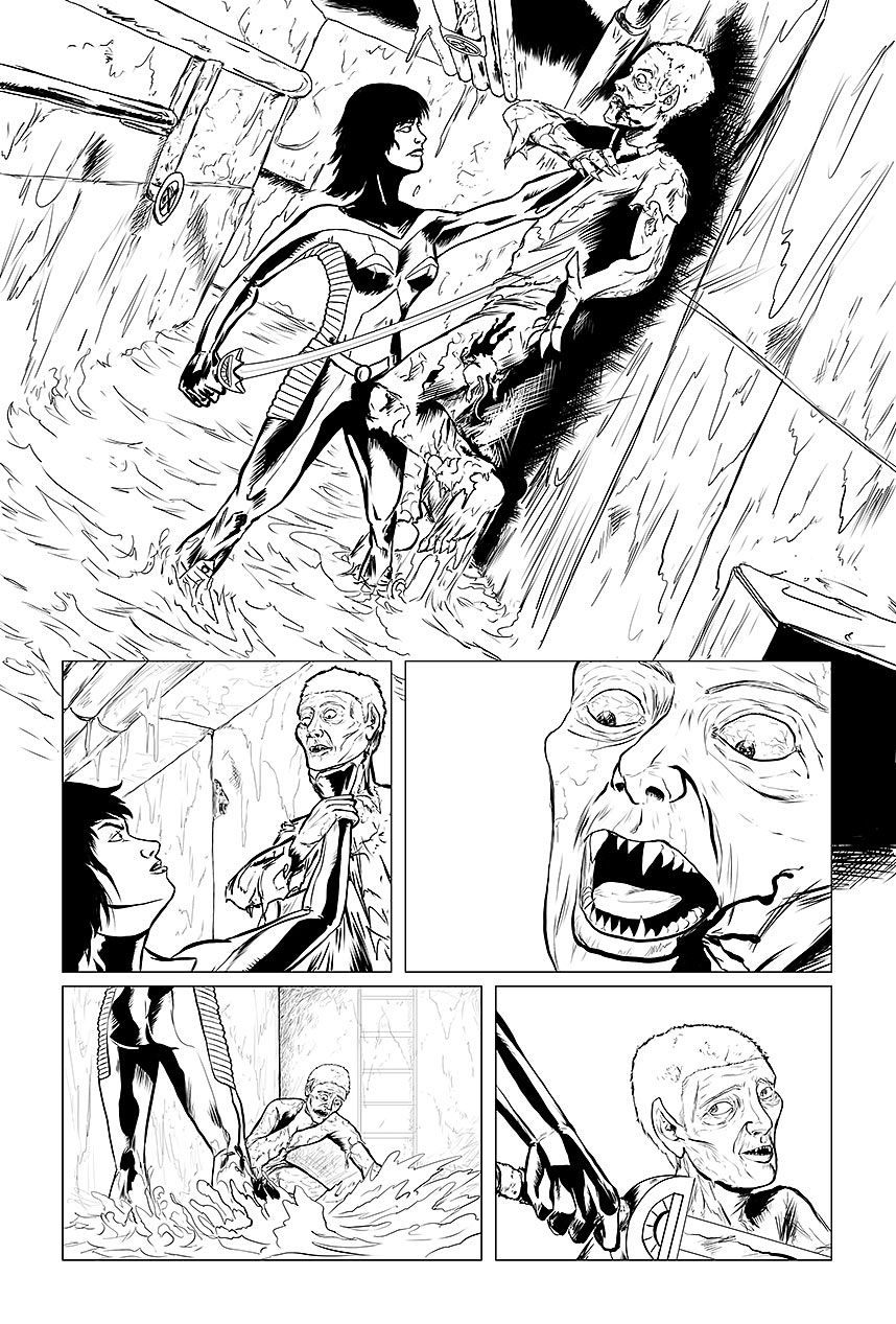
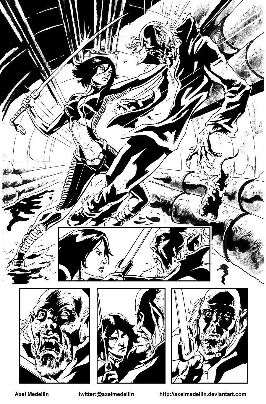
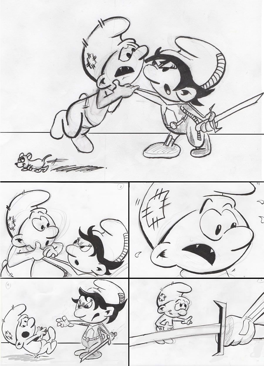
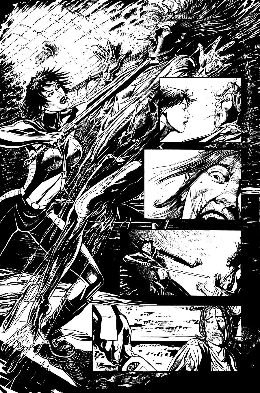
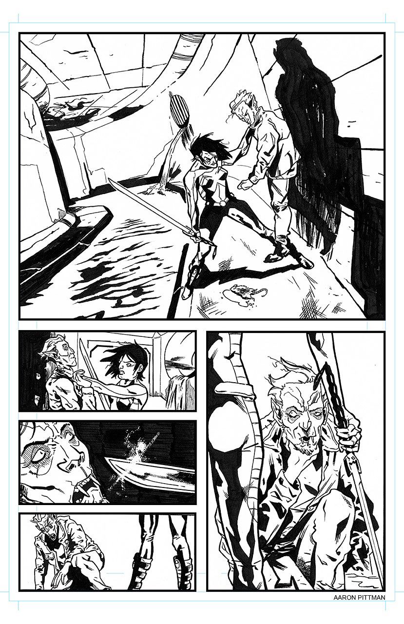
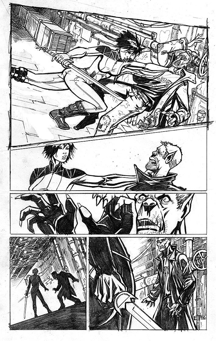
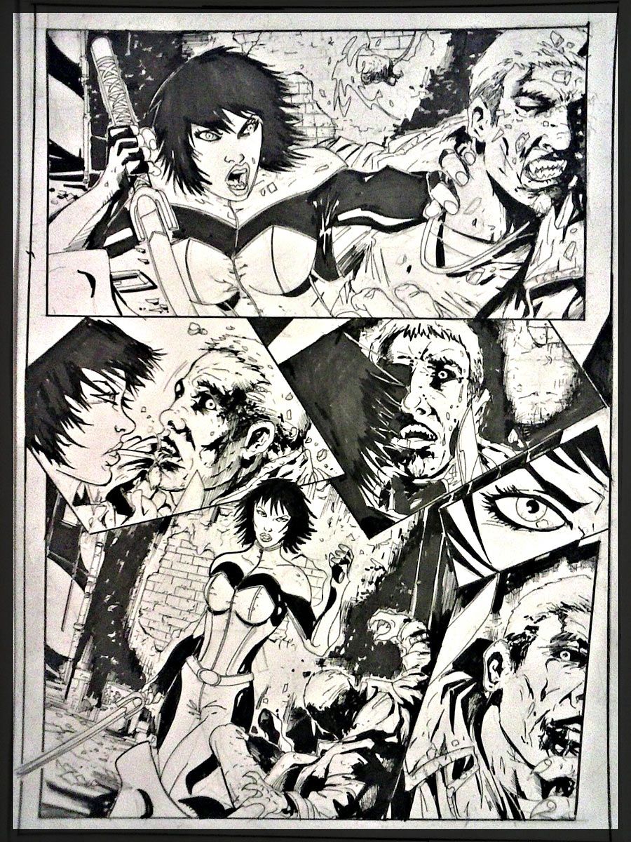
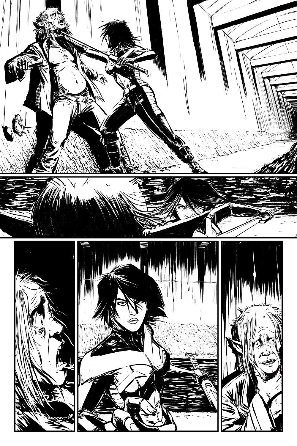
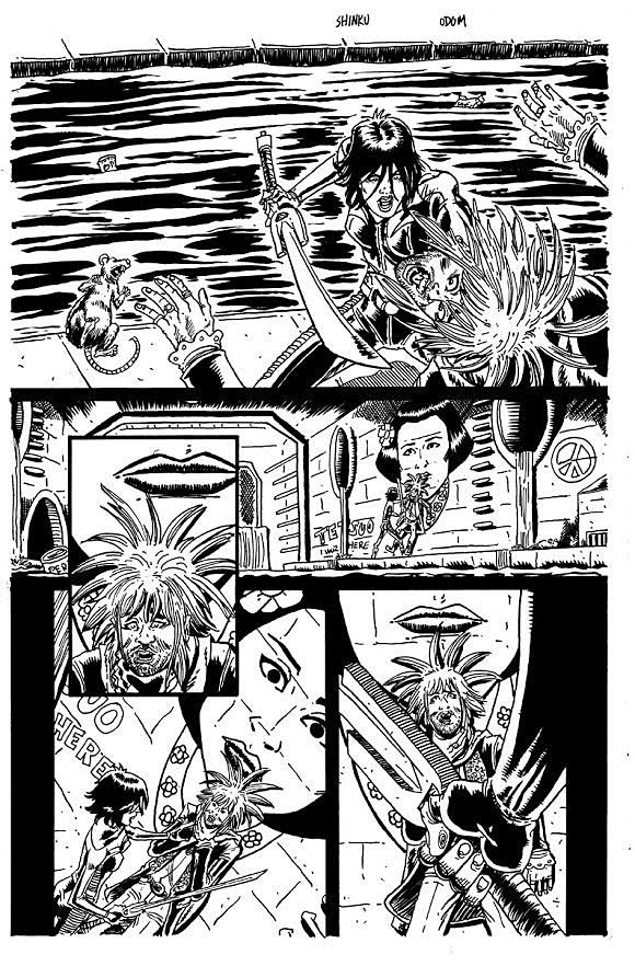
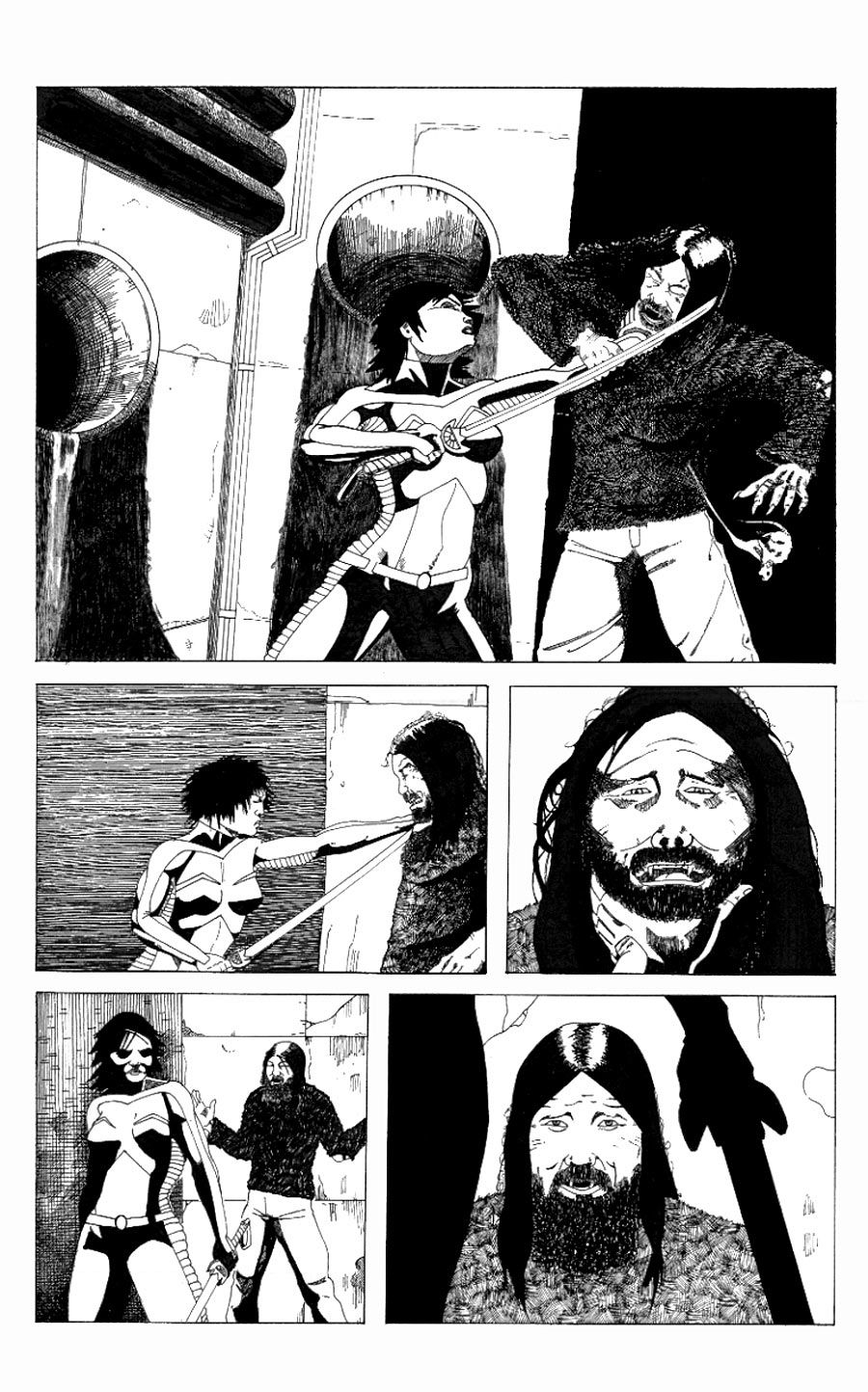
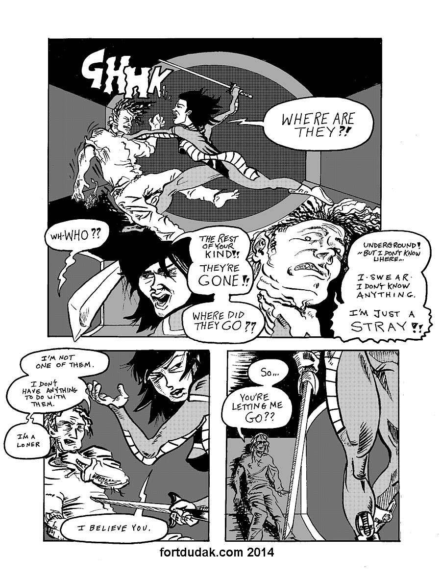
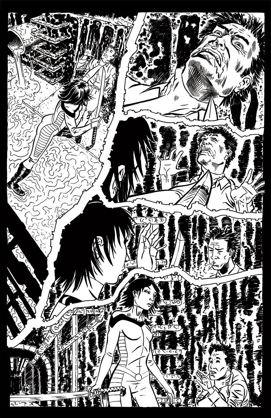
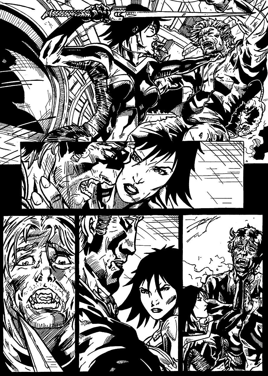
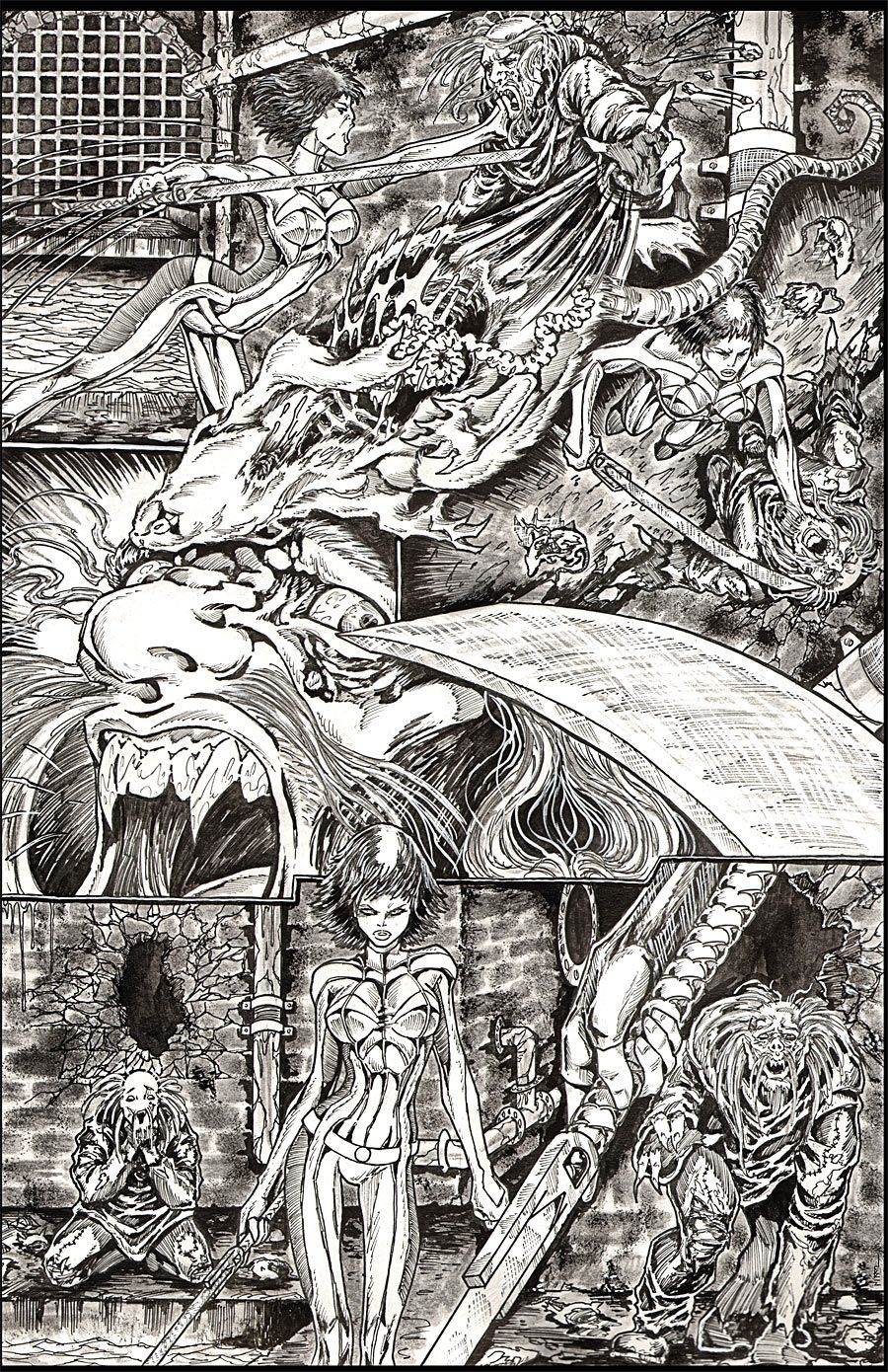
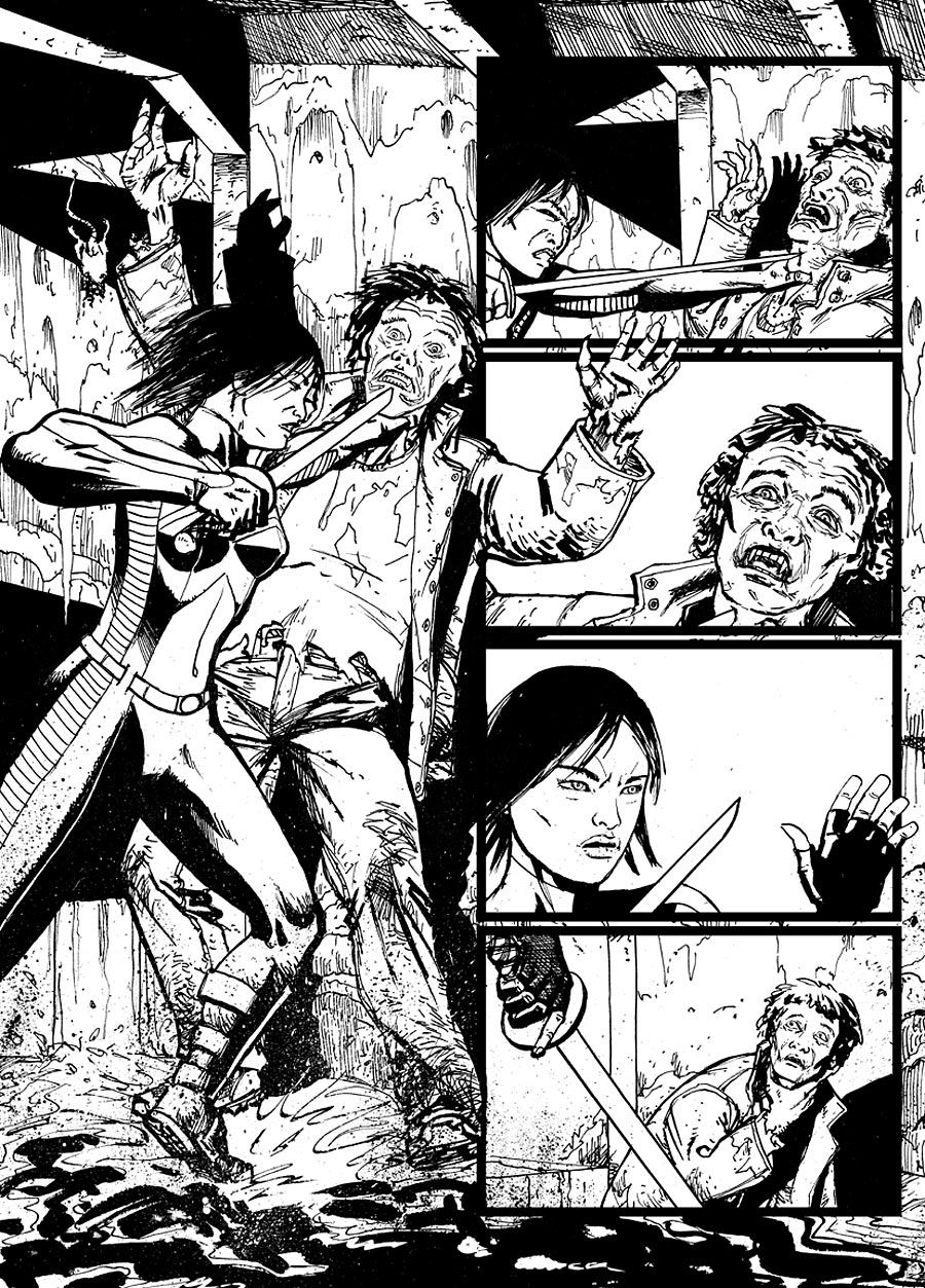
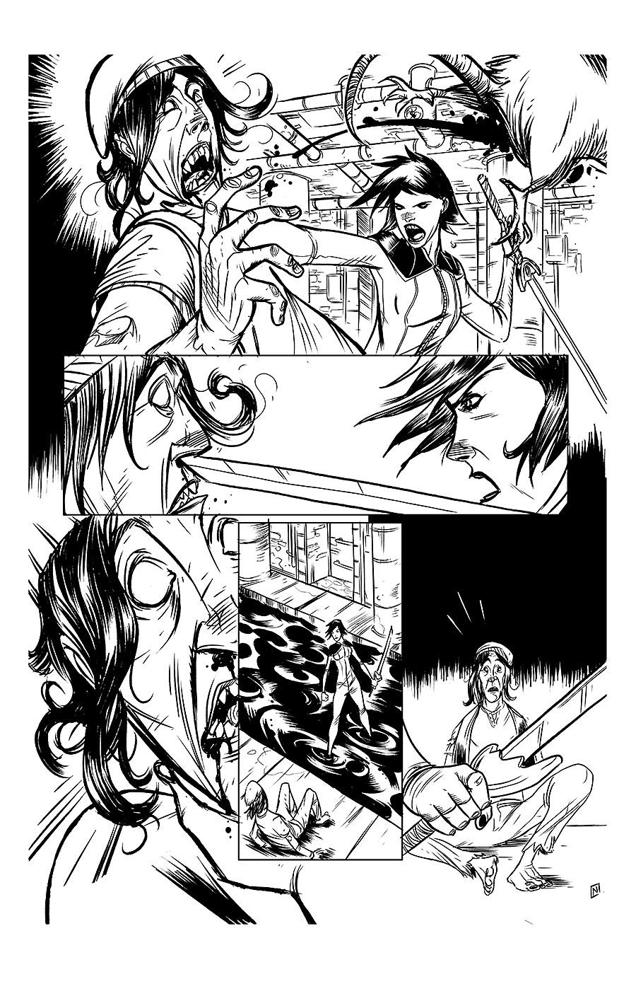
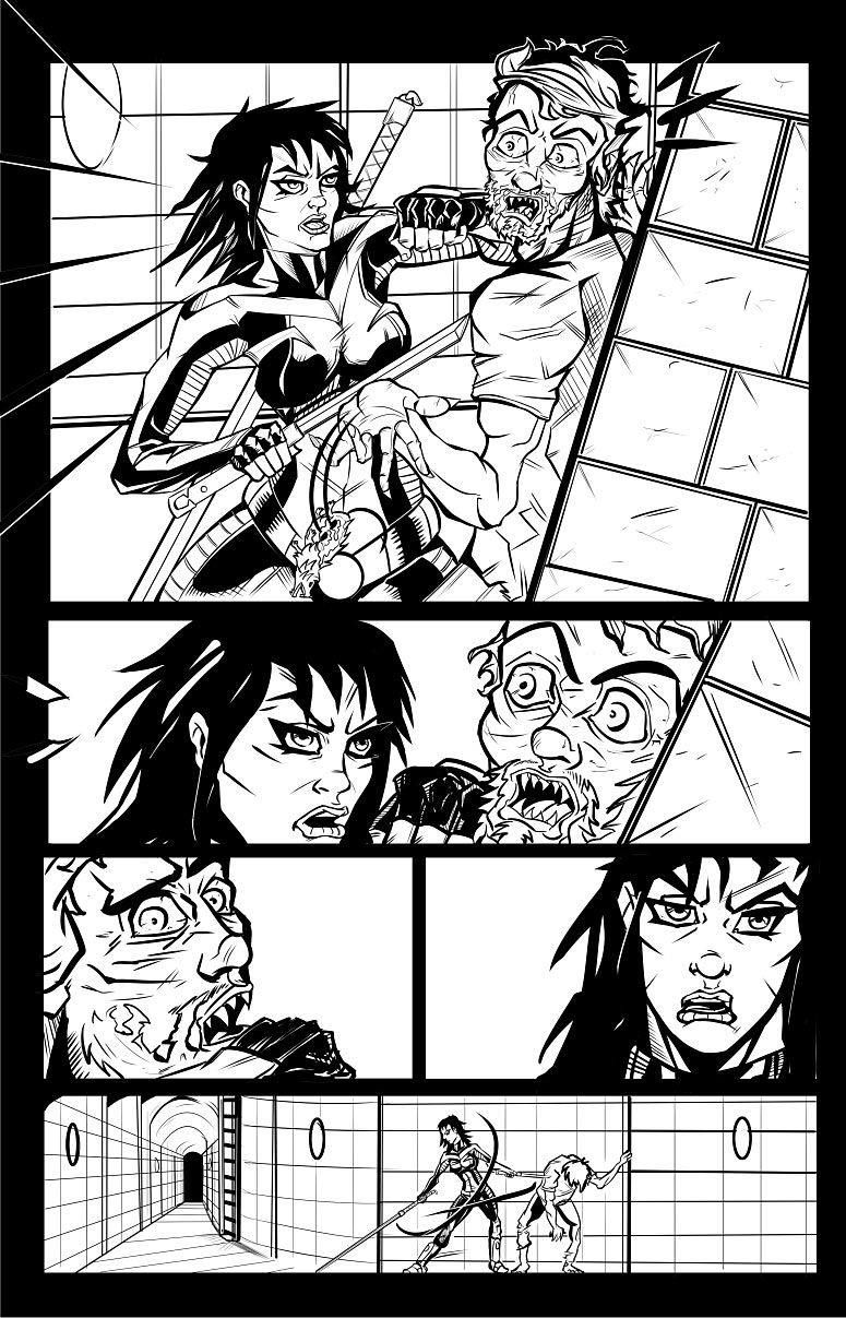
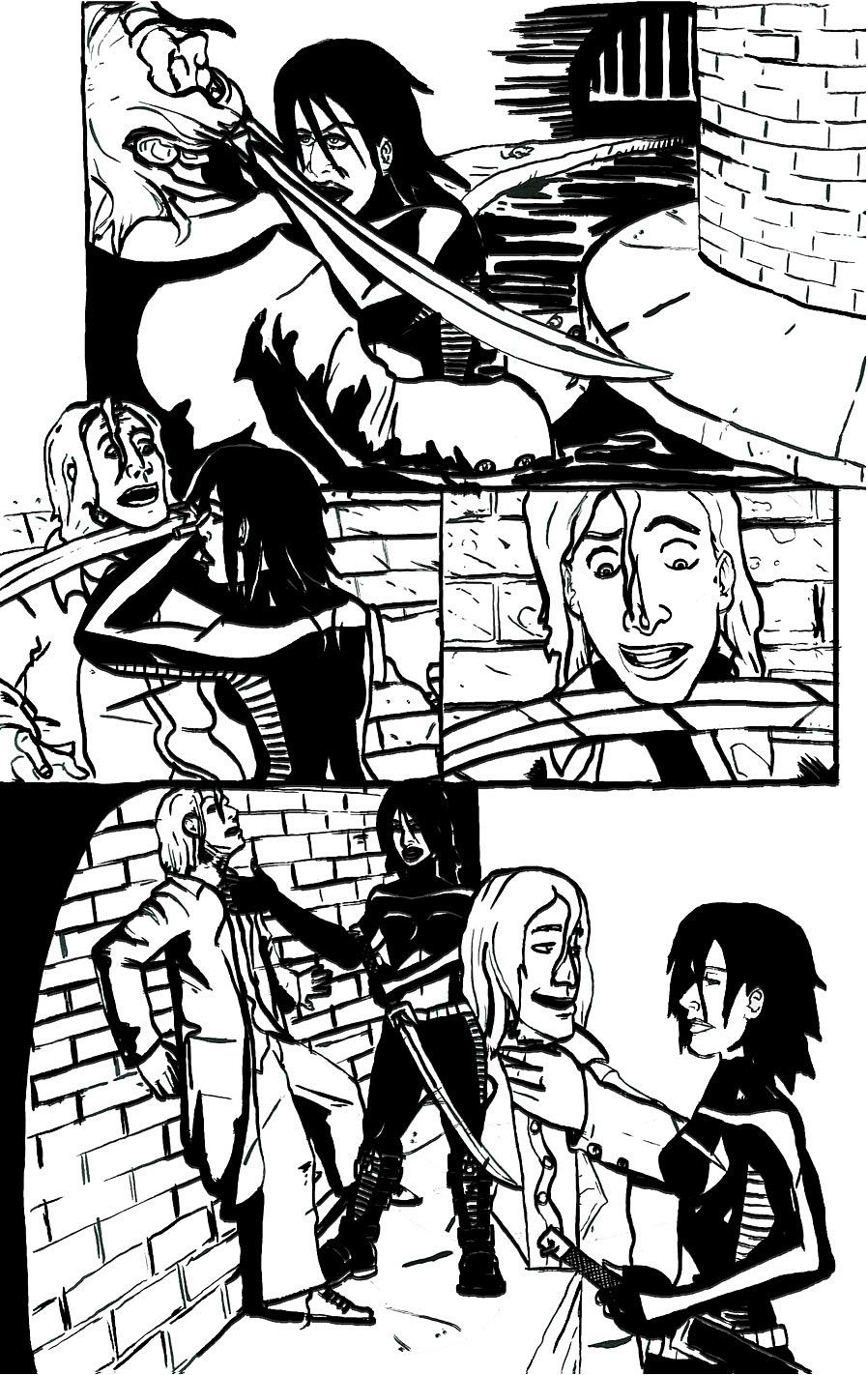
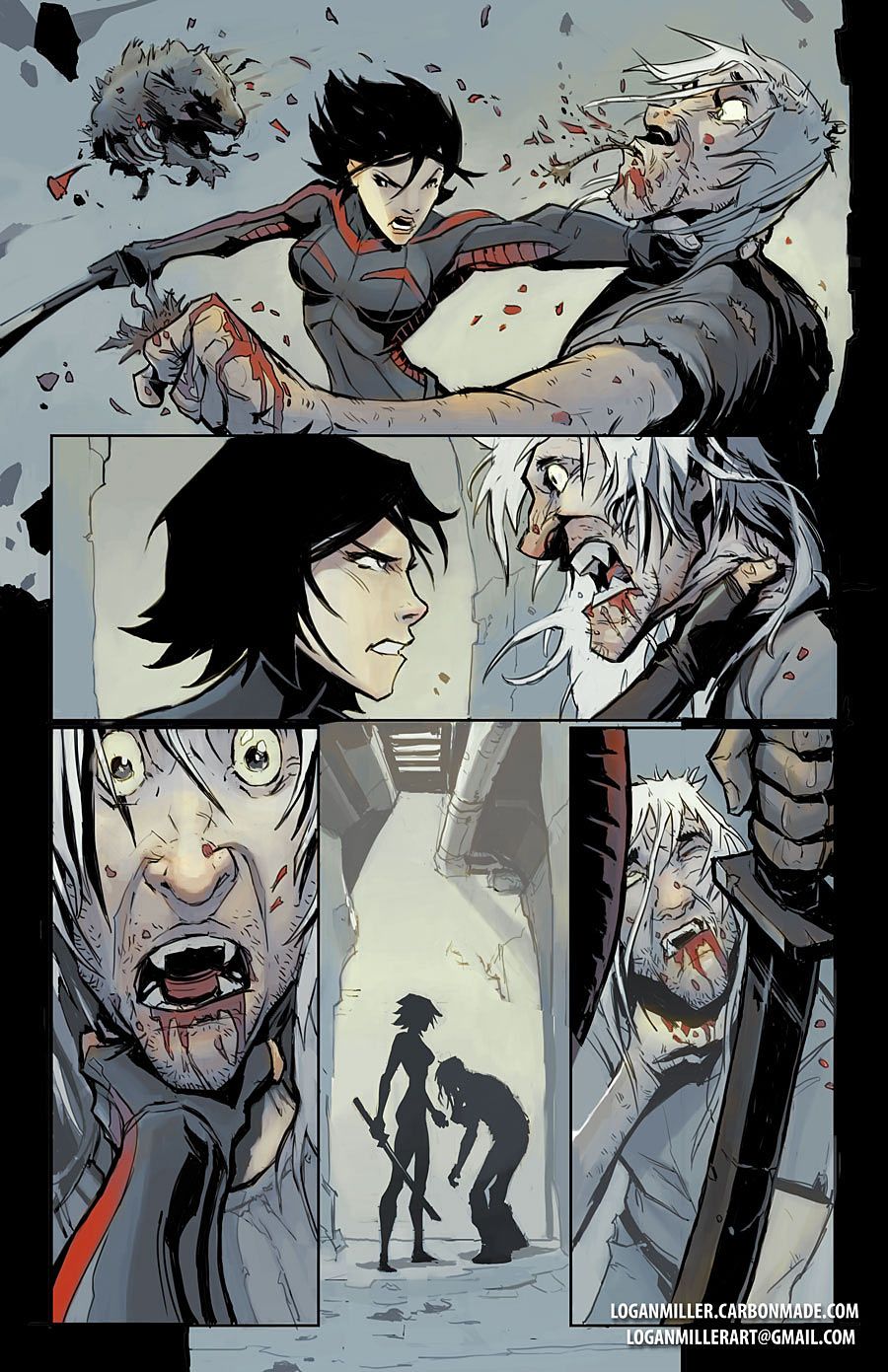
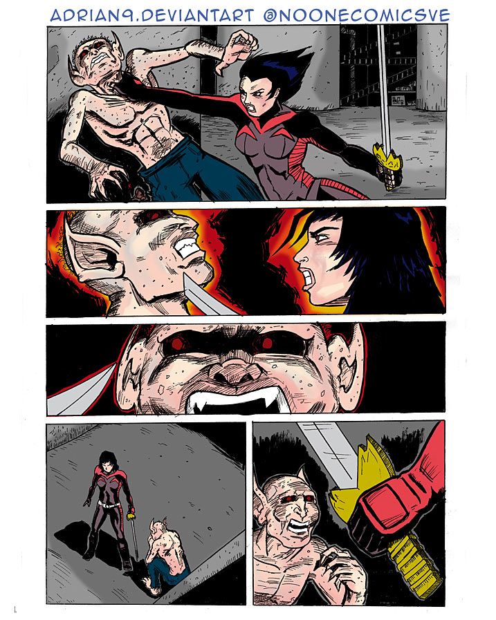
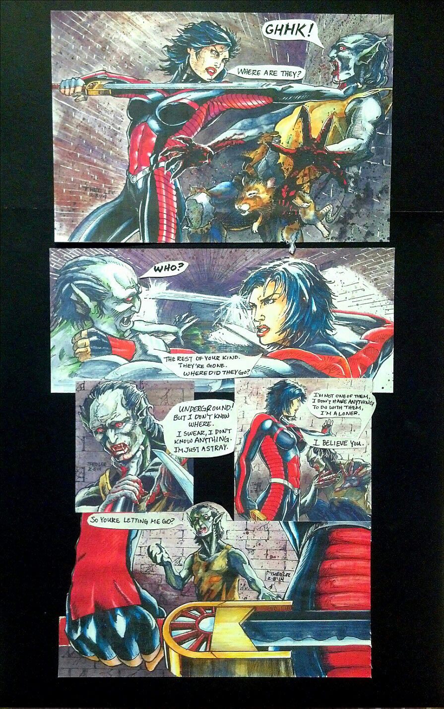
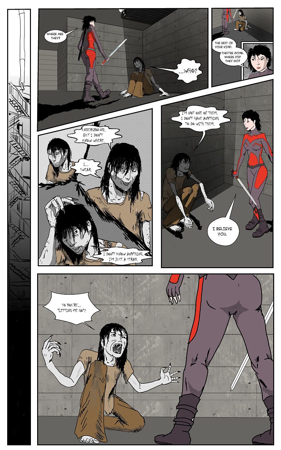
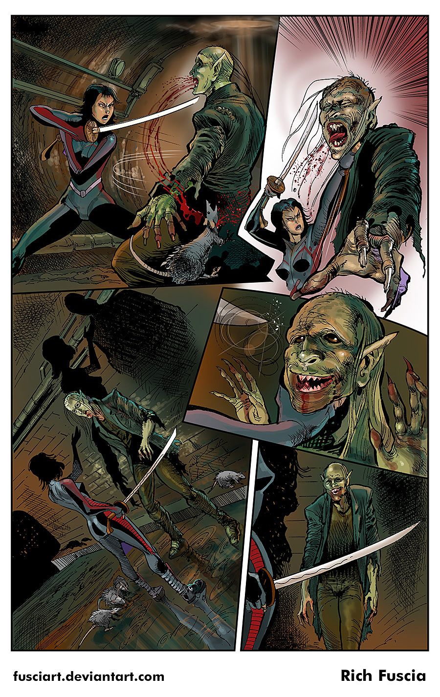
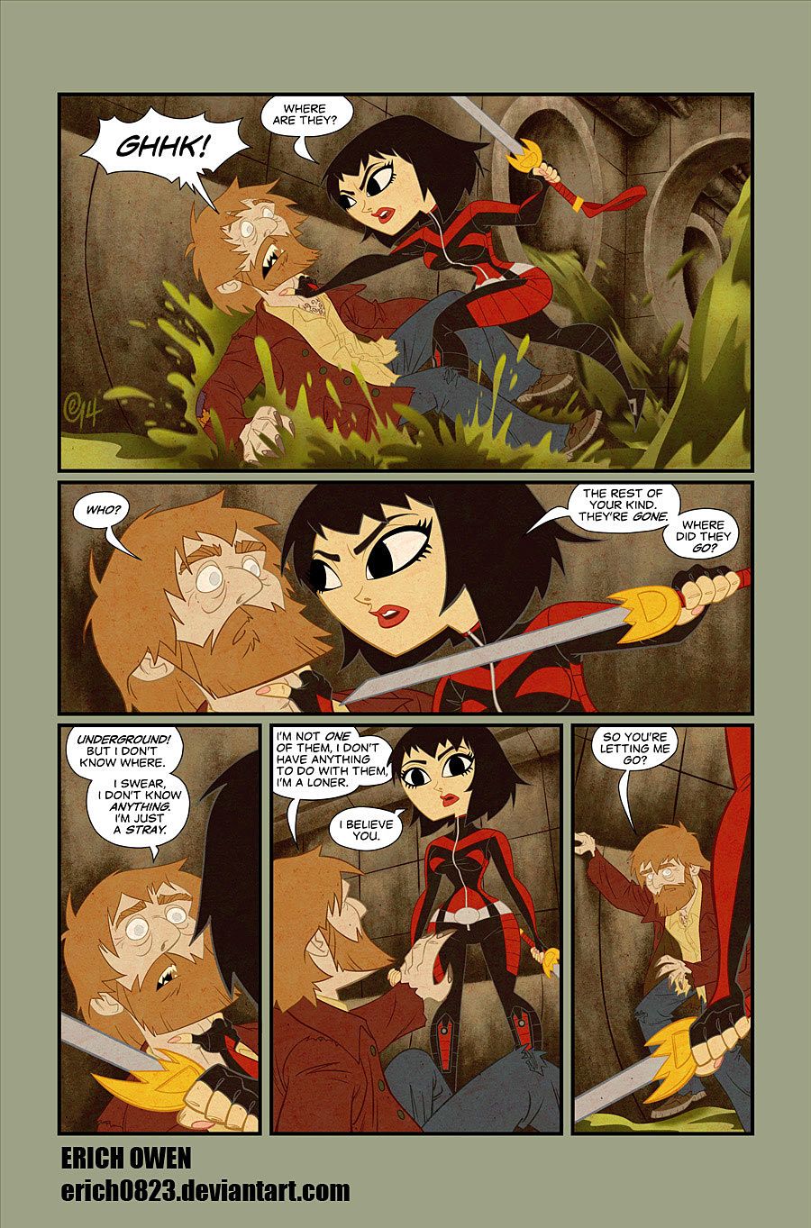
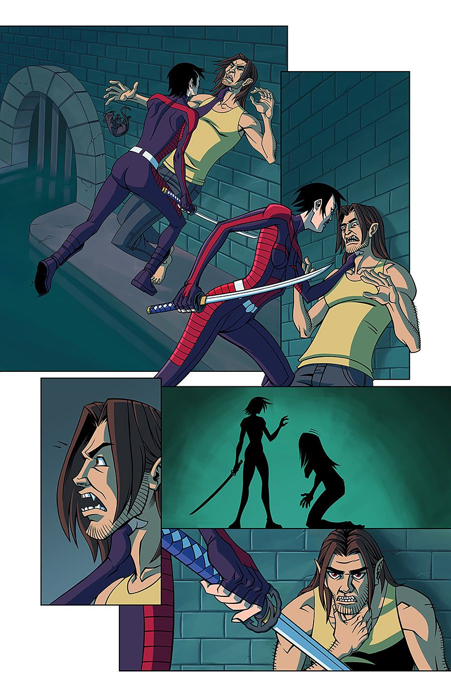
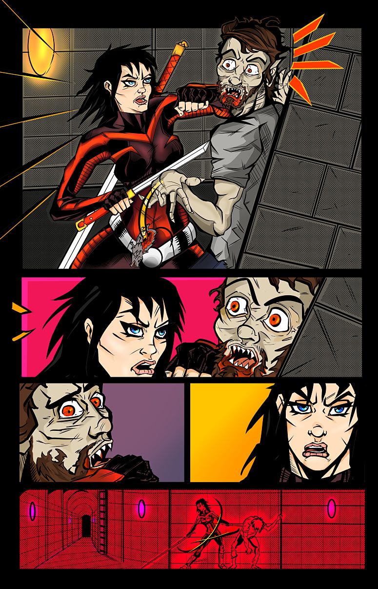
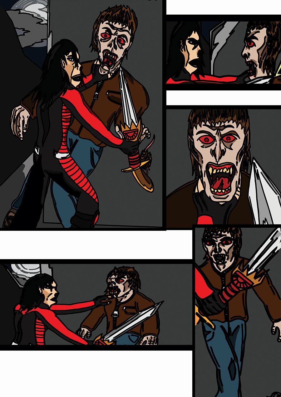
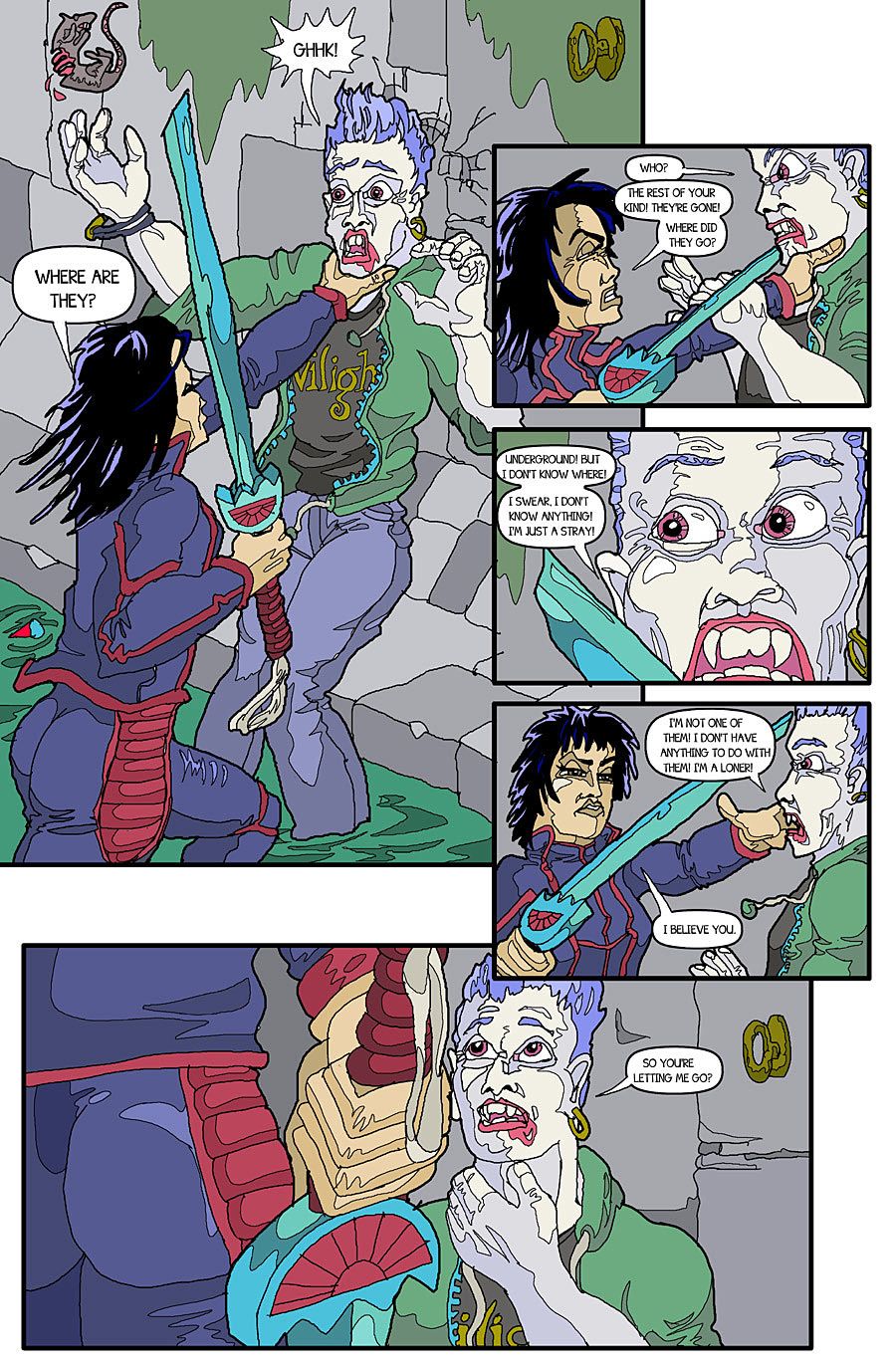
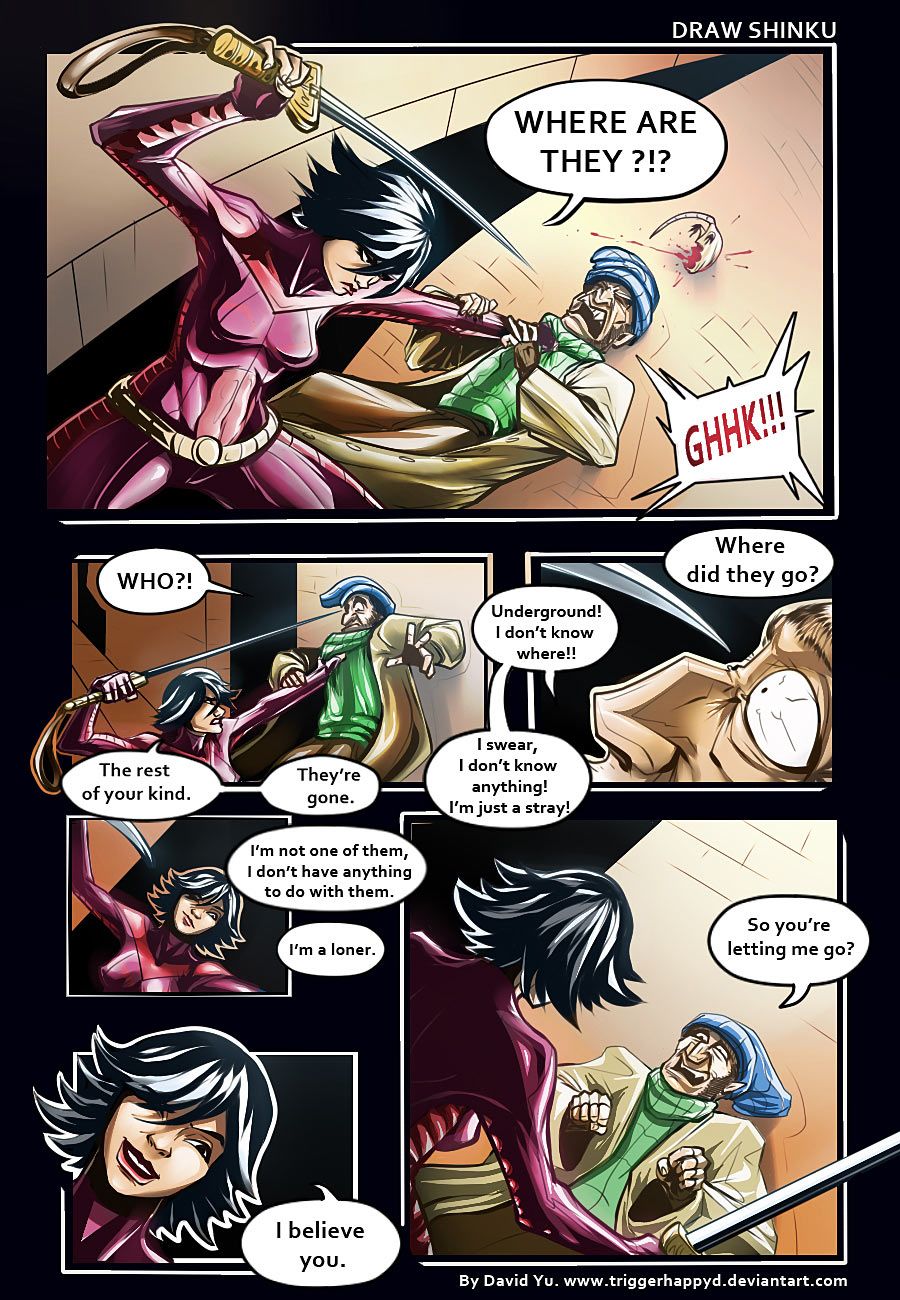
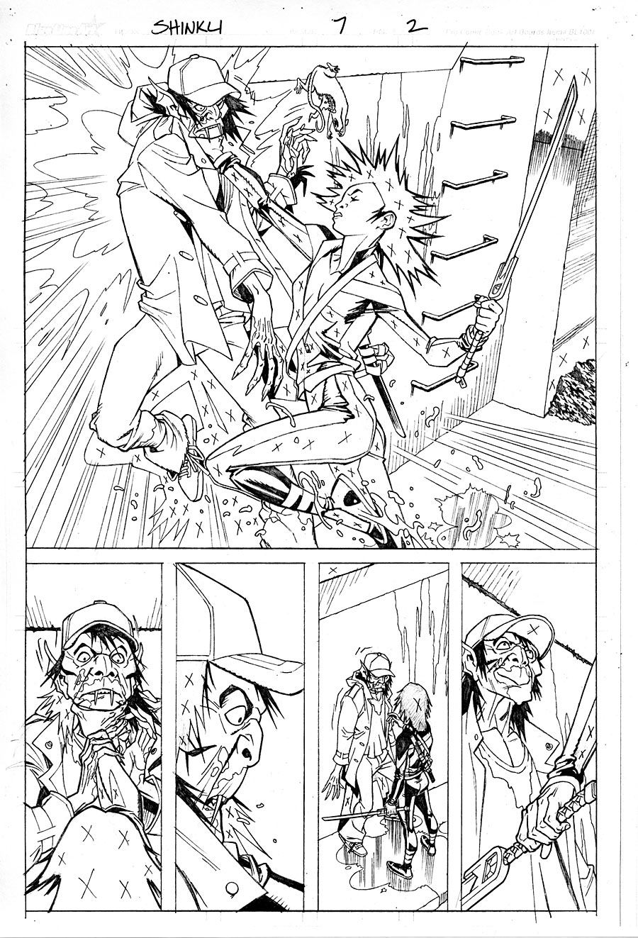
A few weeks ago in this column, I offered up a couple pages of "Shinku" script, and invited artists to interpret one of the pages. It was intended to be an exercise in the importance of what an artist brings to comic storytelling. Each artist is unique; the same page in the hands of a multitude of artists yields a multitude of interpretations.
I expected to get maybe a dozen submissions. Instead, I received 43, all of which can be seen below. I'm amazed and gratified by the turnout, as well as the sheer diversity of material. There are pencils, inks, color, even a number of submissions that went as far as lettering the pages. Thank you to everyone who went to the effort of producing a page.
Many times, the best thing a comics writer can do is get out of the way, and let the pictures tell the story. So that's what I'm going to do here, after some general thoughts on the submissions as a whole.
Obviously there's a wide range of accomplishment displayed in these pages, which is to be expected. But beyond the skill levels, there's a wealth of layout and storytelling choices to be studied. That's the intriguing stuff.
It was interesting to me which pages oriented the action right to left across the page, and which oriented the action left to right. I tend to be a left-to-right thinker when I'm composing a page... but that doesn't mean it's always the right decision.
The most common storytelling flaw was breaking the "180 rule," originally a cinema term referring to keeping spatial relationships consistent. In other words, if Character A is on the left side of the frame (or panel), and Character B is on the right side, it's disorienting for the viewer if those characters suddenly switch sides. The 180 rule is broken more often in comics than in film, but still risks pulling the reader out of the story. Sometimes it's done successfully for effect in comics, but more often, it's a result of careless composition.
Most artists retained the five-panel layout suggested in the script. However, a few added panels, and one dropped a panel... all of which is fair game. A script page is a map, a guide for a journey, rather than the journey itself. Treating a script more like scripture, sacrosanct with no room for deviation, smothers the creative possibilities of collaboration.
Many pages maintained a fairly static "camera" angle, about chest high, never venturing too high or too low. Depicting panels from high or low angles is a more difficult drawing task, but it's a necessary storytelling tool, and makes for more interesting, dynamic pages.
Not one submission executed the same layout that Lee Moder utilized on the finished page (which is the final page included here).
Submissions reflected the increasingly international makeup of the comics talent pool, including pages from the UK, Germany, Australia, Venezuela and Croatia.
The vast majority of submissions were from males. The only real disappointment for me was that we didn't get more pages from female artists.
And, yes, there were Smurfs.
Ron Marz has been writing comics for two decades, and thinks it's pretty much the best job ever. His current work includes "Witchblade" and the graphic novel series "Ravine" for Top Cow, "The Protectors" for Athleta Comics, his creator-owned title, "Shinku," for Image, and Sunday-style strips "The Mucker" and "Korak" for Edgar Rice Burroughs, Inc. Follow him on Twitter (@ronmarz) and his website, www.ronmarz.com.

