Comic Book Questions Answered – where I answer whatever questions you folks might have about comic books (feel free to e-mail questions to me at brianc@cbr.com).
Reader Jim G. wrote in to ask:
When I first purchased Demon number 15 I thought I got a misprint and I had dollar signs in my eyes. Now I know that that's the way the cover should have been with apparently missing text. What is the story behind that place?
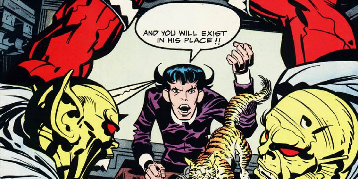
Here is he cover in question, from the very tail end of Jack Kirby's run on The Demon for DC Comics in the 1970s...

Quickly, as an aside, Kirby actually did another cover for this issue that was replaced by the one that was published. Here it is, courtesy of the kirbymuseum.org (I had originally had a reproduction here by mistake)...

I don't know what the deal was with covers for Kirby back during his time at DC Comics. I know he was definitely given a lot of orders by Carmine Infantino, like, "Drop that, do this. Put this character into that book. Do a book like this. That worked, let's do a book like this now," since his contract called for X amount of pages to be produced and it was up to Infantino to decide how best to spread those X pages around. So I really don't know whether Infantino would tell Kirby to scrap covers. Stan Lee would often do so at Marvel, but I don't know how Infantino worked at DC. So the cover might have been scrapped simply because Kirby wanted to do another cover.
ANYhow, back to the main question - what's the deal with the missing text? Obviously, from the context of the cover, the words that Klarion the Witch Boy is SUPPOSED to be yelling are "Kill him!" So why wasn't it there?
I checked with the great Mark Evanier, who has forgotten more about comics than we'll ever know (and is a particular expert when it comes to the works of Jack Kirby, who Mark worked with as an assistant during the 1970s and remained close with the King after that) and he said it was a simple screw-up.
You see, back in the day, comic book coloring would be done with just four colors ( blue (cyan), red (magenta) and yellow, plus black. The colors would be mixed at 25%, 50% and 100% to create the various color mixes) and they would create three negatives (one for each color) and then they would be merged with the negative from the black line art to create a final printing plate of the colors as needed for the issue. That would be then used for the actual printing process.
As Mark notes, though, "There was lettering there that was supposed to be moved from the black printing plate to the red one. They took it off one and never put it on the other."
So simple human error led to one of the odder cover mix-ups of the 1970s!
Thanks for the question, Jim and thanks for the info, Mark!
Okay, folks, if anyone else has anything that they'd like to know about comic books, just drop me a line at brianc@cbr.com!