
DEEP IN THE INKS
I picked up a brush pen in the last couple weeks. I do lots of drawings for my daughter and love using a pencil to produce little cartoon characters for her. Lately I've been picturing that work with a better ink line on top of it. The idea stuck in my head to try inking them with a brush. I don't have a dedicated art table, though, and don't want to be bothered with bottles of India Ink and cleaning brushes and all the rest, so I went for a brush pen. I've seen artists at conventions using them, and they seemed to be right up my alley.
My initial foray was with a Faber Castell Pitt brush pen I found at Michael's, a chain crafts store here in the North East. They have a section dedicated to drawing supplies, with a heavy emphasis on manga drawing. I guess that's their market, complete with lots of fine black ink line pens and books that cater to those who want to draw with a Japanese comics accent. They also sell Copic markers, but I'm not quite there yet, thanks. That takes a special kind of crazy to get obsessed with. I'm not that man. (Todd Nauck is.)
The Faber Castell "brush" pen feels like a Sharpie pen with a much finer point, and a shape that looks something like a brush with that bulb at the base leading up to a point. Problem is, it can't do very thin lines. It requires far too fine a touch to get a thin line, and after initial use, even that goes away. There is not a great range of line weights you can produce with the brush pen, which kills the whole point of buying one. It's also disposable. It's under $5, so you're not throwing money away, exactly, but if this went into heavy rotation, I'd hate to have to keep buying new ones at five bucks a pop.
The pen interested in the process of inking, but was not the right tool to do it with, even at the most beginning level.
Next came a trip to Blick's Art Store. I've seen their catalog before, but the brick and mortar store opened not a half hour from here a year or so ago. It's Art Nirvana. I walked around for a while to check out all the cool stuff. I nearly bought a sketchpad of Bristol Board paper just to draw on paper like comic professionals do. Feeling that size and that texture would be interesting, I thought, but I cheaped out and went for a regular spiral-bound drawing pad that would hold the ink.
In the pen department, they sell the Pentel brush pen that many swear by. It runs about $13 and comes with two ink cartridges. Don't know how long those will last me, but I'm heartened that refills are dirt cheap -- only $2 and change for two more ink cartridges.
I've also been recommended the disposable pens at JetPens.com. One day I'll get to them. For now, I'm experimenting with what's within reach. I'll do an internet order big enough for free shipping down the road.

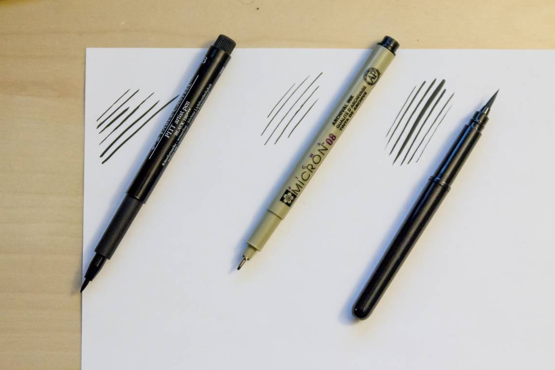
The Faber Castell Pitt brush pen is on the left. You can see how difficult it is to get any kind of line weight variation out of that thing. Getting that first thin line was far too much effort.
The second pen is a Pigma Micron with a 0.50mm line. It's not a brush. It's a thin pen line (with India Ink) that I bought for drawing very fine lines, perhaps like backgrounds. I also use it to draw Smurf eyes, since drawing tiny circles with a brush is still beyond me.
The pen on the far right is the Pentel Pocket Brush Pen. It is just what I was looking for. It's more brushy than that Faber Castell tool, while still feeling somewhat like you're writing with a pen. I'm gripping it too hard right now, but that's because I'm new at this and still getting a feel for it.
Line weights vary depending not just on how hard you push down on it, but the angle you draw at. (Drag it left to right for the thinnest line. Brush up for something thicker.) I've found myself spinning the paper around more often to get just the kind of line I want.
I've also broken a single line into multiple pieces so that I can control the thickness for each piece, hoping to smooth over the difference as I go. The results there, as you'll see soon, have not been too great. The purpose of a brush is to use its fluidity, and I'm not confident enough with one to pull that off completely yet.
Also, now that I have such control, I'm learning more about when to use it. My head hurts when it comes time to lay down a line and I have to think about where I want it to be thick and where it needs to be thin. It's always easier to judge that kind of thing when someone else is doing it. Like most newbies, I'm probably overdoing it. I don't need such great variations all in the same place. I'm exaggerating for the sake of learning. That's OK. I'll settle down eventually.
General rule of thumb: Thinner lines recede, thicker lines pop out. But making a curved line with thick ends and a thin middle help make it appear to bulge and be more three-dimensional.
The next biggest challenge is to slow down and concentrate. Most of my worst mistakes with the brush so far have been from going too fast and accidentally laying down way too thick a line. There's nothing that makes a drawing look worse than a suddenly thick line in the midst of all the thin ones. It takes some training to stop thinking like a penciler, where loose gestural drawings are encouraged to keep the loose energy on the page. As the "inker," it's important to reproduce that line and keep the energy at the same time. I'm just drawing simple Smurf figures here for practice, and even I can see how that works.
Here's one example:

I've drawn and inked about three dozen of the little guys for practice so far. I've learned a lot about the proper proportions of a Smurf as well as where to thicken up the ink line. That's not all on display here, though. This Smurf's body is about the right size, actually, but the upper right side of it is too thick at the chest. He's too wide. You can see where different ink lines meet up at the top of his hat. The line gets too thin at the front. The same problem happens at his nose, which additionally has the problem that the Smurf winds up with a pointy nose. His butt doesn't line up if you followed the lines through the front leg. I think his tail sits too low. His ear lobe is too fat. The dimple on his smile should carry through across the corner of the mouth. That right pointer finger is flat at the bottom, and the ink line goes past where it should. His chest has an oddly fat ink line at the top before getting thinner at the belly and thicker again at the bottom.
On the bright side, I like the thicker ink stroke at the right side of his head and where the hat meets the head between the ear and eyebrows. The eyeball lines are perfectly thin. Those never get thick in Peyo's art. They might sometimes disappear and occasionally have minor variations in the weight, but never get thick.
I do this kind of over-thinking on every Smurf I draw, even the ones I'm happy with. The ones I'm happy with I'm often annoyed by with a fresh set of eyes the next day. I'm tempted to start a blog, name it "100 Blue Guys," and mercilessly critique myself on it for 100 straight days.
Being an artist is a lesson in killing your ego and self-confidence. People like doing this?
Quick Smurf drawing tip: The Smurf's head, from the top of his hat to the bottom of his chin, is half his body height. Split the other half in half, and you'll get the line where you can drawn the top of the Smurf's pants.

While I haven't perfected my Smurf drawing by a long shot, I'm comfortable enough with it to do more than just copy Peyo's drawings. Here's "Smurferine," which I copied off a Wolverine image that came up on a Google Images search. It, too, is nowhere near perfect. His left foot looks twisted. The face mask doesn't follow the contour of his face. The far eye line is too thick. The ink line is uniformly too thick throughout the image, though I like the way the line around his butt tapers off at the bottom. And I like the arm hair. It's a good start.
Consider this my contribution to Cute Core. I'm doing SmurfCore. Be nice or I'll mix it up and do SnorkCore!
WHY I INK
Looking back at the last 20 years, I've experimented with a lot of comic book creation tasks. I've played with lettering, learning Illustrator and joining in on exercises at the Digital Webbing message board. I even owned an ink pen and an Ames Guide and practiced some hand lettering. I bought a couple sheets of Vellum Bristol board, grabbed a bottle of India ink, and had at it. I found that practice scrap of paper not too long ago. Wish I hadn't thrown it out. It would make an excellent sample for this Pipeline. Completely laughable, but good practice and exploration.
Before that, I'd written some fan-fics in the form of comic scripts, mostly in the Savage Dragon world. I experimented with writing my own comics. I even collaborated with an artist or two on some things that never went anywhere.
I've always drawn. Up until an ill-fated Art 2 class in high school, I even considered pursuing animation as a career. Twenty years late, suddenly, I figured out how to draw hands while doodling. It was like watching my daughter practice to get a cartwheel right for a year before suddenly, one day, she just upped and did one. Then another. And another. We're wired like that sometimes. Practice, practice, practice, and things might just click together. It's not always an evolution. Sometimes it's a big step up when something just clicks and things make sense. Hard work (or occasional work over a protracted period of time) pays off. The funny thing is, I wasn't even trying to figure out how to draw hands. I was just drawing one of the two or three stock poses I knew how to do (mostly from "Animaniacs" or "Tiny Toons"), and more hand poses suddenly came to mind and I was able to draw them. Click.
I'm still better at drawing three fingered hands than four, though.

Coloring is the one thing I said I could never do. I have no sense of color. I've played with Photoshop enough that I could probably flat a page or two if you put a gun to my head, but that's only the first step of coloring a page. Most instructively, I watched some of Brian Haberlin's Quicktime courses that I picked up from him at conventions past. I've sat in convention panels and watched people like Laura Martin explain some of that mystical art. I colored a page or two myself, for one silly reason: I love it when you drop out the line art and you can read the art just from the colors. It's magical.
Now I'm picking up a pen brush and learning a bit about how to ink a line with something other than a pen. The brush is a tool that produces amazingly smooth lines. It keeps a sense of energy to the art it finalizes. And it's ten times harder to draw with than a pen. I make lots of mistakes with it, but I also have lots of happy accidents. Sometimes, I recognize the happy accidents, because they remind me of someone else's brush line. My stupid mistakes have led me to understand just a tiny itty bit of the kind of work that people like Skottie Young or Doug Ten Napel or Peyo go through on the page.
This all helps me as a critic, as a reviewer, as an Internet loud mouth who writes about comics for two or three thousand words every week. It's something I suggest everyone else do, as well. You don't need to. You can still appreciate or critique a piece of work as someone who's never walked an inch in those shoes. That's fine by me. But I think it adds something to know what you're looking at, how it was formed, and some of the techniques being used in the creation of the art. If you can see the art from the other side, you might be better informed as to what went wrong. You can make better guesses. You can see more of the weaknesses and be more impressed by their strengths.

I've even seen ink lines I've laid down that reminded me of other artist's work. It's not that I'm consciously trying to ape them, but I'm seeing how different techniques with the tool can lead to different results from different artists. Some of those quirks I've seen on the page now have origins for me. I can see how the line might be laid down with the flip of the wrist and the twist of a brush, or by overdrawing the same line, or joining two lines together is such a way.
Don't get me wrong: Playing with something for a couple of days or weeks or months won't get you anywhere near expert status in any discipline. It will, however, teach you to look for things you never expected. You'll see things from a different perspective and be able to explain some of the choices being made by the creator along the way. You'll be able to better explain, perhaps, how some things might be done. If you interview a creator, you can speak their language just a little bit better.
Learning just the basics of these tasks in the comic book assembly line process also makes you humble. It's a little harder to rip into someone and claim they're doing it all wrong when you've done just enough to know how hard it is to learn, and how much harder it is to do it right. It also helps you see what's wrong, what might be bothering you, and how to explain it. We've all had those frustrating moments looking at a comic and thinking that there's something wrong with it, but we don't know how to explain it. When you've been on the other side of the curtain, you know just enough to see the detail. You can explain what it is that bothers you better. Then it's up to the comic reader (and even the professional, in some instances), to decide if what bothers you is a matter of taste or a matter of skill.
There's a third level of knowledge I haven't gone into here that I do not have and imagine never will. I've never worked for editorial inside the sausage factory. I've read enough interviews and talked to enough creators and lived a life in corporate America long enough, though, to understand that what we see on the page isn't always the best representation of the art. We may not have all the information, but it's often true that it's impossible for everyone to do their absolute best work every month. Life gets in the way. Company politics butt in. Late creators start a domino effect. An update in computer software at the printers can print something out in a lousy way. The end results are often more miraculous than any of us give them credit for, even when they're a complete bomb.
I encourage my fellow reviewers/critics/commentators to take an active step in better understanding the creators whose work we criticize. Go beyond just reading the interviews and listening to the podcasts. Walk 500 feet in their shoes. Get a feel for what it is they do, and what kind of choices they have to make. Trade-offs are all over the place.
Plus, hey, you might discover some hidden talent somewhere. Maybe I'll find mine someday, too...

Twitter || E-mail || Pipeline Message Board || VariousandSundry.com || AugieShoots.com || Original Art Collection || Google+