THE PREREQUISITE DEADPOOL SECTION
Since the guy had a fairly successful movie out this weekend, I'd be remiss to ignore Deadpool.
Three Deadpool Firsts, a Nostalgic Look Back
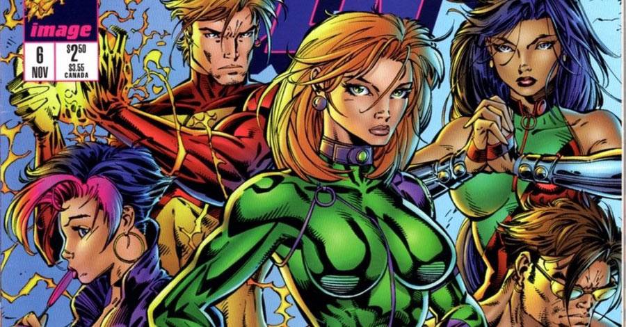
GEN13 EPIC RE-READ: "GEN13" #6-#7


In this two-parter, the kids land in trouble in Italy and Jim Lee fills in on art duties.
Brandon Choi and Jim Lee are credited with the story on both issues. J. Scott Campbell's name is added in the second. There are two stories intertwined here:
The first story is what amounts to an introduction to DV8, a team that would go on to have its own spinoff series by Warren Ellis and Humberto Ramos a year later. We see the beginnings of that at the top of both issues, most notably in issue #7, when Ivana (she's baaaack!) sends them on a VR training mission. But that storyline doesn't pay off here. I'm guessing that it's the 'B' plot that will eventually rise up to be the 'A' plot in a future issue, the way Chris Claremont structured his "X-Men" tales for so long. (Denny O'Neill has written about this structuring of storylines for serialized comics, as well.) Claremont tended to tell those stories in much smaller chunks until they got to the main stage, though. This one took up too much space, leading to an overall unbalanced feeling to the story.
The second story -- the main plot -- has the team in Italy on their way home from their Coda Island adventure in previous issues. There, they get caught up in a fight against The Order of the Cross, an ancient secret organization in Italy dedicated to protecting the church from evil. It's like something straight out of a bandes dessinees album series, where religious organizations are the villains in much the way corporations are the big bads in American storytelling.
The Order speak Italian, are powerful and scary, and wind up confronting the Gen13 kids in a most bombastic way, through their superpowered team, The Centurions.

I mention the Italian because it's a sore point in the issue. To be authentic, the dialogue amongst The Order and the Centurions in the first issue of this story is all in Italian, with translations to English included in the letters column. This is just a bad idea. The dialogue is necessary to understanding the story, and not at all obvious. With the second issue, they included the translations of English in the balloons, themselves. It makes the story much clearer.
The Centurions are super powerful, including an impressive character in a gigantic chunk of armor, the way only Jim Lee could draw it. They also have quicker, dangerous combatants and Superman analogues and everything you'd expect. In the end, though, they lose to a battle of wits. Caitlin out-thinks the Centurions to win the day. It's clever and a nice change from the expected -- as is even noted in the dialogue at the end -- but part of me was hoping for a big brawl. Sometimes, I admit, I'm still a 12 year-old boy.
Either way, it seems like a waste to create a team like this for a single storyline and then disappear them entirely. Given how much Jim Lee loves to draw and reference Italy, you'd think he'd have come up with a good excuse to bring them back at some point...
Meanwhile, all of the romantic subplots continue to churn through this issue. After a night of drinking, Rainmaker and Burnout wake up together, creating more awkwardness. Grunge still isn't treating Freefall right, yet she keeps coming back for him. And, most important of all, Burnout meets up with Bliss again, and feelings are exchanged. Her sister may be evil, but Bliss is just bored and loves Bobby. There's a scene of the two of them racing through the Italian city that's great comedic fodder in issue #7. It's all character-based, that's why. It may not always be terribly deep, but it's considered and included, which only makes the series more enjoyable.
One other moment of comedy that deserves pointing out for its effective use of visual storytelling, comes in issue #6. Ivana and Bliss are exchanging unpleasantries in a scene that ends with Bliss lashing out against her brother like this:

That cat cracks me up every time.
Jim Lee, believe it or not, has a lot to live up to J. Scott Campbell's art in the series. Campbell had drawn it all up to this point and his style was the way to show these characters. Lee has some awkward moments in trying to make the characters look younger than what he's used to drawing in "WildC.A.T.s and "Uncanny X-Men," but he more than makes up for it in his storytelling. Sure, a lot of the standard Jim Lee poses and techniques are here, but he mixes them in nicely. He can also draw stand out panels that you wouldn't expect, like this overhead angle on the kids standing around a Ferrari.

Lee has a knack for composition in his storytelling, also. One of the most glaring examples is this page, where Lee mimics a rack focus technique common in movies and television shows. Using a shallow depth of field, the camera quickly changes its focal point in the middle of a scene when the audience's attention should shift, too.

The WildStorm FX people use a blur technique to show this off, but the storytelling moment here is more than just that Photoshop technique. Look at the way Lee has laid out this panel, to make the foreground characters create a "U" shape surrounding the background characters, who exist on the plane the colorists create a focus on with the second panel by blurring out the foreground. The planes are well defined, but the way Lee stages the panel could draw your eye through the appropriate focus spots even without the blur filter.
The script also gives Lee the chance to draw more of those sequences like in the run that shot him to fame on "Uncanny X-Men": The characters trying on multiple outfits across a page montage is great, and there is, of course, the half page shot of the Gen 13 women revealing their new Italian fashions.

The ongoing coloring struggle continues with this pair of issues. Joe Chiodo's coloring is excellent, but the paper soaks up all the ink and leaves a much duller and muddier looking mess behind. We're spoiled by today's paper quality and digital coloring techniques, but this is tough to take at times. There are moments you know colors were chosen to make things pop out, but they barely separate themselves from the backgrounds, instead.
Overall, these two issues are entertaining. The general plot feels too little focused, with a major subplot distracting from it. But the character work and back-and-forth dialogue between characters is still the strongest draw of the book. No wonder people fell in love with the characters.
Back Matter:
It's always fun to look at the ads and house material in the backs of these comics, so here's a small sampling:

Yes, kids, there was a time when Adam Hughes drew the interiors to comics and not just the covers. This ad also shows a certain amount of self awareness for the timeliness issues of Image Comics at the time:
"Debuting in February. Honest!"

There was also a long stretch of time when "Spawn" was a Top Ten selling comic. He was popular enough to support a movie and a video game, too.

I'd like to see one of these today...

Finally, for pure eye candy, here's a Jason Pearson pin-up.
Coming up in the next story: The tall, dark, mysterious goth stranger from the first issue returns. I think that's him at least. I haven't read it yet. J. Scott Campbell returns! For an issue. Then Humberto Ramos fills in, before Campbell returns in time for another Wildstorm crossover event. Sigh.
Twitter || E-mail || Pipeline Message Board || Instagram || Tumblr || VariousandSundry.com || AugieShoots.com || Original Art Collection || Google+