Design-heads, you are going to want this book. "Heroical" is a self-published, 10" x 14", blue-inked, die-cut comic. Created by by David Plunkert, who owns a design firm with his wife in Baltimore and whose work has appeared in the likes of "The Wall Street Journal" and "Time," "Heroical" is a curious, magnetic end-product. Make no mistake: This goes beyond comic-making. It's the product of a love of design and printmaking, pure and simple.
Selling his product off his company's website, "Heroical" looks like something one would frame in their hip, cozy study; a clever piece of design art that wouldn't look out of place next to your favorite Warhol print. But Plunkert describes his first indy issue as something more -- a study, an effort of distilling his ten year old self's imagination through his grown-up experiences.
Plunkert spoke with CBR News about his design background, which designers in the industry he has an eye on and, finally, what it means to be heroical.
CBR News: "Heroical" is coined as "a collection of stripped down, neo-expressionistic superhero stories." That sounds really sexy, but how else would you describe it, and what's it about?

David Plunkert: "Heroical" is my effort to make characters that were inspired indirectly by what fired my imagination as a boy. As a kid of the '70s, I read most current comics I could get my hands on, but what really grabbed me was the old stuff that could be found in reprints like DC's Famous First Editions and in the backs of their 100-page specials, or in Marvel's case, "Fantasy Masterpieces."
For example, the Superman that appears in "Action Comics" #1 is all scowls and is so unpredictable and dangerous. Another early inspiration was the "Radio Comics" cover that Jules Feiffer created as a boy in 1941, and shares in his fantastic book "The Great Comic Book Superheroes."Other boyhood inspirations were Kirby's '70s Marvel output which stood out as something different and peculiar from other comics on the rack -- so non-slick, but so angst-ridden.Also, the uneven stories published by Charlton -- whenever a Ditko story would appear, it was like finding a prize.
What I took from these comics is the condensed storytelling of getting from A to C in one page, and the weird pulpiness of the characters. Stuff I would find much later and work into the mix is the work ofFletcher Hanks and thesequential woodcuts of Frans Masereel.
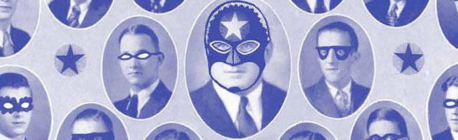
The awkwardness is an intentional byproduct of the working method of starting with the first picture and barreling through to the end -- like the way a kid would make a comic. All of the origins and stories are just one page long. If someone doesn't think a particular story is very good at least there's not a lot of it. There are aspects of parody that creep in, but I think the book works best if viewed as a love letter to the act of spontaneous comic book making.There is no badassery on display, but plenty of strangeness.Its ten-year old me's imagination on display, sifted through grown-up me's experiences.Its superheroes meets boy meets Weimar Cabaret.
Speaking of which, the book is pretty daring. Your love for design shines bright through each page -- the layout, the production that went into the book, all of it smacks of someone bitten by the design bug. So, tell me, what's your background?
I was trained as a graphic designer, but developed as an illustrator fairly early in my career. I typically design posters for theatre productions, colleges, independent movies and rock concerts.I teach design and illustration at the college level occasionally and have the odd speaking gig every now and then.My editorial illustrations appear fairly frequently in the "New York Times," "The Wall Street Journal," "Playboy" and "Time," to name a few.

My work is heavily influenced by comics, by the work of significant designers like Paul Rand and Seymour Chwast, and by art movements like Dada and Futurism.
I run Spur Design which is a 5-person studio in Baltimore, Maryland with my wife, illustrator Joyce Hesselberth. We bought and renovated a 10,000 square foot warehouse which holds our design office, workshop and gallery.
So why comics? Couldn't you have created a zine or an online pamphlet with the same effect?
Being a cartoonist was my first love. I submitted work to Marvel as a teenager and received a kind and supportive rejection letter. I sort of shrugged and went, "Oh well," and enrolled in a college design program. Fortunately, I love graphic design and illustration, but comics have always been in the back of my head. In regards to online pamphlets, I'm a print guy and an art guy and I think there are still experiences print can deliver that peering into the web-quarium can't. I think comics represent objects of desire for the folks who are fans of the form; most of my regular work isn't intended to be entertainmentso this was a brazen attempt to engender a small bit of affection and find some new energy.
I like the auteur aspect of comics. It's one of the most basic ways that an individual can tell a story with something handmade. There are rules to follow and rules to break depending on how recognizable or unrecognizable an artist wants to make the form. Looking at mainstream comics made today is like working for someone else -- you can learn a lot about how to run your business by seeing what to do and more importantly what not to do.
"Heroical" is 10" x 14", drawn in blue ink, packaged in a sexy die cut cover. Looking at the parts versus the whole, can a product -- that's what I view works like "Heroical" as, a true product -- be successful, be noticeable, only if all the elements complement one another?
Even if all the elements complement each other it won't be successful if no one hears about it or can find it. That's the biggest hurdle. I think if all of the elements are working together that it hopefully adds to a long shelf life.
Incidentally, I swiped the size from those previously mentioned Famous First Editions. The size and the die-cut are its only real print production extravagances.

What's it like owning something from soup to nuts? Furthermore, what's your favorite part in the design process?
It feels good to see a creative body of work grow that can also hopefully be shaped in a positive direction. My favorite part of the design process is the idea at the thumbnail sketch stage. I enjoy the detailing that comes after but no amount of shining can fix a bad concept while sometimes a clever idea can be executed quickly with just ink and a stick.
Are there any designers working in comics whose work you follow? Are there any comics that you can point to, design-wise, and say, "They're doing it right!"
Chip Kidd is probably the design community's most prominent player who keeps a hand in comics and was no doubt key in changing the perception that books about comics could be art objects. Craig Yoe likewise puts together sweet looking collected anthologies of horror comics. My long time friend Paul Sahre designed a mind-blowing book with author Walter Mosley on the first issue of "Fantastic Four" which elevated and isolated each Kirby panel.Adhouse Books and Fantagraphics also publish wonderfully designed books.
As far as individual comics that are well-designed, the first two that spring to mind are "Palookaville" by Seth and the wondrous Chris Ware's "Acme Novelty Library." Seth and Ware are cartoonists first and foremost, but they both display a dazzling design sensibility.

Do you have any follow-up projects in the works?
Along with my regular assignments, I'm taking part in an upcoming Windsor McCay tribute book which will include artists Bill Sienkiewicz, Paul Pope, Mike Allred and many more. I'm currently illustrating a thick book of short stories, and I'll have the second issue of "Heroical" completed by the fall of next year.