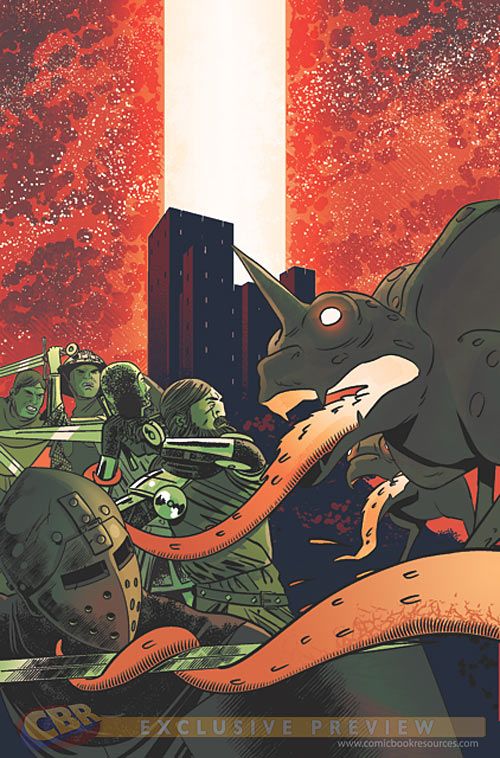
The creative team that brought zombies into Victorian-era London in Vertigo Comics' excellent "The New Deadwardians" now brings aliens into medieval Europe in the equally compelling "Dark Ages" #1 written by Dan Abnett and illustrated by I.N.J. Culbard. As the God-tolerating captain and his group of mercenaries make their away across Europe seeking to live off the fortunes of never-ending war, his group encounters a new kind of enemy that plummets down from the stars and does far greater damage than the kind seen from a sword or mace. There's even a touch of the undead thrown in, but Abnett makes sure that there's more to the threat, and the mystery behind it, before the issue is over.
Abnett tells readers straight off when and where they are when the story begins, and Culbard shows them with a semi-barren landscape slowly succumbing to winter. Abnett plays on the barren mood with a clear explanation of who the main characters are, and their motives, which are simple: to earn money for survival. In the span of a few pages, Abnett establishes a rapport between the bitter, firm, but kind Captain Hawkherst and his loyal second-in-command "Lucifer" Galvin, which comes into play later when Hawkherst's band encounters the newly-arrived alien creatures. The dialogue flows naturally and its period nature seems convincing enough, centering around Hawkherst and Galvin's disillusionment with the All-Mighty and their indifference regarding their seemingly amoral warring ways, although these ways are rooted in the basic need for survival; both their own, and their group's.
Culbard has a highly-effective style of simplicity that shows only as much detail that is needed to tell the story; no more, and no less. There alien creatures aren't painstakingly embellished with otherworldly textures or characteristics, but neither are they too vague to identify; they have acid-emitting tentacles, which is all readers get to see thus far, but is also all they need to really know. Culbard relies on obvious facial discrepancies to discern the characters, like beards, large noses, etc., almost rendering them more as caricatures than characters, and it works. Culbard makes sure his art simply tells the story, not draw attention to itself. It's not the prettiest comic, but then, it does take place during the Dark Ages, after all.
One puzzling piece of Culbard's art is a mysterious sanctuary at the top of a hill that looks more like an early 20th-century skyscraper, which is seen on his cover illustration as well as inside the issue. This may be artistic license, or it may look this way for a reason; a reason that may or may not relate to the title's modern looking logo, which looks like it's printed on a circuit board. It's an understated mystery that's easily dismissed at first, but later pokes at readers telling them that there just might be more behind this seeming incongruity.
"Dark Ages" #1 stands up fine on its own simply as a sci-fi/swordfight mashup, but is elevated by both the mystery behind the aliens' arrival, and the subtle foreshadowing that there could be more behind this still.

